
Typography is never simply a visual decision. Every typeface carries a personality, a history and a set of cultural associations that influence how people interpret what they see. When you choose a font, you are not only deciding how words should look; you are also shaping how the message, brand or person behind those words is perceived.
Most of the time, this happens without much conscious thought. Designers often react instinctively to typefaces based on what feels appropriate, familiar or attractive. Even so, those choices communicate something before the audience has read a single sentence, which is why typography plays such an important role in design.
Different Typeface Categories Send Different Signals
Typeface categories tend to create recognisable impressions, even though those impressions can shift depending on culture, context and execution. Serif, sans-serif, display, monospaced and handwritten styles each bring their own visual language to a project.
These associations are not absolute rules, but they are consistent enough to influence how people feel about a design. Choosing a typeface therefore means choosing a tone, whether that tone is traditional, modern, expressive, technical or personal.
Serif Typefaces Suggest Tradition And Authority
Serif typefaces are strongly associated with history, credibility and established institutions. Newspapers, universities, law firms, publishers and financial organisations have used serif typography for generations, giving it a sense of permanence and seriousness.
When a designer chooses a serif, the message often feels more formal, trustworthy or rooted in tradition. It can suggest that the subject deserves attention and has a certain level of authority behind it.
That does not mean serif typography must always feel old-fashioned. Modern serif families can look highly contemporary when paired with clean layouts and restrained colour palettes, allowing designers to combine heritage with sophistication.
Sans-Serif Typefaces Communicate Clarity And Modernity
Sans-serif typography is closely associated with modern design, technology and efficiency. Its clean shapes and lack of decorative strokes make it feel direct, functional and visually uncomplicated.
Technology companies, startups, software platforms and contemporary brands frequently rely on sans-serif typefaces because they work well across screens and tend to feel accessible. Choosing one often communicates that the organisation values clarity, speed and simplicity.
The downside is that sans-serif typography has become so common that poorly considered choices can feel anonymous. A generic typeface may communicate modernity, but it may not necessarily communicate much personality.
Display Typefaces Make A Stronger Statement
Display typefaces are designed to attract attention. They often use unusual proportions, dramatic shapes or distinctive stylistic details that make them particularly effective for headlines, posters, campaigns and branding.
Choosing a display typeface usually signals confidence and creativity. It suggests that the design is intended to stand apart rather than quietly blend into the background.
Because these typefaces are visually dominant, they need to be used carefully. What looks striking in a short headline can quickly become exhausting when applied to long passages of text.
Monospaced Typefaces Feel Technical And Precise
Monospaced typefaces give every character the same horizontal width, creating a visual style strongly associated with programming, engineering, terminals and typewriters. This gives them an immediate sense of precision and technical authenticity.
Designers often use monospaced fonts when they want a project to feel analytical, structured or closely connected to software development. The aesthetic communicates logic and function more strongly than ornament.
They can also evoke nostalgia because of their connection to early computing and mechanical typewriters. Depending on the surrounding design, the same monospaced typeface can therefore feel futuristic, retro or deliberately utilitarian.
Script And Handwritten Typefaces Feel More Personal
Script and handwritten fonts tend to communicate warmth, personality and human connection. Their irregularity and fluid forms can make a design feel less corporate and more intimate.
They are commonly used in wedding invitations, boutique businesses, lifestyle brands and personal projects because they create the impression that a human hand is involved. This can make the message feel friendlier and more emotionally expressive.
However, handwritten styles can also become difficult to read when overused. The personality needs to support the message rather than become an obstacle to understanding it.
Typography Often Reflects The Designer As Much As The Project
Designers rarely choose typefaces in a completely objective way. Personal history, education, cultural background and professional habits all influence what feels visually correct.
Someone trained heavily in Swiss modernist design may instinctively gravitate towards clean sans-serif typography and strict grid systems. Another designer influenced by independent magazines or DIY culture might prefer rougher, hand-drawn or experimental lettering.
These preferences become part of a designer's visual identity. Even when two people receive exactly the same brief, their typography choices may reveal very different interpretations of the project.
Professional Habits Shape Typeface Choices
Designers also develop habits based on the kinds of work they regularly produce. Someone working primarily in corporate identity may prefer typefaces that feel stable and highly legible, while an editorial designer may be more comfortable mixing contrasting serif and sans-serif families.
Over time, these habits can become almost automatic. A designer may reach for a familiar font because it has worked well before, even when another typeface might better suit the new project.
This is why it is useful to occasionally question instinctive choices. Familiarity can improve efficiency, but it can also prevent designers from exploring typography that better reflects the specific message.
The Project Should Still Drive The Decision
Personal taste matters, but the needs of the project should ultimately come first. Typography has to work for the audience, context and purpose rather than simply reflecting what the designer personally enjoys.
A fintech startup, for example, may need typography that feels modern and trustworthy without becoming cold or bureaucratic. A luxury fashion brand may prefer a refined serif, but the execution needs to feel contemporary rather than historical.
The right typeface sits at the intersection of brand personality, audience expectations and practical usability. Good typography does not simply look attractive; it reinforces the idea the project is trying to communicate.
Context Can Change The Meaning Of A Typeface
The same font can communicate very different things depending on where and how it is used. A serif typeface placed inside a traditional newspaper layout may feel authoritative, while the same font used at enormous scale on a minimalist website can feel bold and fashionable.
Colour, spacing, weight, size and surrounding imagery all influence how typography is interpreted. Typeface selection therefore cannot be separated completely from the rest of the visual system.
This is why evaluating fonts only through a type specimen can be misleading. They need to be tested inside the actual design before their personality becomes fully apparent.
Misalignment Is A Bigger Problem Than Choosing The "Wrong" Font
There is rarely one objectively correct typeface for a project. The bigger danger is selecting typography whose personality conflicts with the message.
A funeral service using a playful cartoon script could create an inappropriate emotional tone. A children's brand built entirely around aggressive blackletter typography may feel intimidating rather than welcoming.
The problem is not that either typeface is inherently bad. The issue is that the signals being sent do not align with what the organisation wants people to feel.
Typography Speaks Before The Words Do
Before someone consciously reads a headline, their brain has already processed its visual appearance. The weight, shape, spacing and style of the letters all contribute to an immediate emotional impression.
A heavy geometric typeface may feel confident and powerful, while a thin elegant serif can feel refined and restrained. A rounded sans-serif may appear friendly, while an angular one can feel more technical or futuristic.
Typography therefore operates on two levels at once. The words communicate meaning, while the shapes of those words communicate mood.
Default Typography Can Send A Message Too
Choosing not to think about typography is still a typography decision. A company that simply leaves its website using an unconsidered default system font may unintentionally communicate that visual identity was not a priority.
That does not mean system fonts are automatically poor choices. In many interfaces, they provide excellent readability and performance.
The difference is whether the choice is intentional. A deliberately selected system font can support a functional design philosophy, while an accidental one may simply feel unfinished.
Readability Still Comes Before Personality
A typeface can communicate exactly the right personality and still fail if people cannot comfortably read it. This is especially important in digital design, where typography needs to work across different devices, resolutions and viewing conditions.
Body text should prioritise legibility, comfortable line lengths and sufficient spacing. Highly expressive typography is usually better reserved for headlines, branding and other short-form elements.
Good typography balances communication and usability. Personality matters, but it should never come at the cost of understanding.
Typography Is Also Part Of Brand Memory
Consistent typography can become one of the strongest elements of a brand's identity. People may not know the name of the typeface, but they can still recognise its visual character.
When the same typographic system appears across websites, packaging, advertising and social media, it creates familiarity. Over time, the type itself becomes associated with the organisation.
This is why major brands invest heavily in custom or carefully selected type families. Typography helps create recognition even before a logo appears.
Cultural Associations Matter
Typeface interpretation can also change across cultures. A style that feels modern or sophisticated in one market may carry very different historical or emotional associations somewhere else.
Designers working internationally therefore need to consider more than Western typographic conventions. Language support, writing systems and local expectations can all influence whether a typeface feels appropriate.
This becomes especially important for multilingual branding. A Latin typeface and its corresponding Chinese, Arabic or Japanese typography need to feel visually related without forcing one writing system to imitate another unnaturally.
Trends Can Influence Typography More Than We Realise
Typeface choices are also shaped by the period in which they are made. Certain styles become fashionable, spread rapidly and eventually begin appearing across countless brands.
Geometric sans-serifs, high-contrast editorial serifs and retro-inspired display fonts have all moved through cycles of popularity. Designers may believe they are making highly individual choices while unknowingly responding to the same visual trends as everyone else.
Following trends is not inherently bad, but it becomes risky when the typography dates the brand too quickly. A strong choice should work beyond the current design fashion.
The Best Typography Choices Feel Intentional
Successful typography rarely attracts attention solely because the font itself is unusual. Instead, it feels appropriate enough that the entire design becomes more convincing.
The typeface supports the message, hierarchy makes information easy to scan and spacing creates the right rhythm. Every decision appears to belong together.
That sense of intention is what separates thoughtful typography from simply choosing a font because it looks attractive in isolation.
Final Thoughts
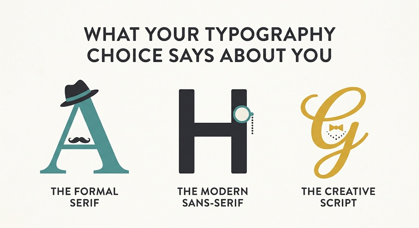
Typography says far more than most people realise. Serif typefaces can suggest authority and tradition, sans-serifs often communicate modernity and efficiency, display fonts bring personality, monospaced styles imply precision and script typography creates a more personal tone.
Those signals also reveal something about the designer. Education, taste, professional experience and cultural influences all shape the fonts we instinctively prefer.
But typography ultimately needs to serve the project rather than the designer's ego. The most important question is not whether a font looks beautiful on its own, but whether the personality it communicates matches the message, audience and context.
You cannot really choose typography without sending a signal. Even choosing the default sends one. The goal is therefore not to avoid making a statement, but to understand the statement you are already making and choose it deliberately.
A typeface is never just a font. It is part of the message itself.











Comments 0