Please wait while we're digging into our systems to find what you want....
close
What’s on your mind..?
LOADING...
listing out our multimedia graphic design services...
GRAPHIC & MEDIA
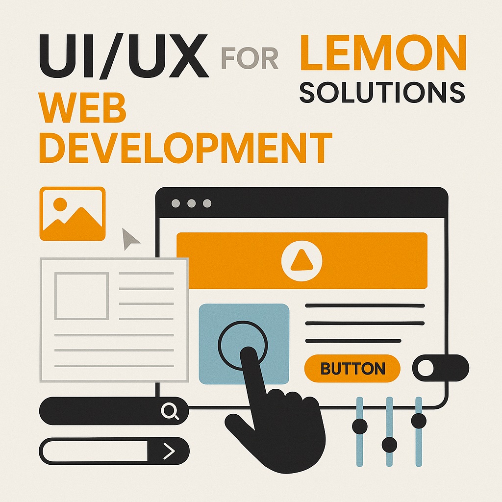
UI/UX for Web Development
A successful website needs more than attractive colours and polished graphics. Visitors should understand where they are, what the website offers, how to find the information they need, and what action they can take next without having to struggle through confusing layouts or inconsistent controls.
Lemon Web Solutions creates UI/UX design assets for modern web development, including wireframes, interactive prototypes, icon sets, buttons, navigation components, content layouts, forms, cards, and other interface elements. Each asset is planned to combine visual appeal with functional clarity so that the design supports the user rather than becoming decoration around the content.
The design direction can support corporate websites, e-commerce platforms, web applications, dashboards, service portals, and interactive digital experiences. Brand identity, user flow, responsive behaviour, usability, accessibility considerations, and developer handoff are reviewed together so the final interface can look consistent and feel natural across different screen sizes.
Good UI attracts attention, while good UX helps people complete their purpose. The strongest web experiences connect visual design, content structure, navigation, interaction, and responsive behaviour into one understandable journey.
RM 1,000 - RM 2,500 per project, depending on page scope, interface complexity, prototype requirements, and developer handoff
DISCOVER Your UI/UX Direction
A corporate website, e-commerce store, dashboard, and interactive web application may all require navigation, buttons, forms, and responsive layouts, but the user journeys and design priorities are different. Answer five quick questions below to create a preliminary UI/UX direction based on the type of project, its current stage, the main experience goal, the required scope, and the visual character you prefer.
Question 1 of 5
What are you designing?
Choose the type of website or interface that most closely represents your project.
What stage is the project currently at?
This helps determine whether the work should begin with structure, visual design, refinement, or developer support.
What is the main experience goal?
The final design can address several goals, but this identifies the area that needs the greatest attention.
How broad is the design scope?
Select the option that most closely represents the number of pages, screens, components, and user journeys involved.
Which visual character best suits the interface?
The final style should support the brand, audience, content, and tasks rather than appearance alone.
Your UI/UX Direction
Website UI/UX Design
RM 1,000 - RM 2,500 per project
— final price depends on scope, screens, components, prototype depth, and handoff requirements
Your answers have been combined into a preliminary UI/UX direction.
The final scope should be confirmed after reviewing the users, content, pages, features, technical environment, brand assets, and development requirements.
YOUR Selected Requirements
Project Type
-
Current Stage
-
Main Experience Goal
-
Design Scope
-
Visual Character
-
Next Step
Confirm the users, page or screen list, content, features, brand assets, technical constraints, and required deliverables.
DESIGN Planning Focus
User Journeys
Clarify who uses the website, what they need, and which actions matter most.
Information Structure
Organise pages, navigation, content groups, and priorities into an understandable structure.
Wireframes
Plan the layout and interaction flow before detailed visual styling begins.
Responsive & Inclusive Use
Consider different screens, touch interaction, readability, focus, forms, and accessible states.
Developer Handoff
Prepare screens, reusable components, states, behaviours, and specifications developers can interpret.
UNDERSTAND Users, Goals, and Journeys
A website may serve several audiences at the same time. A potential customer may want to understand a service, an existing customer may need support, a shopper may be comparing products, and an employee may be trying to complete a specific task within a web application. Each journey begins with a different purpose.
UI/UX planning identifies who the primary users are, what they need to accomplish, which questions appear along the way, and what information or interface action helps them move forward. This prevents the design from being organised only around internal departments or available content while overlooking how visitors actually encounter the website.
The most important journeys can then guide navigation, page structure, calls-to-action, forms, search, product discovery, account areas, dashboards, and other interactive components.
Primary Users
User Questions
Journey Steps
Key Actions
Desired Outcomes
ARRIVE
EXPLORE
DECIDE
ACT
Find Information
Help visitors locate services, products, answers, documents, or support information without unnecessary searching or repeated navigation.
Compare and Decide
Present options, benefits, prices, features, evidence, and next steps in a structure that supports confident decision-making.
Complete a Task
Guide users through forms, checkout, registration, record management, data entry, account actions, or other interactive workflows.
Ask or Respond
Make enquiries, support requests, feedback, appointments, quotations, and other communication paths easy to understand and complete.
WIREFRAME Content Before Decoration
Wireframes organise the page before detailed colour, imagery, typography, and visual effects are introduced. They help focus the discussion on content order, layout, navigation, component placement, form steps, calls-to-action, and the relationship between one screen and the next.
This is especially useful when several stakeholders are involved. A wireframe gives everyone a simpler structure to review before time is spent polishing an interface that may still contain unclear priorities or missing content.
Wireframes can range from quick low-detail layouts to more structured screen plans depending on the project. The objective is not to make the website visually complete at this stage, but to confirm that the experience makes sense before detailed interface design begins.
Content Hierarchy
Decide what users should see first, which information supports the decision, and what details can appear later.
Navigation Structure
Organise menus, page groups, breadcrumbs, tabs, filters, search, and internal links around understandable labels.
Forms and Tasks
Plan fields, steps, instructions, validation, decisions, confirmations, and completion states before styling the form.
Responsive Priority
Identify what should remain prominent, stack, collapse, move, or become easier to reach on smaller screens.
DESIGN a Consistent Interface System
Once the structure is understood, the interface can be developed into a visual system that reflects the brand while remaining clear and reusable. Typography, colour, spacing, imagery, icons, buttons, forms, cards, navigation, tables, alerts, and other components should feel connected rather than designed independently on every page.
A consistent component system gives developers repeatable building blocks and helps users learn how the website behaves. When buttons, links, fields, menus, and messages follow predictable patterns, the interface becomes easier to understand and future pages can be added with less visual drift.
The level of detail depends on the project. A focused landing page may need a small set of styles, while a web application or large website may require reusable states, variants, spacing rules, and component behaviour across many screens.
Typography
Colour System
Components
Spacing
Reusable Patterns
Typography & Hierarchy
Define headings, body text, labels, captions, supporting information, links, and emphasis so content remains readable and clearly prioritised.
Buttons & Actions
Distinguish primary, secondary, destructive, disabled, loading, and other action states so users understand what each control will do.
Forms & Inputs
Design labels, fields, selections, instructions, validation, error states, confirmations, and grouped information around the task.
Cards, Icons & States
Create reusable content containers, icons, alerts, badges, tabs, filters, progress indicators, empty states, and other interface patterns.
GUIDE Users with Clear Navigation and Feedback
Users should not need to guess which element is clickable, whether an action succeeded, where they are within the website, or what to do after an error. Navigation and interaction design create the signals that help people understand the interface as they move through it.
Menus and Page Location
Use understandable labels, active states, breadcrumbs, tabs, and page titles so users can recognise where they are and move elsewhere confidently.
Search, Filters, and Discovery
Help users narrow large collections of products, services, records, articles, or data without creating confusing controls or hidden results.
Calls-to-Action
Make enquiries, purchases, registrations, downloads, submissions, and other important actions visually clear without overwhelming the page.
Feedback and Status
Show loading, success, warning, validation, error, empty, disabled, and completion states so users understand what the system is doing.
RESPOND across Today's Devices
Responsive UI/UX is not simply a desktop layout reduced until it fits a smaller screen. Navigation, content priority, card arrangement, form fields, tables, media, touch targets, and action placement may need to change so the experience remains comfortable on desktop computers, tablets, and mobile phones.
The design should identify what remains visible, what stacks vertically, what can collapse, how wide content should become, and which controls need more space for touch interaction. Text and important actions should remain readable without forcing users to zoom or move repeatedly between distant parts of the screen.
Responsive behaviour can be shown through representative layouts, component rules, or dedicated screen states depending on the complexity and development needs of the project.
Desktop Layout
Tablet Adaptation
Mobile Priority
Touch Targets
Content Reflow
INCLUDE More Users through Accessible Design
Accessibility considerations help make the interface clearer for people with different visual, motor, cognitive, situational, and device-related needs. Many of the same decisions also improve everyday usability, including readable text, understandable labels, visible focus, clear errors, suitable contrast, and predictable interaction.
Readability and Contrast
Use legible typography, sufficient spacing, clear hierarchy, and colour combinations that do not make important text or controls difficult to distinguish.
Focus and Keyboard Use
Plan visible focus states and a logical interaction order so links, buttons, forms, menus, and dialogs are not understandable only through a mouse pointer.
Forms and Instructions
Use meaningful labels, helpful instructions, clear requirements, understandable error messages, and confirmation states that do not rely on colour alone.
Motion and Interaction States
Avoid unnecessary motion, show state changes clearly, and consider alternatives or reduced-motion behaviour for animation that is not essential to the task.
Accessible Design and Accessible Implementation Work Together
UI/UX assets can define accessible intentions, states, contrast, labels, focus behaviour, and responsive patterns. Final accessibility also depends on the HTML structure, code, content, third-party components, browser behaviour, assistive-technology testing, and ongoing implementation decisions made during development.
HANDOFF Assets Developers Can Build
UI/UX design becomes useful to development when the screens and components communicate more than a static appearance. Developers need to understand how the layout responds, which components repeat, what happens when a control is hovered or selected, how errors appear, and how the interface behaves when content is short, long, empty, loading, or unavailable.
The handoff can include representative screen layouts, reusable components, icons, buttons, navigation patterns, spacing guidance, colour and typography direction, interaction states, responsive examples, and notes about important behaviour. The exact format depends on the tools and development workflow used by the project.
Clearer handoff reduces guesswork and helps the implemented website remain closer to the intended experience. It also gives developers modular building blocks rather than requiring every page to be interpreted from scratch.
Reusable Components
Interaction States
Responsive Examples
Spacing Guidance
Behaviour Notes
Screen and Layout References
Provide representative pages or screens showing hierarchy, component placement, content relationships, responsive direction, and important variations.
Components and States
Show buttons, forms, cards, navigation, alerts, tabs, filters, icons, empty states, validation, loading, selected, disabled, and other relevant conditions.
Specifications and Behaviour Notes
Clarify spacing, visual rules, responsive changes, interaction expectations, content constraints, and behaviours that may not be obvious from a static screen.
PROTOTYPE and Review Important Interactions
An interactive prototype can connect important screens so stakeholders can experience the intended journey before development is complete. It can demonstrate navigation, menus, forms, modal windows, onboarding, checkout, account actions, dashboard flows, or other interactions where a static image does not explain the sequence clearly enough.
Prototypes do not replace the finished website, and they may not reproduce every technical behaviour. Their purpose is to make key decisions easier to review, identify confusing steps earlier, and confirm how users move through important tasks.
Feedback can then be organised around the goal of the screen rather than personal preference alone. Content, hierarchy, interaction, responsive behaviour, visual consistency, and development practicality can be refined before final handoff.
Content Priority
Confirm that users notice the right information first and can understand the purpose of the screen quickly.
Interaction Flow
Review whether navigation, form steps, decisions, confirmations, and next actions follow an understandable sequence.
Visual Consistency
Check that colours, typography, components, spacing, icons, and interaction states follow the intended system.
Development Practicality
Consider how the design responds to real content, technical constraints, data states, browsers, and reusable implementation.
PROCESS from Requirement to Developer Handoff
The exact process depends on the size and stage of the project. A focused screen may move through the stages quickly, while a larger website or web application may require more detailed user journeys, wireframes, components, prototypes, responsive states, and review.
01
Discover
Discuss the users, business goal, content, pages, features, technical environment, brand materials, and current concerns.
02
Structure
Organise user journeys, page relationships, navigation, content hierarchy, tasks, and information architecture.
03
Wireframe
Plan representative layouts, components, forms, calls-to-action, screen states, and responsive priorities.
04
Design & Prototype
Develop the visual interface, reusable components, responsive examples, and important interactive flows.
05
Review & Handoff
Refine the agreed design and prepare screens, assets, component states, specifications, and behaviour guidance for development.
START Your UI/UX Design Project
You do not need to prepare a complete design specification before getting in touch. Begin by explaining what the website or web application is for, who will use it, which pages or tasks are most important, what problems exist today, and what outcome you want the new interface to achieve.
Helpful materials may include a sitemap, content draft, screenshots, existing website link, brand guidelines, logo files, feature list, user roles, sample data, competitor references, development framework, technical limitations, and any pages or workflows that already exist. From there, the suitable UI/UX scope, deliverables, timeline, and quotation can be discussed.
RM 1,000 - RM 2,500 per project based on pages, screens, components, responsive states, prototype depth, and handoff requirements
We craft visual systems that look sharp and work hard—unifying brands, interfaces, and media into clear, memorable experiences.
From identity and web UI to motion and print, our designs balance creativity with production-ready precision.
Brand Identity & Logo
UI/UX & Web Design
Print & Marketing Collateral
Motion Graphics & Video Edits
Infographics & Data Visuals
Packaging & Large Format
Color Lab
Palette Contrast
Artboard & Layers
Layers Crop
Video Timeline
MP4 1080p
ABOUT LEMON
Experienced webmaster specializing in functional, visually appealing web design since 2008, with a strong focus on programming and innovation.