

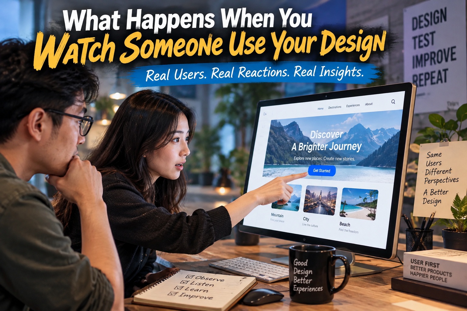
You can spend weeks refining a design until everything feels right. The typography is balanced, the spacing is consistent, the colours work beautifully together, and every interaction seems obvious because you have already lived with the interface for days or even months. Then someone else sits down, uses it for the first time, and immediately does something you did not expect.
They overlook the button you thought was impossible to miss. They tap the wrong control, misunderstand a label, scroll past the main call-to-action or stop because they are unsure what to do next. That moment can be uncomfortable, but it is also one of the most valuable parts of the design process. Watching a real user interact with your work exposes the difference between what you intended and what the design actually communicates.
The Design in Your Head Is Not the Design the User Sees
Designers naturally build an internal map of the interface while creating it. You know where every feature lives, which button is primary, which information matters most and what sequence someone is supposed to follow. Because you understand the system so deeply, many interactions eventually begin to feel obvious.
The user arrives without any of that knowledge. They do not know which element took you three hours to refine, which path is considered correct or what you intended a particular icon to mean. They simply look at what is in front of them and try to make sense of it using their own experience, expectations and priorities.
That difference creates one of the biggest traps in design: familiarity can disguise usability problems. What feels intuitive to the person who created the interface may only feel intuitive because they already know how it works.
Users Are Not Failing Your Design
One of the most important mindset changes in usability testing is to stop thinking of user mistakes as user failures. If several people repeatedly miss the same control or misunderstand the same instruction, the problem is probably not that they are careless or unintelligent. The interface is giving them insufficient guidance.
It is easy for designers to defend their work by saying, "The user should have noticed that," or "It is obvious what this button does." Those reactions usually reveal that the design is relying too heavily on assumptions. A well-designed interface should reduce the amount of interpretation required from the user rather than expecting them to understand the designer's intentions.
When someone struggles, the better question is not "Why did they do that?" but "What did the interface communicate that made this action seem reasonable?"
Observation Shows You the Gap Between Intention and Reality
Design is full of intention. You create hierarchy because you want users to notice something first, choose a colour because you want an action to feel important and arrange content because you expect people to move through it in a particular order. In your design file, all of those decisions appear logical.
Watching someone use the interface tells you whether those intentions survived contact with reality. Perhaps the supposedly dominant button does not look clickable. Maybe the secondary content attracts more attention than the primary action. A heading you assumed would explain the next step may be ignored completely because the user is scanning rather than reading.
This is the moment where design stops being theoretical. The interface is no longer being judged by what you wanted it to communicate; it is being judged by what someone actually understood.
People Scan Far More Than Designers Expect
Designers often spend considerable time writing labels, descriptions and instructions, but real users rarely read interfaces line by line. They scan. Their eyes move rapidly across headings, icons, buttons and visual cues while they search for something that looks relevant to their immediate goal.
This is why a perfectly written explanation may fail if it sits in a part of the page users never notice. The wording might not be the problem at all; the hierarchy may simply be too weak. Observation lets you see whether people are reading, scanning or completely bypassing the information you thought would guide them.
A design should ideally make the next action understandable even when the user is only paying partial attention. Usability often depends less on whether information exists and more on whether the right information appears at the right moment.
Users Come With Their Own Priorities
A designer usually thinks in terms of tasks. Complete the form. Press the button. Finish checkout. Configure the account. The user, however, is usually thinking about a larger personal goal.
Someone completing a booking form does not care about the form itself; they want to reserve the room. A customer using an e-commerce checkout does not want to complete six interface steps; they want to buy the product. A patient using a healthcare portal may not care which section contains laboratory results; they simply want to know whether the result is normal.
This difference matters because an interface can technically make a task possible while still making the user's real goal unnecessarily difficult. Watching people use your design helps reveal when the workflow has been optimised around the system rather than around the person.
Mistakes Reveal Where the Interface Is Fragile
Users will make mistakes. They will type information into the wrong field, click the wrong link, accidentally leave a page or misunderstand what an action will do. The question is not whether mistakes can be eliminated entirely, but whether the design handles them gracefully.
A good interface expects human error. It provides clear feedback, offers ways to undo actions and prevents small mistakes from becoming serious problems. If one incorrect click causes someone to lose ten minutes of work, the issue is not simply that the user clicked incorrectly; the system was not forgiving enough.
Observation makes these weaknesses much easier to identify because designers rarely make the same mistakes as first-time users. You know which actions are dangerous, so you unconsciously avoid them.
The User's Hands Tell You More Than Their Answers
There is a major difference between asking someone whether they understand an interface and watching what they actually do. People are often polite during testing and may say something feels easy even when their behaviour suggests otherwise.
Their hands are usually more revealing. A cursor hovering repeatedly between two options suggests uncertainty. Rapid back-and-forth navigation indicates the information architecture may not make sense. Repeated scrolling often means the user expects something to be somewhere else.
These behavioural signals can reveal friction before the user even describes it. That is why observation is so powerful: you are not relying entirely on what people say they experienced; you can see the experience unfolding.
Silence Can Be a Usability Signal
One of the most revealing moments in a usability session is often silence. A user suddenly stops clicking, pauses and stares at the screen. They may not say they are confused, but the hesitation tells you something important has happened.
Designers sometimes rush to help at this point because the silence feels uncomfortable. Doing so can ruin the observation. If you immediately explain where to click, you have removed the opportunity to discover what prevented the interface from communicating clearly on its own.
Letting the user work through the problem provides much more valuable information. The path they eventually choose may reveal what they expected the system to do.
Emotions Matter as Much as Task Completion
Analytics can tell you whether someone completed a task, but they do not always explain how the person felt while completing it. A user may successfully reach the end of a checkout process while feeling confused, irritated or distrustful throughout the experience.
Those emotions matter because they shape how people remember the product. A frustrating interaction can make an otherwise functional service feel unreliable, while a smooth and reassuring experience can strengthen trust even when the underlying task is relatively ordinary.
Watching someone in person reveals signals that dashboards cannot easily capture. Facial expressions, sighs, hesitation and changes in tone can show where the experience becomes stressful or unexpectedly delightful.
Confusion Spreads Beyond One Screen
A small usability problem rarely stays isolated. If a user becomes confused early in a workflow, that uncertainty can influence everything that follows. They may become more cautious, start second-guessing buttons and lose trust in the interface.
This means the emotional cost of one unclear interaction can be larger than it initially appears. A confusing label may cause hesitation, but the deeper effect is that the user no longer feels confident that they understand how the system behaves.
Designers should therefore pay attention not only to whether a user eventually succeeds but to how much confidence they have along the way.
The Most Painful Problems Are Often the Most Obvious After You See Them
One of the strange things about usability testing is how obvious a problem can become once you watch someone encounter it. A button that seemed perfectly visible suddenly looks hidden. A label that felt clear now appears ambiguous. A workflow you spent weeks refining suddenly seems unnecessarily complicated.
This can be frustrating because the issue may have been sitting in front of you the entire time. Familiarity simply prevented you from seeing it. Once someone else exposes the problem, however, the redesign often becomes much easier.
The challenge was not necessarily finding the solution. It was recognising the problem accurately.
Redesign Is Not an Admission That the First Design Failed
Some designers become defensive when usability testing reveals problems because they interpret criticism as evidence that the original work was poor. That is not a productive way to view iteration.
The first design is a hypothesis. It represents your best understanding of how the interface should work based on the information available at the time. User observation gives you new evidence, and redesigning the interface is simply the process of responding to that evidence.
In that sense, testing does not invalidate the original design. It completes the design process.
A Missed Button Tells You More Than "Make It Bigger"
Suppose users repeatedly fail to notice a primary button. The obvious reaction is to make the button larger or change its colour, but the deeper issue may not be visual prominence alone.
Perhaps users do not expect an action at that point in the workflow. Maybe another element looks more interactive. The surrounding content may be creating the wrong hierarchy, or the button label may not describe what users think should happen next.
This is why observation should lead to questions rather than immediate cosmetic fixes. The goal is not just to make the missed element louder; it is to understand why it was missed in the first place.
Real Users Break the Assumptions Built Into Prototypes
Designers naturally create ideal scenarios while building interfaces. The user enters the correct information, understands the labels, follows the intended path and reaches the expected outcome. Real people rarely behave so neatly.
They arrive with incomplete information. They change their minds halfway through. They open several browser tabs, return later, misunderstand a term or try something you never imagined anyone would try.
This unpredictable behaviour is incredibly useful because it tests the resilience of the system. A design that only works when users behave exactly as expected is not particularly robust.
Watching One Person Can Reveal a Problem, but Patterns Matter More
A single usability session can reveal valuable issues, but not every unusual behaviour requires an immediate redesign. One person may simply have a unique preference or misunderstanding.
The stronger evidence comes from patterns. If several users hesitate at the same point, overlook the same control or ask the same question, the probability that the interface has a genuine communication problem increases dramatically.
This is why usability testing does not always require hundreds of participants. Even a small number of carefully observed sessions can reveal recurring issues that were invisible during the design process.
Do Not Explain the Interface While Testing It
One of the hardest skills for a designer during user observation is remaining quiet. When someone struggles with something you created, the instinct is to explain how it works.
The moment you explain the interface, however, you are no longer testing the interface. You are testing the interface plus the designer standing beside it.
Instead, ask neutral questions such as "What are you looking for?", "What do you expect to happen?" or "What are you thinking right now?" These questions reveal the user's mental model without giving away the intended answer.
You Are Testing Your Assumptions as Much as the Interface
Usability testing is often described as testing a design, but it is equally accurate to say that you are testing your assumptions. Every design contains assumptions about what people understand, what they notice and how they behave.
Maybe you assume an icon is universally recognised. Perhaps you believe users understand a particular industry term. You may assume people will naturally scroll down or recognise that an image can be clicked.
Observation turns those assumptions into something measurable. Some will prove correct. Others will collapse almost immediately.
Analytics Tell You What Happened; Observation Helps Explain Why
Digital analytics are incredibly useful. They can show where people abandon a funnel, which buttons receive the most clicks and how users move between pages. What analytics often cannot tell you is why those behaviours occurred.
A high abandonment rate could mean the form is too long, the wording is confusing, users do not trust the payment step or they simply discovered unexpected fees. The numbers reveal the symptom but not necessarily the cause.
Watching people use the interface provides context. Ideally, designers should combine behavioural observation with analytics rather than treating one as a replacement for the other.
The Designer Is Often the Least Objective Person in the Room
By the time a project reaches testing, the designer has spent so much time with it that true objectivity is almost impossible. You remember why decisions were made, know where compromises happened and can mentally fill in information that may not actually appear on the screen.
This is not a personal failure. It is simply a consequence of familiarity.
Bringing in someone who has never seen the interface removes that knowledge. Their confusion, curiosity and mistakes expose what the design communicates without the benefit of insider understanding.
Good User Testing Creates Humility
Watching someone struggle with something you believed was obvious can be uncomfortable, but it is one of the healthiest experiences a designer can have. It reminds you that design is not primarily about demonstrating how clever the designer is.
The real measure is whether people can use the result successfully.
That mindset changes the way feedback feels. Instead of treating user confusion as criticism, you begin treating it as information. The user is showing you where the design still needs work.
Design for People Who Are Distracted, Impatient and Busy
Another valuable lesson from observation is how little attention real users often give an interface. Designers frequently evaluate screens under ideal conditions, staring carefully at every element. Users may be interacting while walking, talking, commuting or thinking about something completely unrelated.
They may be tired. They may be in a hurry. They may already be frustrated before they even reach your screen.
Designing for real behaviour means accepting that users will not always give the interface their full attention. Clear hierarchy, forgiving workflows and understandable actions become much more important under those conditions.
The Best Interface Is Often the One That Needs the Least Explanation
A design should not require a user manual for ordinary interactions. The less explanation a user needs, the stronger the communication usually is.
That does not mean every interface must be simplistic. Complex professional tools can contain sophisticated functionality while still making common actions clear. The goal is not to remove complexity but to reveal it progressively in a way that matches what users need.
Observation is one of the fastest ways to discover where the interface is asking people to think harder than necessary.
Final Thoughts
Watching someone use your design can be uncomfortable because it removes the protective layer between intention and reality. The interface you spent weeks perfecting suddenly has to communicate on its own, without your explanations, assumptions or knowledge supporting it.
That is exactly why the experience is so valuable. Users reveal where hierarchy fails, where labels are unclear, where attention disappears and where workflows become fragile. Their hesitation often teaches more than another hour spent adjusting spacing inside a design file.
A design is not complete simply because it looks polished or because the designer believes it is intuitive. It becomes stronger when it has survived contact with the people who actually need to use it.
So watch carefully. Watch where the cursor stops. Notice what gets ignored. Pay attention to the questions, the mistakes and the silence. Look at the user's face when something becomes frustrating and when something finally clicks.
The user does not need to understand what you intended. Your design needs to understand the user.











Comments 0