

Every WordPress website has at least one form field that causes unnecessary trouble. It may be a phone-number box that rejects perfectly normal input. It may be a country selector that forces someone to scroll through an endless list. It may be a password field that only reveals its requirements after the user has already been told their password is invalid.
When this happens repeatedly, it is easy to blame users. But in most cases, users are not careless or confused for no reason. The form simply has not made the required input clear enough.
A good form should guide people naturally. It should not make them stop, guess, retry, or wonder whether they are entering something in the "correct" format.
How to Recognise a Problematic Form Field
The warning signs are usually easy to spot once you know where to look.
A field may have a high validation-error rate, where many users fail on their first attempt. It may receive the same support questions repeatedly. It may be the point where visitors abandon a registration, contact, booking or checkout form.
Another clue is inconsistent input. For example, a phone field may receive numbers with spaces, brackets, dashes, country codes, or leading zeroes. That variation does not mean users are doing something wrong. It often means the form has failed to explain what it expects.
A form field becomes a real problem when it interrupts progress. Even a small moment of confusion can be enough to make someone leave, especially on mobile where typing is slower and screen space is limited.
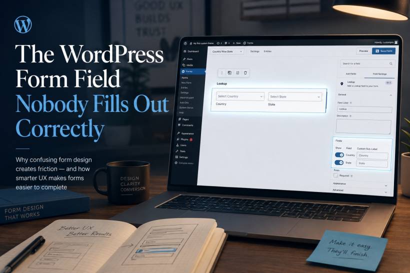
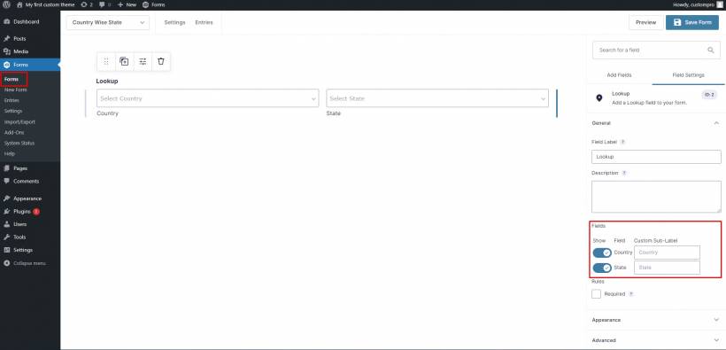
State and Country Selectors Should Not Feel Like a Test
Long dropdown menus remain one of the most frustrating form patterns. Asking a user to scroll manually through a large list of countries, states or regions is technically functional, but it is not a pleasant experience.
This is especially noticeable on WordPress forms used for registrations, e-commerce, service enquiries and appointment bookings. A visitor should not need to scroll through dozens of options just to choose Selangor, Kuala Lumpur or Malaysia.
A better approach is a searchable dropdown. Let users type "Sel", "Kuala" or "Malay" and immediately narrow the available choices. This is faster, more forgiving and much easier on mobile.
The form should also match the audience. A business serving only Malaysia does not always need to show every country in the world. Reducing unnecessary choices is one of the simplest ways to improve completion rates.
Phone Number Fields Need More Flexibility
Phone-number fields are another frequent source of friction because people enter numbers in many valid ways.
One person may type 012-345 6789. Another may use 0123456789. Someone else may include +60, brackets or spaces. A rigid field that rejects anything outside one exact pattern can make a normal task feel needlessly difficult.
Instead of forcing users to adapt to the form, the form should handle common variations intelligently.
A clear placeholder helps, such as:
Example: 012-345 6789
But the best experience goes further. The form can remove spaces and dashes automatically, recognise country codes, and validate the final number without forcing users to format it perfectly themselves.
For sites accepting international enquiries, use a country selector beside the number field and clearly separate the country code from the local number. This prevents confusion and helps ensure the stored data remains consistent.
Address Fields Should Do More of the Work
Address fields often become frustrating because they split a familiar piece of information into several separate boxes: street, unit number, city, state, postcode and country.
The user may know their address perfectly well, but the form creates uncertainty by asking for it in a very particular order.
A stronger design can reduce errors by using postcode or address lookups where appropriate. When someone enters a valid postcode, the city and state can be suggested or populated automatically. The user should still be able to edit the result, but the form has already removed part of the effort.
This is especially useful for delivery, billing and service-area forms. It reduces typing, prevents mismatched postcodes and locations, and makes the form feel more polished.
Date of Birth Fields Should Not Force Endless Scrolling
Date-of-birth fields often rely on three dropdown menus: day, month and year. This may look organised, but it becomes frustrating when a user has to scroll through decades just to find their birth year.
A single date field is usually simpler when paired with a clear format example, such as:
DD/MM/YYYY
For mobile users, a date picker can make the process easier, but users should also be allowed to type the date naturally. A good form should recognise sensible formats rather than rejecting someone because they used slashes instead of dashes.
The important part is clarity. Never assume that all users interpret dates in the same format. A date such as 04/07/1995 can mean different things depending on where the user is from. Label the format clearly.
Password Fields Should Explain Requirements Before Rejecting Users
Few experiences are more irritating than creating a password, clicking submit, and receiving a vague message saying it does not meet the requirements.
The user should not have to discover password rules through trial and error.
A better password field displays requirements before the person starts typing. As they enter a password, the form can show progress in real time:
• At least one uppercase letter
• At least one number
• At least one special character
A simple tick beside each completed requirement provides reassurance and reduces repeated failed submissions.
The same principle applies across every form field: explain expectations early, not only after an error has happened.
The Best Forms Prevent Errors Instead of Punishing Them
Many poorly designed forms take a strict approach. They accept one format, reject everything else, then show a generic message such as "Invalid input."
That places all of the work on the user.
A better form assumes that people will enter information in slightly different ways. It accepts reasonable variations, cleans up formatting where possible, and only stops a user when the data is genuinely incomplete or invalid.
For example, instead of saying:
"Invalid phone number."
Say:
"Please enter a valid Malaysian mobile number with at least 10 digits."
Specific guidance helps users recover quickly. Vague warnings only create frustration.
A Better Process for Fixing Problem Fields
When reviewing a WordPress form, start by identifying the field where users hesitate, make repeated mistakes or abandon the process.
Then work through these steps:
• Show a realistic example directly inside or below the field
• Accept common formatting variations wherever possible
• Validate information while users type, not only after submission
• Write clear, human error messages that explain what needs fixing
• Test the form on both desktop and mobile devices
• Watch real users complete the form and note where they hesitate
This process is valuable whether the form is built with a WordPress contact-form plugin, an online-store checkout page, a membership registration form or a custom enquiry workflow.
Do Not Forget Browser Autofill and Accessibility
Modern browsers can save users a great deal of time through autofill, but only when forms use proper field labels and recognised input types.
Email fields should be marked as email fields. Phone numbers should use telephone input types. Address fields should be named clearly. This helps browsers understand what information belongs where and makes the experience faster for returning users.
Accessibility matters just as much. Form labels should remain visible, colours should have enough contrast, keyboard navigation should work properly, and error messages should be understandable for screen-reader users.
A form that looks attractive but is difficult to use with a keyboard or assistive technology is not truly well designed.
Final Thoughts
The form field that nobody seems able to complete correctly is rarely a sign that users are not paying attention. More often, it is a signal that the form is asking too much while explaining too little.
Clear examples, flexible input handling, real-time validation and useful error messages can transform a frustrating form into a smooth experience.
The goal is not to catch users making mistakes. The goal is to design the form so those mistakes are less likely to happen in the first place.


Comments