

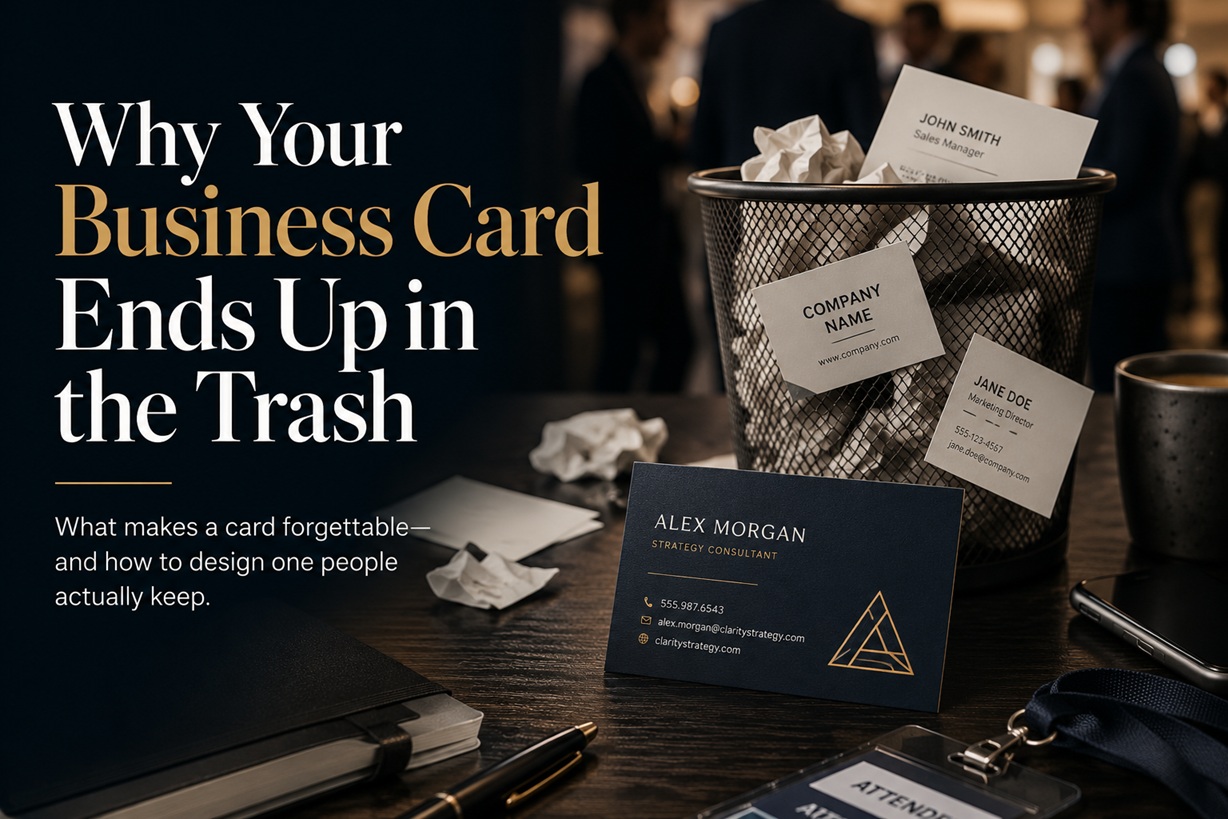
A business card often survives only a few seconds of attention. It is handed over during a meeting, glanced at briefly and placed inside a wallet, pocket or conference bag. By the time the recipient returns home, it has become one of several unfamiliar cards with little context attached to it.
That does not necessarily mean the conversation went badly. The card may simply have failed to remind the recipient why the person behind it mattered.
A useful business card should do more than display a name, job title and telephone number. It should preserve the value of the conversation, communicate what the business offers and provide an easy next step. Without those elements, even an attractive card can quickly become disposable.
A Contact List Is Not a Strong Enough Reason to Keep It
The traditional business-card format usually contains the same information:
These details are necessary, but they are not enough by themselves.
Most people can already find a company website, LinkedIn profile or general contact information online. What they may not remember is the specific problem you solve, the expertise you discussed or why they should contact you instead of another provider.
A stronger card answers a simple question:
Instead of relying only on a broad title such as "Consultant," "Director" or "Business Development Manager," the card can include a short positioning statement.
For example:
Helping private hospitals strengthen cybersecurity and IT governance.
Or:
That single sentence provides far more context than a job title alone. It turns the card from a directory entry into a reminder of value.
The Conversation Disappears Once the Event Ends
At networking events, recipients may speak with dozens of people within a few hours. Names, roles and discussions can quickly blend together.
A card that does not capture any part of the conversation may later feel disconnected from the person who handed it over.
This is why a brief handwritten note can be surprisingly effective. Writing something such as "Discussed hospital data integration" or "Follow up about the October project" gives the card a purpose.
The note does not need to be elaborate. Its value comes from helping the recipient reconstruct the interaction.
It also shows that the exchange was not completely automatic. The card was connected to a genuine discussion rather than distributed to everyone in the room without distinction.
Most Cards Look Almost Identical
Business cards frequently follow a familiar formula: white background, small logo in one corner, name in bold and several lines of contact information beneath it.
There is nothing inherently wrong with a clean design. The problem appears when the card becomes visually indistinguishable from every other card in the recipient's collection.
Distinctiveness can come from several areas:
Standing out does not require using fluorescent colours, complicated shapes or expensive materials. Sometimes a well-organised card with generous spacing and one strong visual element is more memorable than an overly elaborate design.
The objective is not to create the strangest card in the room. It is to create one that can still be recognised several days later.
Unusual Designs Can Become Impractical
Creative business cards sometimes attempt to attract attention through oversized formats, metal construction, transparent plastic, folding sections or unusual shapes.
These approaches can be memorable, but they can also create new problems.
A card that does not fit inside a wallet or card holder may be discarded simply because it is inconvenient to store. Sharp corners, heavy materials and excessive thickness can make it uncomfortable to carry. Small text placed over complicated artwork can reduce readability.
Design should support the card's purpose rather than compete with it.
Before approving an unconventional format, consider whether the card remains:
A memorable card still needs to function as a business card.
Poor Readability Can End the Relationship Before It Starts
A stylish design becomes useless when the recipient cannot read the contact information.
Common problems include:
The card should be tested at its actual printed size, not only viewed as an enlarged design on a computer screen.
Older recipients or people with visual difficulties may struggle with tiny text that appears acceptable to the designer. Contact details should remain readable without requiring someone to photograph the card and enlarge it on a phone.
Accessibility is not separate from good design. A card that is easy to read is more professional and useful to everyone.
A Business Card Should Offer Immediate Utility
A purely promotional card asks the recipient to store something for an uncertain future need. A useful card gives them a reason to keep it now.
The reverse side can provide practical information connected to the business.
Examples include:
A cybersecurity consultant might include five signs of a phishing email. A designer could provide standard social-media image dimensions. A healthcare provider might include appointment preparation instructions. A vehicle workshop could print essential tyre-pressure guidance.
The information should be genuinely relevant and compact. Adding random facts merely to fill the space will not make the card useful.
A good test is whether the recipient might refer to the card even when they are not actively trying to contact the person who gave it to them.
The Card Should Lead Somewhere Useful Online
A physical card can preserve the initial introduction, but most professional relationships continue digitally.
A QR code can connect the card to:
However, simply placing a QR code on the card is not enough.
The destination needs to be mobile-friendly, relevant and quick to understand. Sending someone to a crowded corporate homepage may create more work rather than simplifying the interaction.
A better destination could say:
This continues the conversation rather than restarting it.
The card should also include a readable short address for people who do not want to scan a code. QR codes can fail because of poor printing, damaged surfaces, weak contrast or camera limitations, so they should not be the only route to the information.
Never Use a QR Code Without Testing It
A broken QR code can make a modern business card look careless.
Before printing a large batch, test the code:
The destination should also use a link that the business controls. A temporary free QR service may later introduce advertising, stop working or require payment to maintain the redirect.
Using a controlled web address allows the destination to be changed without reprinting the card, provided the original URL remains active.
Too Much Information Creates Visual Noise
Some cards attempt to include every available communication method: several phone numbers, multiple email addresses, a full postal address, numerous social-media handles, product categories, certifications and a long company description.
The result is often difficult to scan.
A business card should prioritise the contact methods the recipient is most likely to use. For many professionals, that may be one telephone number, one email address, a website and a LinkedIn profile.
Secondary information can be moved to the digital page linked through the QR code.
Reducing clutter creates more room for the details that matter. It also communicates confidence. A card does not need to explain the entire business; it only needs to make the next step clear.
Generic Email Addresses Can Weaken Credibility
An otherwise professional card may lose credibility when it uses an outdated, shared or informal email address.
An address under the company's own domain generally appears more trustworthy than a free personal account. It also makes the connection between the employee and the business easier to verify.
The email address should be written clearly and checked carefully before printing. A single typing error can make an entire batch unusable.
The same applies to telephone numbers, URLs, names and job titles. Every printed proof should be reviewed by more than one person because the designer may become too familiar with the layout to notice a mistake.
Outdated Cards Are Worse Than Having No Card
Employees sometimes continue distributing cards that display an old job title, previous office address or former telephone number because unused stock remains.
This creates confusion and may suggest that the organisation does not maintain its own information properly.
Businesses should avoid printing excessively large quantities merely to reduce the cost per card. Roles, branding and contact details can change long before thousands of cards are distributed.
Smaller print runs may cost slightly more per unit, but they reduce waste and make updates easier.
Digital printing and on-demand ordering can help organisations maintain current information without storing years of outdated stock.
A Personal Card Is More Memorable Than a Mass-Distributed One
The card itself may be standardised, but the way it is given should feel personal.
Rather than handing it over immediately at the beginning of every conversation, wait until there is a clear reason to continue the relationship.
The exchange can then be connected to a specific next step:
Or:
This gives the card context and makes the recipient more likely to keep or use it.
Business cards distributed without a conversation often become promotional waste. Cards exchanged after a meaningful discussion are more likely to become useful reminders.
The Follow-Up Matters More Than the Card
Even an excellent business card cannot carry the entire relationship.
When the conversation is valuable, follow up while it is still fresh. A brief email or LinkedIn message can mention the meeting, refer to the topic discussed and provide the promised information.
For example:
This immediately transforms the physical exchange into a digital connection.
Waiting several weeks may leave the recipient unable to remember the person or the conversation. The business card should make the follow-up easier, but it should not become an excuse to delay it.
Digital Business Cards Are Helpful but Not a Complete Replacement
Digital contact cards can transfer information directly into a phone and avoid the need to retype names or numbers. They can also be updated without printing new stock.
However, they are not always appropriate in every situation.
Some recipients may not want to tap an unfamiliar NFC card or scan a QR code. Internet access may be unreliable, and a digital profile can easily disappear among numerous browser tabs and saved contacts.
Physical and digital formats can work together.
The printed card creates a tangible reminder, while the digital destination provides updated details, richer information and easier contact saving.
The strongest experience allows the recipient to choose whichever method is more convenient.
The Card Should Reflect the Business Experience
A business card creates expectations.
A premium card with precise typography and thoughtful details suggests care and attention. A poorly cut card with blurred printing may create doubts about quality, even when the actual service is excellent.
The design should match the character of the business.
A creative studio may use bold visual language. A law firm may prefer a restrained and authoritative appearance. A technology company might use a modern design with a smart digital connection. A local craft business could benefit from tactile paper and handmade details.
The card does not need to look expensive. It needs to look intentional and consistent with what the business promises.
Questions to Ask Before Printing
Before approving the next batch, review the card from the recipient's perspective.
Ask:
Does it explain why someone should contact us?
The card should communicate more than a name and job title.
Can it be recognised quickly?
The design should remain distinctive without becoming impractical.
Is every detail easy to read?
Check font size, contrast, spacing and print quality.
Does it provide a useful next step?
The recipient should know whether to call, scan, book, view or download something.
Does the digital destination add value?
A QR code should lead to relevant information rather than a generic homepage.
Is the information current and correct?
Confirm every name, number, title, address and link.
Would the recipient have a reason to keep it?
Utility, context and personal relevance matter more than decoration alone.
Final Thoughts
Business cards are not discarded simply because physical networking has become outdated. They are discarded when they fail to preserve the value of the interaction.
A card that only repeats contact details is easy to forget. A card that communicates a clear benefit, offers useful information and provides a simple digital next step has a much better chance of remaining relevant.
The most effective business card is not necessarily the most expensive or visually dramatic. It is the one that helps the recipient remember:
Design the card as the beginning of a professional relationship rather than the final object exchanged at the end of a conversation. When it provides clarity, value and context, it stops feeling like promotional paper and starts functioning as a genuine connection.











Comments 1