

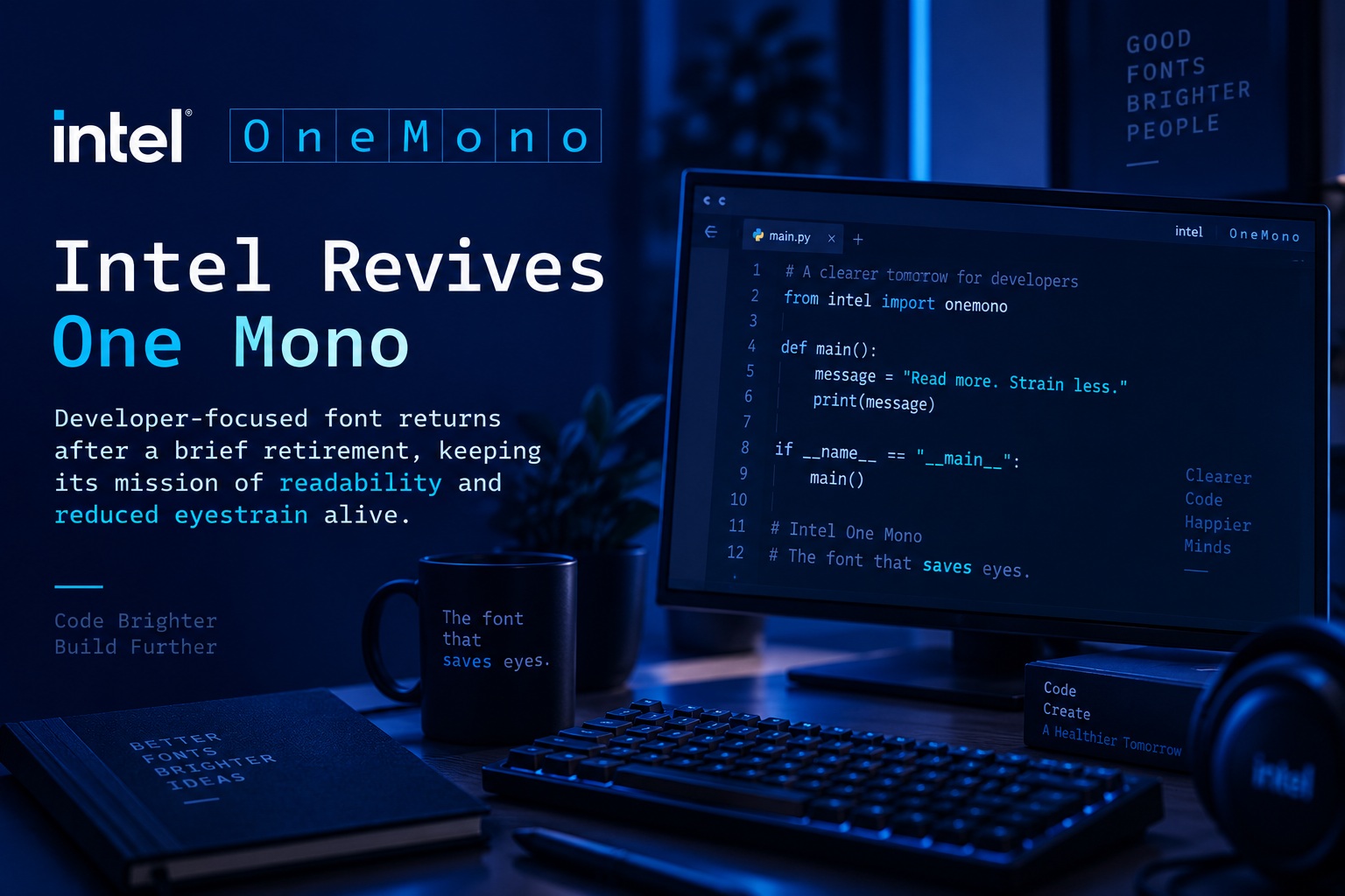
Intel has reversed course on the apparent retirement of One Mono, its open-source monospace font designed specifically for developers. The project's GitHub repository was briefly archived as part of a wider cleanup of Intel's open-source initiatives, but the company has since restored it, suggesting that the typeface may continue to receive support rather than being quietly abandoned.
The short-lived retirement drew attention because One Mono was never just another corporate font experiment. It was created with a very specific goal in mind: making code easier to read, reducing eyestrain and helping developers distinguish between characters that can easily be confused during long coding sessions.
One Mono Was Built for Developers From the Start
Intel introduced One Mono in 2023 as a monospace typeface, meaning every character occupies the same horizontal width. That format is widely preferred in programming environments because it keeps code aligned and makes structure easier to scan, especially across long files or dense blocks of text.
The font was developed in collaboration with type design studio Frere-Jones Type and marketing agency VMLY&R. More importantly, Intel involved low-vision and legally blind developers during the design process, using live testing sessions to identify letters, numbers and symbols that were difficult to distinguish when reading code.
That accessibility-focused approach helped shape many of the font's defining characteristics. Rather than simply aiming for a clean or stylish appearance, the design process prioritised legibility and practical use during long periods of coding.
Designed to Reduce Eyestrain and Coding Mistakes
Developers spend hours staring at similar-looking letters, numbers and symbols, and even small readability problems can become frustrating over time. Intel designed One Mono to make those subtle differences more obvious.
Characters that might otherwise look nearly identical were given more distinctive forms. The lowercase "e" and uppercase "G," for example, were deliberately shaped to stand apart more clearly. Uppercase and lowercase letters also use a greater height difference, making them easier to recognise at a glance.
Longer ascenders and descenders were introduced as well, improving the overall visual rhythm of text and making blocks of code easier to scan. These may sound like small typographic adjustments, but they can make a noticeable difference when someone is reading hundreds of lines of code for several hours at a time.
The underlying idea is simple: if developers can identify characters faster and with less effort, they may experience less visual fatigue and have a lower chance of making mistakes caused by misreading similar-looking symbols.
Accessibility Was Part of the Design, Not an Afterthought
One of the most interesting aspects of One Mono is how directly accessibility influenced its development. Instead of creating a conventional developer font and later adding accessibility improvements, Intel involved visually impaired users during the design process itself.
That matters because typography problems are often easier to identify through real-world testing than through theoretical design rules. A character that looks perfectly clear to one user may be difficult for another to distinguish, particularly at smaller sizes or lower contrast levels.
By testing with low-vision and legally blind developers, Intel was able to focus on issues that might otherwise have been overlooked. The result was a typeface designed not just for aesthetics, but for a wider range of users and viewing conditions.
That approach also reflects a broader shift in software design. Accessibility is increasingly being treated as a core design requirement rather than something added only after a product is complete.
More Than 200 Latin-Script Languages Are Supported
One Mono was also designed to be broadly usable across different regions. The typeface supports more than 200 languages that use the Latin alphabet, making it suitable for international development teams and multilingual environments.
It is available in several weights, including:
Each weight also comes with matching italics, giving developers enough flexibility to use the font across editors, terminals, documentation and user interfaces without relying on artificial font styling.
That level of language support and weight variation makes One Mono more versatile than many niche programming fonts that focus almost entirely on English-language use.
Why Intel Archived the Project in the First Place
The temporary retirement of One Mono appears to have been connected to a broader reduction in Intel's open-source activity. According to reports, the company has been reviewing projects that are no longer seeing active development, especially those where the original maintainers have left the company or internal priorities have changed.
One Mono had seen very little development activity since 2024. During 2025, updates were reportedly limited mainly to changes in documentation rather than significant font development.
From a maintenance perspective, archiving the repository therefore seemed understandable. Open-source projects often become inactive after reaching a stable state, and companies sometimes archive them when they no longer expect to provide ongoing support.
However, the fact that One Mono is primarily a font rather than a constantly evolving software framework makes inactivity less meaningful. A typeface does not necessarily need frequent updates to remain useful, and a lack of recent commits does not mean the project has lost value.
The Repository's Return Changes the Picture
Intel's decision to restore the repository suggests that the company may have reconsidered the impact of archiving the font. Even if development remains slow, leaving the project active signals that it has not been formally abandoned.
That distinction can matter to developers. An archived repository often gives the impression that a project has reached the end of its supported life, even when the files remain available. Restoring it provides greater confidence that One Mono may continue to receive maintenance, fixes or community contributions in the future.
It also keeps the project visible within the open-source ecosystem instead of placing it among Intel's discontinued initiatives.
For a font with a strong accessibility focus, continued availability is particularly valuable because developers may already have incorporated it into their coding environments, documentation systems or design workflows.
Open Source Means Developers Can Keep Using It Anyway
One of the reasons the brief archival did not completely threaten One Mono's future is its open-source licensing. Developers are free to download, use and modify the font regardless of whether Intel actively maintains it.
That means even if Intel were eventually to stop updating the project, the community could continue distributing or adapting it. Other developers could create forks, fix compatibility issues or extend language support without needing Intel to remain directly involved.
This is one of the advantages of releasing developer tools under open-source licences. A company may change direction, reduce staffing or discontinue a project, but the work itself can continue to exist independently.
In the case of One Mono, that makes the font far more resilient than a proprietary typeface tied entirely to one company's support decisions.
A Good Example of Why Developer Tools Do Not Always Need Constant Updates
The situation also raises an interesting question about how open-source projects are judged. Software libraries, operating systems and development frameworks usually require regular updates because bugs, security issues and compatibility problems can emerge over time.
Fonts are different. Once a typeface has matured and its design is stable, long periods without major updates are not necessarily a sign that the project is unhealthy.
A well-designed font may remain useful for many years with only occasional maintenance. That means repository activity alone may not always be the best way to decide whether a project should be archived.
One Mono appears to fit that category. Its value comes primarily from the design decisions already built into it, not from receiving new features every few months.
Why Readable Fonts Matter More Than They Seem
Developers often spend a significant portion of their working day reading code rather than writing it. That makes typography surprisingly important.
A poorly designed coding font can make punctuation harder to distinguish, increase visual fatigue and slow down the process of scanning through large files. Characters such as zero and capital O, lowercase L and the number one, or similar brackets and punctuation marks can become particularly problematic.
A good monospace font helps reduce those ambiguities. It also improves spacing, alignment and visual consistency, which can make complex code easier to understand.
For developers working long hours, those small improvements can accumulate into a noticeably more comfortable experience.
Intel's Wider Open-Source Cleanup Still Matters
Although One Mono appears to have survived, its temporary archival reflects broader changes inside Intel. The company has reportedly been reassessing open-source projects where development activity has slowed or where responsible employees are no longer available to maintain them.
This kind of cleanup is not unusual for large technology companies. Open-source projects can accumulate over many years, and maintaining them requires engineering time, documentation and internal ownership.
The challenge is deciding which projects still provide enough value to justify continued support. Some may no longer be relevant, while others may simply be mature and stable.
One Mono seems to have landed in the latter category. Its development may be quiet, but the project still has a clear purpose and a community of developers who value it.
Final Thoughts
Intel One Mono may have narrowly avoided becoming another casualty of a corporate open-source cleanup, but its brief disappearance highlighted why the project matters. It is not simply another monospace font; it was developed around accessibility, readability and the everyday realities of people who spend hours reading code.
The fact that Intel worked with low-vision and legally blind developers gives the typeface a particularly strong design foundation. Features such as clearer character shapes, greater differences between uppercase and lowercase letters, and improved ascenders and descenders all serve a practical purpose rather than existing purely for visual style.
For now, the restored repository suggests that One Mono is staying alive. Whether Intel resumes active development or simply keeps the project available remains to be seen, but developers who rely on the font can at least breathe a little easier knowing that it has not been formally abandoned.











Comments 0