

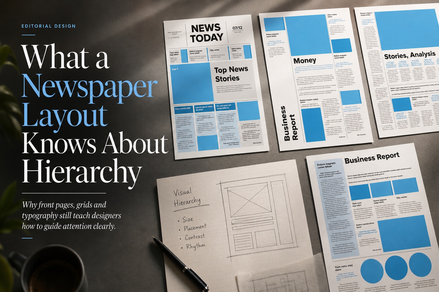
Long before websites, dashboards and mobile apps began competing for our attention, newspapers had already solved one of information design's hardest problems: how to present a large amount of content without overwhelming the reader. A newspaper front page may contain breaking news, politics, business, sport, opinion, photography and advertising, yet an experienced reader can usually understand the page in seconds.
That is not accidental. Newspaper design has spent generations refining the use of scale, position, typography, spacing and structure so readers can immediately sense what matters most. Even though the medium has changed dramatically over time, the underlying principles remain useful for almost any modern design project.
A Newspaper Does Not Treat Every Story as Equally Important
One of the strongest lessons from newspaper design is that hierarchy begins with accepting a simple truth: not everything deserves the same amount of attention. If every headline were the same size, every image had equal prominence and every story occupied the same amount of space, the front page would quickly become exhausting to read.
Instead, newspapers deliberately create differences. The biggest story receives the most visual weight, while supporting stories are given progressively less emphasis. Readers do not need to consciously analyse the design to understand this relationship because the hierarchy communicates importance before they even begin reading.
This is something many digital layouts struggle with. A page can contain excellent content but still feel confusing when every card, button, heading and section competes at the same level. Good hierarchy reduces that competition by making priorities visible.
The Front Page Works Like a Decision-Making Interface
A newspaper front page is essentially a decision engine. Its purpose is not simply to show information; it helps the reader decide what to read first, what to scan next and what can be ignored for now.
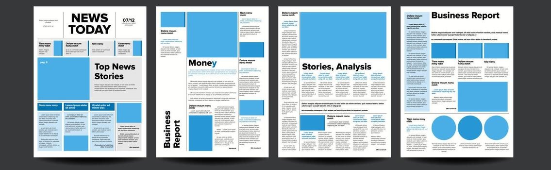
The lead story normally occupies the strongest position on the page. It may use the largest headline, the widest column span, the biggest photograph or the most detailed summary. Even from a distance, the reader understands that this is the story the publication considers most important.
Secondary stories receive less emphasis but remain clearly visible. Their headlines are smaller, their summaries shorter and their placement less dominant. Tertiary stories may appear as briefs, sidebars or small modules, signalling that they are worth including but not important enough to interrupt the main reading path.
This same logic applies directly to modern interfaces. A homepage, dashboard or product page should also help users make decisions quickly rather than forcing them to study every element with equal attention.
Hierarchy Begins Before the Reader Reads a Single Word
One of the most interesting things about newspaper design is that the reader can often understand the page without actually reading the content. The visual structure itself communicates meaning.
A large headline says important. A smaller headline says secondary. A tiny brief says useful, but not urgent. A dominant photograph suggests that the accompanying story deserves more attention, while a narrow column of text indicates something more specialised or less central.
This is visual hierarchy at its most effective. The design is doing part of the interpretation for the reader.
Modern designers should aim for the same outcome. If users must read every label before understanding what matters, the hierarchy is probably too weak.
The Grid Creates Order Without Making Everything Identical
Newspaper layouts rely heavily on grids, and for good reason. A grid gives structure to a page containing many different types of content, allowing headlines, photographs, captions and body text to coexist without feeling random.
Columns create a predictable rhythm. Modules allow stories of different sizes to fit together. Margins and gutters separate information while still making the entire page feel unified.
The important point, however, is that the grid does not force everything to look the same. Strong newspaper design uses the grid as a foundation, then deliberately breaks or stretches it when something deserves greater emphasis.
A lead story might span several columns. A photograph may extend across a large area. A sidebar might occupy only a narrow strip. The grid provides order, but hierarchy determines how that space is distributed.
A Good Grid Helps People Scan Before They Read
Readers rarely approach a newspaper by reading from the top-left corner straight through to the bottom-right. They scan first.
Their eyes move between headlines, photographs, captions and highlighted areas until something catches their interest. Only then do they begin reading in detail.
The grid supports this behaviour by making the page predictable enough to scan efficiently. Because the structure is consistent, readers can quickly distinguish between different types of content and understand how stories relate to one another.
The same principle is especially valuable on websites. Users rarely read every word on a landing page or dashboard. They scan headings, buttons, images and summaries, looking for the next useful action.
A strong grid therefore does more than make a layout look tidy. It helps users move through information with less effort.
Typography Is One of the Most Powerful Hierarchy Tools
Newspapers demonstrate how much hierarchy can be created using typography alone. Headline size, weight, typeface and spacing can communicate importance without requiring additional decoration.
The main headline is usually the largest and most visually commanding element on the page. A subheadline adds context at a smaller scale, while body copy settles into a more restrained style designed for sustained reading.
Captions, bylines, section labels and metadata each have their own typographic treatment. Together, these variations create a system that helps readers recognise different information types almost instantly.
This is a useful reminder that designers do not always need boxes, gradients, shadows or colourful panels to create structure. Sometimes the most effective hierarchy comes simply from making typography do more work.
Contrast Makes the Hierarchy Visible
Hierarchy depends on contrast. If every element looks almost the same, users have no obvious reason to look at one thing before another.
Newspapers create contrast in several ways:
The important part is not simply using contrast, but using it intentionally. Every difference should help communicate something about priority, meaning or structure.
Position Carries Meaning
Where something appears on a page matters almost as much as how it looks. Newspapers have long understood that readers naturally assign greater importance to certain positions.
A story placed prominently near the top of the page immediately feels more significant than one pushed into a small lower corner. Large visual elements near the beginning of the reading path attract attention first, while peripheral modules are treated as optional.
This principle remains relevant in digital design. Content placed above the fold, at the top of a dashboard or near the primary action naturally receives more attention.
Designers should therefore think carefully about placement. A supposedly important action can lose its significance if it is positioned like an afterthought.
Hierarchy Is About Creating Differences, Not Uniformity
One common mistake in modern interface design is confusing consistency with sameness. Consistency is useful because it helps users understand patterns, but excessive uniformity can flatten the hierarchy.
If every card has the same size, every heading uses the same scale and every section receives identical spacing, the page may feel clean but directionless. Everything appears equally important.
Newspapers avoid this by maintaining a consistent design system while varying scale and emphasis according to editorial priority. The visual language remains coherent, but not all content is treated equally.
That distinction is extremely important. A strong design system should create consistency without destroying hierarchy.
Good Hierarchy Reduces Cognitive Effort
Hierarchy is not purely aesthetic. It has a practical effect on how much mental effort users need to understand a page.
When priorities are clearly communicated, the reader does not need to repeatedly ask: "Where should I look next?" The structure answers that question automatically.
This is especially valuable when the page contains a lot of information. Newspapers are dense by nature, yet good ones still feel navigable because the hierarchy provides clear entry points.
The same principle applies to dashboards, admin panels, e-commerce pages and content-heavy websites. The more information the user has to process, the more important hierarchy becomes.
The Lead Story Is Similar to the Primary Action in Interface Design
The lead story on a newspaper front page performs a role similar to the primary action on a digital interface. It tells the reader: start here.
On a website, that might be a call-to-action button, a hero message or the most important product feature. On a dashboard, it might be an alert requiring immediate attention. On an application screen, it could be the next step in a workflow.
The principle is the same. There should be a clear first priority.
If several elements all appear equally dominant, users may hesitate because the design has failed to make that decision easier.
Secondary Content Still Needs to Remain Discoverable
Hierarchy does not mean hiding everything that is not primary. Newspapers are particularly good at keeping secondary and tertiary information visible without allowing it to overpower the main story.
This balance is difficult. Supporting content needs enough visual presence to remain discoverable, but not so much that it competes with the primary message.
Designers can achieve this by adjusting scale, spacing, contrast and placement rather than removing content entirely. A secondary option may use a smaller heading or lighter visual treatment while still remaining accessible.
The goal is not to make less important information invisible. It is to make its relative importance clear.
White Space Is Part of the Hierarchy Too
Traditional newspapers are often associated with dense layouts, but strong editorial design still uses spacing strategically. Space separates unrelated stories, groups connected information and prevents major elements from competing unnecessarily.
Digital designers sometimes think of white space as decoration, but it is actually structural. More space around an element can increase its perceived importance, while tighter spacing can group smaller supporting items together.
This means hierarchy can be strengthened without making anything larger. Sometimes simply giving an important element more room is enough to make it feel dominant.
Editorial Design Shows That Dense Information Can Still Be Usable
One reason newspapers remain such useful references is that they deal with something many modern designs avoid: density.
Minimalism can make hierarchy easier because there are fewer elements to manage. The real test of a design system comes when the page needs to contain a lot of information.
Newspapers prove that dense layouts do not automatically have to become confusing. With a clear grid, strong typography and deliberate visual priorities, a page can contain a large amount of information while still feeling organised.
This makes newspaper design especially relevant to complex interfaces such as dashboards, reporting systems, news websites and enterprise applications.
Hierarchy Should Reflect Meaning, Not Decoration
The strongest newspaper layouts are not simply visually dramatic. Their visual decisions reflect editorial judgement.
The biggest story looks biggest because it matters most. A minor story looks smaller because it has less priority. The hierarchy is connected to meaning.
This is an important lesson for modern design. Visual emphasis should not be assigned simply because something looks attractive.
If a decorative image dominates the page while the main action is visually weak, the hierarchy is working against the user. If an unimportant banner is larger than the primary content, the design is communicating the wrong priority.
Good hierarchy aligns visual weight with actual importance.
What Modern Designers Can Take From Newspapers
Newspaper design offers several principles that transfer directly into web and interface work. The most valuable lesson is not to copy the appearance of a newspaper, but to understand how editorial systems manage attention.
Before finishing a layout, designers should ask:
If the answers are unclear, the hierarchy probably needs more work.
Final Thoughts
Newspapers have spent generations solving a problem that modern designers continue to face every day: how to guide people through a large amount of information without making them feel lost. Their solution has never depended on one technique alone. It comes from the combination of positioning, scale, typography, grids, spacing and contrast.
The front page works because it makes decisions visible. The lead story announces itself immediately, secondary stories remain accessible without becoming dominant, and smaller items stay discoverable without competing for attention. Every visual choice helps the reader understand what deserves attention first.
That is the real lesson of newspaper hierarchy. Good design does not make everything equal. It gives each element the amount of attention it actually deserves.
The next time you are designing a homepage, dashboard, article layout or interface, it may be worth looking at a newspaper before looking at another website. The medium may be old, but its understanding of attention, priority and information hierarchy remains remarkably modern.











Comments 0