

Pure black often feels like the obvious answer in design. It is bold, simple, and always available in every color picker. Because of that, many people treat it as the safest option for text, backgrounds, and interface elements. But in practice, it is often one of the least refined choices you can make. Many of the most polished digital products and premium visual identities do not rely on absolute black at all. Instead, they use softened near-blacks, deep charcoals, and carefully tuned dark grays that feel more natural, more elegant, and easier on the eyes.
That small shift can make a surprisingly big difference. A design that moves away from #000000 often gains depth, better hierarchy, and a more mature overall look.
Why Pure Black Can Feel Harsh
One reason pure black feels so severe is that it rarely appears in the real world the way it does on a screen. Even the darkest shadows around us usually contain reflected light, subtle undertones, and slight tonal variation. Our eyes are used to those natural imperfections. Because of that, completely flat black can look overly digital and somewhat unnatural.
When a layout leans too heavily on true black, the result can feel stiff or aggressive. It may look technically clean, but not necessarily comfortable or sophisticated. Designs start to feel less like something crafted and more like something generated by default settings.
Near-black tones, on the other hand, introduce a subtle softness. They preserve the strength of dark color without creating that overly stark effect. That is part of why so many luxury brands, editorial layouts, and modern interfaces avoid absolute black unless they are using it for a very deliberate reason.
Better Contrast Does Not Always Mean Better Reading
A lot of people assume that maximum contrast automatically creates the best readability. On paper, black text on a white background sounds ideal because it produces the strongest contrast possible. But extended reading does not always benefit from that extreme difference.
Pure black against pure white can feel intense, especially when reading paragraphs, articles, or documentation for a long time. The sharp contrast can create visual fatigue, making the reading experience feel more tiring than it needs to be. It is one of those cases where technically stronger does not always mean practically better.
Using a softer dark tone for text, such as a near-black or dark gray, can make the page feel calmer while still staying highly readable. The same applies in dark mode, where replacing a pure black background with a deep charcoal often makes the interface much more comfortable to look at.
How Softer Blacks Improve Visual Hierarchy
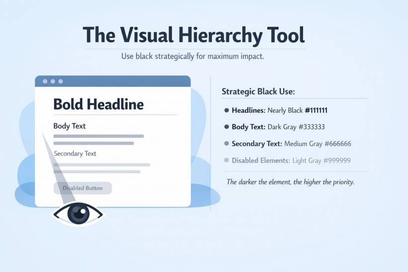
Another advantage of stepping away from pure black is that it gives you more control over emphasis. If everything important is the exact same darkest color, you lose one of the easiest ways to guide the eye.
A more thoughtful palette lets you create layers of importance. Headlines can use a very dark near-black, body text can sit slightly lighter, and supporting information can drop into softer gray values. This creates a natural flow for the reader without forcing every distinction to come from font size or font weight alone.
That hierarchy feels more polished because it mirrors how people actually scan information. The eye picks up darker, more prominent elements first, then moves down to supporting details. When all text is equally intense, that path becomes less clear.
The Hidden Power of Color Temperature
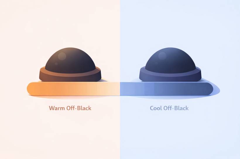
Off-black tones become even more useful when you start thinking about temperature. Dark colors do not have to be neutral. A very slight tint can completely change the emotional tone of a design.
A warm off-black, with a touch of brown or muted red, tends to feel more inviting and human. It works well for editorial content, lifestyle brands, hospitality, or any design that should feel approachable.
A cool off-black, with a faint blue or purple cast, feels more precise and modern. This kind of tone fits technology products, luxury branding, and clean minimal interfaces particularly well.
These differences may seem tiny on paper, but visually they matter. They create cohesion between the dark neutrals and the rest of the palette, making the whole design feel more intentional.
Smarter Alternatives for Light Mode
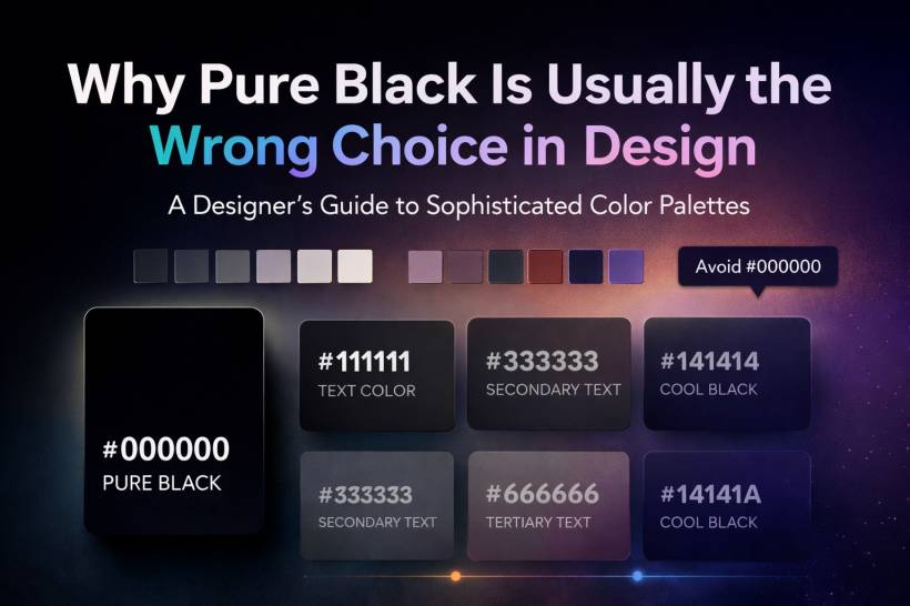
For light interfaces, one of the easiest upgrades you can make is replacing pure black text with a near-black such as #111111 or #1A1A1A. That small adjustment keeps the text strong, but removes some of the harshness that comes with full black.
Secondary text can then move into values like #333333 or #4A4A4A, which still read clearly while feeling less dominant. Borders and dividers can stay in light grays rather than leaning too dark, helping the layout breathe.
This kind of palette makes a page feel quieter and more confident. It does not scream for attention, but it looks more professionally composed.
Better Choices for Dark Mode
Dark mode especially benefits from avoiding pure black. While true black backgrounds can look dramatic, they are not always the most pleasant option for real use. A background like #121212 or #1E1E1E often feels much more balanced. It still reads as dark mode, but with less visual harshness and better separation between layers.
Cards, panels, and surfaces can then sit slightly above that with values like #2A2A2A or #333333. This creates depth and prevents everything from collapsing into one flat mass of darkness. Supporting text can use lighter grays that are clearly visible without becoming glaring.
That layered approach is one reason many polished dark interfaces feel richer than a simple black screen with white text. There is more structure, more dimension, and less strain.
Why Great Brands Rarely Use Absolute Black Everywhere
If you look closely at well-designed products and premium visual systems, you will often notice that their so-called black is not actually black. It is softened, tinted, or slightly lifted. That is true in software, branding, publishing, and product design.
This is not accidental. Designers know that subtle dark tones create a better experience. They feel more expensive, more refined, and more believable. Pure black is sometimes still used, but usually in controlled moments where maximum impact is needed.
That is really the key distinction. Pure black works best as an accent, not a default.
Accessibility Still Matters
Moving away from pure black does not mean sacrificing accessibility. You still need sufficient contrast for text and interface elements, especially for long-form reading and general usability. The good news is that many near-black tones easily exceed accessibility requirements while also feeling more comfortable visually.
A dark text color like #1A1A1A on a white background still provides excellent contrast. It remains highly readable, but avoids the severity of full black. This gives designers a better balance between compliance and comfort.
So the goal is not to reduce clarity. The goal is to remove unnecessary harshness while keeping readability strong.
A Better Way to Think About Black
The biggest mindset shift is this: black should be treated as a deliberate design tool, not an automatic setting. Instead of using #000000 by default, it is better to ask what mood, hierarchy, and reading experience you want to create.
Sometimes pure black really is the right choice. A dramatic headline, a strong focal point, or a high-impact visual element may benefit from it. But for body text, large surfaces, and everyday interface use, a more nuanced dark tone will often perform better.
Final Thoughts
Pure black may be the easiest choice, but it is rarely the most sophisticated one. Designs become more comfortable, more flexible, and more polished when they use near-blacks and deep grays instead of defaulting to #000000 everywhere.
It is one of those subtle adjustments that can instantly improve the feel of a layout without requiring a complete redesign. By softening your darkest tones, introducing better hierarchy, and paying attention to warmth or coolness, you can make your work feel far more intentional.
In the end, the strongest palettes are not always the boldest. Often, they are the ones with just enough restraint to feel effortless.


Comments