

A storefront has only a few seconds to make an impression. Someone walks past your shop, café, studio, salon, or showroom, glances through the window, and makes a quick decision: is this place worth noticing, remembering, or walking into?
That is where a well-designed custom neon sign can make a real difference.
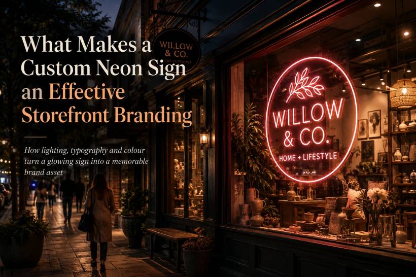
It is easy to think of neon as decoration. Something colourful to fill an empty wall, add personality to an interior, or create a photo-friendly corner for customers. While it can certainly do all of those things, a properly designed neon sign has a much bigger role. It can become one of the most visible and consistent pieces of your brand identity, especially after dark.
When the shop is closed, the lights are dimmed, and the street is quieter, your sign can still be doing its job. It tells people who you are, creates a recognisable visual cue, and helps your business stand out from nearby competitors. In many cases, it becomes the detail people remember long after they have walked past.
A Sign Should Do More Than Look Nice
There is a clear difference between a sign that simply looks good and one that strengthens a brand.
A generic neon shape, motivational phrase, or trendy icon might make a space feel more stylish. However, it may not say anything meaningful about the business itself. A glowing heart, a pair of wings, or a random cursive quote may attract attention, but it could belong to almost any café, boutique, beauty salon, or event venue.
Branding becomes more powerful when the sign feels impossible to separate from the business.
This could mean displaying your actual business name, using a recognisable part of your logo, incorporating a familiar slogan, or recreating the typography people already associate with your company. The goal is not simply for people to notice a light. The goal is for them to connect that light to your business.
That connection matters because storefront visibility is often the first stage of customer recognition. Someone may not enter your shop the first time they see it. However, after passing it several times and noticing the same visual identity, the name starts to stay in their mind. Later, when they need what you offer, your business is more likely to be the one they remember.
A good neon sign quietly supports that process every day.
Your Storefront Is One of Your Most Important Brand Touchpoints
Businesses often spend a lot of time developing their logo, social media visuals, website design, packaging, staff uniforms, and marketing materials. Yet the physical storefront can sometimes become an afterthought.
That is a missed opportunity.
For many customers, the storefront is the most immediate and personal interaction they have with a brand. It is not an advert they scroll past online. It is something they see while walking, driving, meeting friends, heading home from work, or visiting nearby shops.
A custom neon sign helps bring the brand system into the real world.
When the colours, lettering, and tone feel aligned with the rest of your branding, the experience becomes more cohesive. Customers see the same personality in your website, Instagram posts, packaging, and physical space. That consistency builds trust because the business feels established, intentional, and memorable.
On the other hand, a beautifully designed business can lose some of that impact when its storefront uses a sign that feels generic or disconnected. A premium logo paired with an unrelated neon script can make the brand feel less polished than it actually is.
The best results happen when the sign is treated as part of the branding process from the beginning, rather than as a final decorative purchase.
Typography Makes a Bigger Difference Than Most People Expect
Typography is one of the most important elements of a custom neon sign, yet it is often overlooked.
A font that looks excellent on a website or printed brochure may not automatically translate well into neon. Fine details, thin lines, tight spacing, tiny serifs, and decorative flourishes can become difficult to read once they are produced in glowing tubing or LED neon flex.
The issue is not that your original brand font cannot be used. It simply may need to be adapted.
A good sign designer will know how to retain the spirit of the typeface while adjusting it for visibility. Letters may need to become slightly thicker, spacing may need to be opened up, and intricate details may need to be simplified. These small changes help ensure the sign still feels like your brand while remaining clear from a distance.
That distance is important.
A sign should not only work for someone standing directly in front of it. It should be readable from across the road, visible from a passing car, and recognisable in a quick glance. If the text becomes a glowing blur until someone is a few steps away, it is not working as hard as it could.
In most cases, shorter is stronger. A business name, logo mark, or a few well-chosen words can be far more effective than a long phrase that customers need time to decode. Clear, confident messaging usually creates the strongest visual impact.
Lighting Changes How Brand Colours Feel
Colours behave differently when they are illuminated.
A shade that looks calm and elegant in a logo may look much brighter, warmer, or more intense once it becomes a glowing sign. Soft pink can turn bold under LED light. Cool blue can feel more clinical than expected. White can look crisp and modern in one setting but harsh in another.
That is why colour selection should not be based only on what looks good on a screen.
The colour of your neon sign helps shape the emotional mood around your business. Warm white, amber, peach, and soft orange often create a welcoming, comfortable, and relaxed atmosphere. These colours can work beautifully for cafés, restaurants, beauty businesses, lifestyle brands, and hospitality spaces.
Cooler tones such as blue, green, icy white, and purple may feel more futuristic, clean, energetic, or technology-focused. They can suit fitness studios, gaming spaces, creative agencies, tech brands, and modern retail concepts.
There is no universal best colour. The right choice is the one that supports the feeling your brand wants to create.
It is also important to consider the environment around the sign. A bright colour may look excellent against a dark wall but disappear against a light or heavily decorated background. Daytime and nighttime conditions should both be considered, particularly for storefront signs that need to work throughout the day.
Seeing a visual mock-up before production can help avoid costly surprises later.
Choosing Between Traditional Neon and LED Neon Flex
The material used for the sign also affects how it looks, performs, and fits into your business.
Traditional glass neon has a distinctive visual character. It has depth, warmth, and a classic handcrafted glow that many people still love. For businesses with a retro, vintage, artistic, or nightlife-inspired identity, real glass neon can add a level of authenticity that is difficult to replicate.
However, traditional neon also comes with practical considerations. It can be fragile, requires specialist repair, uses more energy, and may generate more heat. For some locations, particularly busy storefronts or commercial interiors with frequent movement, this may not be the most practical option.
LED neon flex has become a popular alternative because it offers a similar visual effect with fewer maintenance concerns. It is lighter, more durable, cooler to operate, and generally more energy-efficient. Many options also include dimming controls, giving businesses more flexibility to adjust brightness depending on the time of day or mood of the space.
For most modern storefronts, LED neon flex offers a strong balance between appearance, reliability, and long-term value.
The decision should come down to what suits the personality and needs of the business. A heritage bar may benefit from the charm of traditional glass neon, while a contemporary boutique, salon, café, or retail store may prefer the durability and flexibility of LED neon.
A Great Sign Can Help Bring People Through the Door
Storefront branding is not only about image. It can have a direct impact on visibility and foot traffic.
People make fast decisions when they are walking through a commercial area. They scan windows, signs, lighting, displays, and movement around them. A distinctive neon sign can catch attention at the exact moment someone is deciding where to go next.
At night, the impact can be even stronger.
When neighbouring storefronts blend into darker surroundings, a clear illuminated sign can become a visual anchor. It gives people something to notice from a distance and a reason to look closer. A memorable sign can also make it easier for customers to find your location again, meet friends outside, or recommend your business to someone else.
It also has a natural social media advantage.
A visually appealing neon sign can appear in customer photos, videos, reels, and stories without the business having to pay for every impression. When the sign includes your name, logo, or a recognisable visual element, that exposure becomes far more valuable than a generic decorative backdrop.
In that sense, a custom neon sign can work as a storefront identifier, an atmosphere-setting feature, a customer photo moment, and a long-term marketing asset all at once.
Think of It as a Long-Term Brand Investment
A quality neon sign is not simply a piece of décor for an opening event or seasonal campaign. It can become a lasting part of how people identify your business.
Unlike many forms of advertising, it does not need to be renewed every month. It continues to work every evening, supports your physical presence, and keeps reinforcing your name to people who pass by.
The strongest signs are designed with purpose. They use recognisable brand elements, clear typography, suitable lighting, and colours that reinforce the right mood. They feel connected to the business rather than added on at the last minute.
That is the difference between a sign people briefly admire and one they genuinely remember.
A decorative neon sign asks people to look at it. A branded neon sign gives people a reason to remember where they saw it.
For businesses that want to create a stronger physical presence, improve visibility, and make their storefront feel more distinct, a custom neon sign can be one of the most effective ways to let the brand keep speaking long after the doors are closed.
Final Thoughts
The best custom neon signs do not rely on brightness alone. They combine identity, clarity, colour, material, and placement to create something that feels uniquely connected to the business.
When done well, the result is more than a glowing feature in a shop window. It becomes a recognisable landmark, a practical branding tool, and a subtle invitation for people to stop, look, and step inside.


Comments