

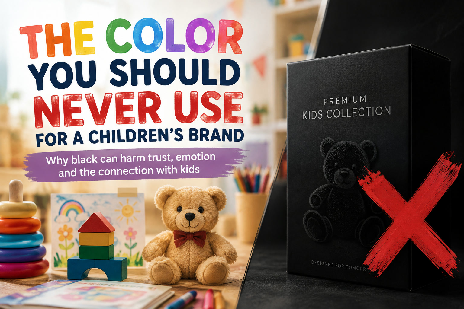
Designing a children's brand is very different from designing something for a bank, luxury label or technology company. With children's products, every visual choice needs to communicate a sense of warmth, friendliness, safety and fun almost immediately.
That makes color especially important.
A palette can influence whether a toy looks exciting, whether packaging feels approachable, and even whether parents instinctively feel comfortable trusting the brand. While there is no universal rule saying a children's brand can never use a particular color, there is one that deserves considerably more caution than most: black.
Black can look sophisticated, premium and powerful in the right context. Those qualities work beautifully for fashion, automotive, technology and luxury brands. But when black becomes the dominant visual language of a children's product, those same qualities can make the brand feel unusually serious, distant or grown-up.
And that is often the opposite of what a children's brand is trying to achieve.
Children Usually Respond to a Brighter Visual World
Look around almost any successful toy shop, preschool product range or children's entertainment brand and you'll notice something immediately: color is everywhere.
Bright blues, cheerful yellows, energetic reds, oranges, greens and playful pastel combinations appear repeatedly because they naturally support the visual personality associated with childhood.
Children's products are typically trying to communicate things such as:
Black communicates something rather different.
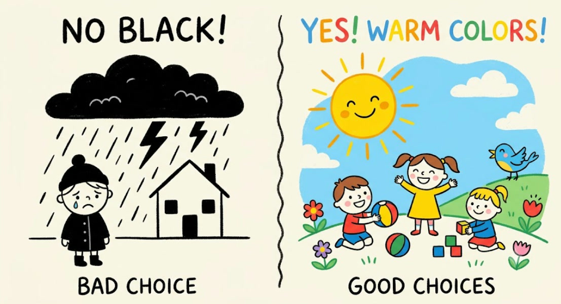
Depending on its context, black can suggest authority, seriousness, exclusivity, power, mystery or sophistication. It can also carry darker associations such as sadness, danger, coldness and mourning.
None of those meanings make black inherently "bad". In fact, they are precisely why black works so effectively for certain brands.
The problem is simply that they don't always match the emotional world a children's brand wants to create.
The Same Color Can Mean Completely Different Things in Different Markets
Color psychology is often oversimplified.
You might hear that yellow means happiness, blue means trust or red means excitement. Those associations can be useful starting points, but people don't respond to colors in isolation. They respond to the entire visual context surrounding them.
A black package containing an expensive perfume can feel luxurious.
The same predominantly black packaging around a toddler's learning toy might feel strangely severe.
Similarly, a black sports shoe aimed at teenagers could look cool and desirable, while a black preschool shoe covered in equally dark branding might lack the warmth parents expect from a product made for younger children.
So the real question isn't:
"Is black a bad color?"
It's:
"Does black communicate what this particular audience needs to feel?"
For younger children's brands, the answer is often not as effectively as brighter alternatives.
Parents Are Part of the Audience Too
Children's branding has an unusual challenge because there are usually two customers involved.
The child may want the product.
But the parent usually decides whether to buy it.
That means the branding has to appeal emotionally to children while simultaneously reassuring adults.
A child might respond to something colourful, exciting and playful, while the parent may be subconsciously looking for signals of:
Safety. Reliability. Warmth. Quality. Age appropriateness.
This is where brighter palettes can work particularly well because they can communicate both playfulness and approachability.
Yellow, for example, can create a cheerful and energetic personality.
Orange feels warm and lively.
Blue is extremely versatile and can combine friendliness with a sense of reliability.
Pink and softer purples can work well when the brand identity calls for something playful, imaginative or gentle.
Green can communicate freshness, nature and wellbeing.
Black has a harder job achieving those emotional signals on its own.
There's Also a Difference Between Using Black and Building Around Black
This distinction is important.
I wouldn't go as far as saying that a children's brand should never contain black anywhere.
Black is incredibly useful for typography, outlines, illustrations, character details and contrast. Used sparingly, it can actually make colourful elements stand out more clearly.
The bigger concern is when black becomes the dominant brand colour.
Imagine two boxes containing exactly the same educational toy.
The first uses a warm yellow background with bright blue illustrations, colourful characters and friendly rounded typography.
The second uses a predominantly matte-black box with restrained graphics and minimalist typography.
The second version might look expensive.
It might even look beautifully designed.
But does it immediately say:
"This is fun for your six-year-old"?
Probably not.
That's the difference between aesthetically attractive design and audience-appropriate design.
Children's Branding Is Particularly Sensitive to Negative Associations
Brands targeting children operate under much greater scrutiny than many other consumer categories.
Parents notice details.
Retailers notice details.
Social media definitely notices details.
Even something that seems minor to a design team can become a much larger reputational problem if customers interpret it differently.
A useful example came from children's footwear brand Ginoble, which faced criticism after a yellow shoe was reportedly labelled "Servant Yellow" because of a translation error involving the colour name "Minion Yellow".
The issue wasn't actually the yellow itself.
The problem was the association created by the wording.
The company removed the product and apologised after complaints.
It's a useful reminder that children's branding isn't judged purely on whether something looks attractive. People also evaluate the language, symbolism and associations surrounding the design.
A harmless internal decision can look very different once it reaches parents.
Color Is Part of the Brand's Personality
One of the easiest ways to think about children's branding is to imagine the brand as a person.
Would the brand be:
Warm?
Energetic?
Curious?
Silly?
Gentle?
Adventurous?
Educational?
Creative?
The palette should help communicate that personality before the customer even reads the brand name.
A bright orange-and-blue identity might feel energetic and adventurous.
Soft yellow, mint and pastel blue could feel gentle and educational.
Bright pink, purple and turquoise could create something expressive and imaginative.
A predominantly black identity usually communicates something more mature.
That's not necessarily wrong if the product is aimed at older children or teenagers. But for toddlers and younger children, it can create an unnecessary disconnect.
Bright Doesn't Mean Throw Every Color Onto the Page
There's another trap worth avoiding.
Once designers hear that children's brands should be colourful, the temptation is to use every available color at once.
That isn't necessarily good design either.
A strong children's palette still needs structure.
You might use one dominant color, one secondary color and a handful of complementary accents. The result can still feel energetic without becoming visually chaotic.
For example:
A warm yellow base paired with blue and coral accents can feel playful without becoming overwhelming.
A pastel blue-and-green palette can feel calm and educational.
Orange combined with turquoise can create a modern, energetic personality.
Pink and violet can work beautifully for imaginative or character-driven brands when used thoughtfully.
The objective isn't simply to make things brighter.
It's to make the brand feel alive.
Gray Can Create a Similar Problem
Black isn't the only colour that deserves caution.
A heavily gray children's identity can also feel overly corporate, industrial or emotionally flat.
Gray works wonderfully as a supporting neutral, particularly when combined with bright colours. But an entire children's brand built around gray can struggle to communicate excitement.
Again, context matters.
A minimalist Scandinavian children's furniture company may intentionally use neutral gray, cream and natural wood because the parents are the primary visual audience.
A preschool toy company trying to attract four-year-olds faces a completely different challenge.
That's why blindly applying "color psychology rules" isn't enough.
You need to understand who you're designing for and what you're asking them to feel.
What About Purple?
Purple is interesting because it can sit comfortably in both adult and children's branding.
Deep purple often feels premium, luxurious or mysterious.
Lighter violet, lavender and brighter purple shades can feel creative, magical and imaginative — qualities that work extremely well for children's products.
So it's usually less about the name of the color and more about its shade, saturation and surrounding palette.
The same principle applies to black.
A small black outline around a colourful cartoon character is completely different from building the entire brand around a black background.
Age Makes a Huge Difference
A color palette suitable for a three-year-old won't necessarily work for a thirteen-year-old.
As children become older, darker and more sophisticated palettes can become increasingly appropriate.
A brand aimed at teenagers might successfully use:
Black + neon green
Black + electric blue
Black + bright pink
Black + red
Those combinations can communicate gaming, streetwear, technology, sports or rebellion — all of which can appeal strongly to older children and teenagers.
But if you're designing baby products, preschool toys or early-learning materials, the emotional expectations are completely different.
That's why saying "never use black for children" is probably too absolute.
A better rule would be:
The younger the audience, the more carefully you should consider making black a dominant part of the brand.
Parents Need to Recognise the Product's Purpose Immediately
Good packaging has only a few seconds to communicate what it is.
A parent walking through a store or scrolling through an online marketplace doesn't carefully analyse every product.
They scan.
The visual identity therefore needs to communicate quickly:
"This is made for children."
"This looks safe."
"This looks fun."
"This seems appropriate for my child's age."
Color does a surprising amount of that work before any written description is read.
A bright and well-balanced children's palette gives designers a head start.
A very dark palette may require other visual elements — illustrations, typography, characters and photography — to work harder to compensate.
Color Can Affect Online Shopping Even More
This becomes especially relevant in e-commerce.
In a physical shop, customers can pick up packaging, inspect the product and see it in context.
Online, the first impression may be nothing more than a small thumbnail on a phone screen.
Color therefore becomes one of the quickest ways to differentiate a product.
A colourful children's product may immediately communicate its category even at thumbnail size.
A predominantly black design can easily blend into electronics, luxury goods, gaming accessories or adult-oriented products depending on the surrounding marketplace.
So when designing for e-commerce, the palette needs to work not only beautifully at full size but also instantly at 150 pixels wide.
There Are Situations Where Black Can Absolutely Work
There are exceptions, and they're important.
Black can work beautifully when the brand deliberately wants contrast.
Imagine children's packaging with a dark background covered in bright planets and colourful stars.
For a space-themed educational brand, the darkness could actually reinforce the concept.
A Halloween children's product could obviously make excellent use of black.
A premium construction toy aimed at older children might also use black very effectively.
The difference is that the black has a reason for being there.
It supports the story.
That's very different from choosing black simply because it looks modern.
Good Children's Branding Starts With Emotion, Not Trends
Design trends come and go.
Minimalism becomes fashionable.
Then gradients return.
Then muted neutrals dominate.
Then maximalism appears again.
Children's brands shouldn't blindly follow any of them.
The better starting question is:
How should a child feel when they see this?
And immediately afterwards:
How should their parent feel?
If the answers are:
Excited.
Safe.
Curious.
Happy.
Comfortable.
Welcome.
Then your colours should help create those feelings.
If black helps achieve that within your concept, use it thoughtfully.
If it doesn't, don't use it just because it looks sophisticated.
Final Thoughts
Black is one of the most powerful colours in design.
It's elegant, authoritative, dramatic and incredibly versatile.
But those qualities are exactly why it needs to be handled carefully when designing for younger children.
Children's branding usually succeeds through warmth, energy, friendliness and imagination, and bright or saturated colors naturally support those qualities more easily.
That doesn't mean black needs to disappear completely.
Use it for typography.
Use it for contrast.
Use it in illustrations.
Use it when the concept genuinely benefits from darkness.
But before making black the dominant colour of a children's brand, ask whether you're designing something that looks impressive to another designer or something that genuinely connects with the child and parent who will eventually see it.
Because in children's branding, the strongest palette isn't necessarily the most sophisticated one.
It's the one that makes the product feel welcoming before anyone has even read a single word.











Comments 0