

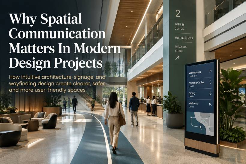
Modern architecture is no longer judged only by how impressive a building looks. Today, the real test is how well a space communicates with the people using it. In busy environments such as transport terminals, shopping centres, mixed-use developments, hospitals, corporate campuses, and public buildings, visitors are often surrounded by competing signs, digital screens, architectural features, and crowds moving in different directions.
This is where spatial communication becomes important. A building should not simply exist as a physical structure. It should help people understand where they are, where they need to go, what areas are safe to access, and how to move through the space with confidence. When this is done well, the environment itself becomes a quiet guide.
Instead of relying only on decoration or visual styling, spatial communication uses architecture, signage, lighting, colour, typography, landmarks, and digital tools to create a more intuitive experience. The goal is simple: people should not feel lost inside a space that was designed for them.
Designing Spaces That People Can Understand
One of the biggest challenges in modern buildings is reducing confusion. When someone enters an unfamiliar place, they immediately start looking for clues. They look for entrances, exits, reception counters, lifts, toilets, waiting areas, service points, and directional signs. If those clues are unclear, the person has to stop, think, ask for help, or backtrack.
That small moment of uncertainty may not seem serious, but it becomes a major problem in large developments. A confusing layout can slow down foot traffic, frustrate visitors, reduce customer satisfaction, and make the entire building feel less welcoming.
Good spatial communication solves this by making the journey feel natural. Directional signs, wall graphics, lighting transitions, floor markings, architectural landmarks, and colour-coded zones all work together to tell people where to go without overwhelming them.
In this sense, wayfinding is not just about putting signs on walls. It is about designing a complete communication system that fits into the architecture from the beginning.
Why Wayfinding Should Be Planned Early
Wayfinding is often treated as something that can be added at the end of a project, but that approach usually leads to cluttered signs and awkward fixes. By the time a building is completed, many of the important movement patterns have already been decided by the layout itself.
A better approach is to consider spatial communication during the planning and design stage. This allows architects, developers, and wayfinding specialists to identify key decision points early. These are the places where users are most likely to pause, hesitate, or choose between different routes.
For example, a visitor may need clear guidance at the main entrance, lift lobby, car park exit, corridor junction, ticketing area, or transition between public and restricted zones. If directional cues are placed exactly where people need them, the whole environment becomes easier to navigate.
This also helps avoid visual overload. Instead of placing too many signs everywhere, a well-planned system uses the right information at the right place.
The Difference Between Decorative Spaces And Communicative Spaces
A decorative environment may look attractive, but that does not always mean it is easy to use. In some buildings, design elements are added for visual impact without considering how people actually move through the space. The result can be beautiful but confusing.
A communicative space works differently. It uses design to improve movement, reduce uncertainty, and support user behaviour. People are guided through natural visual progression rather than forced to depend on maps or staff assistance.
In a poorly mapped environment, visitors may walk in circles, miss important destinations, or feel anxious because they are unsure where to go. In a strategically designed environment, users can move with greater confidence because the building gives them consistent visual signals.
This can also affect how long people stay. In commercial environments, visitors who feel comfortable are more likely to explore, shop, dine, or return in the future. In public buildings, clear spatial communication can improve service flow and reduce pressure on staff. In emergency situations, it can even support faster evacuation.
Managing Visual Overload In Urban Developments
Large urban developments are especially difficult to navigate because they often combine many different functions in one place. A single development may include retail shops, office towers, residential areas, outdoor gardens, transport links, restaurants, entertainment zones, and public facilities.
Without a clear visual hierarchy, these spaces can quickly become overwhelming. Visitors may struggle to understand which areas are active commercial zones, which are quieter public spaces, and which routes lead to main facilities.
Spatial communication helps organise these layers. Colour-coded pillars, consistent icons, lighting changes, floor patterns, and clear transition points can help separate one zone from another. This allows users to understand the character and purpose of each area without needing to read long instructions.
For example, brighter lighting and bold graphics may guide people toward retail or transport areas, while softer lighting and calmer signage may indicate waiting zones, lounges, or passive public spaces. The design does not need to shout. It simply needs to guide.
Accessibility Must Be Part Of The System
A truly effective spatial communication system must work for as many people as possible. This means the design should not depend only on visual signage. Different users navigate spaces in different ways, and some may require additional support.
Tactile pathways, high-contrast signage, audio assistance, accessible digital kiosks, readable typography, and predictable layouts can make a major difference for visually impaired visitors, elderly users, people with disabilities, and those unfamiliar with the building.
Accessibility should not be treated as a separate feature added later. It should be part of the same communication framework. When accessibility is built into the design, the space becomes more inclusive, safer, and easier for everyone to use.
This is especially important in hospitals, airports, government buildings, rail stations, universities, and large commercial properties where users may already feel stressed, rushed, or unfamiliar with the environment.
Combining Static Signage With Digital Guidance
Modern wayfinding is no longer limited to printed signs. Digital directory kiosks, interactive maps, mobile apps, QR codes, and real-time information screens are now common in many large buildings. However, digital tools only work well when they are aligned with the physical environment.
If a digital kiosk uses one naming system while wall signs use another, visitors can become confused. If an app directs users to a landmark that is not clearly marked in the actual building, the guidance breaks down.
That is why static signage and digital wayfinding must follow the same logic. Room names, colours, zone labels, icons, and directional language should remain consistent across every platform. A person should be able to move from a digital screen to a physical corridor without feeling like they are using two different systems.
A seamless hybrid approach gives users flexibility. Some people may prefer to follow signs, while others may use a kiosk or phone. The experience should feel connected either way.
Using Data To Improve Spatial Performance
Good spatial communication does not end once a building opens. User behaviour should be observed and reviewed over time. People may move through a space differently than designers expected, and hidden bottlenecks may only become obvious after the building is in use.
Real-time pedestrian movement data, traffic studies, staff feedback, and user observation can help identify problem areas. If people frequently stop at the same corridor junction, miss a lift lobby, or ask for directions at the same location, that is usually a sign that the communication system needs adjustment.
Lighting should also be reviewed regularly. A sign that looks clear during the day may become difficult to read at night. Seasonal lighting changes, glare, shadows, and renovations can all affect visibility.
Spaces are not static. Tenants change, rooms are repurposed, entrances shift, and building functions evolve. A strong spatial communication system must be maintained and updated so it continues to reflect how the property actually operates.
Why Emergency Navigation Matters
Spatial communication also plays a major role in safety. During an emergency, people do not have time to interpret complicated maps or search for small signs. They need immediate, visible, and reliable guidance.
Clear exit routes, high-visibility emergency signs, lighting that points toward safe movement, and consistent evacuation pathways can help people leave a building faster and more calmly. This is especially important in large developments where visitors may not know the layout.
Emergency drills and simulations can reveal whether evacuation routes are truly effective. If people hesitate, crowd into the wrong area, or miss emergency exits, the design needs to be reviewed.
In this context, spatial communication is not only about convenience. It becomes part of risk management and public safety.
Future-Proofing Buildings Through Better Communication
Buildings are long-term investments. Their design needs to remain useful even as tenant mixes, technologies, visitor expectations, and operational needs change. A strong spatial communication system helps future-proof the property by creating a flexible framework that can grow with the development.
Instead of relying on temporary visual styling, developers should invest in communication systems that are research-backed, adaptable, and easy to update. Environmental graphics, signage, lighting, digital directories, and accessibility tools should all work as part of a larger strategy.
When this is done properly, the building becomes easier to manage, easier to navigate, and more valuable over time. It also creates a better experience for the people who use it every day.
Frequently Asked Questions
How does environmental graphic design reduce visitor frustration?
Environmental graphic design places clear information where people naturally need it. When users can quickly identify directions, zones, entrances, exits, and facilities, they do not have to guess or constantly ask for help. This reduces stress and makes the space feel more welcoming.
Why are normal maps not always enough in large buildings?
Maps require people to translate a flat drawing into a real three-dimensional environment. This can be difficult, especially in complex buildings with multiple levels, corridors, or entrances. Spatial communication works better because it places guidance directly into the physical journey.
What role does lighting play in wayfinding?
Lighting helps guide attention. Brighter or more focused lighting can naturally lead people toward exits, lift lobbies, counters, corridors, and important destinations. When used carefully, lighting creates movement hierarchy without relying only on signs.
How can pedestrian traffic studies improve signage placement?
Traffic studies show where people slow down, hesitate, turn around, or become confused. This data helps designers place signs at the exact points where users need guidance most. It also prevents unnecessary sign clutter because information is placed strategically rather than randomly.
Final Thoughts
Spatial communication is one of the most important parts of modern design, especially in complex public and commercial environments. A building may be visually impressive, but if people cannot understand how to move through it, the design has failed at a basic human level.
The best spaces communicate quietly and clearly. They guide people through architecture, light, colour, signage, texture, and digital support without making the experience feel forced. When done well, users feel more confident, staff face fewer repeated questions, and the property becomes safer and more efficient.
For developers, architects, and design teams, spatial communication should not be treated as decoration. It should be seen as part of the building's core function. A space that communicates well is not only easier to navigate. It is more human, more resilient, and more valuable in the long run.











Comments 0