

There is a reason arcade-inspired gaming interfaces keep returning to dark color schemes, and it goes far beyond visual style. Dark palettes are not just there to make a page feel dramatic or futuristic. In gaming design, they do real structural work. They help direct attention, simplify hierarchy, and create an immediate emotional reaction before the user has even read a headline.
That is what makes this design pattern so interesting. In many of these interfaces, color is not simply decorative. It is strategic. A dark background clears away distraction so that a small number of brighter elements can carry much more visual weight.
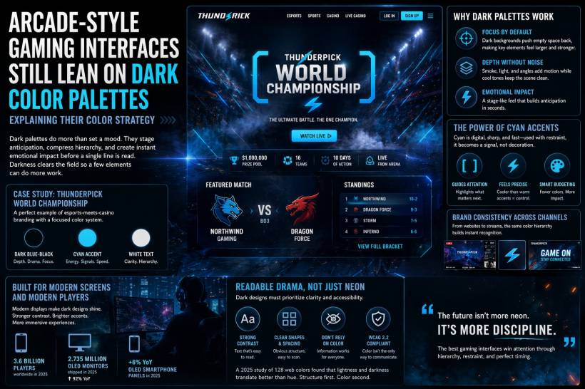
Dark Backgrounds Create Focus, Not Just Mood
Gaming is a broad category, so naturally not every interface looks the same. A competitive esports platform will communicate differently from a casino site, and both will differ again from a game launcher or live event page. Still, one thing that shows up again and again is the use of very dark base tones.
A good example is the kind of gaming page that sits somewhere between esports presentation and digital entertainment branding. These pages often rely on a simple visual formula: a near-black or deep navy background, a bright accent color such as cyan or electric blue, and clean white text layered on top.
The effect is immediate. Instead of feeling like a conventional website, the page starts to feel more like an arena display, a broadcast package, or a game event screen. That shift matters. It changes how the user reads the interface. They are not just browsing information anymore. They are stepping into an atmosphere.
Darkness Helps the Important Elements Work Harder
One of the smartest things about dark palettes is that they make unused space recede. On a lighter page, empty space still feels visually present. On a darker page, it tends to fall away into the background. That makes central content appear stronger and more prominent without requiring extra decoration.
This is why dark interfaces often feel more focused even when they are relatively minimal. The background is doing quiet work behind the scenes. It lowers visual noise and lets the eye settle more naturally on the headline, logo, navigation, or featured content.
When designers add soft smoke textures, angled lines, or faint glow effects within that same cool tonal range, they can introduce motion and depth without making the page feel messy. The page still feels energetic, but it remains controlled. That balance is part of what gives gaming interfaces their distinctive sense of tension and anticipation.
Accent Colors Work Best When They Are Restrained
If the dark background is the stage, the accent color is the spotlight.
Cyan is one of the most common examples because it feels digital, fast, and sharp. It has a technological edge to it, but unlike brighter warm tones, it does not immediately overwhelm the composition. When used carefully, it can direct attention with precision.
That restraint is important. If a bright accent appears only on brackets, edges, icons, interactive states, or selected UI details, it starts to function like a signal system. It tells the eye what matters next. It becomes part of the navigation logic, not just the decoration layer.
A warmer accent like orange or red would create a different emotional effect. Those colors can feel louder, more urgent, and in some cases more chaotic. Cyan, by contrast, often keeps the page feeling intense but measured. It suggests energy without pushing the interface into visual overload.
This is what good color budgeting looks like. Instead of throwing many bright colors onto the screen at once, the design holds most tones back and lets one accent do the heavy lifting.
Gaming Interfaces Are Designed for Fast Emotional Impact
One reason dark-first palettes remain popular is because gaming platforms usually need to do more than guide users through menus. They need to create anticipation almost instantly. A user should feel the tone of the experience before they start reading details.
That makes gaming UI different from many standard websites. In an ordinary business site, the goal may be clarity first and emotion second. In gaming, the emotional read often comes first. The interface is expected to set a mood, compress information, and create a sense of excitement in just a few seconds.
Dark palettes help make that possible. They give the page a cinematic feeling, and they make bright details feel more dramatic. Even simple animations, outlines, or hover effects become more noticeable against a dark field.
This is especially valuable in designs meant to attract not only active players but also spectators, stream viewers, or users who are only checking in quickly. The page has to communicate fast, and dark layouts help create strong focal points almost immediately.
Modern Displays Also Help Explain the Trend
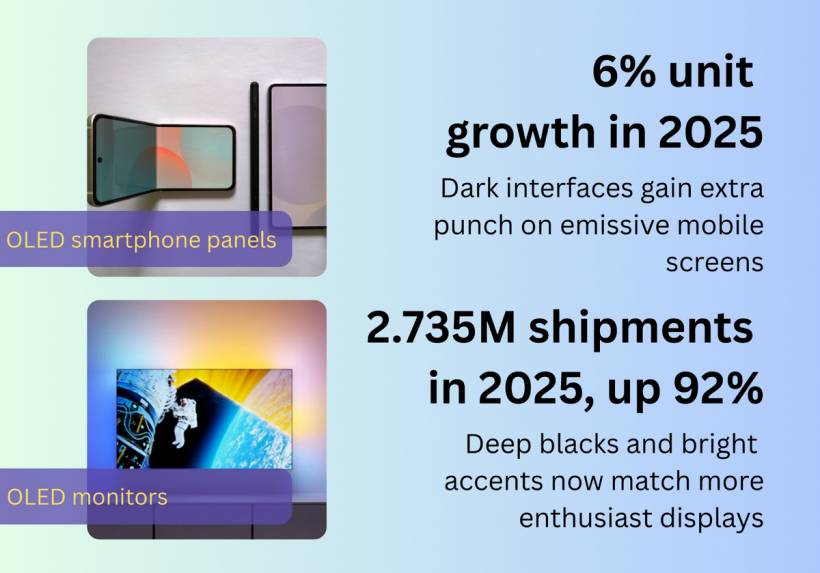
There is a practical reason this style continues to spread across gaming websites, event pages, overlays, and branded landing pages. Modern displays handle dark palettes extremely well.
On OLED screens especially, blacks appear richer and bright accents appear more vivid. That creates a stronger contrast between passive background areas and active interface elements. The result is a cleaner visual split that makes glows, outlines, and motion effects feel more precise.
This helps explain why dark-first design has become so common in gaming-adjacent environments. It works especially well on the kinds of screens people increasingly use, from premium smartphones to gaming monitors. As display technology improves, dark interfaces become even more effective at delivering that polished, high-contrast look.
Readable Drama Is Better Than Pure Neon Drama
Of course, a dark palette only works well if readability is still protected. That is the real test.
A stylish interface can easily become frustrating if it depends too heavily on glow effects or color alone. Strong gaming design is not just about looking futuristic. It also needs to communicate clearly. Users still need to understand hierarchy, identify actions, and interpret information quickly.
That is why the best dark interfaces do not rely on color by itself. They also use strong spacing, clear text labels, obvious icon shapes, and distinct outlines. These elements make the interface readable even when color perception varies from one person to another.
This is especially important from an accessibility perspective. Good contrast, readable typography, and structural clarity matter just as much as visual excitement. If a page only works when the user can perfectly distinguish every hue, then the design is not doing its job well enough.
The stronger approach is to build separation through brightness and layout first, then let accent color support that structure.
Brand Consistency Makes the Palette More Powerful
Another reason these dark palettes work so well is that they often carry across multiple channels. A gaming brand may use the same visual hierarchy not only on its website, but also in stream overlays, tournament graphics, promotional videos, and social content.
That consistency matters. When the same dark base, bright accent, and clean text logic appear everywhere, the brand becomes instantly recognisable. The audience does not have to relearn the visual system every time they encounter it. The design starts to feel like part of the brand's identity, not just a one-off style choice.
This is an important lesson for designers. A color strategy becomes stronger when it is applied consistently across touchpoints. In gaming, where so much of the audience experience is fragmented across platforms, that consistency helps create familiarity and trust.
The Future Is More Discipline, Not More Noise
It can be tempting to think the future of arcade-style design is simply more glow, more neon, and more visual intensity. But in reality, the most effective interfaces are usually the most disciplined ones.
The strongest dark gaming layouts do not succeed because they are louder. They succeed because they control attention well. They know when to stay quiet and when to light something up. They understand that contrast, spacing, and hierarchy matter more than throwing every available visual effect onto the page.
That is why dark palettes continue to hold their place in gaming design. They are flexible, emotionally effective, and structurally efficient. They create atmosphere, but they also improve focus.
Final Thoughts
Arcade-style gaming interfaces still lean on dark color palettes because darkness solves several design problems at once. It creates mood, yes, but more importantly, it reduces clutter, strengthens hierarchy, and gives brighter interface elements more impact.
When paired with a disciplined accent color, good spacing, and strong readability, a dark interface can feel exciting without becoming chaotic. That is the real strength of the style. It turns color into direction, not just decoration.
In the end, the most successful gaming interfaces are not simply dark for the sake of drama. They are dark because it helps the design communicate faster, feel sharper, and leave a stronger impression from the very first glance.


Comments