


Color isn't just decoration. Long before someone reads your tagline or understands what your business offers, they feel something about your brand, and color plays a major role in shaping that first impression. Our brains are wired to react emotionally to color, often without us even realizing it.
That's why choosing the right color palette isn't a purely visual decision. It's a psychological one. The colors you use influence how people perceive your brand, whether they feel comfortable, excited, confident, or even skeptical. When used correctly, color becomes one of your strongest branding tools.
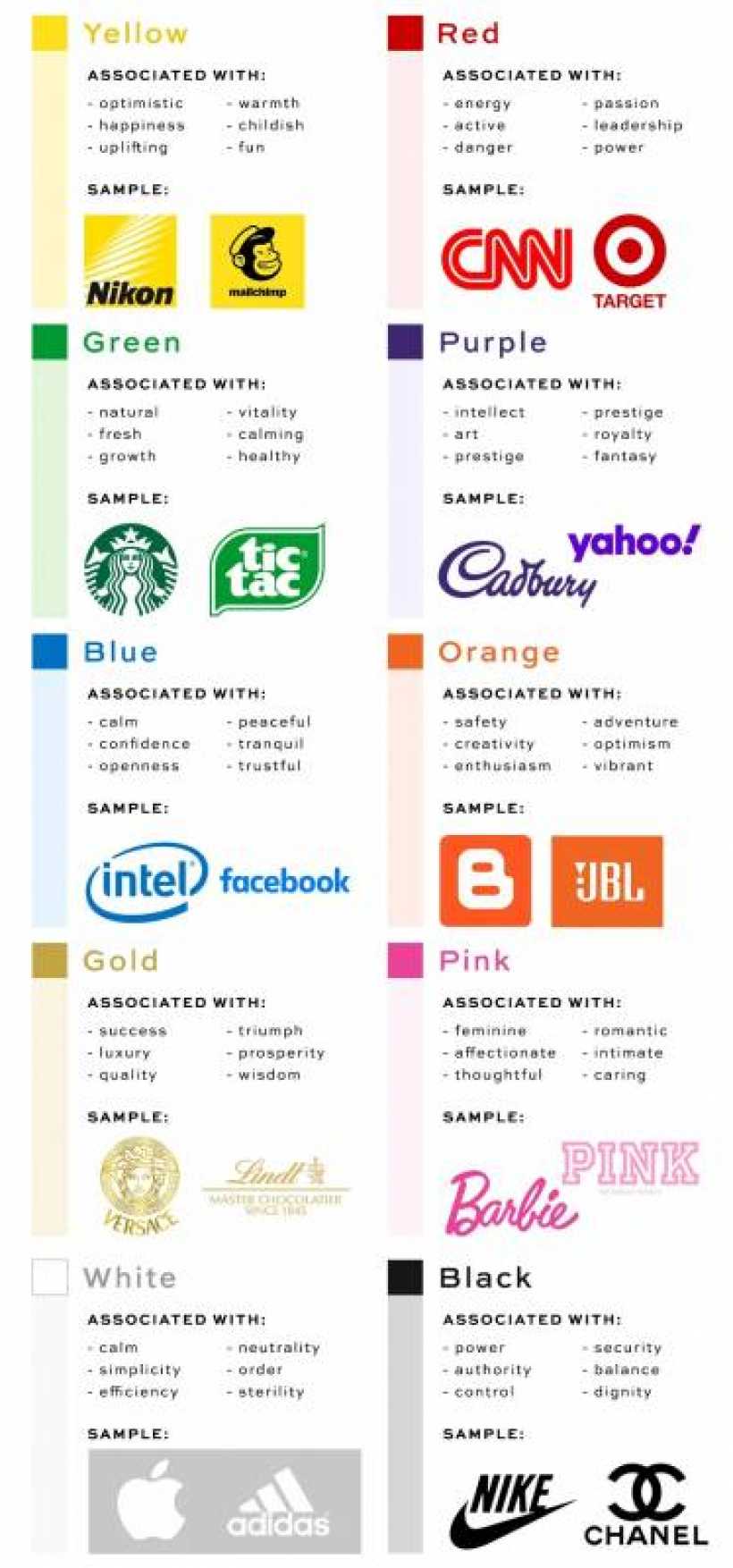
Understanding the Psychology Behind Colors
Every color carries meaning. Over time, we've developed subconscious associations with different hues based on culture, experience, and human instinct. When people see a brand's colors, those associations kick in instantly.
As you think about color psychology, don't focus only on what looks nice or trendy. Instead, ask yourself what emotions and values you want your brand to communicate. The goal is alignment between how your brand looks and how it should feel to your audience.
Your subconscious already understands color. This step is about making your conscious branding decisions catch up.
Choosing Colors That Reflect Your Brand's Personality
One of the most common branding mistakes is choosing colors based on personal taste alone. While it's natural to gravitate toward colors you love, branding works best when decisions are made strategically.
Your color palette should reflect your brand's personality, message, and target audience, even if that means stepping outside your comfort zone. A well-chosen palette supports your story and reinforces trust, while a poorly chosen one can confuse or repel potential customers.
How Different Industries Use Color Strategically
Looking at real-world examples can make this clearer.
In the beauty and cosmetics industry, color choices vary widely depending on the brand's positioning. Soft pinks often convey youthfulness and approachability, while black signals luxury, sophistication, and exclusivity.
Food and beverage branding is another area where color psychology plays a crucial role. Even if a restaurant owner personally loves blue, it's rarely used because it tends to suppress appetite. Warmer tones like red and orange are far more effective at stimulating hunger and creating energy.
For health and wellness brands, green is a natural choice. It instinctively communicates growth, balance, freshness, and vitality, which aligns perfectly with the values people expect from fitness and wellness businesses.
Checking If Your Brand Colors Match Your Message
At the end of the day, your color palette should resonate with the people you want to attract and accurately reflect what your business stands for. Consistency between message and visual identity builds trust, while mismatched colors create doubt.
Take a moment to look at your current branding. Do your colors support your brand's personality, or are they sending mixed signals? If your visuals don't match your values, it may be time to rethink your palette and let color work for your brand, not against it.


Comments