

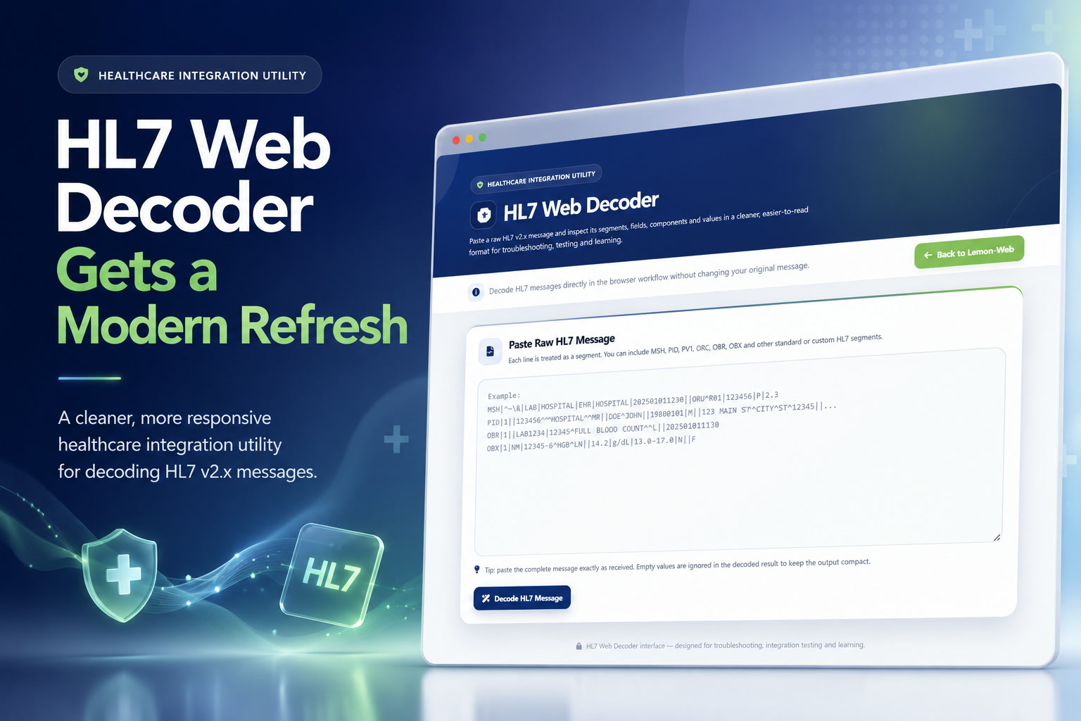
I've recently given my HL7 Web Decoder a fairly major visual refresh. The actual HL7 decoding engine was already doing what I wanted it to do, so this update wasn't about rebuilding the application from scratch. Instead, the focus was on making the tool feel more polished, easier to use, and much nicer to work with when inspecting HL7 messages.
The result is essentially the same lightweight HL7 utility underneath, but wrapped inside a much more modern interface that feels more appropriate for a healthcare integration and troubleshooting tool.
Importantly, I've also kept the application compatible with PHP 5.6, so the update doesn't require me to change the existing hosting environment just for the sake of improving the frontend.
What Is the HL7 Web Decoder?
The HL7 Web Decoder is a simple web-based utility I created for reading and breaking down HL7 v2.x messages.
Instead of manually trying to follow a long raw message filled with pipes, carets and other delimiters, I can simply paste the HL7 message into the application and let it separate everything into individual segments, fields and components.
For example, a typical HL7 message might contain segments such as:
MSH – Message Header
PID – Patient Identification
PV1 – Patient Visit
ORC – Common Order
OBR – Observation Request
OBX – Observation Result
The decoder identifies these segments and presents their contents in individual cards with a much cleaner field-by-field breakdown.
This is particularly useful when troubleshooting interfaces between systems such as a Hospital Information System, Laboratory Information System, Radiology system, integration engine or other healthcare applications exchanging HL7 messages.
The existing decoder already detects the message field separator from the MSH segment, processes components and subcomponents, ignores empty values, and generates a structured output from the raw HL7 data.
The Existing Features Are Still There
One thing I specifically wanted to avoid was redesigning the application and accidentally changing something that was already working.
The underlying decoding workflow therefore remains largely unchanged.
You still simply:
The application also continues to recognise common segments and provides short explanations of what they represent.
For example, PID is identified as Patient Identification, while OBX is identified as Observation Result. Unknown or custom segments are still decoded even when the application doesn't have a built-in description for them.
That last part is quite useful because real healthcare environments don't always contain perfectly standard HL7 messages. Vendors sometimes introduce their own segments or implementation-specific structures.
A Completely Refreshed Interface
The most obvious improvement is the overall design.
The previous interface was functional but relatively traditional: a header, white content cards, a textarea and a collection of result tables.
The new design gives the application a much more modern healthcare integration utility appearance.
The top section now uses a polished blue gradient hero area with subtle visual effects, a healthcare icon and a dedicated Healthcare Integration Utility badge.
Rather than making the page unnecessarily flashy, I wanted it to still feel like a professional technical tool.
The colour palette also continues to incorporate the familiar Lemon Web green, particularly on navigation elements, while blue remains the main colour for the application itself.
A Cleaner and More Focused HL7 Input Area
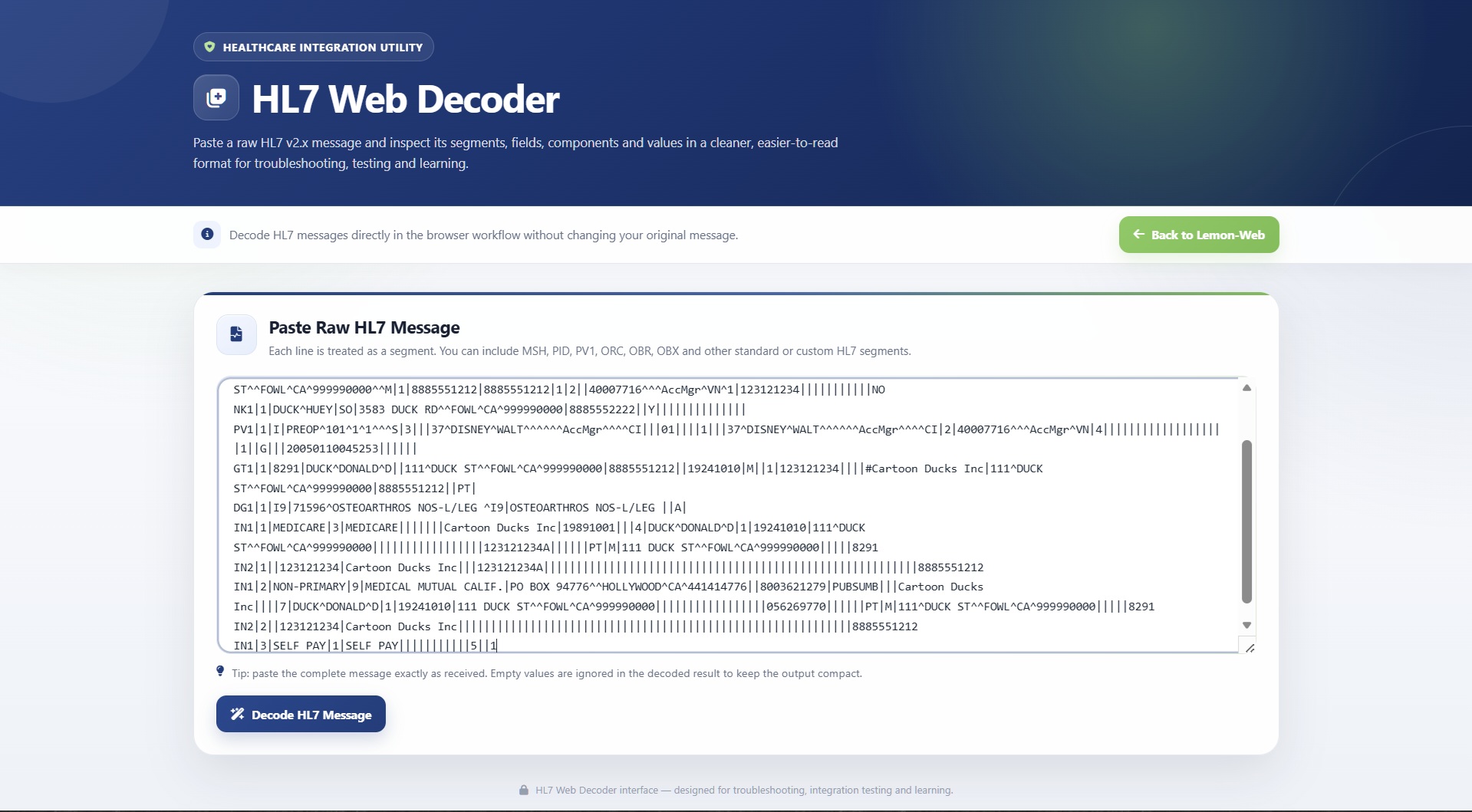
The raw HL7 input area has received quite a bit of attention.
The textarea is now larger and uses a proper monospace font so messages are much easier to read while working with them.
There is also improved spacing, clearer focus highlighting and a subtle bordered container around the editor.
I've retained an example HL7 message inside the placeholder, making it immediately obvious what kind of data the decoder expects.
There is also a small reminder underneath the editor explaining that the complete message can simply be pasted as received.
The workflow remains intentionally simple: there is no need to configure message types, upload files or define delimiters manually before decoding.
Improved Decode and Navigation Buttons
Buttons have also been redesigned.
Instead of basic pill-shaped controls, the application now uses more substantial modern buttons with:
Font Awesome icons, subtle gradients, hover movement, shadows and clearer colour separation between different actions.
The main Decode HL7 Message button uses the application blue.
The Restart button uses red, making it clear that it resets the current decoding session.
The existing Back to Lemon-Web navigation remains green and continues to take the user back to the HL7 Decoder entry on Lemon Web Apps. The original application already provided Restart and Lemon-Web navigation controls when viewing decoded results.
New Message Summary Information
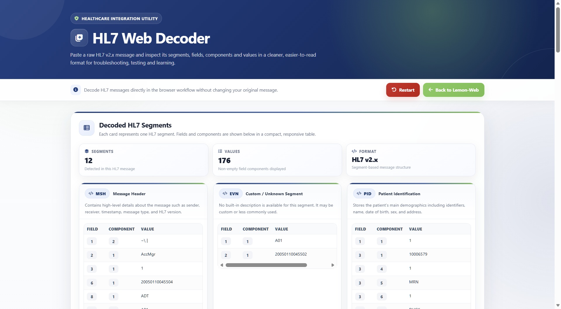
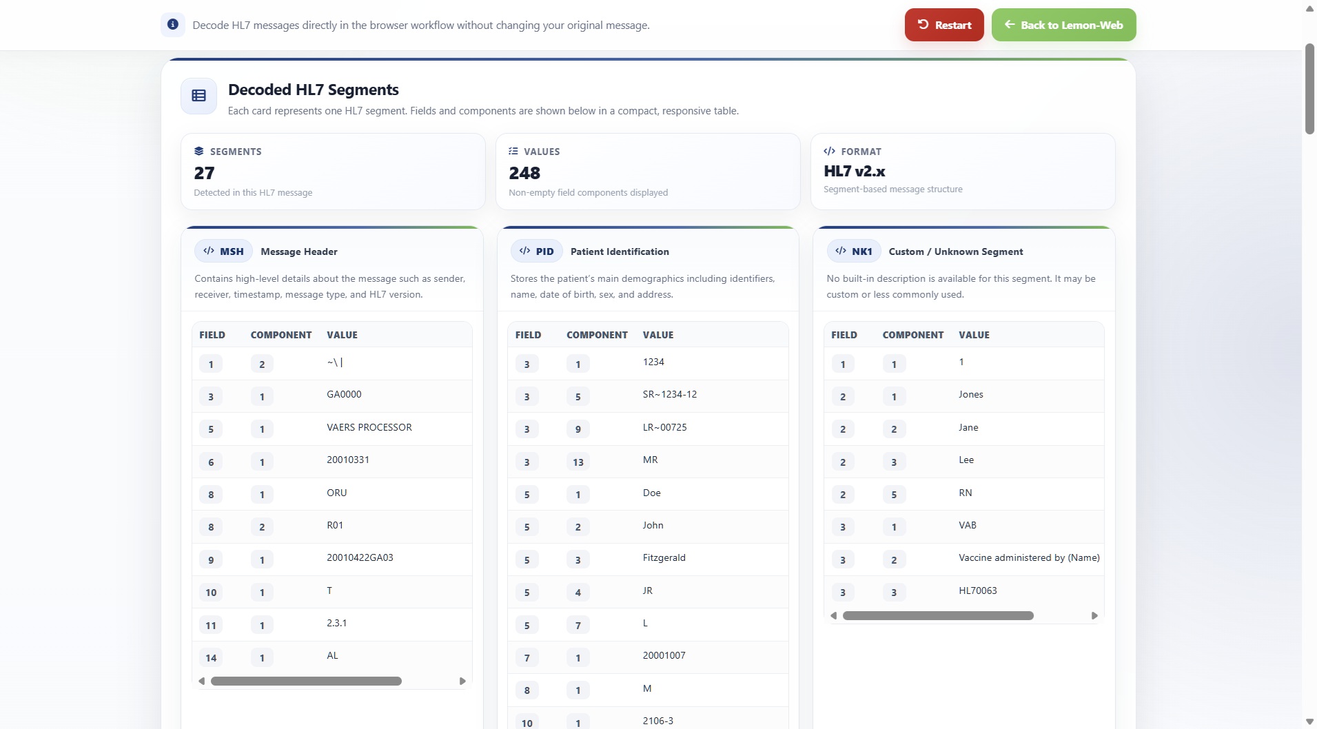
One of the more useful additions is a summary area that appears after an HL7 message has been successfully decoded.
It now immediately shows:
Segments – the total number of HL7 segments detected.
Values – the total number of non-empty field components being displayed.
Format – identifies the decoded structure as HL7 v2.x.
This isn't meant to replace the actual message analysis, but it gives me an immediate idea of how large the message is before I start going through individual segments.
Much Better Segment Cards
The decoded segment cards are probably where the redesign makes the biggest difference.
Each HL7 segment now gets its own clearly separated card.
The segment identifier, such as MSH, PID, OBR or OBX, appears inside a compact badge at the top of the card.
Beside it is the human-readable segment name, followed by a short description explaining what that segment normally contains.
This information already existed in the original decoder, where individual segment cards contained a segment code, description and compact results table.
The refreshed interface simply makes that information much easier to scan.
Cards now include better spacing, subtle shadows, cleaner borders, colour accents and a slight hover effect.
It makes a surprisingly big difference when analysing messages containing many segments.
Cleaner Field and Component Tables
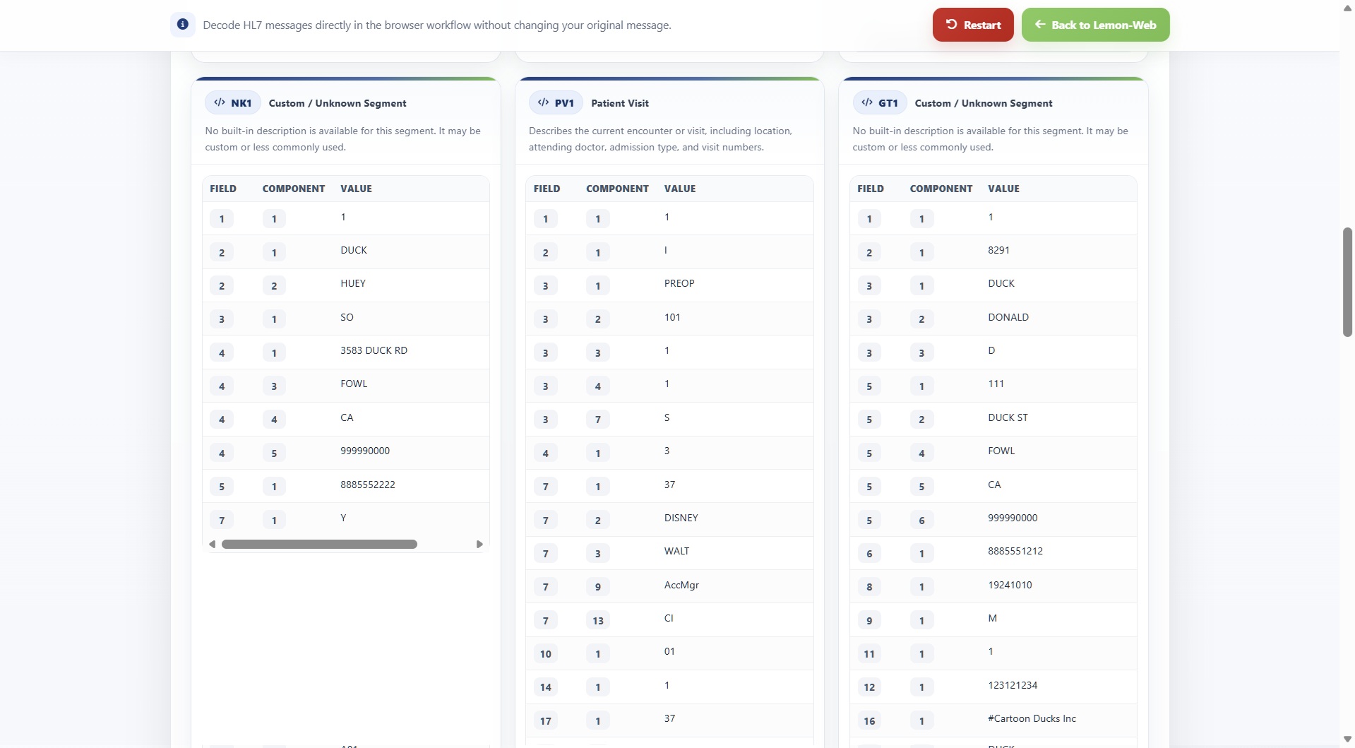
Inside each segment, decoded values are still presented using three main columns:
Field
Component
Value
But visually, the tables are now much easier to follow.
Field and component numbers appear inside small badges, while actual HL7 values get more horizontal space.
Alternating row backgrounds and hover highlighting make it easier to follow a value across a busy table.
Long values are also allowed to wrap properly instead of potentially breaking the layout.
This is especially helpful with patient names, addresses, identifiers, order descriptions or long observation values.
Better Support for Smaller Screens
Responsive behaviour was another important part of the update.
The old interface already had some basic mobile adjustments, particularly for the top navigation.
The refreshed version goes considerably further.
On smaller screens, the layout automatically changes from multiple segment columns to a single-column presentation.
The summary cards stack vertically, navigation buttons adapt to the available width, padding is reduced appropriately and the HL7 editor becomes more comfortable to use on smaller displays.
Most importantly, tables are now contained inside their own horizontally scrollable area.
That means a large HL7 value can no longer force the entire webpage beyond the width of the screen.
A Sticky, Translucent Utility Bar
The navigation bar has also been redesigned into a translucent sticky utility bar.
While scrolling through a large decoded message, the controls remain conveniently available near the top of the screen.
A subtle background blur helps the bar stay readable without completely disconnecting it visually from the content underneath.
It's a small usability improvement, but it becomes especially useful when inspecting a message containing a lot of OBX or other repetitive segments.
Improved Error Presentation
Error messages have also been cleaned up.
If someone clicks Decode without providing an HL7 message, the application still performs the same validation as before.
However, the warning is now presented in a clearer error panel with an appropriate icon, softer colours and improved spacing.
Again, the behaviour hasn't changed — only the presentation has improved.
Still Lightweight and Server-Side
Despite the visual improvements, I deliberately kept the application relatively lightweight.
The actual HL7 parsing continues to happen directly in PHP.
There is no large JavaScript framework, frontend build process or complicated application stack involved.
The only external UI dependency is Font Awesome, which is used for interface icons.
For a utility like this, I actually prefer that approach.
It means the decoder remains easy to deploy, easy to maintain and compatible with the older PHP environment already hosting it.
Existing Features Retained
To summarise, the update retains the important functionality that was already available:
The original interface already supported pasting messages, decoding them and displaying individual segment tables.
What's New in This Update
The refreshed version adds or improves:
Why I Wanted to Update It
HL7 messages aren't particularly pleasant to read in their raw form.
Something like:
PID|1||123456^^^HOSPITAL^MR||DOE^JOHN||19800101|M...
is perfectly understandable once you know HL7, but when you're debugging a larger message with many segments and hundreds of fields, it becomes very easy to lose track of what you're looking at.
That was really the reason I originally built this decoder.
The latest update takes the same idea one step further.
Instead of simply transforming the HL7 into tables, I wanted the entire experience of inspecting the message to feel cleaner and less tiring.
Final Thoughts
This update isn't a reinvention of the HL7 Web Decoder. In many ways, that is exactly the point.
The decoding logic that already worked remains intact, while the interface around it has been significantly improved.
It is now cleaner, more responsive, easier to navigate and much more comfortable when working with larger HL7 messages.
For me, tools like this don't need to become enormous applications. Sometimes a small utility that does one job properly is much more useful.
The refreshed HL7 Web Decoder remains exactly that: paste an HL7 message, decode it, inspect the structure and quickly understand what the systems are exchanging — only now it looks and feels considerably better while doing it.











Comments 0