

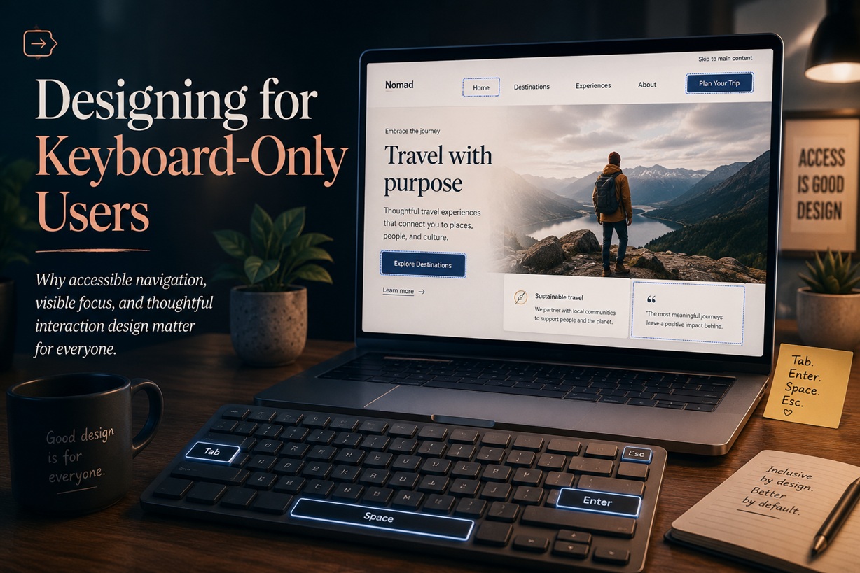
Most people browse the web using a mouse, trackpad or touchscreen, so it is easy for designers and developers to assume that every visitor will interact with a website in the same way. That assumption can make an otherwise attractive website unusable for anyone who depends on a keyboard.
Keyboard accessibility is sometimes treated as a specialised enhancement added near the end of a project. In reality, it should be part of the interface from the beginning. The Web Content Accessibility Guidelines require website functionality to be operable through a keyboard interface, and those standards are frequently incorporated into accessibility laws, procurement requirements and organisational policies around the world.
More importantly, keyboard support is simply a sign that an interface has been built properly.
A visitor should be able to move through a page, open menus, submit forms, close pop-ups and operate every important control without reaching for a mouse.
Keyboard Users Are More Common Than You May Think
The phrase "keyboard-only user" can sound as though it describes a small and highly specialised audience. The reality is much broader.
Some people use a keyboard because a physical disability makes a mouse or touchscreen difficult to control. Tremors, arthritis, limited mobility and reduced fine motor control can all affect someone's ability to point accurately at small interface elements.
People with visual impairments often navigate websites through screen readers. These tools rely heavily on keyboard commands to move between headings, links, buttons, form controls and page regions.
Other visitors simply prefer the keyboard because it is faster. Developers, writers, customer-service teams and experienced software users may use shortcuts to move through interfaces without interrupting their workflow.
Keyboard dependence can also be temporary or situational. A visitor may have an injured arm, a broken trackpad, a discharged wireless mouse or limited space to use a pointing device.
Accessibility is therefore not only about permanent disability. It also supports people whose circumstances change from one moment to the next.
Why Keyboard Accessibility Matters
A website that cannot be used with a keyboard excludes visitors before they have an opportunity to understand its content or services.
A person may be able to read the homepage but remain unable to open the navigation menu. They may complete every field in a form but be unable to reach the Submit button. They may open a modal window and then discover that there is no keyboard method for closing it.
In each case, the user has not failed to understand the interface. The interface has failed to support the user.
The business consequences are straightforward. Someone who cannot complete a purchase, registration, appointment request or enquiry will probably leave. They may also choose a competitor whose website is easier to operate.
For public services, healthcare, education, banking and government platforms, inaccessible navigation can prevent people from reaching information or completing important tasks.
Keyboard support should therefore be treated as a basic functional requirement rather than an optional gesture of goodwill.
WCAG Establishes the Baseline
The Web Content Accessibility Guidelines, commonly known as WCAG, provide internationally recognised recommendations for making digital content more accessible.
WCAG Success Criterion 2.1.1 requires functionality to be operable through a keyboard interface, with limited exceptions for tasks that genuinely depend on a path-based movement, such as freehand drawing.
This is a Level A requirement—the most fundamental level of WCAG conformance.
WCAG itself is a technical standard rather than a law in every jurisdiction. However, governments, courts, regulators and organisations frequently refer to it when defining legal or contractual accessibility obligations.
From a practical design perspective, the distinction changes very little. Keyboard accessibility is already an expected part of a professionally built website.
How Keyboard Navigation Normally Works
Keyboard users interact with websites through a familiar set of controls.
These conventions reduce the amount of learning required. Users should not have to discover a completely new interaction model for every website they visit.
Custom shortcuts can be helpful, particularly in complex applications, but they should supplement standard keyboard behaviour rather than replace it.
Focus Is the Keyboard User's Cursor
Mouse users can see the pointer moving across the screen. Keyboard users rely on something different: the focus indicator.
Focus shows which element is currently selected and will respond when the user presses Enter, Space or another key.
Without a visible focus indicator, keyboard navigation becomes guesswork.
Unfortunately, many websites remove the browser's default outline because someone believes it looks unattractive. A CSS rule such as outline: none may create a cleaner visual appearance for mouse users while making the page almost impossible to navigate by keyboard.
The correct solution is not to remove focus. It is to design a better focus state.
A good focus indicator might use:
The indicator should remain visible against both light and dark backgrounds. It should also appear consistently across links, buttons, inputs and custom controls.
Focus is not visual clutter. It is navigation information.
Tab Order Should Match the Page
A keyboard user expects focus to move through the interface in a predictable order.
On a normal page, navigation should usually follow the visual and reading sequence: header controls, primary navigation, main content, supporting information and footer.
Problems appear when the underlying HTML structure differs greatly from the visible layout. CSS may place elements in one position while the document order sends keyboard focus somewhere else.
A user might see a button directly beneath a form field, press Tab and unexpectedly jump to the footer. After several more key presses, focus may eventually return to the button.
This disconnect makes the interface difficult to understand.
Developers should avoid forcing tab order with positive tabindex values such as tabindex="5" or tabindex="12". These values are difficult to maintain and often create confusing navigation sequences.
The better approach is to structure the HTML in a logical order and allow the browser to manage focus naturally.
Semantic HTML Solves Many Problems Automatically
One of the easiest ways to support keyboard users is to use the correct HTML elements.
A clickable action should normally use a <button>. Navigation should use links created with <a>. Form fields should use appropriate <input>, <select> and <textarea> elements.
These elements already include expected keyboard behaviour, focus handling and accessibility information.
Problems often begin when developers use a generic <div> or <span> as a button because it is easier to style.
A clickable <div> may respond to a mouse click but remain unreachable through Tab. Even when tabindex="0" is added, the developer must still recreate button behaviour for Enter, Space, focus states, disabled states and screen-reader announcements.
Using a real button provides most of that functionality automatically.
Semantic HTML is not old-fashioned or restrictive. It is a reliable foundation that browsers and assistive technologies already understand.
Hover-Only Features Create Invisible Barriers
Mouse users can reveal menus, descriptions and controls by hovering over an element. Keyboard and touchscreen users cannot depend on hover.
Important information should never be available only when the mouse pointer sits over a particular area.
A navigation menu that opens exclusively on hover may be inaccessible by keyboard. A tooltip containing necessary instructions may never appear. Action buttons hidden until a card is hovered may remain impossible to discover.
Interactive content should also become available when the element receives keyboard focus. Menus should be operable through focus and activation keys, while essential instructions should remain accessible without requiring hover.
Hover can enhance an experience, but it should not be the only way to reach functionality.
Modals Need Careful Focus Management
Modal windows are a common source of keyboard problems.
When a modal opens, keyboard focus should move into it—usually to its heading, first meaningful control or close button. Users should not continue tabbing through invisible content behind the dialog.
While the modal remains open, focus should stay within its controls. Pressing Tab on the final interactive element should return focus to the first relevant element inside the modal.
This controlled behaviour is sometimes called a focus trap. In this situation, the trap is intentional because the background content is temporarily unavailable.
The problem occurs when users become trapped without an escape route.
The Escape key should normally close the modal, and a clearly labelled Close button should also be available. After dismissal, focus should return to the element that originally opened the dialog.
Without that final step, the user may suddenly find themselves at the top of the page or at an unpredictable location.
Drop-Down Menus Must Work Without a Mouse
A menu that looks simple visually may involve several keyboard decisions.
Users should be able to reach the menu trigger through Tab and open it with Enter or Space. Once open, arrow keys may be used to move between items, depending on the type of menu.
Escape should close it, and focus should return to the trigger.
A user should not have to press Tab dozens of times through hidden menu items after the menu has already been dismissed.
Native HTML controls should be preferred whenever they satisfy the requirement. Custom drop-downs can provide more visual flexibility, but they also require careful handling of focus, keyboard events, roles and accessibility states.
The more an interface moves away from native behaviour, the more responsibility the developer takes on.
Custom Widgets Need Complete Keyboard Behaviour
Modern interfaces often include tabs, accordions, carousels, date pickers, autocomplete fields and drag-and-drop areas.
Each of these components needs a defined keyboard interaction model.
A tab interface, for example, may use Tab to reach the active tab and arrow keys to move between tabs. An accordion should allow its header buttons to open and close sections with Enter or Space.
A carousel should provide keyboard-accessible previous, next and pause controls. Automatically rotating content should not move so quickly that keyboard users lose track of focus.
Drag-and-drop interfaces also need an alternative. A user should be able to select an item and move it through keyboard controls rather than being required to hold and drag it with a pointer.
Adding tabindex alone does not make a custom component accessible. The control must behave in a way that users can understand and operate.
Inconsistent Key Behaviour Creates Confusion
Users rely on established expectations.
Buttons should normally respond to Enter and Space. Links should activate with Enter. Checkboxes are commonly toggled with Space. Radio buttons and menu options often use arrow keys for movement.
When a custom control responds only to an unusual key, users may assume it is broken.
Developers sometimes listen only for mouse clicks and then add an Enter event as an afterthought. The control may still ignore Space or behave differently from a native button.
The easiest way to maintain consistent behaviour is once again to use semantic elements.
When custom interactions are unavoidable, they should follow recognised accessibility patterns rather than inventing new ones.
Avoid Accidental Keyboard Traps
A keyboard trap occurs when focus enters part of the interface and cannot escape through normal navigation.
This can happen inside embedded content, custom menus, widgets and poorly implemented dialogs.
A user may press Tab repeatedly while focus cycles through the same two controls. Escape may do nothing, and the only apparent solution may be to refresh the page or close the browser tab.
WCAG specifically requires users to be able to move focus away from a component using standard keyboard methods, unless clear instructions explain another method.
Testing should include moving both forward and backwards through every complex component.
A keyboard user should never feel that the page has taken control away from them.
Skip Links Make Long Pages Easier to Use
Imagine having to press Tab through an entire header and navigation menu every time a new page loads.
For a website with dozens of navigation links, this quickly becomes exhausting.
A Skip to main content link allows keyboard and screen-reader users to bypass repeated sections and move directly to the primary content.
The link may remain visually hidden until it receives keyboard focus. Once visible, it should be clear and easy to activate.
Skip links are simple to implement and can significantly improve navigation across large websites.
Additional skip links may also help users move directly to search, navigation or other major page areas when the interface is especially complex.
Forms Need More Than Reachable Fields
A form may appear keyboard accessible because the user can Tab through its fields. That is only the beginning.
Each input should have a properly associated label. Required fields should be identified clearly, and errors should explain what went wrong and how to correct it.
When the form is submitted with errors, focus should move to an error summary or the first invalid field rather than leaving the user uncertain about what happened.
Radio buttons and checkboxes should have large, understandable labels. Custom visual controls should preserve their native keyboard behaviour.
Date pickers deserve special attention. Many calendar widgets are difficult to operate without a mouse. Users should either receive a fully keyboard-accessible calendar or be allowed to type the date directly in a clearly documented format.
A form is accessible only when the entire task—from entering the first value to receiving confirmation—can be completed through the keyboard.
Testing With the Keyboard Is Surprisingly Simple
Keyboard accessibility testing does not require expensive equipment.
Put the mouse aside and load the website from the beginning.
Press Tab repeatedly and observe:
Then repeat the process with Shift and Tab to navigate backwards.
Testing should cover mobile menus, cookie notices, pop-ups, carousels, search suggestions, authentication screens and error messages—not merely the main page content.
Even a five-minute keyboard review can reveal major issues that may never be noticed through mouse testing alone.
Screen-Reader Testing Adds Another Layer
Keyboard testing shows whether controls can be reached and operated, but a screen reader reveals whether they make sense.
A button may be keyboard accessible while being announced only as "unlabelled." A field may accept input but lack an understandable name. A menu might open without telling the user that its state has changed.
Screen readers such as NVDA on Windows, VoiceOver on macOS and iOS, and TalkBack on Android can help expose these issues.
Teams do not need to become expert screen-reader users before beginning basic testing. Learning how to move through headings, links, buttons and form controls already provides valuable insight.
Professional accessibility testing and feedback from people who use assistive technology regularly remain important for complex or high-risk services.
Keyboard Accessibility Benefits Everyone
Many accessibility improvements also make interfaces more efficient for users without disabilities.
Clear focus states help people understand where they are. Logical document order improves screen-reader navigation and search-engine understanding. Semantic HTML makes code easier to maintain.
Keyboard shortcuts can speed up repeated tasks. Escape-to-close behaviour makes dialogs easier for everyone. Large controls and clear labels improve usability across touchscreens and desktops.
This is the broader value of inclusive design.
Designing for people with specific access needs often produces an interface that is more predictable and resilient for the entire audience.
The Cost of Fixing It Early Is Small
Keyboard accessibility becomes expensive mainly when it is ignored until the end.
If semantic HTML, logical source order and visible focus states are built into the design system, most screens inherit good keyboard behaviour automatically.
When accessibility is postponed, teams may need to rebuild custom controls, reorder complex layouts and repair components already used across many pages.
The most efficient approach is to include keyboard acceptance criteria in design and development from the beginning.
A component should not be considered complete merely because it looks correct and responds to a mouse. It should also be reachable, understandable and operable through a keyboard.
Final Thoughts
Keyboard-only users are not an edge case. They include people with permanent disabilities, temporary injuries, visual impairments, broken devices and simple preferences for faster navigation.
Designing for them does not require rebuilding the web from scratch.
Use semantic HTML. Keep focus visible. Maintain a logical tab sequence. Support familiar activation keys. Make Escape close temporary interfaces. Test every important task without touching the mouse.
These practices satisfy accessibility standards, reduce legal and commercial risk and create a more dependable experience for everyone.
Most visitors who encounter an inaccessible website will not send a detailed report explaining what went wrong. They will simply leave.
Good design gives them no reason to.











Comments 0