


If you're starting a new brand, one of the very first decisions you'll face is your logo. Whether it's for a growing business, a side project, or even a personal blog, your logo plays a major role in how people perceive you. It's often the first visual impression someone has of your brand, so getting the style right really matters.
With so many logo styles out there, it's easy to feel overwhelmed. To simplify things, let's break down four logo styles that consistently remain popular. This categorisation is based on years of real-world design experience, and while trends evolve, these styles continue to resonate with clients across different industries.
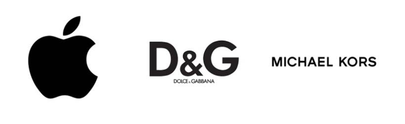
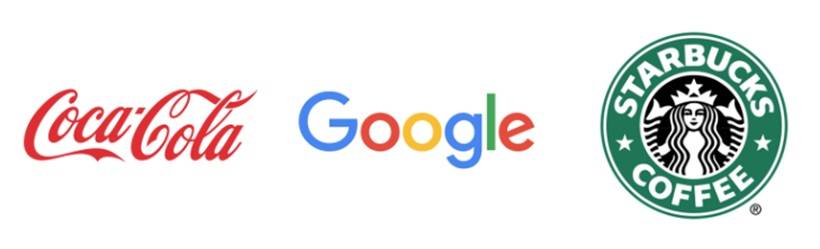
Modern and Minimalist Logos
Minimalist logos are often the hardest to design well. They rely on clean typography, limited colour palettes, and simple shapes. At first glance, they may seem basic, but when done right, they are anything but boring.
The strongest modern logos are simple yet highly recognisable. They don't try to do too much, but they still manage to stand out. While some minimalist logos work perfectly as symbols alone, professional branding usually includes multiple versions, such as a symbol-only mark and a full logo with the brand name.
This style works especially well for modern brands, digital products, and premium services that want to project clarity, confidence, and sophistication.
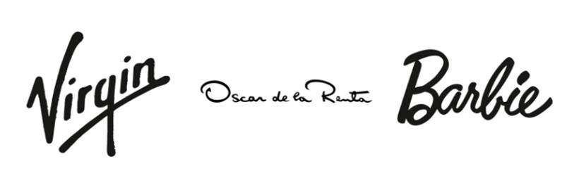
Feminine and Signature-Style Logos
Despite the name, "feminine" logos aren't limited to women-led businesses. This category focuses more on mood than ownership. These designs often feel softer, more personal, and less formal, frequently using script or handwritten-style fonts.
Signature logos take this one step further by mimicking natural handwriting, often featuring a full name in black or neutral tones. The result feels authentic and approachable, almost like a personal stamp rather than a corporate mark.
When combined with thoughtful colours and decorative details, this style has become extremely popular among bloggers and content creators, especially in beauty, fashion, lifestyle, and travel niches. It's a great choice if you want your brand to feel friendly, personal, and human.
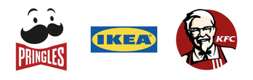
Graphic and Playful Logos
If bold, colourful, and expressive sounds like your vibe, graphic logos might be the right direction. This style offers the most creative freedom, with expressive typography, illustrations, and vibrant colour choices. There are very few rules here, which makes it perfect for brands that want to stand out visually.
While many large brands have simplified their logos over time, graphic styles still have a loyal following. They work particularly well for businesses that don't want to blend in and are comfortable making strong visual statements.
This style is especially effective for food brands, fashion labels, children's products, and family-oriented content where fun and personality matter more than formality.
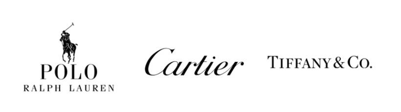
Classic and Formal Logos
When in doubt, classic logos are always a safe option. These designs often combine traditional typography, usually serif fonts, with more detailed or realistic imagery. Compared to modern logos, they feel more established and timeless.
Classic logos are commonly associated with heritage, trust, and quality. They work well for premium brands targeting mature audiences or customers who appreciate tradition and craftsmanship. This style subtly communicates experience, stability, and long-standing value.
Mixing Logo Styles for a Unique Look
You don't always have to fit neatly into one category. Many successful brands mix elements from different styles to create something unique. A logo can be minimalist but still playful, or classic with a modern twist.
Colour also plays a huge role in shaping how a logo is perceived. The same logo design can communicate entirely different messages depending on the colours you choose, attracting different audiences without changing the core design.
So, Which Logo Style Is Right for You?
There's no single "correct" answer. The best logo style depends on your brand's personality, your target audience, and the goals you want to achieve. Personal preference matters, but strategy matters more.
When your logo style, colours, and message align, your brand feels confident and cohesive. That's when a logo stops being just a graphic and starts becoming a powerful identity.


Comments