

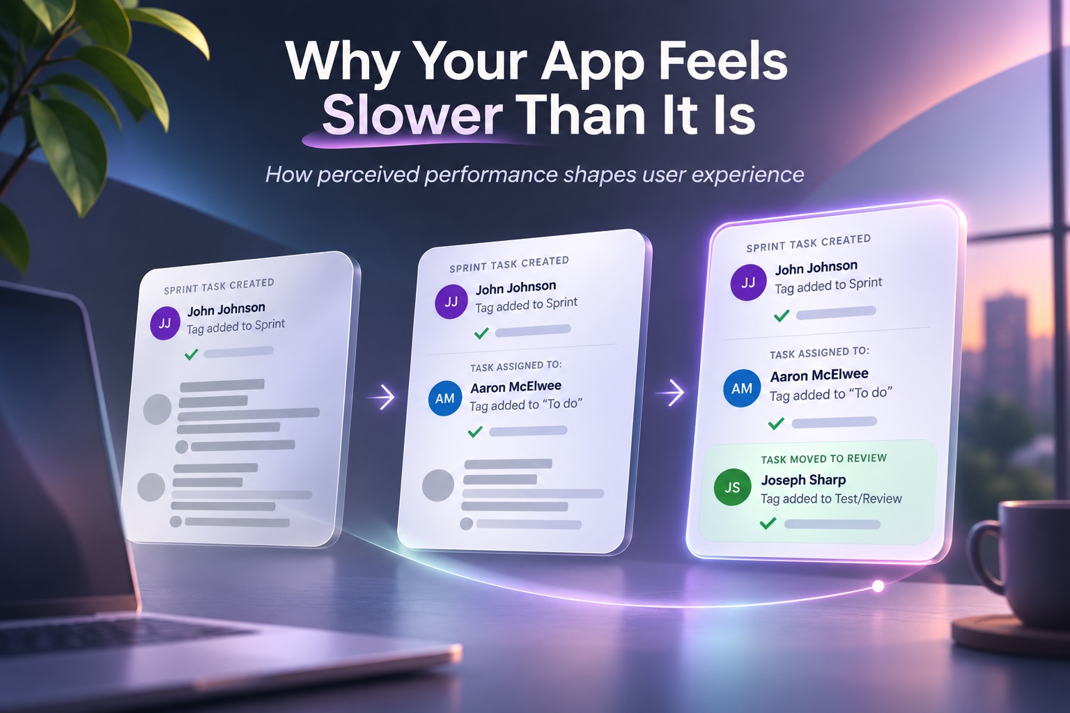
A performance test may say your application responds in 1.2 seconds, yet users can still complain that it feels painfully slow. Both statements can be completely accurate because technical performance and perceived performance are not the same thing. A stopwatch measures how long an operation takes, but a user experiences that time through attention, expectation, uncertainty and emotion. This is why improving an application is not always about reducing another 200 milliseconds from an API response; sometimes the bigger improvement comes from changing what the user experiences while those milliseconds are passing.
Performance Is A Feeling, Not Just A Number
Developers naturally measure performance using concrete numbers such as response time, time to first byte, first contentful paint and total loading duration. Those metrics are extremely important because they reveal genuine technical problems, but they do not completely describe how fast an application feels. Two interfaces can take exactly the same amount of time to finish loading while producing completely different reactions from users. One may feel responsive and polished, while the other feels frozen and frustrating even though both technically complete in three seconds.
The Perception Gap Changes Everything
Research into waiting behaviour consistently shows that perceived waiting time often influences satisfaction more strongly than the objective amount of time spent waiting. Studies outside technology have demonstrated the same effect, including research into physical waiting environments where people were more satisfied when the surroundings felt comfortable or engaging even though their actual wait had not changed. Digital interfaces operate according to the same psychology because users are still human beings experiencing time rather than measuring it precisely. If an application gives people something useful to look at and communicates what is happening, the same delay can feel dramatically shorter.
The Brain Does Not Experience Time Objectively
Human perception of time changes depending on what we are doing and how we feel. Five minutes spent enjoying a conversation can disappear quickly, while 30 seconds waiting for an unresponsive website can feel strangely long. Digital products inherit this behaviour because uncertainty and frustration cause users to focus directly on the delay. The moment someone begins wondering whether an application has crashed, stopped responding or ignored their action, every additional second becomes much more noticeable.
A Short Uncertain Wait Can Feel Longer Than A Predictable One
Imagine pressing a button and seeing absolutely nothing happen for two seconds. You do not know whether the click registered, whether the internet connection failed or whether the application has frozen, so those two seconds feel uncomfortable. Now compare that with a five-second operation where the button immediately changes state and a clear progress indicator appears showing that processing has begun. Technically, the second experience takes much longer, but many users will perceive it as faster because they understand what is happening and feel confident that the system is responding.
Occupied Time Feels Shorter Than Empty Time
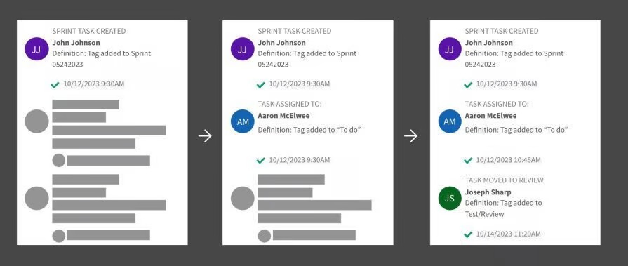
One of the simplest principles of perceived performance is that occupied waiting time feels shorter than unoccupied waiting time. A blank screen with a spinning icon gives users nothing to do except stare at the delay, making them acutely aware that they are waiting. A skeleton interface, meanwhile, shows the structure of the page while data is still loading, giving the user something visual to process. The actual network request may take exactly the same amount of time, yet the second experience feels faster because attention has shifted away from the wait itself.
Why Spinners Often Feel So Slow
The traditional loading spinner has become almost synonymous with waiting because it communicates very little beyond the fact that something is happening. It provides no clue about how much work has been completed, how much remains or whether progress is actually being made. After several seconds, users may begin wondering whether the spinner is simply rotating forever because the application has encountered an error. A spinner is better than providing no response at all, but it is usually one of the weakest ways to communicate a meaningful delay.
Skeleton Screens Create The Impression That The Page Is Already There
Skeleton screens are effective because they make the interface appear partially complete even before the actual content arrives. Instead of presenting an empty area, the application displays placeholder shapes representing headlines, images, buttons and other elements that will eventually populate the page. Users can immediately understand the page structure and often begin orienting themselves before the data finishes loading. Nothing about the server response necessarily becomes faster, but psychologically the application has already started delivering something useful.
Progress Bars Give Users Something To Follow
Progress indicators become especially valuable when an operation takes several seconds or longer. Unlike an indefinite spinner, a progress bar gives users a sense of movement and direction, showing that the system is getting closer to completion. Even an approximate indicator can reduce uncertainty because people understand that the operation has a beginning and an expected end. Watching progress also occupies attention, which further reduces the perceived duration of the wait.
Known Waits Feel Shorter Than Unknown Waits
People tolerate delays much better when they understand how long those delays are likely to last. A message saying "Uploading — approximately 20 seconds remaining" usually feels less frustrating than an identical upload accompanied by nothing more than a spinner. The first interface sets an expectation, allowing the user to mentally accept the delay and perhaps do something else while waiting. The second forces the user to repeatedly wonder whether another second, another minute or an indefinite amount of time remains.
Uncertainty Creates Anxiety
When users cannot predict what is happening, they begin imagining possible problems. Perhaps the payment was submitted twice, the file failed to upload or the form did not save correctly. That uncertainty makes the delay feel longer because attention becomes completely focused on the system's behaviour. Clear status information reduces this anxiety by reassuring users that the application understands the request and is still processing it.
Explained Waits Feel Better Than Unexplained Ones
A small amount of context can significantly change how users perceive a delay. Messages such as "Fetching your latest data," "Preparing your report" or "Securing your payment" explain why the application is taking time and reassure users that something meaningful is happening. The explanation does not need to reveal technical details about databases, APIs or background services. It simply needs to communicate that the delay has a purpose rather than being a sign of failure.
The Explanation Should Match What Is Actually Happening
Loading messages become ineffective when they feel fake or overly theatrical. Users quickly notice when an interface cycles through meaningless phrases designed purely to distract them from a slow operation. Good status communication should reflect the actual stage of the process whenever possible, particularly during longer tasks. If the application is importing records, validating data and generating a report, communicating those stages can make the experience feel much moretransparent.
Unfair Waits Feel Longer Than Fair Ones
People become especially frustrated when they believe others are progressing while they remain stuck. This is why queues often display position numbers or estimated waiting times rather than leaving everyone wondering whether anything is moving. Digital systems can use the same principle by indicating that a request is queued, processing or waiting behind other tasks. Even when the user cannot proceed immediately, understanding that the system is working through requests in a predictable order makes the wait easier to tolerate.
Immediate Feedback Changes The Entire Experience
Every user action should produce some form of immediate acknowledgement. A button might visually depress, a switch may animate, a row could highlight or a subtle vibration may confirm that a tap has been registered. These reactions happen before the underlying operation necessarily finishes, but they tell the user that the application heard them. That tiny moment of feedback can make an interface feel dramatically more responsive even though the backend performance has not changed at all.
Buttons Should Never Leave Users Guessing
One of the fastest ways to make an application feel slow is allowing users to click a button without any visible response. When nothing happens immediately, people often click again because they assume the first attempt failed. This can lead to duplicated requests, repeated purchases or other unintended actions. Changing the button into a loading state instantly solves both problems: users know their action was received and are less likely to repeat it.
Optimistic UI Can Make Actions Feel Instantaneous
Optimistic interfaces take immediate feedback even further by updating the interface before the server confirms that the operation succeeded. When a user likes a post, for example, the heart icon can change instantly while the application sends the request to the server in the background. From the user's perspective, the action feels instantaneous even though the network operation may take another second. If the server later reports an error, the application can reverse the change and explain what happened.
Optimistic UI Works Best For Predictable Operations
Not every action should use optimistic updates. Operations involving money, inventory or other situations where failure has significant consequences often need stronger confirmation before the interface presents the action as complete. However, low-risk interactions such as favourites, likes, preference changes or simple edits can benefit enormously from optimistic behaviour. The technique works because it prioritises the user's perception while allowing the technical operation to complete asynchronously.
Progressive Loading Lets Users Start Earlier
Another powerful technique is loading the most important parts of an interface before everything else. A page containing text, images, recommendations and secondary widgets does not necessarily need to wait until every asset is available before showing anything. Rendering the primary content first allows users to begin reading or interacting while lower-priority elements continue loading. The experience feels faster because the relevant measurement becomes the time until something useful appears rather than the time until every background resource finishes.
First Meaningful Content Matters More Than The Final Asset
Users rarely care that the last decorative image finished loading at 3.8 seconds if they were already reading useful content at 1.2 seconds. This is why perceived performance often depends more heavily on the first meaningful paint than total completion time. Developers should therefore prioritise whatever the user came to the screen to see. Non-essential scripts, analytics, advertisements and secondary interface components can often load later without hurting the experience.
Load The User's Goal First
A useful question when optimising any screen is: what did the user come here to do? If someone opens an article, the headline and first paragraph matter more than recommendations at the bottom of the page. If they open a banking application to check their balance, that balance should appear before promotional banners or unrelated features. Prioritising the user's primary goal can make the product feel considerably faster without changing the total amount of data loaded.
Visual Stability Also Affects Perceived Speed
An interface can technically load quickly and still feel unpleasant when elements constantly move around while content arrives. Buttons shift positions, images suddenly expand and text jumps downward as additional components appear. This instability forces the user to wait mentally because they cannot confidently interact until the page stops moving. Reserving appropriate space for incoming elements makes progressive loading feel intentional rather than chaotic.
Smooth Animation Can Hide Small Delays
Animations can also help bridge short gaps between states. A carefully timed transition gives the interface something visually meaningful to do while processing happens in the background. The trick is keeping animation short enough that it enhances responsiveness rather than becoming another delay users must wait through. When used properly, motion can transform a technically identical operation into something that feels polished and immediate.
Animation Should Never Become An Excuse For Poor Performance
There is a limit to how much perception can compensate for genuinely slow software. A beautiful five-second animation will not make users happy if every simple action consistently takes ten seconds to complete. Perceived performance techniques should complement technical optimisation rather than replace it entirely. The best experience comes from reducing actual delays while simultaneously making unavoidable waits feel understandable and productive.
Context Changes How Fast The Same App Feels
Users do not experience application performance in isolation. Their environment, expectations and current emotional state influence how every delay feels. Someone casually browsing at home may tolerate several seconds of loading, while someone trying to buy a train ticket before departure may find the same delay unbearable. Designing perceived performance therefore requires understanding the situations in which the product is actually used.
Urgency Makes Waiting Feel Longer
A user who is in a hurry becomes much more sensitive to delays. Banking applications, transportation apps, authentication systems and payment platforms frequently operate in situations where people want something completed immediately. Even a modest pause can feel significantly longer when the person believes time matters. These interfaces benefit especially from clear progress feedback and immediate confirmation that an action has begun.
Users Compare You Against Other Products
Perceived speed is also relative. If users regularly use a competitor that loads immediately, your two-second response may feel slow even if it would once have been considered perfectly acceptable. Expectations evolve as technology improves, and experiences that felt fast several years ago may now feel sluggish. Performance design therefore needs to consider the benchmark established by other applications your users interact with every day.
Familiarity Can Make Delays Easier To Accept
People may tolerate slightly longer waits when they understand why they are happening. A professional user generating a complicated report knows that the system has substantial work to perform, so a ten-second delay may feel completely reasonable. The same user would probably become frustrated if opening a simple settings panel took five seconds. Expectations are tied to the perceived complexity of the task, which means interfaces should communicate when a longer operation is genuinely doing more work.
Slow Connections Change Who Gets Blamed
Network quality also influences perceived performance in interesting ways. Users on a visibly poor connection may blame their mobile network or Wi-Fi rather than the application, particularly if the interface communicates connectivity problems clearly. Without that information, the application itself may receive the blame. Detecting and communicating network conditions can therefore help users understand why content is taking longer than usual.
Offline And Cached Content Can Make Apps Feel Dramatically Faster
Caching previously loaded information is another way to improve perceived speed. Instead of presenting an empty screen while fresh data arrives, the application can immediately show the most recent cached version and update it once the network responds. Users gain immediate access to useful information while still receiving current data moments later. This technique is particularly powerful on mobile applications where network conditions can vary constantly.
Never Replace Useful Existing Content With A Spinner
A common design mistake is removing perfectly usable content the moment a refresh begins and replacing everything with a loading indicator. In many situations, the previous information could remain visible until the updated response arrives. Keeping existing content on-screen preserves context and makes the refresh feel much less disruptive. A small indicator can communicate that newer information is loading without forcing the user to stare at an empty interface.
Background Work Should Stay In The Background
Whenever an operation does not require immediate user attention, it should ideally happen without blocking the interface. Saving drafts, synchronising preferences, uploading analytics or preloading additional information can often run asynchronously. Users should remain free to continue working rather than being stopped by processes that do not require their involvement. The fastest-feeling application is often the one that simply avoids making users wait in the first place.
Performance Problems Are Often Interaction Problems
Developers frequently approach performance by profiling code, optimising database queries and improving network requests. All of those are valuable, but some complaints about slowness are actually problems with interaction design rather than computing speed. A user may describe a workflow as slow because it requires too many steps, repeated confirmation screens or unnecessary navigation. Removing one screen from a process can sometimes improve perceived performance more than shaving hundreds of milliseconds from the backend.
Fewer Steps Can Feel Faster Than Faster Code
Imagine one checkout process that loads each page in 500 milliseconds but requires six different screens. Another takes 800 milliseconds per page but finishes in only three screens. Technically, individual interactions in the first system are faster, yet the second workflow may feel dramatically quicker because the user reaches the goal sooner. Performance should therefore be measured at the level of completing tasks, not just individual network requests.
The Stopwatch Still Matters
None of this means conventional performance metrics should be ignored. If a server takes 30 seconds to respond, no amount of skeleton screens or friendly messaging will make the experience genuinely good. Measuring latency, rendering time and resource usage remains essential because perception techniques have limits. The goal is to optimise both sides simultaneously: make the application objectively fast and make the remaining wait subjectively comfortable.
Measure What Users Actually Experience
Traditional averages can also hide meaningful problems. An average load time of two seconds may look good while a significant percentage of users regularly experience eight-second delays. Monitoring percentiles, device classes, geographic regions and network conditions can reveal the actual experience much more accurately. Combining technical telemetry with user feedback gives designers and developers a clearer understanding of why an application feels slow to certain groups.
Perceived Performance Should Be Designed Intentionally
Teams often treat loading states as something to design at the end of a project once the main interface has already been completed. In reality, waiting states are part of the experience and deserve the same attention as any other interaction. Every network request, save operation or background calculation creates a moment where the interface needs to communicate effectively. Designing these moments intentionally can dramatically improve the overall impression of quality.
The Right Question Is Not Only "How Fast Is It?"
A better question is: what does the user experience during the wait? Are they staring at an empty screen, or can they already understand what is coming? Do they know the application received their action, and do they understand whether the operation is progressing? Answering those questions often reveals opportunities to improve perceived performance without touching the underlying infrastructure.
Final Thoughts
Your app can technically be fast and still feel slow because users do not experience milliseconds; they experience uncertainty, attention and expectation. A two-second wait with no feedback can feel worse than a five-second operation that immediately acknowledges the user's action, explains what is happening and shows meaningful progress. The stopwatch measures duration, but people experience the story the interface tells during that duration.
Designers can dramatically improve that story through skeleton screens, progressive rendering, optimistic updates, clear status messages and immediate interaction feedback. They can keep existing content visible during refreshes, move background work out of the user's way and prioritise the information users actually came to see. None of these techniques necessarily makes the server faster, but they can make the application feel significantly more responsive.
Technical optimisation still matters, and genuinely slow systems eventually need genuinely faster code and infrastructure. But perceived performance deserves equal attention because users judge products according to experience rather than benchmarking tools. The fastest application is not always the one with the lowest number on a stopwatch — it is the one that makes users feel as though they are never unnecessarily waiting.











Comments 0