

Most abandoned checkouts do not happen because a website has completely broken. More often, customers leave because of smaller frustrations that pile up at the worst possible moment. A form field is unclear. The guest checkout option is hard to find. Shipping costs appear too late. A button is too small to tap comfortably on a phone. Each issue may only affect a small number of users, but together they can create a checkout experience that feels slow, confusing or untrustworthy.
For e-commerce businesses, these small barriers are not minor design problems. They are lost revenue.
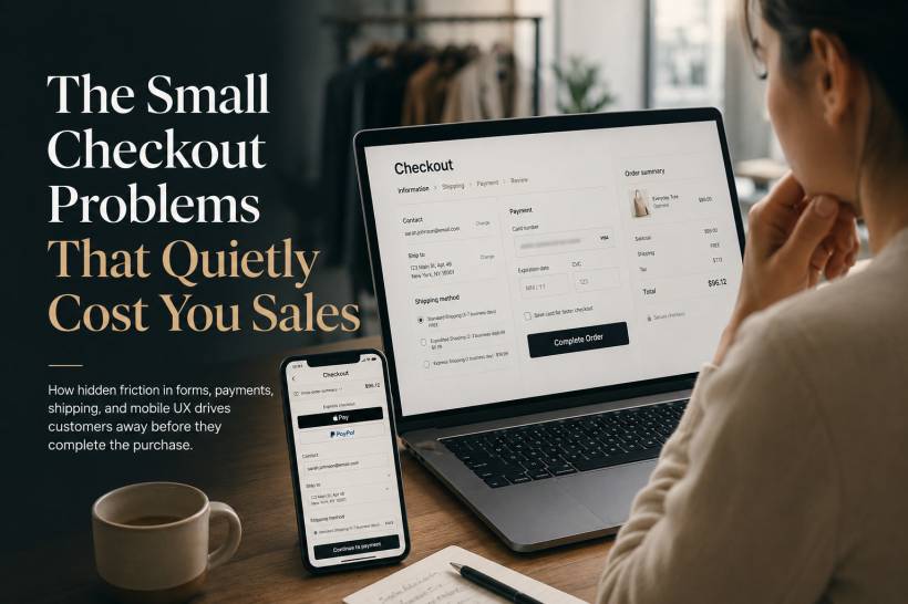
The Address Form Is Often Harder Than It Should Be
Address forms are among the most error-prone parts of an online checkout. Every unnecessary field creates another opportunity for hesitation, incorrect information or abandonment.
One common example is the label "Address Line 2." Many shoppers do not know whether they need to fill it in. A clearer label such as "Apartment, suite, unit number, etc. (optional)" makes the purpose obvious.
State or region fields can also create avoidable mistakes. A preselected state may lead users to skip the field without noticing it is wrong. Leaving it blank and requiring an active selection is usually safer.
Postal code validation should also happen as early as possible. Instead of waiting until the user submits the entire form, the website can check whether the postcode matches the selected city or state while the customer is filling in the address. This prevents frustrating backtracking later.
Phone numbers should only be mandatory when they are genuinely needed, such as for delivery coordination or SMS updates. When required, explain why. A short note such as "Used by the courier for delivery updates" gives customers confidence that their number is not being collected unnecessarily.
Guest Checkout Should Not Feel Like a Hidden Option
Forcing customers to create an account remains one of the fastest ways to lose a sale.
A person buying a product for the first time may not want to set up another username, create another password or agree to more marketing emails. They simply want to pay, receive the item and move on with their day.
The problem gets worse when "Sign in" is presented as a large, attractive button while "Continue as guest" is buried as a small grey link beneath it.
Guest checkout should be easy to see and just as easy to use as account sign-in. Account creation can still be encouraged after the order is complete, when the customer already has a reason to save their details for future purchases.
Password Rules Can Create Unnecessary Friction
Customers who choose to create an account often encounter another barrier: password requirements that are only explained after they fail.
Few things are more frustrating than entering a password, clicking continue and seeing a vague error message that does not clearly explain what is missing.
The better approach is to show requirements before the customer starts typing. As they enter a password, each requirement can update in real time, such as minimum length, uppercase character, number or symbol.
Some stores are also moving towards passwordless login options, such as one-time links sent by email. This removes the need to remember passwords and can make returning customers feel less burdened.
Unexpected Fees Can End the Purchase Immediately
Shipping charges, taxes and service fees are among the biggest reasons customers abandon a cart.
A shopper may feel comfortable with the product price, only to discover near the final payment step that the total has increased significantly. Even when the extra charges are legitimate, the late surprise can make customers feel misled.
Whenever possible, estimated shipping and taxes should appear early in the process. A simple shipping calculator on the cart page can help. If an exact total cannot be calculated without a full address, provide a realistic estimate and explain that the final amount will be confirmed during checkout.
Transparency is much more effective than presenting a low initial price and revealing the full cost only after the customer has invested time in the process.
Coupon Fields Can Distract Customers From Buying
A visible coupon-code box may seem harmless, but it can create doubt.
When customers see a prominent field asking for a promo code, many immediately assume they are missing out on a discount. They may leave the checkout page to search for codes online, find outdated offers or unrelated websites, and never return.
A better design is to hide the field behind a small "Have a promo code?" link. Customers who already have a code will know where to find it, while everyone else can continue paying without being distracted.
Payment Forms Need to Feel Effortless
Payment is where customers are most cautious, so even small form problems can have a big impact.
Card numbers should accept spaces automatically and format themselves as the customer types. A layout such as "1234 5678 9012 3456" is easier to review than a long uninterrupted string of digits.
The expiry date should usually be entered in one field using the MM/YY format, with the slash inserted automatically. Separate dropdown menus or multiple small fields add effort without improving the experience.
CVV fields should include brief, clear help. A note such as "The 3-digit code on the back of your card" removes uncertainty without crowding the screen.
When card verification fails, error messages should be written in plain language. Instead of showing a technical payment error, tell the customer what needs checking, such as the billing street number or postcode.
Mobile Checkout Needs Bigger, Safer Touch Targets
Many online purchases now happen on phones, where checkout mistakes are easier to make.
A tiny "Place Order" button may look neat on a desktop screen, but on mobile it can be difficult to tap accurately. When buttons are too small or too close together, users may tap the wrong link, accidentally leave checkout or become frustrated after repeated attempts.
Interactive elements should have comfortable spacing and be large enough for thumb use. A checkout button should feel obvious, easy to press and visually separate from less important actions.
Testing on a real phone matters here. Browser emulators are useful, but they cannot fully replicate how people hold a phone, scroll one-handed or miss a tap while moving quickly.
The Waiting Period After Payment Matters Too
The checkout experience does not end when a customer clicks "Place Order."
A vague loading spinner can create anxiety, especially when the page takes more than a few seconds. Customers may wonder whether the payment went through, refresh the page or submit the order again, creating duplicate transactions.
A better approach is to explain what is happening. Messages such as "Verifying payment," "Confirming stock availability," and "Creating your order" reassure the customer that the system is still working.
Once the purchase is complete, the confirmation page should be unambiguous. It should clearly show that the order was successful, provide an order number and state when the customer can expect a confirmation email.
A Good Confirmation Email Builds Trust
The post-purchase email is part of the checkout experience, not an afterthought.
A plain text email with little branding can make customers question whether their purchase was processed successfully. A strong confirmation email should include the order summary, expected delivery details, payment information where appropriate, customer support contacts and tracking information once it is available.
For products customers buy regularly, a simple reorder link can also make future purchases much easier.
Final Thoughts
Checkout friction is rarely caused by one major issue. It is usually the result of many small inconveniences that gradually reduce trust and momentum.
Every unnecessary field, hidden guest option, late fee, unclear error message and difficult mobile tap adds another reason for a customer to leave. The best checkout experiences are not necessarily packed with more features. They are designed to remove doubt, reduce effort and help customers complete their purchase with confidence.
A useful next step is to review your own checkout flow as if you were a first-time customer, especially on a real mobile device. The small frustrations you notice may be the same ones quietly costing your business sales.


Comments