

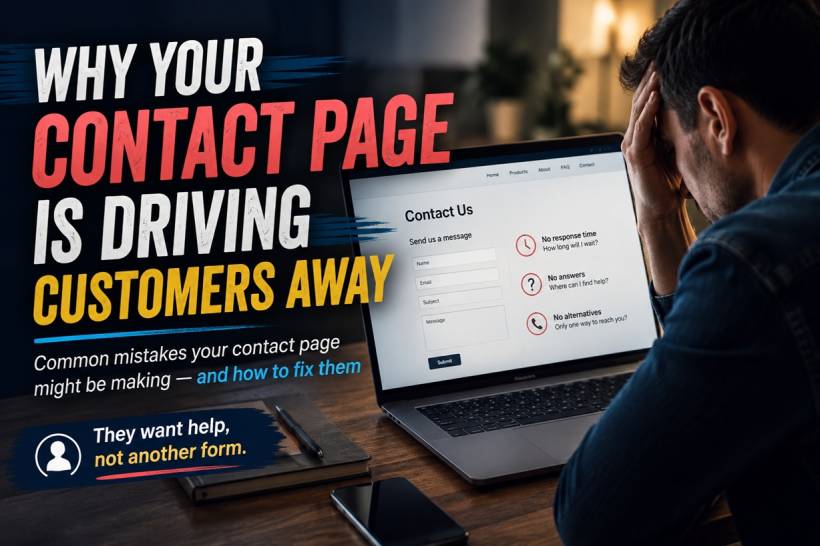
A contact page is often treated as one of the simplest parts of a website. Add a form, include a submit button, and the job is done. But for the customer, the contact page is rarely just another page. It is usually the moment they decide whether your business is actually reachable, reliable, and willing to help.
When someone arrives there, they may already be confused, frustrated, or unable to find the information they need. If the page gives them nothing more than a blank form and no idea what happens next, it can quickly feel like a dead end.
A strong contact page does more than collect messages. It reduces uncertainty, answers common questions, offers clear support options, and shows customers that there is a real person on the other side.
A Contact Form Is Only One Part of the Experience
Forms are useful. They help businesses collect the right information, organise enquiries, and route messages to the correct team.
The problem begins when the form becomes the entire contact experience.
A customer with an urgent billing issue, account problem, delivery delay, or technical difficulty does not want to complete a long questionnaire and wait without knowing whether anyone will respond. They want progress.
That means the contact page should not be designed around what is easiest for the business. It should be designed around what the visitor is trying to achieve.
The best contact pages help people solve simple problems immediately and make it easy to reach the right person when human support is genuinely needed.
Most Visitors Would Prefer Not to Contact You
This may sound strange, but many people who open a contact page are not actually hoping to start a conversation.
They are often looking for one specific answer:
If the answer is easy to find, many visitors will happily solve the issue themselves.
This is good for both sides. The customer gets an immediate result, while the support team receives fewer repetitive enquiries.
A well-designed contact page should therefore include short answers to the most common questions. These should appear directly on the page rather than being hidden behind another link whenever possible.
Customers should not have to move through several pages just to find basic information.
The Contact Page Is Often the Last Stop
By the time someone reaches your contact page, they may already have searched the site, read product pages, checked the help section, and looked through frequently asked questions.
The contact page can therefore become their final attempt to get help.
If that final page provides no useful information, the visitor may conclude that support will be just as difficult after they become a customer. Existing customers may feel ignored, while potential buyers may decide the business is not dependable enough to trust.
This is why contact pages have a direct effect on customer confidence. They may not attract as much attention as a homepage or product page, but they often influence whether someone stays, buys, complains publicly, or leaves permanently.
Unclear Response Times Create Anxiety
One of the most common weaknesses is failing to tell visitors when they can expect a reply.
The customer fills in the form, presses submit, and sees a basic confirmation message. After that, they have no idea what happens.
Will someone reply in ten minutes? Tomorrow? Next week? Was the message even delivered?
That uncertainty encourages repeat submissions, follow-up calls, negative reviews, and unnecessary frustration.
A clear response-time statement removes much of that anxiety. For example:
The exact promise will depend on the organisation, but it must be realistic. It is better to promise a response within one business day and consistently meet that commitment than to promise one hour and regularly fail.
Customers Need to Know What Happens Next
A response-time promise is helpful, but the page should also explain the process.
Visitors may need to know:
This information makes the support process feel organised rather than uncertain.
Even a short message can help:
"After submitting this form, you will receive a confirmation email with a reference number. Our support team will review your enquiry and reply within one business day."
That simple explanation shows the customer that there is a real process behind the form.
One Contact Method Is Rarely Enough
Different customers have different needs.
Someone asking a general question may be comfortable using email. A customer whose account has been locked may want immediate help through live chat. Someone dealing with an urgent service disruption may need a phone number.
A contact page that provides only one option forces everyone into the same process, even when that process is unsuitable.
A better page offers a small number of clearly explained channels, such as:
The page should also explain what each channel is best used for. Too many unexplained options can be just as confusing as having only one.
Do Not Hide Important Contact Details
Some businesses deliberately make phone numbers or email addresses difficult to find because they want to reduce support volume.
This may lower the number of incoming calls, but it can also damage trust.
Customers notice when a company appears eager to sell but difficult to contact after payment. Hiding support information can make the organisation feel inaccessible or even suspicious.
That does not mean every business must provide 24-hour telephone support. It simply means the available options should be clearly stated and honestly presented.
If support is email-only, say so. If calls are accepted only during business hours, display those hours. If urgent matters use a separate number, make that distinction obvious.
Clear limitations are better than hidden information.
Long Forms Feel Like Work
Many contact forms ask for more information than the business actually needs.
A visitor may be required to enter their name, company, job title, phone number, address, account number, enquiry category, preferred contact time, and a detailed message before they can submit anything.
Every additional field creates friction.
For a simple enquiry, the form may only need:
Additional fields should appear only when they genuinely improve the response. For example, an order enquiry may require an order number, while technical support may need the product version or operating system.
Conditional fields can keep the initial form simple and reveal extra questions only when relevant.
The goal is not to collect as much data as possible. It is to collect enough information to help the customer efficiently.
Mobile Experience Matters More Than Ever
A form that looks acceptable on a desktop can be frustrating on a phone.
Common mobile problems include tiny text, narrow input fields, buttons that are difficult to tap, dropdown menus that do not display properly, and forms that are pushed beneath unnecessary banners.
Many users will abandon the page rather than struggle through a badly designed form.
The contact experience should be tested on different screen sizes. Fields should be large enough to tap comfortably, labels should remain visible, and the submit button should be easy to reach.
Phone numbers should also be clickable, email addresses should open the user's email application, and addresses should link directly to a map when appropriate.
A Human Touch Builds Confidence
Many contact pages feel cold and anonymous. They include a generic heading, a form, and nothing else.
Adding a small human element can make the business feel more approachable.
This could be:
Visitors do not need a long biography. They simply want reassurance that their message will reach an actual person rather than disappear into an automated system.
A line such as "Your message will be reviewed by our customer support team, not an automated chatbot" can be surprisingly reassuring when it is accurate.
Automation Should Support, Not Replace, Service
Automated confirmation emails are useful because they prove that the enquiry was received.
However, they should not be mistaken for actual customer service.
A customer who receives an instant acknowledgement but no meaningful reply may feel even more frustrated. The automated message created an expectation that someone was handling the case.
Confirmation emails should include useful information, such as:
The eventual human response should then address the specific issue rather than repeat generic wording.
Generic Replies Can Damage Trust
A poor response can be almost as harmful as no response.
Customers quickly recognise when a reply has been copied from a template without reading their message. A generic answer that ignores the actual question forces the customer to explain everything again.
Templates can still be helpful, especially for common enquiries, but they should be personalised and adapted to the situation.
A strong reply should:
The objective is not merely to close a support ticket. It is to solve the problem.
Accessibility Should Be Part of the Design
Contact pages must also work for visitors with disabilities.
Forms should include proper labels that screen readers can identify. Instructions should not rely only on colour, and error messages should clearly explain what needs to be corrected.
Keyboard users should be able to move through the form logically, while text should remain readable when enlarged.
CAPTCHA systems can also become a serious barrier. If anti-spam protection is necessary, choose a method that does not make legitimate users repeatedly identify images or complete difficult visual challenges.
A contact page is supposed to improve access to the business. Poor accessibility does the opposite.
Error Messages Should Be Helpful
When something goes wrong, many forms display vague messages such as "Invalid input" or "Submission failed."
These messages do not tell the customer what happened or how to fix it.
A better error message would say:
When a technical failure occurs, the page should provide an alternative contact method so the customer is not trapped.
The Confirmation Page Is Part of the Journey
After the form is submitted, the confirmation page should do more than display "Thank you."
It should confirm that the message was received and explain what happens next.
This is also an opportunity to provide relevant options while the customer waits. Depending on the type of business, the page could include links to order tracking, support articles, booking management, account recovery, or emergency contact information.
The confirmation should never send the customer back to uncertainty.
Measure More Than Form Submissions
Businesses often judge a contact page only by how many forms are completed.
That does not reveal whether visitors received help.
Useful measurements may include:
These insights can reveal whether the page is genuinely useful or merely collecting messages.
For example, a high number of questions about delivery times may indicate that this information should be displayed more clearly elsewhere on the website.
A Better Contact Page Structure
A practical contact page could begin with a friendly introduction explaining how the team can help.
Below that, it might show answers to several common questions, followed by clearly separated options for general support, urgent issues, sales enquiries, and physical visits.
The form itself should remain short, with a clear statement about response time. The page should then end with business hours, location details, and any emergency or after-hours instructions.
This approach turns the page into a small support centre rather than a simple message collection tool.
Questions to Ask Before Publishing
Before launching or redesigning a contact page, consider the visitor's experience.
Can they find an answer without submitting a message? Do they know which contact method to use? Is the expected response time visible? Does the page work properly on a phone? Is the form asking only for necessary information? Is there an alternative when the form fails? Does the page feel like it is run by real people?
Most importantly, does the business actually deliver the service promised on the page?
A beautifully designed contact experience means little if messages remain unanswered.
Final Thoughts
A contact page is one of the clearest signals of how a business treats its customers.
A page with only a form may be technically functional, but it does not necessarily provide reassurance, guidance, or support. Customers need answers, clear expectations, suitable contact options, and confidence that someone will respond.
The most effective contact pages reduce the need to make contact when possible and make the process simple when human help is required.
Treat the page as the beginning of a service experience rather than the end of a website menu. When visitors feel heard before they have even submitted a message, they are far more likely to trust the business and return.











Comments 0