

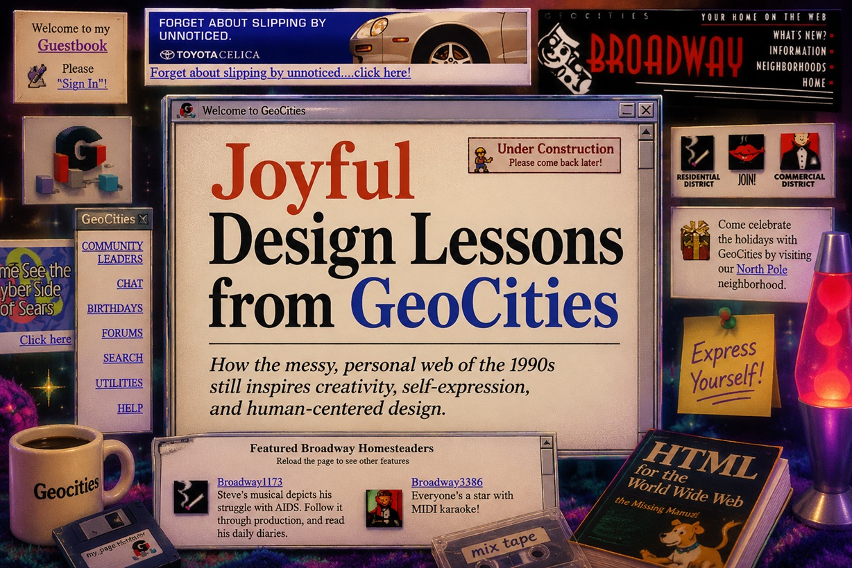
The early web was not clean, consistent or particularly easy to use. It flashed, scrolled, played music without permission and placed bright text over backgrounds that made reading almost impossible. Yet it also felt wonderfully alive. GeoCities, which launched in 1994, gave ordinary people one of their first opportunities to publish a website without paying for professional hosting or understanding advanced programming. At its height, it became one of the internet's most popular destinations, filled with personal pages about music, games, films, recipes, pets, hobbies and almost every interest imaginable.
Most of those websites would fail a modern design review. They had clashing colours, overloaded pages, confusing navigation and animated images scattered everywhere. Still, they possessed something many polished websites struggle to achieve today: a visible sense of personality.
GeoCities reminds us that good design is not only about consistency, speed and conversion. Sometimes it is also about giving people the freedom to make something that feels unmistakably their own.
The Web Was a Place to Introduce Yourself
A personal website in the 1990s often acted like a digital bedroom wall.
People decorated their pages with favourite bands, television characters, quotations, family photographs and lists of links. They added guestbooks for visitors, counters showing how many people had arrived and animated "Under Construction" signs to explain that the page was still evolving.
There was rarely a commercial objective behind any of it.
The page was not designed to collect leads, improve sales or keep visitors moving through a carefully planned funnel. It existed because someone wanted to share a part of themselves with the world.
That made each site feel personal, even when the design was technically poor.
A badly cropped image, an uneven title or a strange colour combination could reveal more about the creator than a perfectly configured template ever could. The imperfections became part of the identity.
People were not merely publishing content. They were learning how the web worked by making things in public.
The Joy Came From Ownership, Not Perfection
Many GeoCities users were not designers or developers. They learned HTML through experimentation, copied small pieces of code from other pages and discovered new techniques by selecting "View Source" in the browser.
There were no sophisticated visual builders showing exactly how the finished page would look. Users often edited text and markup, saved the file and refreshed the browser to see what had happened.
Sometimes it worked. Sometimes the entire layout collapsed.
That uncertainty was part of the experience.
Every successful change felt like a small discovery. Making text move across the screen or adding a new animated image could feel genuinely exciting because the creator had made the browser do something new.
The result might not have been elegant, but it carried the satisfaction of having been built by hand.
Modern platforms remove much of that friction, which is usually a good thing. However, they also remove some of the feeling that the page belongs entirely to the person who created it.
GeoCities users did not simply fill in a template. They shaped their own small corner of the web.
The Chaotic Style Was Not Entirely Intentional
The classic GeoCities look is often remembered as though everyone deliberately chose to create visually chaotic pages.
In reality, much of that style emerged from limitations.
Web design tools were primitive. CSS support was inconsistent, so layouts often depended on deeply nested tables, spacer images and transparent GIFs. A single change could affect the entire page in unpredictable ways.
Internet connections were also slow. Images had to be compressed aggressively so they could load over dial-up connections. Large photographs were impractical, which encouraged the use of tiny icons, repeating backgrounds and low-resolution animations.
Browsers did not always display code in the same way. A design that worked in one browser could break completely in another.
There was also no mature library of design patterns to follow. People were inventing the visual language of personal websites while using the tools for the first time.
The mess was not simply a rejection of good taste. It was what happened when millions of enthusiastic beginners explored a new medium without established rules.
GeoCities Became a Form of Digital Folk Art
Users frequently borrowed ideas from one another.
They copied HTML snippets, saved images from pages they admired and adapted layouts to suit their own interests. A particular animation might appear on hundreds of unrelated websites, but each creator placed it in a different context.
This produced something similar to folk art.
The creators were not necessarily professionally trained, and the work was not controlled by large design studios. Styles spread informally through observation, imitation and personal modification.
Animated flames, rainbow lines, rotating email icons, glowing buttons and sparkling text became part of a shared visual vocabulary.
Nobody needed to own the aesthetic. People simply took what inspired them and added something of their own.
That kind of creative exchange helped build the culture of the early web. The pages were individual, but they also felt connected to a wider community of people learning together.
Animated GIFs Made Pages Feel Alive
Animation was one of the defining features of GeoCities.
Small GIFs flashed, rotated, bounced and danced across the page. Visitors might encounter spinning planets, flying envelopes, skeletons, flames, stars, cartoon animals or the famous dancing baby.
These animations rarely served a practical purpose. They existed because movement on a webpage still felt remarkable.
Today, motion design is often used carefully to guide attention, confirm an action or make an interface feel smoother. GeoCities pages used animation much more freely.
Everything could move at once.
A welcome message might flash while a scrolling banner crossed the screen and an animated email icon encouraged visitors to get in touch.
From a usability perspective, it could be exhausting. From a creative perspective, it communicated excitement.
The creator was not merely displaying information. They were trying to make the page feel alive.
Backgrounds Were Part of the Personality
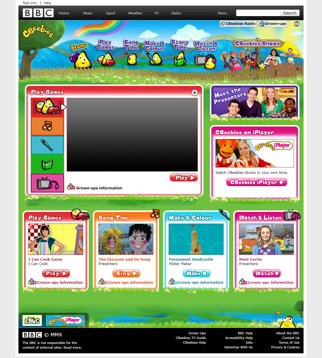
Repeating background images were another signature of the era.
Instead of using a plain colour, users covered their pages with stars, clouds, bricks, roses, chains, marble, water, flames or velvet curtains. A small image tile could repeat across the entire screen, producing a dramatic visual effect without requiring a large file.
Sometimes the pattern blended smoothly. Sometimes the edges were painfully obvious.
Readability was often secondary. Bright text might sit directly over an equally bright background, forcing visitors to highlight the paragraph just to understand it.
Yet the background immediately established the mood.
A science-fiction fan page might open against a galaxy. A gothic poetry page could use dark stone or red velvet. A family recipe collection might choose flowers, lace or textured paper.
The background was not simply decoration. It helped transform a generic browser window into a themed personal space.
Typography Was Loud, Colourful and Unapologetic
GeoCities typography ignored most modern rules.
Titles could contain a different colour for every letter. Text shifted between uppercase and lowercase. Decorative symbols appeared before and after headings, while multiple fonts competed for attention on the same page.
Comic Sans, Times New Roman and Impact became common not because they formed a carefully selected type system, but because they were available.
Users chose fonts according to mood rather than consistency.
The result was often difficult to read, but it was rarely anonymous. A title could immediately reveal whether the creator wanted the page to feel playful, dramatic, romantic or rebellious.
Modern design systems correctly emphasise legibility and consistency. However, GeoCities shows that typography can also communicate emotional energy.
Not every heading needs to feel as though it came from the same corporate template.
Music Turned Visiting a Website Into an Event
Many personal pages automatically played MIDI music as soon as they loaded.
The selected track could be a simplified version of a film theme, pop song, television soundtrack or game melody. Visitors were often given no obvious way to stop it.
By today's standards, autoplaying music is intrusive and frustrating. It can disrupt other audio, create accessibility problems and embarrass someone browsing in a quiet room.
But in the 1990s, sound helped make a webpage feel closer to a multimedia experience.
The creator was not only choosing what visitors would read and see. They were also deciding what atmosphere should accompany the page.
A fan page dedicated to a film might open with its main theme. A romantic homepage could play a popular ballad. A gaming page might include a MIDI recreation of its soundtrack.
It was technically limited, but emotionally ambitious.
The website tried to become a complete experience rather than a silent collection of text and images.
The Neighbourhood System Created a Sense of Place
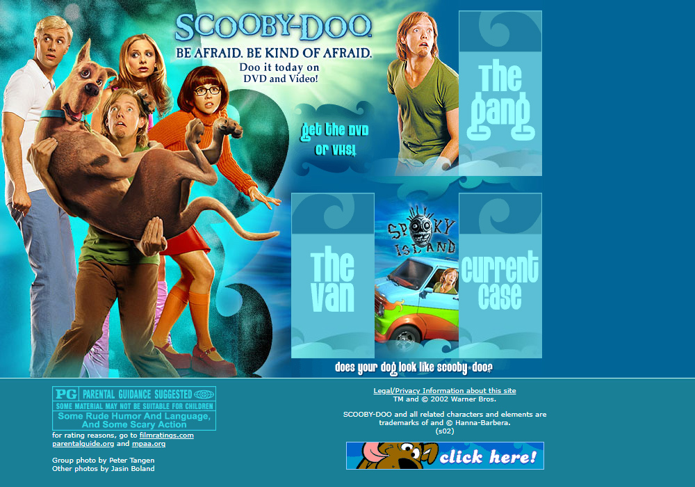
GeoCities organised personal websites into themed neighbourhoods.
Areas such as Area 51 attracted science-fiction and fantasy pages, while other neighbourhoods focused on entertainment, education, travel, food or particular lifestyles.
The idea made the web feel less like an endless collection of disconnected pages and more like a digital town.
Users were not merely given hosting space. They were given an address within a community related to their interests.
This sense of place encouraged browsing and discovery. A visitor might arrive at one fan page, follow a link to a neighbour and then spend an hour exploring websites created by strangers with similar interests.
Modern social platforms also organise people around communities, but the experience is different. Content now appears inside a platform-controlled interface, while GeoCities users designed the spaces themselves.
The neighbourhood connected the pages without forcing them to look the same.
The Early Web Encouraged Participation
GeoCities lowered the barrier to publishing at a time when the web still needed more content.
People needed a reason to visit the internet, but creators also needed evidence that someone might see what they published. Free hosting helped both sides of that problem.
Anyone with basic computer access could create a page without purchasing a domain, arranging server space or hiring a developer.
This accessibility turned internet users into internet creators.
A person who began by reading fan pages might soon build one. Someone who visited a recipe collection could create their own. Publishing became an activity rather than something reserved for companies, universities and technical experts.
The quality varied enormously, but that was part of the point.
The early web grew because people were allowed to experiment before they were experts.
Today's Web Is Better—and More Uniform
Modern websites are faster, safer and far easier to use.
Responsive layouts work across phones, tablets and desktop screens. Accessibility standards help more people navigate digital content. Professional templates allow small businesses to launch attractive websites without learning code.
These are genuine improvements.
However, the same tools that make design easier can also make the web feel repetitive.
A company chooses a template, replaces the photographs, adjusts the accent colour and publishes. The result is clean and functional, but it may resemble hundreds of other websites built with the same system.
Social media platforms go even further. Everyone publishes inside the same visual structure, with identity expressed mainly through profile images and content rather than through the design of the space itself.
The internet has gained consistency, but it has lost some of its visual unpredictability.
Many websites now feel professionally designed but emotionally interchangeable.
Polish Can Sometimes Remove Personality
Modern design often treats imperfection as something to eliminate.
Spacing must be consistent. Colours must belong to a defined palette. Buttons must match. Every page must follow the design system.
These rules improve usability, especially for large products. Yet they can also reduce the sense that a real person is behind the screen.
A hand-built page might contain odd decisions, but those decisions reveal taste, humour and enthusiasm.
The problem is not that modern websites are too usable. It is that usability and personality are sometimes treated as though they cannot exist together.
A site can be accessible, responsive and clear while still including unexpected illustrations, playful interactions, unusual typography or personal details.
GeoCities does not teach us to recreate its worst design habits. It teaches us not to design every human trace out of the experience.
Joyful Design Does Not Mean Copying the 1990s
Bringing GeoCities-style thinking into modern design does not require autoplaying music, unreadable backgrounds or ten animated GIFs above the fold.
The lesson is philosophical rather than visual.
Joyful design gives people room to express themselves. It allows surprise, humour and imperfection. It recognises that an interface can be emotionally engaging without becoming difficult to use.
A modern website could apply this through:
The aim is not chaos. It is character.
Designers Should Leave Space for the Amateur
One of the most important lessons from GeoCities is that creation should not belong only to professionals.
Modern tools often promise that anyone can build a website, but many still direct users towards a narrow set of approved layouts. The creator can change the content without changing the underlying personality of the platform.
A more open design tool would provide safe defaults while allowing people to break away from them.
It could help users maintain accessibility and responsive behaviour without forcing every page into the same visual system.
This balance is difficult, but worthwhile.
When tools allow meaningful personalisation, people become more emotionally invested in what they create. They are not simply filling out fields. They are building something that feels like theirs.
The Act of Making Was the Real Source of Joy
The appeal of GeoCities was never entirely about how the websites looked.
The deeper joy came from making something and knowing that anyone in the world could potentially find it.
A teenager could publish a game guide. A parent could create a family album. A group of friends could share recipes, stories or photographs. A fan could build an entire digital shrine to a favourite film.
These pages did not need large audiences to feel meaningful.
A few guestbook messages or a slowly increasing hit counter could be enough to show that someone had visited.
The creator had contributed something to the web, however small.
That sense of participation is harder to feel on modern platforms, where people publish into enormous feeds controlled by algorithms. Content may reach thousands of viewers, yet the space itself never truly belongs to the person posting.
GeoCities offered modest audiences but strong ownership.
Final Thoughts
The websites of 1990s GeoCities were loud, messy and frequently difficult to navigate. They also captured the optimism of a period when the web felt open to anyone willing to experiment.
Their value is not found in their flashing text, broken layouts or MIDI soundtracks. It lies in the freedom they gave people to express identity, form communities and learn by creating.
Modern web design has solved many of the early internet's technical problems. It should not also remove the sense of play that made people excited to build online in the first place.
The best lesson from GeoCities is simple: a website does not have to be perfect to feel meaningful.
Good design should help people understand and use an interface. Joyful design goes one step further—it gives them something to remember.











Comments 0