

A logo can be redesigned. A color palette can be adjusted. A visual style can be refreshed over time. But changing a brand's main typeface years after launch is much harder.
Typography sits deep inside a brand system. It appears in the logo, website, brochures, packaging, presentations, social media graphics, advertisements, app interfaces and internal documents. Once a brand has used the same typeface for years, changing it can become expensive, time-consuming and risky.
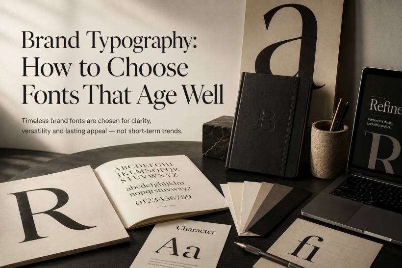
That is why choosing the right brand typography from the beginning matters. A good brand font should not feel fashionable for only one or two years. It should age well, remain functional across different platforms and continue to support the brand even as design trends change.
The best typography does not shout the year it was chosen. It quietly helps the brand feel consistent, professional and trustworthy.
Why Timeless Typography Matters
Typography is one of the most visible parts of a brand identity, even when people do not consciously notice it.
A typeface can make a brand feel premium, friendly, serious, modern, traditional, technical or playful. The problem is that many brands choose fonts based on what looks stylish at the moment, without thinking about how the font will feel five or ten years later.
Trendy fonts can work well for short-term campaigns. They can make a launch, event or seasonal promotion feel fresh. But they are risky as the foundation of a long-term identity.
A brand's primary typeface needs to survive changing trends. It must still look appropriate when design tastes move on, when the company expands, and when the brand appears in new formats that may not exist today.
The Difference Between Trendy and Timeless Fonts
Trendy typefaces usually have a very obvious design signature. They are popular for a short period, appear across many brands, then quickly begin to feel overused.
This has happened many times before. Condensed sans-serif fonts had their moment. Extreme geometric typefaces became common. Retro-inspired display fonts also return every few years before fading again.
These fonts are not necessarily bad. They simply work better for temporary use than permanent brand systems.
Timeless typefaces behave differently. They tend to be:
• Flexible enough for both print and digital use
• Neutral enough to support different brand messages
• Proven across many years or decades
• Distinctive without depending on a gimmick
A timeless typeface does not need to look boring. But its character should come from balance, proportion and usability rather than novelty.
Familiarity Is Not a Weakness
Many brands wrongly assume that a font must look unusual to be memorable. In reality, the most durable brand typography is often familiar.
Familiarity helps people read quickly, understand easily and feel comfortable with the brand. This is especially important for brands that need to communicate clearly across many touchpoints.
A typeface does not need to do all the branding work by itself. The brand can still feel distinctive through layout, spacing, color, imagery, tone of voice and how the typography is applied.
In other words, the font does not always need to be the loudest part of the identity. Sometimes its job is to stay out of the way and let the message come through.
Proven Typefaces That Continue to Work
Some typefaces have remained relevant for decades because they are practical, flexible and well-built. They may not always feel exciting, but that is exactly why they last.
Helvetica, released in 1957, remains one of the most widely used sans-serif typefaces in the world. Its strength is neutrality. Brands that use Helvetica are not trying to make typography the star. They are using it as a clean foundation.
Garamond has been used for centuries and still carries a sense of elegance, tradition and refinement. It works especially well for brands that want to communicate heritage, education, luxury or editorial authority.
Futura, released in 1927, brings geometric clarity and modern energy. It has roots in the Bauhaus era, but still feels relevant because its structure is simple and confident.
Times New Roman is often dismissed because it is so common, but it remains highly readable, especially in dense text. For newspapers, legal services, academic publishing and document-heavy brands, it can still be a strong option.
Akzidenz-Grotesk, which predates Helvetica, offers neutrality with slightly more human character. It has a practical, understated quality that continues to work across many design systems.
These are not the only good choices. But when choosing a different typeface, brands should be able to explain the decision strategically, not just aesthetically.
What Makes a Typeface Age Badly
Some font choices begin to feel dated because they rely too heavily on novelty.
A typeface may look fresh at launch because of one unusual detail, but that same detail can become annoying after repeated exposure. This is especially true when many brands adopt the same visual style at the same time.
Several characteristics tend to date quickly:
• Overly unusual letter shapes
• Aggressively condensed proportions
• Retro display styles tied too strongly to one decade
• Decorative curves or gimmicks that dominate the design
The common issue is that these fonts depend on surprise. But surprise fades. Once the novelty wears off, the font may feel tired or overly connected to a specific period.
This is why novelty is dangerous for primary brand typography. What feels distinctive today may feel outdated tomorrow.
The Versatility Test Every Brand Should Use
A brand font must work in many places, not just in a beautiful presentation mockup.
It may appear on a website, mobile app, billboard, printed brochure, business card, packaging label, social media graphic, embroidered shirt, trade show banner or digital ad. Each format has different limitations.
Before choosing a typeface, test it in real situations.
Try it at very small sizes. Use it on a low-resolution screen. Place it on a dark background. Print it on paper. Use it in all caps. Use it in sentence case. Test it in long paragraphs. Test it in short headlines. If your brand operates internationally, test accents and special characters such as é, ñ and ü.
A strong primary brand typeface should remain clear and usable in all these conditions. If it only works in large headlines but fails in small text, it may be better suited as a secondary display font.
A Brand Font Must Work Across Different Emotions
Another important test is whether the typeface can support different moods.
A brand may need to sound confident in a sales campaign, calm in a customer support message, serious in a legal notice and warm in a social media post. If the font only supports one emotional tone, it may limit the brand later.
This matters because brands evolve. A startup may begin with a playful identity, then later need to look more mature as it enters enterprise markets. A healthcare brand may need to be both approachable and professional. A financial brand may need to be modern without losing trust.
The best typefaces have enough range to grow with the brand.
Customization Can Add Identity Without Sacrificing Longevity
A brand does not always need a fully custom typeface. Custom fonts can be expensive to design, maintain and implement.
However, small customizations can help make an existing typeface feel more ownable.
A brand might adjust certain letterforms, refine spacing, create a custom ligature or develop a slightly modified version of a standard typeface. These changes can make the typography feel more specific without turning it into something strange.
The key is restraint.
The goal is not to invent a completely new alphabet. The goal is to create subtle distinction while keeping the font usable, readable and future-proof.
Over-customization can create the same problem as trendy typography. If the font becomes too unusual, it may age badly or become difficult to use across different applications.
Testing Against Competitors
Typography should also be evaluated in context.
A font may look strong on its own, but the real test is how it performs beside competitors. Brands do not appear in isolation. They appear on search results, social feeds, shelves, trade shows, proposal documents and advertisements next to other companies.
Collect competitor materials and compare them directly. Set similar headlines using your candidate typeface and place them beside competitor examples.
Ask practical questions:
• Does it communicate the right level of trust, energy or authority?
• Does it look too similar to competitors?
• Does it fit the category while still feeling distinctive?
The goal is not to be different just for the sake of being different. The goal is to be appropriately distinct.
A law firm should not look like a toy company. A fintech brand should not accidentally feel like a fashion label. A children's brand should not use typography that feels cold or institutional.
Primary Fonts and Secondary Fonts Should Have Different Jobs
A strong typography system usually has more than one typeface or font style.
The primary typeface should be the reliable foundation. It should handle everyday communication, body text, UI labels, menus, documents and general brand messaging.
A secondary typeface can carry more personality. It can be used for headlines, campaigns, quotes, packaging highlights or special creative moments.
This balance allows the brand to feel expressive without making the entire identity dependent on a risky font choice.
Think of the primary typeface as the brand's everyday voice. The secondary typeface can be the accent, but it should not carry the whole identity alone.
Digital Performance Matters More Than Ever
A typeface that looks beautiful in print may not work well on screens.
Modern brands need fonts that perform across websites, apps, email, social media and digital advertising. That means the font must render clearly on different browsers, screen sizes and operating systems.
It should also load efficiently. A font family with too many weights and styles can slow down a website if not handled properly. For digital-first brands, performance is part of the typography decision.
Good brand typography should look good, read well and function smoothly.
The Bottom Line
Brand typography is a long-term decision. Choosing a font only because it looks cool today almost guarantees that it will feel dated later.
The better approach is to choose a typeface that is functional, flexible and proven. It should work across different platforms, support different kinds of messaging and remain clear in both small and large applications.
Avoid novelty as the main foundation. Use personality carefully. Test the typeface in real-world conditions before committing to it.
The best brand typography often goes unnoticed. People may not comment on the font, but they feel the result. The brand feels trustworthy, consistent, professional and right.
That feeling is the real goal. The font is simply the tool that helps create it.


Comments