

Ever notice how a simple tap in a good mobile game feels weirdly satisfying? You press a button and it gives a tiny bounce. A menu slides in like it has weight. A wrong move triggers a subtle shake that says "nope" without yelling at you. None of that is random flair. It's deliberate feedback. And it's one of the biggest reasons games feel "alive" while a lot of everyday apps feel… stiff.
Micro-animations aren't just decoration. They're communication. They tell users what just happened, what to do next, and whether the system is paying attention.
The 300-Millisecond Moment Your Brain Cares About
Micro-animations usually live in the blink-and-you-miss-it range, roughly a couple hundred milliseconds to about half a second. That sounds tiny, but it's exactly where your brain forms confidence.
When something responds instantly and clearly, you feel in control. When it doesn't, you start doubting:
Did it register?
Did I tap the right thing?
Is it loading or frozen?
Do I press again?
Games are ruthless about this. They know hesitation kills momentum. So they patch that hesitation with motion: quick, clear, readable responses that keep you moving forward. And it's not only about information. It's also emotion. A health bar pulsing when you're low doesn't just "inform" you. It adds urgency. It changes how you feel in that moment.
Why Game Interfaces Feel Better Than Most "Serious" Apps
Gaming UI isn't magical because it moves. It's better because the movement has a job. In great game interfaces, animation usually does one (or more) of these things:
• Signals a state change (something is now active, disabled, selected, low, dangerous)
• Guides attention (look here next)
• Builds anticipation (something good is about to happen)
• Softens failure (error feedback without harsh popups)
That's why even simple menus in polished games feel premium. The interface doesn't just show you options. It reacts to you like it's part of the world.
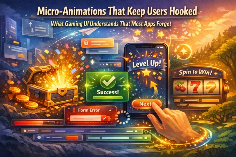
The "Loot Box Effect": Anticipation, Payoff, Repeat
Loot boxes are controversial, sure, but from a motion design perspective they're a masterclass in pacing. The opening sequence is rarely instant. It's staged:
A glow starts.
The box shakes.
There's a pause.
Then the reveal.
That's animation psychology doing its thing: anticipation makes the outcome feel bigger than it technically is. The prize doesn't change, but your experience of getting it does.
You don't need loot boxes in your app (please don't). But you can borrow the same pacing idea for moments that matter: rewards, achievements, confirmations, successful submissions, "saved" states, anything that benefits from a tiny sense of payoff.
Onboarding Without the Boring Tutorial Wall
Mobile games are shockingly good at teaching players without making them read.
Instead of dumping instructions, they use motion to nudge:
A button gently pulses.
A highlight slides toward the next step.
A sparkle appears where you should tap.
A tiny celebration happens when you do it correctly.
That's onboarding that doesn't feel like onboarding. It feels like progress.
Most SaaS apps and websites still rely on tooltips and long helper text. But motion can reduce the need for both by showing "this is interactive" and "this is what happens next" in a way humans understand instantly.
Speed Is the New Spectacle
Here's the big shift: people don't want longer animations. They want faster feedback.
In 2026, users are impatient in a very specific way: they'll tolerate processing time if the interface responds immediately. Even if the action takes a second, you can still give an instant micro-response that says "got it, working on it."
That quick acknowledgment builds trust. It signals competence. It prevents rage-clicking. It keeps people from abandoning a task because they think nothing happened.
But there's a trap here.
If everything animates all the time, your interface turns into a noisy arcade cabinet. Motion becomes visual clutter. The gaming rule still applies: every animation needs a purpose.
How to Borrow Gaming Micro-Animations Without Turning Your App Into a Carnival
You don't need particles, fireworks, or dramatic zooms. You need a small set of motion patterns that consistently communicate.
1) Reward small wins
When users finish something, let them feel the completion. A subtle "success" motion can make routine tasks feel smoother:
• A tiny confirmation pulse near the action
• A quick transition from "saving…" to "saved"
• A gentle highlight that fades out once complete
It shouldn't scream "congratulations." It should quietly say "nice, done."
2) Use motion to teach behavior
Want people to notice what's clickable, draggable, or expandable?
Don't write an essay next to it. Use a minimal nudge:
• A card lifts a bit on hover to suggest it's selectable
• An accordion arrow rotates to show expanded state
• A tab indicator slides so the relationship is obvious
Motion can teach patterns faster than text ever will.
3) Make errors helpful, not hostile
Games rarely slap you with a brutal modal that stops everything. They point to the problem quickly and let you keep going.
In apps, small error micro-animations can reduce frustration:
• The error message fades in near the input (not at the top of the page)
• The problematic area highlights briefly, then calms down
It's the difference between "you messed up" and "this part needs attention."
4) Respect accessibility and reduced motion
Some users are motion-sensitive, and many operating systems include "Reduce Motion" preferences. Good UI motion isn't just pretty, it's considerate.
That means:
• Avoid large sweeping movements that shift the whole screen
• Keep motion short, subtle, and informative
Games learned this because players demanded it. Apps should treat it as standard craftsmanship.
The Real Point: It's Not Flash, It's Feel
A great interface isn't defined by how it looks when it's idle. It's defined by how it behaves when you touch it. Micro-animations make the system feel responsive. They reduce uncertainty. They guide attention. They turn "I clicked a thing" into "the system understood me." And when users feel understood, they stay longer. They trust more. They come back.
That's the lesson gaming UI has been teaching for years: the tiny moments aren't tiny at all. They're the experience.


Comments