

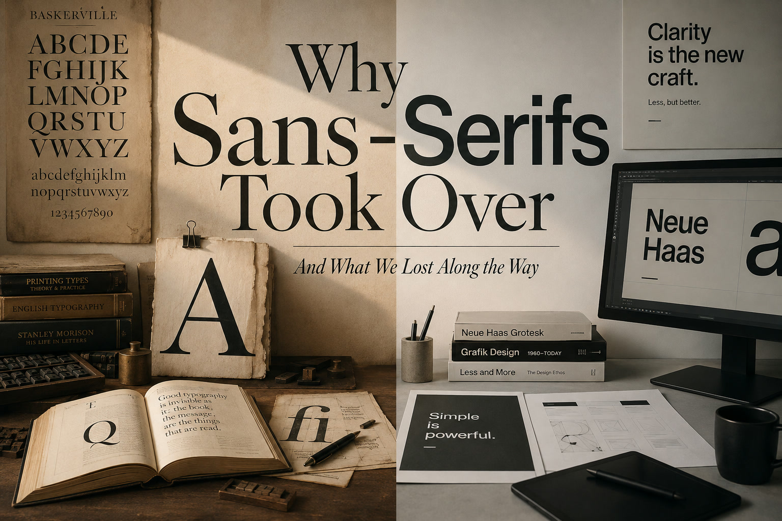
Typography has changed dramatically over the past century. There was a time when serif typefaces were almost automatically associated with serious communication. Books, newspapers, academic publications, legal documents and formal correspondence overwhelmingly relied on serif fonts because they were familiar, readable and deeply connected to the history of printing.
Today, the situation is almost reversed. Sans-serif typefaces dominate corporate identities, websites, mobile applications, operating systems, public signage and technology products. For many designers, choosing a sans-serif is no longer treated as a stylistic decision at all. It has simply become the default.
That shift did not happen by accident. It was shaped by modernist design movements, changing cultural attitudes, the rise of corporate branding and, perhaps most importantly, the transition from printed pages to digital screens. Sans-serifs solved many practical problems along the way, but their dominance also came with a cost. As typography became cleaner and more universal, some of its individuality, warmth and character gradually disappeared.
Serifs Once Defined Serious Communication
For centuries, serif typography was closely associated with reading. The small strokes attached to the ends of letters were not merely decorative flourishes. They were part of a highly refined system of letterforms developed through handwriting, engraving, metal type and eventually modern printing.
Readers became accustomed to seeing serif fonts in books and newspapers, so the style naturally acquired strong cultural associations. A page set in serif type immediately felt established, authoritative and literary. It suggested that the content was intended to be read carefully rather than glanced at quickly.
This historical familiarity still influences how we perceive typography today. A traditional serif can make a law firm feel more established, a newspaper more authoritative or a luxury brand more sophisticated before the reader has consciously processed any of the words.
Modernism Changed the Direction of Typography
The rise of sans-serif typography was closely connected to the broader modernist movement of the early 20th century. Designers and architects increasingly rejected ornamentation in favour of simplicity, clarity and function. The Bauhaus philosophy, in particular, promoted the idea that design should remove anything unnecessary and allow function to determine form.
Sans-serif typography fitted perfectly into that philosophy. By removing decorative terminals and simplifying letterforms, designers created typography that appeared rational, efficient and contemporary. It represented a clear break from the historical traditions associated with serif fonts.
This was not simply an aesthetic preference. Sans-serifs came to represent an entirely different attitude toward communication. Instead of typography carrying historical personality, the goal was often to make it as direct and universal as possible.
Helvetica Helped Turn Neutrality Into a Strength
By the middle of the 20th century, typefaces such as Helvetica had become enormously influential. Helvetica was particularly attractive because it could appear relatively neutral. It did not strongly suggest luxury, tradition, playfulness or craftsmanship. Instead, it functioned as a clean visual container for information.
That neutrality made it incredibly useful for corporations, governments, transportation systems and international organisations. A single typeface could work on everything from directional signs to packaging, advertisements and corporate documents.
For large brands, this consistency was valuable. Highly expressive typography could sometimes compete with the identity of the company itself, while a restrained sans-serif allowed other elements such as colour, photography and layout to carry more of the branding.
Over time, this neutrality became closely associated with professionalism. Eventually, many organisations began choosing sans-serif fonts not because a particular communication problem demanded one, but because sans-serif typography had become synonymous with looking modern and corporate.
Digital Screens Accelerated the Shift
The arrival of computers dramatically strengthened the case for sans-serif typography. Early screens had extremely low resolutions compared with the displays we use today. Letterforms had to be rendered using limited grids of pixels, and delicate typographic details did not always survive the process.
Fine serifs could blur or disappear entirely. Thin-and-thick stroke contrasts could become uneven, and small serif fonts were sometimes difficult to render clearly. Sans-serif typefaces, with their simpler shapes and more consistent strokes, were far better suited to those technological limitations.
As computers became more common, sans-serif typography naturally became associated with digital interfaces. Software menus, operating systems, websites and later mobile applications increasingly relied on clean, simple letterforms because they remained readable at small sizes.
Once millions of people became accustomed to seeing sans-serif typography every time they interacted with technology, the association between sans-serifs and modernity became even stronger.
Smartphones Made Sans-Serifs the Digital Default
The smartphone era pushed the trend even further. Mobile interfaces have to present a large amount of information within a very small physical space. Text competes constantly with icons, images, buttons, notifications and interactive controls.
Sans-serif fonts work extremely well in these environments because they can remain clear even at small sizes. Their relatively simple shapes allow designers to create clean visual hierarchies without adding unnecessary complexity to already crowded screens.
Operating systems adopted them extensively, application designers followed, and websites increasingly mirrored the visual language of mobile interfaces. Before long, sans-serif typography was everywhere.
The interesting part is that the design decision gradually became invisible. Instead of asking whether a sans-serif was appropriate for a particular project, designers often started with the assumption that digital design simply meant sans-serif typography.
The Original Technical Limitations Have Mostly Disappeared
Many of the technological arguments that originally favoured sans-serif fonts are far less important today. Modern displays have incredibly high pixel densities, and even very small typographic details can be reproduced with impressive clarity.
Modern browsers also support sophisticated font rendering, variable fonts, optical sizing and advanced typographic controls that were unimaginable during the early years of web design. Serif typefaces that would once have looked muddy or uneven on a computer monitor can now appear beautifully sharp.
In other words, designers are no longer forced to avoid serifs because of screen limitations.
Yet the habits established during those earlier technological periods remain. Sans-serif typography continues to dominate because designers and users have spent decades becoming accustomed to it.
Minimalism Turned Simplicity Into an Aesthetic
Another major reason for the dominance of sans-serifs is the continuing popularity of minimalism. Modern technology brands frequently communicate through generous whitespace, restrained colour palettes, simple icons and clean typography.
The goal is usually to create an impression of simplicity. A minimal interface suggests that the product itself is straightforward, organised and easy to use. Sans-serif typography supports this message exceptionally well.
The problem begins when minimalism stops being a deliberate design choice and becomes a formula.
When technology companies, banks, fashion brands, startups and even government agencies begin using similar typefaces, similar spacing and similar visual systems, their identities start to blur together. The designs may all look polished, but they also begin to look remarkably alike.
We Gained Consistency but Lost Some Individuality
One of the biggest things lost through the widespread adoption of neutral sans-serifs is typographic individuality.
Serif typefaces can communicate dramatically different personalities. A traditional old-style serif can feel warm and literary. A high-contrast Didone can immediately suggest fashion or luxury. A heavy slab serif can feel industrial and confident, while a transitional serif can communicate authority without becoming overly formal.
These differences allow typography itself to become part of the brand's identity.
Sans-serif typefaces certainly have personalities too. A geometric sans-serif feels very different from a humanist one, and a grotesque carries different associations again. The problem is that many contemporary brands gravitate toward a relatively narrow range of clean, neutral sans-serifs.
As a result, typography often becomes less expressive. Designers then have to rely more heavily on colour, photography, illustration and layout to make the brand distinctive.
Corporate Logo Redesigns Show the Problem Clearly
This trend is particularly obvious when looking at modern logo redesigns. Many companies have replaced distinctive lettering with increasingly simplified sans-serif wordmarks.
The practical reasoning is understandable. Simpler logos scale easily. They remain readable on small smartphone screens. They reproduce consistently across websites, social media, packaging and advertising.
But simplification can also remove personality.
When multiple companies redesign themselves using similar geometric or neo-grotesque sans-serifs, the logos can begin to feel interchangeable. What has technically become cleaner may also become less memorable.
A logo is not successful simply because it works perfectly at 16 pixels wide. It also needs to create recognition and emotional association.
Serifs Can Give a Design Character Immediately
Typography communicates emotion surprisingly quickly. Readers may not consciously analyse the typeface, but they instinctively respond to its visual character.
Consider the same sentence displayed in several different fonts. The words remain identical, yet the emotional tone changes.
A traditional serif might feel scholarly or dependable. A refined high-contrast serif may suggest elegance and luxury. A slab serif can feel bold and industrial. A geometric sans-serif might communicate precision and modernity, while a rounded sans-serif can feel friendly and informal.
Typography therefore behaves almost like a visual tone of voice.
When designers remove expressive typographic choices in pursuit of neutrality, they are not eliminating personality entirely. They are simply choosing the personality of restraint.
Readability Is More Complicated Than Serif Versus Sans-Serif
One of the traditional arguments in favour of serif typography is that serifs can support sustained reading. The small terminals may help strengthen the horizontal rhythm of text and make certain letterforms more distinguishable from one another.
For example, lowercase l, uppercase I and the number 1 can sometimes look remarkably similar in poorly designed sans-serif fonts. A serif typeface often differentiates these characters more clearly.
However, it would be inaccurate to claim that serif typography is always more readable.
Readability depends on many factors, including:
A poorly designed serif can be much harder to read than a carefully designed sans-serif. Likewise, many modern humanist sans-serifs have excellent letter differentiation and are extremely comfortable for long-form reading.
The important lesson is that readability should be tested within the actual context rather than assumed based purely on classification.
Interfaces and Long-Form Reading Are Different Problems
Another reason the serif-versus-sans debate often becomes oversimplified is that typography serves very different purposes depending on the context.
A navigation menu is not the same design problem as a 3,000-word article.
Interface typography needs to remain compact, predictable and easy to scan. Labels, buttons and menu items usually benefit from letterforms that do not demand much visual attention. Sans-serif fonts are exceptionally good at this.
Long-form editorial content has different requirements. Readers need a comfortable visual rhythm that remains pleasant across hundreds or thousands of words. Serif fonts have traditionally performed extremely well in this environment.
That does not mean every article should use a serif. It simply means that the typography selected for a button does not automatically have to become the typography used everywhere else.
Serifs Still Carry a Sense of Authority
Typography also carries cultural memory.
Serif fonts remain strongly associated with institutions that existed long before the digital era: newspapers, universities, publishers, courts, libraries and government documents.
That history gives them a particular kind of authority.
This is one reason many newspapers continue using serif typography for editorial headlines or article text even when their surrounding website interfaces rely heavily on sans-serifs. The difference helps separate the content from the interface.
Similarly, a financial institution that wants to emphasise longevity and stability may deliberately choose a serif rather than adopting the same visual language as a technology startup.
The typography becomes part of the message.
Serifs Can Bring Warmth Back Into Digital Design
Sans-serif typography often communicates precision and efficiency. Serif typography can communicate craft and humanity.
Traditional serif letterforms evolved from handwriting, calligraphy and carved inscriptions. Their shapes frequently contain greater variation in stroke width, curve and proportion. Even when produced digitally, these characteristics can make them feel less mechanical.
That warmth can be especially valuable in contemporary digital environments, where so many interfaces are built from perfectly aligned grids, neutral colours and standardised components.
A carefully chosen serif can immediately make a website or application feel more editorial, personal or intentionally crafted.
In a digital world increasingly shaped by automation and generative content, that human quality may become more valuable rather than less.
Neutral Typography Is Still a Design Statement
One common misconception is that using a clean sans-serif somehow removes style from the equation.
It does not.
A neutral-looking sans-serif still communicates particular qualities. It can suggest technology, efficiency, modernity, professionalism, simplicity or corporate restraint.
Those are just as much stylistic associations as heritage, warmth or luxury.
Choosing a typeface such as Helvetica, Inter or another restrained sans-serif is therefore still a design decision. The mistake is assuming that because the typeface looks neutral, no meaningful decision has been made.
There is no completely neutral typography.
Every typeface communicates something.
The Problem Is Not Sans-Serifs — It Is Automatic Choice
Sans-serif typography deserves its popularity.
It is versatile, adaptable and extremely effective in modern interfaces. Some of the most successful design systems in the world depend heavily on sans-serif families.
The problem appears only when designers stop asking why they are using one.
If every project begins with the assumptions that modern design means minimalism and minimalism means sans-serif typography, the designer has already restricted the available visual language before solving the actual communication problem.
The goal should not be to reject sans-serifs.
The goal should be to choose them deliberately.
Serif Typography Is Quietly Returning
Interestingly, serif typography has been making a noticeable return across contemporary design.
Luxury brands continue to use it extensively because it can communicate elegance and heritage. Editorial websites are increasingly pairing serif headlines or body copy with sans-serif navigation. Independent brands are adopting expressive serif families precisely because they want to stand apart from highly minimal competitors.
Even technology-oriented companies occasionally use serifs for major headlines to create more personality and contrast.
This does not represent a return to old-fashioned design.
Instead, it reflects the fact that modern screens and web technologies now allow designers to use a much broader typographic vocabulary without sacrificing clarity.
Digital design no longer has to mean typographic simplicity.
Serif and Sans-Serif Work Extremely Well Together
Designers do not need to treat serif and sans-serif typography as opposing camps. In many cases, the strongest typographic systems use both.
A sans-serif can handle functional interface elements such as:
A serif can then provide contrast through:
This combination creates a natural hierarchy. The sans-serif handles functionality while the serif gives the content a more distinctive voice.
Publishers and magazines have used this relationship successfully for decades, and digital products can benefit from the same principle.
Typography Should Solve a Communication Problem
Rather than beginning with a preferred font category, designers should first ask what the project needs to communicate.
Does the design need to feel modern and efficient? A sans-serif may be appropriate.
Does it need to communicate heritage, authority or craftsmanship? A serif might be stronger.
Does the product need functional clarity while its editorial content requires more personality? Use both.
The decision should come from the communication objective rather than from design fashion.
Typography becomes much more powerful once it is treated as part of the message instead of merely the mechanism used to display the words.
Defaults Are Useful Until We Forget Why They Became Defaults
Defaults save time and provide consistency. They are especially important within large design systems where every screen cannot reinvent its visual language.
But defaults become limiting when designers forget why those choices were originally made.
Sans-serif typography became dominant for legitimate reasons. Modernist designers valued functional simplicity. Corporations needed scalable visual identities. Early digital screens favoured simple letterforms. Mobile interfaces rewarded clarity at small sizes.
Those circumstances shaped modern typography.
Today, however, many of the original technical limitations no longer exist. Designers have better screens, better browsers, better font technology and a much wider selection of professionally designed typefaces.
There is more freedom available than ever before.
The challenge is remembering to use it.
Final Thoughts
Sans-serif typography did not take over because serif fonts suddenly stopped working. It became dominant because it matched the needs of a changing world built around modernism, corporate identity, digital screens, mobile interfaces and minimalist design.
Those strengths remain completely valid.
What we lost was not necessarily readability or functionality. What we lost was some of the willingness to let typography carry personality.
As branding became cleaner, companies often became visually more similar. As interfaces became more consistent, typography increasingly faded into the background. And somewhere along the way, designers sometimes forgot that a typeface can communicate authority, emotion, heritage and character before the reader has processed a single word.
The choice therefore should never simply be serif versus sans-serif.
Use a sans-serif when clarity, neutrality and efficiency support the message. Use a serif when personality, warmth, history or authority are important. Combine them when contrast creates a stronger hierarchy.
The typographic toolbox is far richer than a single default choice.
Good typography begins when the designer remembers to actually choose.











Comments 0