

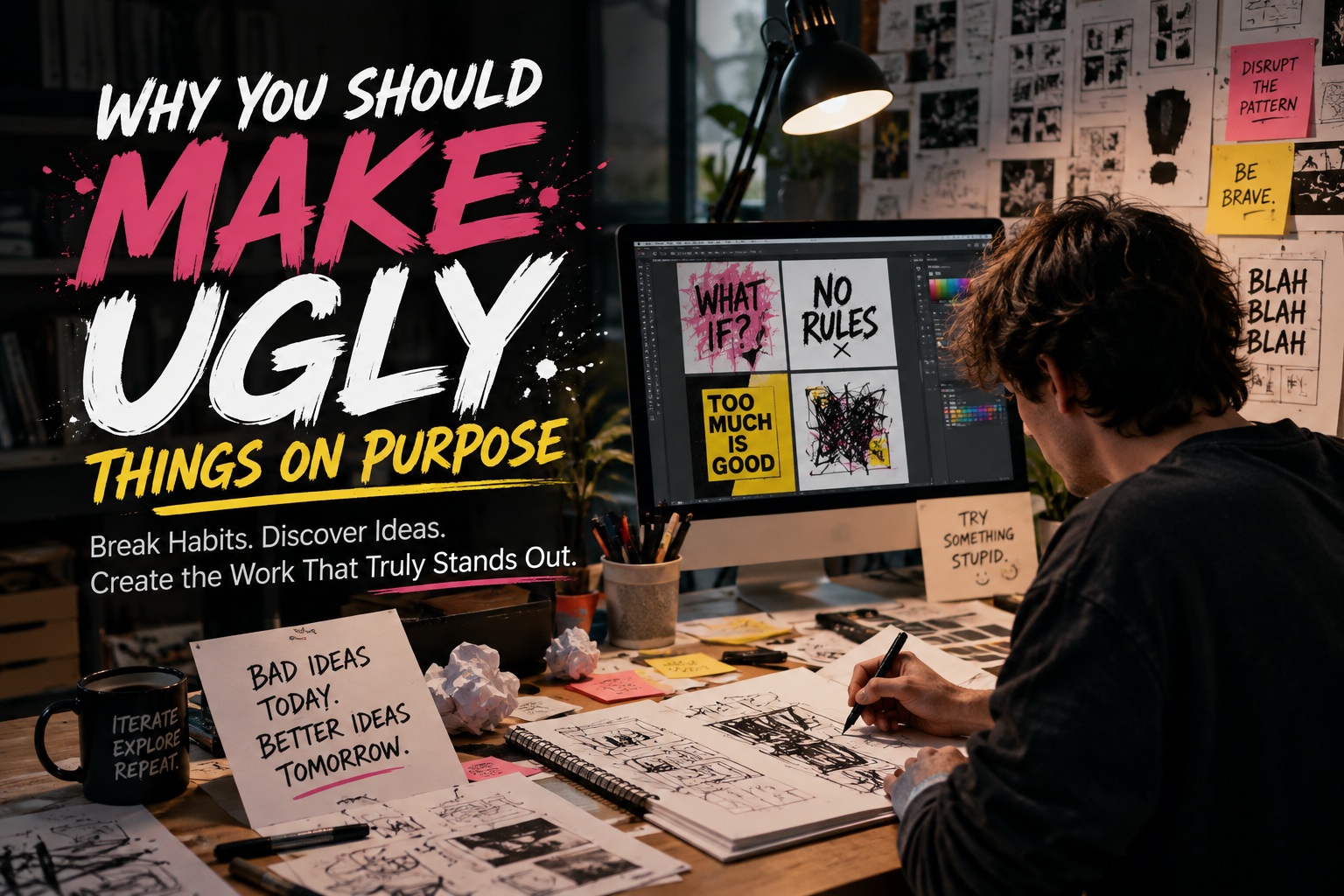
There is a strange pressure that follows almost every creative professional: whatever you make should look good. Designers feel it especially strongly. A logo, website, poster, interface or illustration is rarely treated as just another experiment. Once it is shown to someone else, it becomes part of your reputation. People judge your taste, your ability and sometimes even your professionalism based on a single piece of work.
That pressure can be useful because it encourages higher standards. But taken too far, it can quietly damage the creative process.
When every idea has to look polished from the beginning, experimentation starts disappearing.
You stop making things to discover what might happen and begin making things only when you already know they will probably look acceptable.
That is where deliberately creating something ugly can become surprisingly useful.
Not because bad design should be celebrated, but because ugly work gives you permission to explore without immediately worrying about whether the result deserves to be shown to anyone.
Sometimes the fastest route to something beautiful begins with something genuinely terrible.
The Problem With Trying to Make the First Version Perfect
One of the easiest ways to become creatively stuck is to expect the first attempt to already resemble the finished product.
You open Photoshop, Illustrator, Figma or whatever tool you use and immediately start thinking about whether the typography looks professional, whether the colours work together and whether the layout feels balanced.
Before long, you may have spent twenty minutes adjusting something that should have been nothing more than an experiment.
The problem is not lack of skill.
It is that your internal critic has arrived far too early.
You start asking:
Those questions matter eventually.
They just do not necessarily belong at the beginning.
The first version only needs to answer one question:
Does this idea have potential?
Everything else can come later.
An Ugly First Draft Is Still Progress
Writers often talk about the importance of producing a rough first draft.
Designers should probably think the same way.
The first layout can be awkward.
The first colour palette can look horrible.
The first interface can have terrible spacing.
The first illustration can be embarrassing.
None of that matters if the purpose of the first attempt is simply to turn an idea into something visible.
Once something exists, you can react to it.
You can say:
"This part works."
"This feels too crowded."
"That colour combination is awful."
"The composition is interesting, but the typography is wrong."
"This looks ridiculous, but strangely I like that section."
That feedback is impossible when the idea exists only inside your head.
You Cannot Improve Something That Does Not Exist
Perfectionism often disguises itself as quality control.
You tell yourself you are waiting until you have the right idea.
But sometimes what you are really doing is avoiding the uncomfortable stage where the work looks unfinished.
Creative work almost always looks bad before it looks good.
A website can look terrible before the grid is refined.
A logo can look childish before its geometry is cleaned up.
An illustration can look messy before the composition develops.
A user interface can look completely unbalanced before the hierarchy becomes clear.
The ugly stage is not necessarily evidence that the idea has failed.
It may simply mean that the idea is still becoming something.
That distinction is important.
Designers Naturally Build Habits
Experience makes designers faster.
Over time, you discover what works.
You develop favourite typefaces.
You know which spacing feels comfortable.
You remember which colour combinations usually succeed.
You develop preferred grid systems, visual styles and compositions.
These habits are extremely useful.
They allow experienced designers to create good work quickly without solving every design problem from the beginning.
But there is a downside.
The tools that make you efficient can eventually make you predictable.
You may start reaching automatically for:
The work may still look good.
It may simply stop feeling surprising.
Ugly Experiments Interrupt Your Automatic Decisions
Deliberately making something ugly forces you away from your usual instincts.
Try the colour combination you normally hate.
Use the typeface you would usually reject immediately.
Make the heading absurdly large.
Break the grid.
Move everything off centre.
Use too much spacing.
Use almost no spacing.
Create a layout that looks completely wrong.
Most of those experiments probably will fail.
That is the point.
You are not searching for a finished design.
You are testing the boundaries of what might work.
Occasionally, something unexpected happens.
Perhaps an exaggerated type scale creates an interesting hierarchy.
Maybe two colours that look terrible individually somehow work together in a particular composition.
Perhaps breaking the grid creates the energy the original design was missing.
You would never have discovered those possibilities if every decision had been filtered through your existing definition of "good design."
Surprise Usually Lives Outside Your Comfort Zone
One reason creative work becomes repetitive is that designers naturally avoid uncertainty.
Once you know a technique works, using it again feels safe.
There is nothing inherently wrong with that. Clients often pay for reliability.
But personal development requires occasional uncertainty.
If you always know exactly what the finished piece will look like before you begin, you may not really be exploring anymore.
You may simply be executing.
Experimentation is different.
Sometimes you begin without knowing whether the result will work at all.
That creates room for surprise.
And surprise is often where new ideas come from.
Breaking Design Rules Helps You Understand Them
Design education teaches rules for good reasons.
Contrast helps readability.
Alignment creates order.
Whitespace improves clarity.
Consistent typography creates hierarchy.
Grid systems help organise information.
These principles are valuable.
But following rules without ever questioning them can turn design into formula.
One interesting exercise is to intentionally violate a rule and observe what happens.
For example, try:
Sometimes the result will prove exactly why the rule exists.
That is useful.
Other times, you may discover that what you assumed was a universal rule was actually just a convention.
That is even more useful.
Good Designers Know the Rules. Better Designers Know When They Can Be Broken
Rules provide structure, but they should not become invisible walls.
When you deliberately create work that ignores accepted conventions, you learn which principles are fundamental and which ones are flexible.
Some rules survive almost every experiment.
Break them and the design becomes genuinely difficult to use.
Those rules deserve respect.
Others turn out to be much more subjective.
Breaking them may create something unusual, memorable or even better.
The only way to discover that difference is to experiment.
Ugly Work Creates Freedom From Judgment
A major obstacle to creativity is knowing that someone else might see the result.
The moment an experiment becomes public, your brain begins evaluating it socially.
Will people like it?
Will another designer criticise it?
Will a client think this represents my usual standard?
Would I post this online?
That pressure narrows experimentation.
You begin making choices that are easier to defend.
Private ugly work removes that pressure.
Nobody needs to see it.
Nobody needs to understand it.
Nobody needs to approve it.
You can produce something completely absurd simply because you want to know what happens.
That freedom is incredibly valuable.
Not Everything You Create Needs to Become Content
Social media has changed the way creative professionals work.
There is now a temptation to treat every creative process as something potentially publishable.
Sketches become Instagram posts.
Experiments become portfolio pieces.
Work-in-progress screenshots become LinkedIn updates.
Even failures are sometimes carefully presented as polished "behind-the-scenes" content.
The danger is that creativity slowly becomes performance.
Instead of experimenting privately, you start imagining the audience even while exploring.
Sometimes it helps to create something with a simple rule:
Nobody is ever going to see this.
That immediately changes how you work.
You can be reckless.
You can make mistakes.
You can try something that feels stupid.
There is no reputation to protect.
Ugly Design Can Reveal Better Ideas
Many strong creative concepts do not appear fully formed.
They emerge from combinations of partially successful experiments.
Imagine producing ten deliberately rough layout concepts.
Eight are terrible.
One is boring.
But the tenth contains a strange typographic treatment that feels interesting.
You take that element and combine it with the structure from another concept.
Suddenly you have something much stronger than the polished idea you originally imagined.
Creative discovery often works like this.
The value of an experiment is not always the complete outcome.
Sometimes the experiment contains one useful fragment.
That fragment becomes the seed of something better.
Quantity Can Help Produce Quality
There is another benefit to allowing yourself to create ugly work: you produce more ideas.
If every design must be perfect, producing ten concepts feels exhausting.
If each concept only needs to explore one possibility, suddenly producing ten or twenty becomes realistic.
This changes the creative process from:
"I need one brilliant idea."
into:
"I need enough ideas that one of them becomes interesting."
That is a much healthier approach to experimentation.
Instead of placing enormous pressure on one concept, you allow ideas to compete.
Some die quickly.
Some evolve.
Some combine with others.
Eventually, stronger work begins to emerge.
Separate Exploration From Refinement
One useful way to structure creative work is to treat exploration and refinement as two different phases.
During exploration, speed matters more than polish.
Try things.
Break things.
Duplicate the artboard.
Change everything.
Produce alternatives.
Do not spend fifteen minutes adjusting a shadow on an idea you may delete ten minutes later.
During refinement, the priorities change.
Now you can focus on:
Many designers accidentally try to do both phases simultaneously.
They explore and polish at the same time.
That makes experimentation much slower.
Give Yourself an Ugly Design Session
One practical exercise is to deliberately schedule a short period where good design is forbidden.
For thirty minutes, create as many variations as possible.
The rules could be something like:
You may create ten terrible designs.
That is completely fine.
At the end, look through them and ask:
Is there anything here I would never have discovered using my normal process?
Even one interesting idea makes the exercise worthwhile.
This Approach Works Beyond Graphic Design
The principle applies to almost every form of creative or technical work.
A developer can build an ugly prototype before designing the proper interface.
A writer can produce a terrible paragraph before rewriting it.
A photographer can experiment with strange framing.
A video editor can create an intentionally excessive cut before reducing it.
A musician can explore combinations that initially sound wrong.
The common principle is the same:
Separate discovery from judgment.
You need both.
The problem occurs when judgment arrives before discovery has had enough time to work.
Ugly Does Not Mean Careless
There is an important distinction here.
Making something ugly deliberately does not mean lowering professional standards.
A client should not receive unfinished work simply because experimentation is valuable.
Production environments still require precision.
Accessibility still matters.
Usability still matters.
Brand consistency still matters.
Quality still matters.
The ugly stage happens earlier.
It is the laboratory.
The polished design is the finished product.
Nobody criticises a scientist because the laboratory looks different from the final manufacturing process.
Creative work deserves the same separation.
Your Portfolio Should Not Contain Everything You Create
Another useful mindset is accepting that most of your creative output probably should never appear in your portfolio.
That is normal.
A portfolio represents selected outcomes.
Your actual creative process is much larger.
There may be hundreds of failed layouts behind one successful design.
There may be dozens of rejected colour combinations behind one brand identity.
There may be countless abandoned ideas behind one interface.
That invisible work still has value.
It trained your eye.
It eliminated weak directions.
It revealed possibilities.
The public sees the final result.
You benefit from everything that happened before it.
The Best Idea May Initially Look Wrong
Some creative ideas feel uncomfortable precisely because they are unfamiliar.
When you first encounter them, your instinct may be to reject them.
They do not resemble the patterns you already recognise as successful.
That is why unusual ideas sometimes need a little time.
Instead of immediately asking whether something looks good, try asking:
Why does this look wrong?
Is the idea genuinely bad?
Or is it simply unfamiliar?
Can one part of it be rescued?
Would changing one element completely transform it?
Those questions turn rejection into investigation.
Final Thoughts
Making ugly things on purpose is not an argument against beautiful design.
It is one of the ways beautiful design becomes possible.
The ugly draft gives you something to react to.
The failed layout reveals what does not work.
The strange colour combination challenges your habits.
The broken rule teaches you why the rule exists.
The ridiculous concept may contain one idea worth keeping.
Most importantly, deliberately creating imperfect work gives you permission to start before you are certain.
That is often where creativity actually begins.
Professional designers eventually need to polish, refine and deliver excellent work. But the creative process should contain a private space where none of that matters yet.
A space where ideas can be awkward.
A space where experiments can fail.
A space where something can look completely wrong without immediately being thrown away.
Because if everything you create always looks safe, polished and familiar, there is a chance you are no longer exploring very much.
Make the ugly version.
Break the layout.
Try the terrible colour.
Use the ridiculous font.
Then look again.
Somewhere inside all that mess, you may find the idea you would never have reached by trying to make everything beautiful from the beginning.











Comments 0