

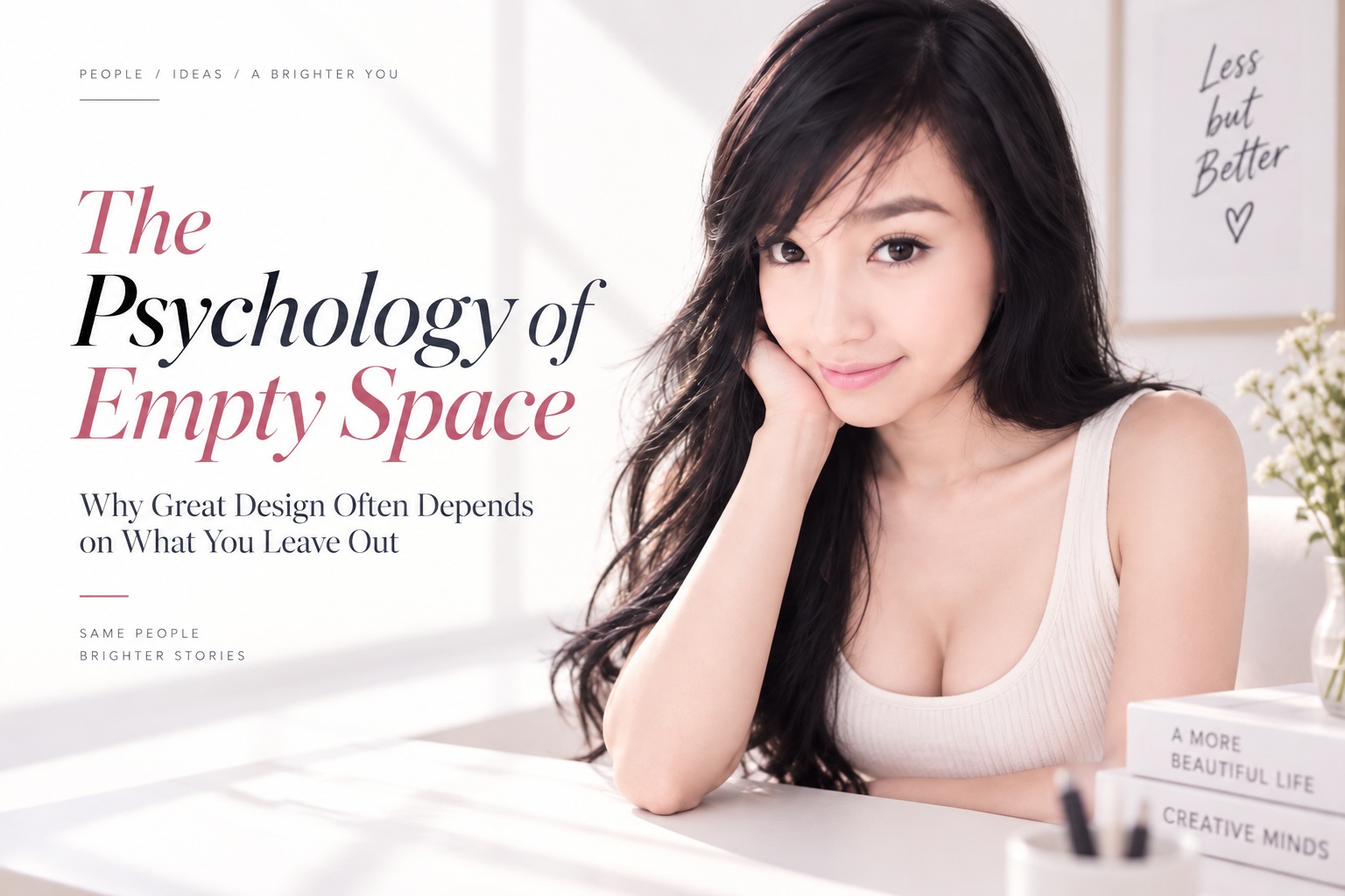
When we look at a well-designed website, poster, app interface or magazine spread, our attention naturally goes to the things we can see. We notice the typography, colours, photography, illustrations, buttons and decorative elements. Yet some of the most important decisions in a strong layout are actually defined by what is not there.
The empty areas surrounding content can determine whether a design feels calm or overwhelming, premium or inexpensive, intuitive or difficult to navigate. Designers often refer to this as negative space, but the word "negative" can be misleading because the space is doing real work. It separates ideas, creates hierarchy, reduces visual noise and gives important elements enough room to stand on their own.
Good design is therefore not simply about deciding what to add. It is also about knowing when adding another element would make the communication weaker.
Empty Space Is an Active Design Element
Negative space is the area surrounding and separating visual elements. It can appear between paragraphs, around a headline, inside a logo, beside an image, between navigation items or across large sections of a webpage. It does not necessarily need to be white either; colour, photography, texture or even video can function as negative space when they create enough visual calm around the content that matters.
Consider a crowded interface filled with banners, icons, buttons, headings, pop-ups and promotional messages. Everything may technically be visible, but users have to work much harder to understand which part deserves attention. When competing elements are reduced and more breathing room is introduced, the structure becomes easier to recognise almost immediately.
The space itself has not added new information. Instead, it has made the existing information easier to understand.
Our Brains Naturally Look for Groups and Relationships
Human perception does not interpret every visual object individually. Our brains automatically search for patterns, connections and groups, which is one reason the principles of Gestalt psychology remain so useful in design.
One of the clearest examples is proximity. When several objects are positioned close together, people naturally assume they belong to the same group. Move one of those objects farther away and the relationship changes even if nothing else about the design has been altered.
This means spacing can communicate structure without requiring borders, labels or additional graphics. A heading positioned close to the paragraph below it clearly belongs to that content, while a larger gap before the next heading communicates that a new section has begun. The user understands the relationship almost instinctively because the spacing is doing the organisational work.
Space Is One of the Strongest Tools for Creating Hierarchy
A good layout tells the viewer what to notice first, what to explore next and where to take action. Not every element should compete for the same level of attention, and negative space is one of the easiest ways to establish that hierarchy.
Imagine a landing page containing a headline, short description, photograph and call-to-action button. If all four elements are placed tightly together with identical spacing, they begin to feel equally important. Give the headline more room around it and it immediately becomes more prominent. Isolate the call-to-action and it becomes easier to recognise as the next step.
In this sense, empty space works almost like a volume control. More space around an element can make it feel louder and more important without changing its colour, size or typography.
Clutter Increases Cognitive Load
Every visual element asks the brain to process something. A new colour suggests distinction. An icon carries meaning. A button suggests an action. An illustration adds context or decoration. None of those elements is necessarily a problem on its own, but when too many appear at once, the user has to spend more mental effort deciding what deserves attention.
That additional effort is often described as cognitive load. Interfaces with excessive visual signals can feel difficult even when users cannot immediately explain why. They may need longer to locate information, understand the navigation or decide which action to take.
This is why designers should not automatically ask, "What should go in this empty area?" Sometimes the more useful question is, "Does anything need to go there at all?" Removing one decorative graphic, shortening a navigation menu or eliminating a redundant button can make everything that remains easier to understand.
The goal is not to make the design emptier. It is to make the experience more focused.
Why Spacious Designs Often Feel More Premium
Luxury brands frequently use generous spacing, and there is a psychological reason for it. A layout that is not desperately trying to fill every available centimetre communicates confidence. Individual elements feel more deliberate because they are given enough room to exist without competing with everything around them.
A product photographed against a large, uncluttered background can appear more important than the same product surrounded by promotional graphics, badges and decorative elements. The space effectively says that the object deserves attention on its own.
This does not mean simply adding more white space automatically creates a premium experience. A children's website, supermarket catalogue, financial dashboard and luxury fashion campaign all have different communication needs. The real objective is intentional spacing, not maximum emptiness.
Good negative space supports the personality of the design rather than forcing every project into the same minimalist aesthetic.
Space Can Guide the Eye Without Arrows or Labels
Negative space can also create a visual path through a composition. Designers often use the direction of photographs, body language or open areas to gently encourage the viewer to look toward important information.
An advertisement featuring a person looking toward the right side of the page naturally invites the viewer's eyes to follow that gaze. If the headline or product sits inside the open space in that direction, the composition becomes easier to navigate without needing a giant arrow pointing at it.
The same principle works in interfaces. Give a primary button enough clear space around it and the user's attention naturally lands there. Give a powerful photograph an entire page in a magazine and the image becomes a visual pause that separates one part of the story from another.
Empty space does more than separate elements. It can quietly control the sequence in which people experience them.
Typography Needs Space to Work Properly
Typography is especially dependent on surrounding space. Even the most beautiful typeface can become unpleasant to read if line spacing, margins and paragraph spacing are too tight.
Headlines need enough room to establish importance, paragraphs need comfortable line spacing, and groups of information need sufficient separation to prevent everything from merging together visually. Good typographic spacing creates rhythm across a page, helping readers move from one section to another without consciously thinking about why the layout feels comfortable.
Designers sometimes focus heavily on font choice while overlooking spacing, but the relationship between letters, lines and surrounding elements can affect readability just as much as the typeface itself.
A sophisticated typographic system therefore includes not only font sizes and weights but also deliberate spacing rules.
Minimalism Can Go Too Far
If space is powerful, it can be tempting to conclude that removing as much as possible will always improve a design. That is where minimalism can become its own problem.
A website with enormous empty areas may look elegant but still fail to explain what the service actually does. A navigation menu containing only three items may look beautifully clean, but it becomes frustrating if users need access to ten important sections. A landing page can become so minimal that visitors cannot identify the next action.
Good design is not about removing information until almost nothing remains. It is about removing unnecessary information while preserving everything the user needs.
That distinction is what separates thoughtful simplicity from empty decoration.
Start by Designing the Relationships, Not the Objects
One useful way to improve spacing is to reverse the typical design process. Instead of immediately asking what components belong on the page, start by considering the relationships between them.
Where should the user's attention begin? Which elements belong together? Where should one idea clearly end and another begin? Which component deserves isolation? How much breathing room does the typography need before it begins to feel important?
These questions help establish structure before decorative decisions start competing for space. Once the basic relationships are clear, colours, images and embellishments can be added more intentionally.
Another useful technique is temporary subtraction. Hide an illustration, remove a secondary button, reduce the number of colours or eliminate an unnecessary label. If the layout suddenly becomes clearer, the removed element may not have been helping in the first place.
The Hardest Design Skill Is Often Knowing When to Stop
Designers naturally want to improve their work, and improvement often feels like adding something. Another icon. Another animation. Another section. Another colour. Another call to action.
But design is not a competition to fill the canvas. The purpose is communication, and sometimes the final improvement comes from removing the last thing that does not need to be there.
This is where experienced designers often differ from inexperienced ones. Beginners frequently worry that empty areas make a design look unfinished, while experienced designers recognise that intentional space can make everything else feel more complete.
Knowing when to stop is therefore as important as knowing where to begin.
Empty Space Creates Rhythm
Space also gives a design rhythm. Large gaps can create pauses, smaller gaps can create continuity, and repeating spacing patterns help users predict how information is organised.
This rhythm matters because people scan digital interfaces quickly. They rarely read every element from beginning to end. Consistent spacing helps them understand where sections start, which items relate to one another and which areas deserve closer attention.
Inconsistent spacing does the opposite. When similar elements have different gaps for no reason, the page begins to feel messy even if users cannot consciously identify the problem.
A strong spacing system therefore works much like a grid. It creates order quietly in the background while allowing the visible content to take centre stage.
Final Thoughts
Empty space is one of the most powerful elements in design precisely because it does not demand attention itself. It gives other elements room to speak, creates meaningful relationships, establishes hierarchy, reduces cognitive load and helps users understand where to look next.
The lesson is not that every design should become minimalist. Busy designs can work beautifully, just as sparse designs can fail completely. What matters is whether every element earns its place and whether the space around it supports the message.
The next time a layout feels crowded or difficult to understand, resist the instinct to add another colour, icon, shape or component. Remove something. Increase the spacing. Give the important content more room.
You may find that the most effective element in the entire design is the one you never added.











Comments 0