

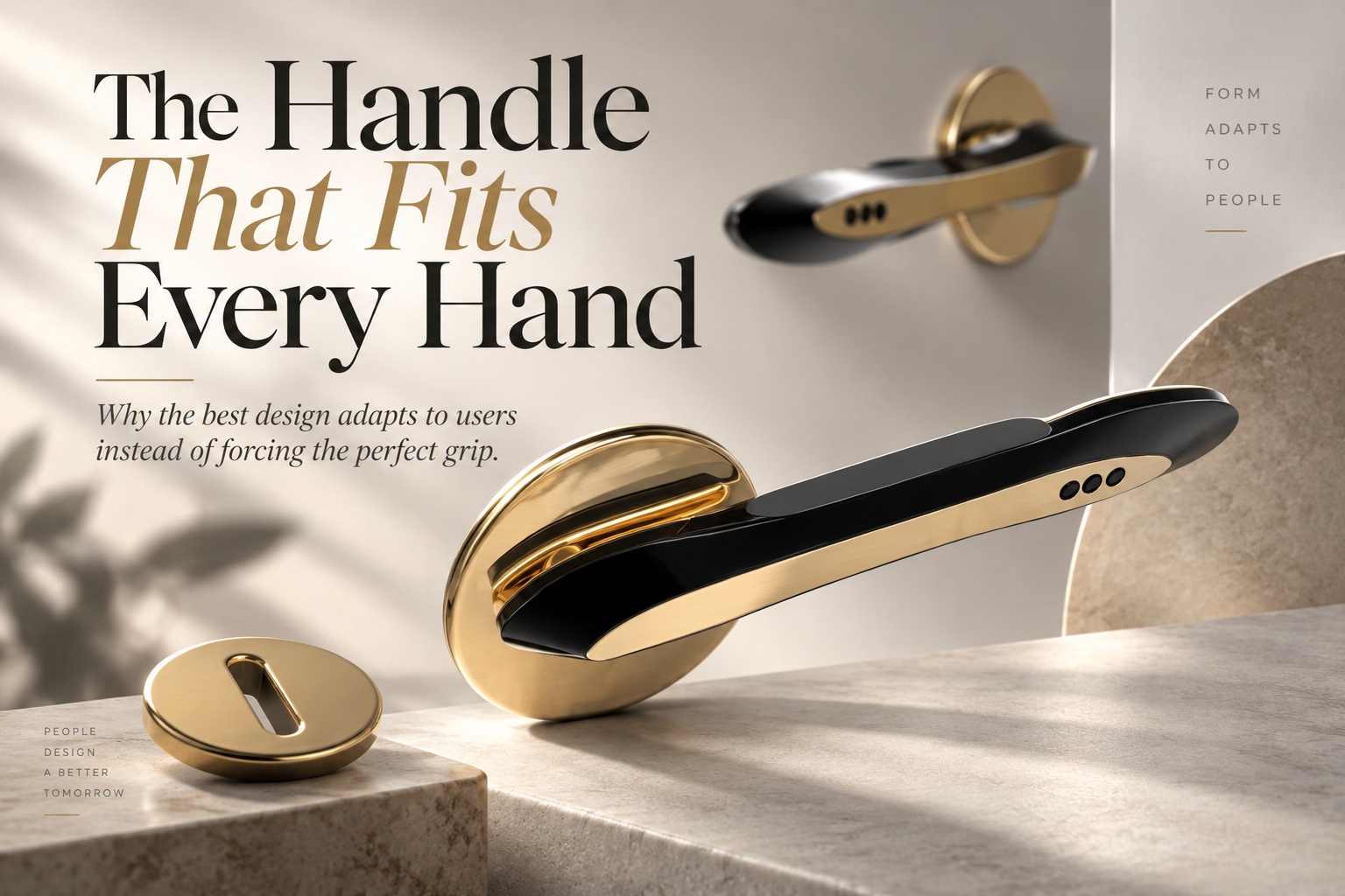
For years, I carried a folding knife that I was convinced was close to perfect. The blade was sharp, the action felt refined, and the polished titanium handle looked more like a piece of industrial art than an everyday tool. Its grip was heavily sculpted, with flowing contours and a pronounced thumb ramp that suggested a lot of thought had gone into making it comfortable. Yet there was one problem I could never quite ignore: I could rarely open it smoothly with one hand.
Every attempt felt slightly awkward. I would reposition my fingers, shift the knife in my palm, stretch for the thumb control, and often end up using my second hand anyway. The knife looked ergonomic, but in practice it never seemed to cooperate with the way my hand naturally wanted to move. I blamed myself at first, assuming I simply needed more practice.
Then one evening at a friend's workshop, he handed me his own folding knife. It was plain, almost boring by comparison, with a simple black handle, shallow grip lines, and an ordinary thumb stud. I opened it effortlessly on the first try. That moment made something very clear: the problem was not the knife mechanism, my technique, or even the size of the tool. It was the geometry of the handle.
When "Ergonomic" Means Ergonomic for Someone Else
The word ergonomic is often treated as if it automatically means comfortable for everyone, but that is not really how human bodies work. A deeply sculpted handle may feel extraordinary when the curves happen to align with the user's fingers, palm, and thumb. When they do not, those same contours can become restrictions that force the hand into a position it would never choose naturally.
My titanium knife had clearly been designed around a particular grip. The thumb ramp guided the hand toward one ideal position, the finger grooves encouraged a specific finger spacing, and the overall shape assumed a particular relationship between palm width and thumb reach. For whoever matched those proportions, the design probably felt fantastic. My hand simply did not match the template.
That is where the idea of one-size-fits-all ergonomics begins to break down. Human hands vary significantly in overall length, palm width, finger length, joint mobility, strength, and thumb position. Even two people with similarly sized hands may hold the same object differently because of habit, previous injury, dexterity, or the task they are performing.
The thumb is especially important because so many tools rely on it for control. Small differences in thumb length or angle can determine whether a button, stud, switch, or lever feels perfectly placed or frustratingly out of reach. A design optimised around one hand can therefore become noticeably worse for another, even when the overall dimensions appear suitable.
Contours Can Help, but They Can Also Trap the User
Designers often introduce additional curves and grooves because they want to make a product feel more supportive. The intention is reasonable: shape the object around the human body and the result should feel more natural. The problem is that every additional contour also removes freedom from the user.
A finger groove tells the fingers where they are supposed to sit. A thumb recess tells the thumb where it is expected to rest. A pronounced palm swell encourages the hand into one particular position. When all of those assumptions match the user, the object can feel exceptionally refined, but when even one is slightly wrong, the whole grip can become uncomfortable.
This is why highly sculpted products often produce very different reactions from different users. One person may describe the grip as perfect, while another immediately wants to shift their fingers away from the very contours that were supposed to make the tool more comfortable. The design has not necessarily failed in craftsmanship; it may simply be too prescriptive.
A useful ergonomic design should support the user without demanding that every user interact with it in exactly the same way. There is a difference between guiding a movement and controlling it too tightly.
Why Simpler Shapes Often Work Better
The knife from my friend's workshop worked precisely because it did less. Its handle did not try to place every finger into a predefined position or tell my thumb exactly where it should land. The shape was relatively neutral, allowing my hand to settle naturally around it.
Simple cylindrical, oval, or gently tapered handles often perform well across a wide range of users for this reason. They provide enough shape to grip securely but leave room for people to adjust finger spacing, wrist angle, and hand position according to their own proportions. Instead of forcing the body to conform to the object, the object allows the body to find its own solution.
That does not mean every handle should literally be a featureless cylinder. Texture, slight tapering, edge softening, and modest shaping can all improve grip and control. The important distinction is whether those features expand the range of comfortable positions or reduce it.
The best universal designs are often not the ones that perfectly match one ideal hand. They are the ones that remain usable across many different hands because they leave enough flexibility for individual adaptation.
Designing for the Average Can Exclude Almost Everyone
One of the common traps in product design is designing around an average measurement. An average hand size sounds like a logical reference point, but very few actual people possess every average dimension simultaneously. Someone may have an average palm width but unusually short fingers, or long fingers with a relatively small hand.
This becomes even more problematic when a product is used by people across different ages, sexes, body sizes, and physical abilities. A grip that feels comfortable for a large adult hand may be impossible for someone smaller to wrap securely. A handle designed around a smaller hand may become cramped for someone with wider fingers.
Good ergonomic design therefore needs to think in terms of ranges and percentiles, not a single ideal user. The goal is not to make every dimension perfect for an imaginary average person but to ensure that the product remains functional and comfortable for as much of the intended population as possible.
In some cases, adjustability is the best answer. In others, a neutral shape works better because it naturally accommodates variation. The most important thing is recognising that human diversity is not an edge case; it is the normal condition designers need to work around.
The Same Principle Applies Beyond Hand Tools
This idea extends far beyond knives, tools, or handles. Chairs provide an obvious example. A heavily sculpted chair that locks the body into one posture may feel supportive for some users while becoming uncomfortable for anyone whose proportions differ from the designer's assumptions.
A chair that allows multiple seating positions, adjustable height, movement, and some freedom in posture may ultimately serve a broader range of people. Comfort often comes not from forcing the body into the theoretically correct position, but from allowing people to shift and adapt throughout the day.
The same principle can be seen in controls, appliances, sports equipment, medical devices, and even everyday household products. Whenever a design assumes too much about the size, strength, reach, or movement pattern of its user, it risks becoming less universal despite appearing more sophisticated.
Sometimes the most inclusive design is the one that provides fewer instructions through its physical shape.
Software Interfaces Have Their Own Version of Finger Grooves
Digital interfaces suffer from the same temptation to overdesign. A software product may try to anticipate exactly how users should complete a task, creating rigid workflows with carefully planned steps and prompts. That can work beautifully for users whose needs match the intended process, but it becomes frustrating when someone wants to approach the task differently.
An interface that provides clear, consistent tools while allowing several reasonable paths can often feel more comfortable than one that attempts to optimise every decision on the user's behalf. The digital equivalent of a heavily sculpted handle is a workflow that keeps pushing the user back into the path the designer considered ideal.
This does not mean interfaces should be completely unstructured. Good design still provides hierarchy, guidance, sensible defaults, and constraints where they prevent genuine mistakes. The challenge is distinguishing helpful guidance from unnecessary control.
Users are often very good at adapting tools to the way they think and work. A design becomes stronger when it supports that adaptation instead of fighting it.
Comfort Often Comes From Removing Constraints
The experience with those two knives changed how I think about comfort. I had assumed the more expensive and carefully shaped handle should naturally be the better one because it contained more obvious ergonomic thinking. In reality, the simpler handle was better for me because it imposed fewer assumptions.
This is an important distinction. Adding another contour, support ridge, menu, shortcut, or automated decision can look like an improvement because something new has been introduced. Yet every added feature can also narrow the range of ways in which people can comfortably interact with the product.
Sometimes improving ergonomics means removing something rather than adding something. A smoother handle, a wider control area, a less restrictive chair, or a more flexible software workflow can improve usability precisely because the user has more freedom to adapt.
Simplicity is not the absence of design. In many cases, it is the result of understanding exactly which constraints are unnecessary.
Design for Variation, Not an Imaginary Perfect User
The real lesson is that designers should be careful about using themselves as the model for everyone else. It is remarkably easy to hold a prototype, decide that a particular grip or control feels natural, and assume most users will feel the same way. That assumption becomes even more dangerous when a small testing group happens to share similar proportions or habits.
A better question is not, "Does this fit my hand?" but "How many different hands can use this comfortably?" Testing should include users with different sizes, reach, strength, dexterity, dominant hands, and interaction styles. When a design fails for someone, the goal should be to understand whether the product can accommodate that variation rather than treating the person as an exception.
Universal design is rarely about creating one perfectly shaped object that somehow matches every individual. It is usually about creating enough neutrality, adjustability, and tolerance that different people can find their own comfortable way to use it.
That is a much more realistic definition of good ergonomics.
Final Thoughts
The handle that seems to fit every hand is probably not the one with the most elaborate curves. More often, it is the handle that leaves enough room for each hand to find its own position. A simple profile can outperform a beautifully sculpted one because it adapts to the user instead of demanding that the user adapt to it.
That does not make contours inherently bad. Carefully designed shaping can improve control, reduce fatigue, and make tools safer, particularly when the task itself requires a consistent grip. Problems arise when designers mistake one comfortable configuration for a universal one.
The broader principle applies almost everywhere: design for the range, not merely the average. Respect variation in bodies, habits, preferences, and workflows, and avoid adding constraints unless they genuinely improve the experience for the people who need to use the product.
A good design should guide without dictating. Give people enough structure to understand the tool, enough freedom to adapt it to themselves, and then stay out of their way.











Comments 0