

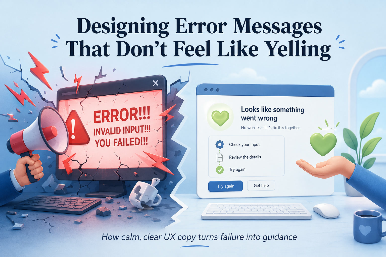
Error messages are one of those small interface details that are easy to overlook until something breaks. A user clicks a button, submits a form, uploads a file or tries to complete a payment — and suddenly the system cannot continue. At that moment, the interface has a choice.
It can effectively say:
Or it can say:
Those two approaches may communicate the same technical failure, but they create completely different experiences.
Good error messages are not just about displaying an error code. They are about helping someone recover from a problem with as little frustration as possible.
Unfortunately, plenty of applications still treat errors like alarm sirens rather than helpful guidance.
Why So Many Error Messages Feel Aggressive
Think about some of the error messages you have encountered over the years:
INVALID INPUT!
ACCESS DENIED!
ERROR 500!
YOU MUST ENTER A VALID EMAIL ADDRESS!
Technically, these messages may be accurate.
From a user-experience perspective, however, they can feel surprisingly hostile.
Capital letters resemble shouting. Multiple exclamation marks make a routine mistake appear catastrophic. Phrases such as "invalid input" describe the problem from the system's perspective rather than the user's.
And when an error provides no useful next step, the user is left staring at the screen wondering what they are supposed to do.
The problem isn't necessarily the existence of an error.
Software will fail occasionally.
The problem is how that failure is communicated.
An Error Message Appears at the Worst Possible Moment
Users normally encounter an error while trying to accomplish something.
Maybe they are:
checking out from an online store,
submitting an important form,
uploading a document,
resetting a password,
making a payment, or
saving work they have spent considerable time creating.
They are already focused on completing a task.
An error interrupts that flow.
This means the user is more likely to be frustrated, confused or worried than during a normal interaction.
That makes tone particularly important.
The interface shouldn't add additional emotional friction to an already inconvenient situation.
The System Should Never Sound Like It Is Blaming the User
One of the biggest mistakes in error-message design is assigning blame.
Consider these two messages.
Incorrect password entered.
versus:
Both describe essentially the same issue.
But the second message sounds considerably more helpful.
Another example:
You entered an invalid date.
could become:
The second version doesn't care who made the mistake.
It simply explains what the system needs.
This is an important principle:
The user is trying to complete a task. The interface should help them succeed, not judge how they got there.
Sometimes the problem may not even be the user's fault.
A server could be unavailable.
An API could have timed out.
A payment gateway might be experiencing difficulties.
A network connection may have dropped.
A file-processing service might have failed.
Blaming the user in those situations is both unfair and inaccurate.
Tone Matters More Than Developers Sometimes Realise
Developers naturally think about errors technically.
A database connection fails.
An authentication token expires.
A request returns HTTP 403.
A form validation rule fails.
Those details are useful for logs.
They aren't always useful to users.
The user doesn't necessarily need to know:
ERR_AUTH_VALIDATION_EXCEPTION
They need to know:
Good error messages should therefore use a calm, neutral and helpful tone.
That means avoiding unnecessary urgency unless something genuinely requires urgent attention.
A missing postcode doesn't need to sound like a security breach.
Likewise, an incorrectly formatted phone number doesn't require a giant red warning banner.
The severity of the visual and written message should reflect the severity of the actual problem.
Explain What Happened in Plain Language
A useful error message should first answer a simple question:
What went wrong?
Unfortunately, many systems fail at even this basic step.
Consider:
That tells the user almost nothing.
Compare it with:
Now the problem is understandable.
Or:
versus:
The second version gives context.
People are much more comfortable dealing with problems when they understand what is happening.
Mystery creates frustration.
Clarity creates confidence.
Tell Users What They Can Do Next
Explaining the problem is only half the job.
A good error message should also answer:
That is where many interfaces fall short.
For example:
is technically informative, but still incomplete.
A better version would be:
This file type isn't supported. Upload a JPG, PNG or WebP image instead.
Now the user has a solution.
Similarly:
could become:
Username unavailable.
could become:
That username is already taken. Try another one, such as lemonweb26.
The goal is not merely to report failure.
The goal is to guide recovery.
Specific Messages Are Better Than Generic Ones
One of the strongest improvements you can make to error messages is simply becoming more specific.
Generic:
Invalid input
Specific:
Your email address is missing the @ symbol.
Generic:
Password invalid
Specific:
Your password must contain at least eight characters and one number.
Generic:
Upload failed
Specific:
This video is 2.4GB. The maximum upload size is 2GB.
Generic:
Form error
Specific:
Enter a phone number before continuing.
Specific messages reduce the amount of thinking required from the user.
Instead of asking themselves, "What did I do wrong?", the interface has already answered the question.
Error Messages Should Be Written for Humans, Not Logs
There is nothing wrong with storing detailed technical information.
In fact, developers need it.
The mistake is exposing internal technical language directly to users.
For example:
SQLSTATE[23000]: Integrity constraint violation
may be extremely helpful to a developer diagnosing a database problem.
It is meaningless to most users.
A better interface might display:
We couldn't save your changes right now. Try again in a few moments.
Meanwhile, the full exception, database query, stack trace and request ID can still be recorded internally.
This creates a useful separation:
User-facing errors explain the problem. Developer-facing logs explain the implementation failure.
Trying to make one message serve both audiences usually results in poor communication.
Error Codes Can Still Be Useful
That doesn't mean error codes should disappear completely.
For support-heavy applications, a short reference code can be extremely useful.
For example:
We couldn't complete your request. Try again shortly.
Reference: ERR-2047
If the user contacts support, they can provide that reference.
Support staff can then correlate it with logs.
The important part is that the error code should supplement the human-readable explanation rather than replace it.
Structure Makes Errors Easier to Understand
A well-written error message often follows a simple three-part structure:
What happened → Why it happened → What to do next
For example:
We couldn't upload your image.
The file is larger than the 10MB limit.
Choose a smaller image and try again.
Not every message needs three separate sentences, of course.
Sometimes everything can fit naturally into one line:
Your password has expired. Create a new password to continue.
The important thing is that users can quickly understand both the problem and the recovery path.
Place the Error Where the Problem Actually Happened
Error design isn't only about wording.
Placement matters enormously.
Imagine completing a long registration form and seeing:
There are errors in this form.
But nothing tells you where.
Now you have to scroll through 20 fields searching for the problem.
A much better solution is to show the relevant message beside the affected field.
For example:
Email Address
lemon-web.net
Enter a valid email address, such as This email address is being protected from spambots. You need JavaScript enabled to view it..
This keeps the error close to the action required to fix it.
For forms containing many fields, it can also be useful to provide a short error summary at the top while highlighting the individual fields themselves.
Don't Delete Everything the User Already Entered
Few experiences are more frustrating than filling out a long form, clicking Submit and discovering that one error has caused the entire form to reset.
The user didn't fail.
The interface did.
Whenever possible, preserve valid information the user has already entered.
If only one field contains a problem, allow them to correct that field rather than recreating everything else.
This becomes even more important for long application forms, healthcare systems, government portals, checkout pages and enterprise software.
Users should never lose ten minutes of work because they forgot one mandatory field.
Visual Design Should Communicate, Not Panic
Red has become almost synonymous with errors.
There is nothing inherently wrong with using red.
The problem comes when everything becomes aggressively red.
Huge red panels, flashing icons, warning triangles and bold uppercase text can make a minor validation error look like a disaster.
Visual emphasis should correspond with severity.
A mistyped email address might require only:
a subtle red border,
a small error icon, and
a short explanatory message.
A destructive action or critical security failure may justify stronger visual treatment.
The key is hierarchy.
Not every error deserves the same visual alarm level.
Accessibility Matters Too
Error messages also need to work for users who don't perceive interfaces visually in the same way.
Colour alone should never communicate that something is wrong.
If a form field simply changes from gray to red, someone with colour-vision deficiency may not notice the difference.
Use additional indicators such as text or icons.
For screen-reader users, errors should also be announced appropriately and associated with the affected field.
And whenever the interface moves focus after an error, it should do so predictably.
Accessibility isn't an extra layer added after error design.
It should be part of the design from the beginning.
Avoid Humour When the Situation Is Serious
Friendly language can improve error messages, but designers sometimes take this too far.
A playful message such as:
Oopsie! Our servers are having a little nap
might seem charming inside a casual social application.
It becomes considerably less charming when someone has just attempted to transfer RM5,000 and doesn't know whether the transaction succeeded.
Context matters.
Humour is usually safest when the failure has little consequence.
For payments, healthcare, security, account access or data-loss situations, clarity should always come first.
Users don't need personality at that moment.
They need certainty.
Be Especially Careful With Payment Errors
Payments deserve their own category because poor error design can create genuine anxiety.
Imagine clicking Pay and receiving:
TRANSACTION ERROR!
Immediately, several questions appear.
Was I charged?
Did the order go through?
Should I try again?
Will retrying charge me twice?
A much better message might be:
Your payment wasn't completed and you haven't been charged. Try again or choose another payment method.
That one sentence answers the questions the user is actually worried about.
This illustrates why error-message design isn't simply a writing exercise.
It requires understanding the user's context.
Security Messages Need Balance
Security-related errors create another challenge.
Sometimes systems shouldn't reveal too much.
Consider login authentication.
A message saying:
No account exists for This email address is being protected from spambots. You need JavaScript enabled to view it.
reveals information that attackers could use for account enumeration.
A safer version might be:
The email address or password doesn't match our records.
This still gives legitimate users enough information without confirming whether a specific account exists.
Good error design therefore balances:
helpfulness, security and privacy.
The most detailed message isn't always the safest one.
Don't Display an Error When the System Can Fix the Problem Automatically
Perhaps the best error message is sometimes no error message at all.
If the system can safely correct or recover from a minor issue automatically, it often should.
For example, if someone enters:
This email address is being protected from spambots. You need JavaScript enabled to view it.
with spaces before and after the address, the application can simply trim the spaces.
There is little value in displaying:
Invalid email address: whitespace detected.
Likewise, if a phone number can safely be reformatted, do that rather than forcing the user to manually enter brackets or spaces.
Error messages should be reserved for situations where user intervention is actually required.
Retry Buttons Are Better Than Dead Ends
Some errors are temporary.
Network timeouts are a classic example.
Instead of displaying:
Request failed.
and leaving the user stranded, provide an obvious recovery action:
We couldn't connect to the server.
Try Again
If the failure involves connectivity, you can sometimes retry automatically in the background.
The important principle is to avoid leaving users at a dead end.
There should usually be a next action.
Don't Hide Errors Too Quickly
Another frustrating pattern occurs when an error appears for two seconds as a small toast notification and then disappears.
If the message contains something the user needs to fix, they may not have enough time to read it.
Persistent errors should remain visible until:
the problem is corrected,
the user dismisses the message, or
the context changes.
Transient notifications are useful for simple confirmations.
They are much less suitable for important corrective instructions.
Success Messages Matter After an Error Too
Recovery should feel complete.
If a user fixes an error and retries successfully, consider confirming that the operation worked.
For example:
Password updated successfully.
or:
Your payment has been completed.
This closes the loop.
Without confirmation, users may still wonder whether the system accepted the correction.
That is particularly important after failures involving payments, uploads or account changes.
Error Messages Are Part of Your Product's Personality
Interfaces communicate personality constantly.
Button labels, loading messages, onboarding screens and notifications all contribute.
Error messages are arguably even more revealing because they appear when things aren't going according to plan.
A product that sounds friendly when everything works but suddenly becomes cold and accusatory during failure feels inconsistent.
Good products maintain the same communication style during both success and failure.
Calm.
Clear.
Respectful.
Useful.
Developers Should Treat Error Copy as Part of the Feature
Error handling is sometimes implemented at the very end of development.
The happy path gets carefully designed.
Then someone adds:
alert("Something went wrong");
and moves on.
That approach misses an important reality.
Errors are part of the application.
Users will encounter them.
For many workflows, especially complex systems, handling failure gracefully is just as important as handling success.
Error states therefore deserve design, writing and testing alongside the primary workflow.
Ask:
What happens if the network disappears?
What happens if the API responds slowly?
What happens if the file is corrupted?
What happens if the user enters something unexpected?
What happens if the payment provider fails?
What will the user see?
Answering those questions early produces significantly better software.
Error Messages Can Actually Build Trust
It may sound strange, but failure can sometimes improve a user's impression of a product.
Imagine two systems experiencing exactly the same outage.
System A says:
ERROR 503. SERVICE UNAVAILABLE.
System B says:
We're having trouble connecting to the service right now. Your changes are saved locally, so nothing has been lost. Try again in a few minutes.
Both systems failed.
But System B feels considerably more trustworthy because it communicates clearly and reassures the user about what matters.
People don't expect software to be perfect.
They do expect it to behave responsibly when things go wrong.
Final Thoughts
An error message is not simply a notification that something failed. It is part of the recovery experience. The best error messages explain what happened, why it matters and what the user can do next without making them feel responsible for the system's frustration.
Avoid shouting.
Avoid unnecessary technical jargon. Avoid vague phrases such as "invalid input" when you can explain exactly what needs changing. Put the message next to the problem, preserve the user's work and give them a clear path forward. Most importantly, remember that an error message appears precisely when someone needs the interface's help the most.
That is why good error design should feel less like:
and much more like:
That small shift in language can make the difference between an interface that frustrates users and one they genuinely trust.











Comments 0