

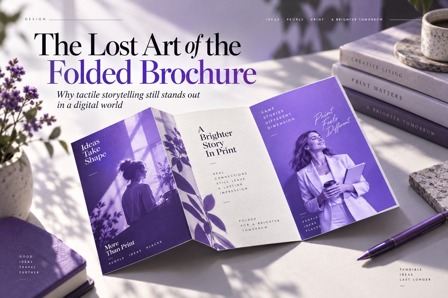
Before websites, landing pages and social media feeds became the default way to present information, the humble brochure had already mastered something digital design often struggles to recreate: a physical sense of progression. A well-designed brochure does not simply place information on paper. It controls when information appears, how it is revealed and what the reader encounters next.
That is what makes the fold so important. The fold is not merely a production detail added after the design is finished. It is part of the structure, pacing and storytelling of the piece itself. When used well, a brochure becomes less like a printed document and more like a small experience that unfolds in the reader's hands.
The Fold Is Part of the Design Language
Every folded brochure has its own rhythm. The way the paper opens determines how the reader moves through the content, which elements are revealed first and which ideas are held back until later. In that sense, choosing a fold is similar to choosing navigation for a website: it directly shapes how people experience the information.
This is why different folding styles naturally suit different kinds of communication. Some are better for immediate visual impact, while others encourage a more sequential reading experience. The best format is not necessarily the one that looks most impressive on screen, but the one that supports the story the brochure is trying to tell.
The Bi-Fold Is About Simplicity and Impact
The bi-fold is one of the simplest brochure structures. A single fold creates four broad panels, giving the designer more uninterrupted space than more complex formats. Because each panel is relatively large, the layout can feel clean, confident and visually generous.
That makes the bi-fold particularly effective when imagery needs room to breathe. Product catalogues, premium menus, real estate presentations and high-end brand materials can benefit from the larger visual areas. Rather than forcing the reader through many small sections, the format encourages fewer, stronger statements.
The strength of the bi-fold is clarity. It does not try to be clever with its mechanics. It simply provides enough structure to organise information while leaving plenty of space for photography, typography and strong visual hierarchy.
The Tri-Fold Creates a Natural Narrative
The tri-fold is probably the format most people recognise immediately. With three panels on each side, it creates a sequence that feels almost instinctive: the reader opens one panel, then another, gradually moving deeper into the information.
That built-in progression makes the tri-fold excellent for storytelling. Travel guides can introduce a destination, explain what to do and finish with contact or booking information. Service brochures can move from problem to solution to benefits. Event materials can guide the reader from introduction to schedule to registration details.
The important point is that the tri-fold is not simply six rectangles arranged on a page. The panels work together as a sequence. A designer who understands that can use the reveal itself as part of the message.
The Z-Fold Encourages Continuous Movement
The Z-fold behaves differently because it opens like an accordion. Instead of creating a front cover that leads into an interior spread in the traditional way, the panels unfold continuously from one side to the other.
This makes it particularly useful for content with a clear progression. Timelines, step-by-step instructions, itineraries and process explanations all work naturally because each panel can represent the next stage in the sequence. The physical motion of opening the brochure reinforces the logic of moving forward through the information.
When fully extended, the Z-fold can also become one long visual composition. That gives designers the opportunity to create elements that continue across several panels while still preserving individual stages when the brochure is partially folded.
The Gatefold Turns the Reveal Into an Event
The gatefold is more theatrical. Two outer panels open from the centre like doors, concealing a larger interior area until the reader physically interacts with the piece. That moment of reveal can immediately make the brochure feel more deliberate and premium.
Luxury brands, special events, high-end launches and visually driven campaigns can benefit from this structure because it creates anticipation. The exterior can remain restrained, while the inside carries the major visual or message. Instead of presenting everything immediately, the format asks the reader to participate.
That is something digital media often tries to imitate with transitions and animations, but paper achieves it with an extremely simple mechanism: two folds and the reader's hands.
Designing for Paper Is Different From Designing a Flat Screen
One of the most overlooked parts of brochure design is that the finished object is not flat. Designers usually create it on a screen, where every panel appears perfectly aligned and every measurement looks precise. Once printed, trimmed and folded, however, paper begins behaving like a physical material.
A fold has thickness. Paper resists being bent. Panels move slightly during trimming and creasing. Ink can cross a fold differently depending on the stock and finishing process. These realities mean a brochure that looks flawless in Illustrator or InDesign can behave very differently when it comes off the printing press.
Understanding that difference is part of the craft. Good print designers are not simply designing artwork; they are designing an object.
The Fold Line Is Not Just Another Guide
It is tempting to treat fold guides as harmless lines that disappear before export, but they represent real physical creases in the finished piece. Putting important content too close to those lines can create problems that are difficult to appreciate on screen.
Text positioned directly over a fold can become awkward to read. Faces in photographs can be distorted by the crease. Fine lines may appear slightly displaced from one panel to another. Even a perfectly aligned visual can look wrong if the fold moves by a few millimetres during production.
That is why experienced designers leave breathing room around critical content. The fold should be treated as a physical boundary rather than an invisible mathematical line.
A Tri-Fold Is Not Simply Three Equal Panels
One of the classic mistakes in brochure production is dividing a page into three perfectly equal sections and assuming the job is finished. In many standard tri-fold configurations, the panel that folds inward must actually be slightly narrower than the others.
That small difference allows the flap to tuck neatly inside without buckling or pushing against the outer panel. If every section is exactly the same width, the brochure may look correct in the design file but refuse to close cleanly once printed on real paper.
This is a perfect example of why print design requires an understanding of production. The mathematical solution is not always the physical solution.
Paper Stock Changes How the Fold Behaves
The material itself also matters. A lightweight brochure stock folds very differently from thick premium paper. Heavier stocks may need proper scoring before folding so the surface does not crack or resist the crease.
Coated paper introduces another consideration because solid ink coverage can sometimes show cracking along poorly prepared folds. Laminates, varnishes and specialty finishes can also change how the brochure bends and how accurately panels sit against one another.
The design therefore cannot be separated entirely from the printing specification. A fold that works beautifully on one paper stock may need adjustment on another.
Images Need to Respect the Physical Structure
Large photographs can create dramatic brochure layouts, but they need to be positioned carefully around folds. A strong image may technically span two or three panels, yet important details should not accidentally land directly on a crease.
A person's eye, a product logo or a key architectural detail sitting precisely on the fold can look distorted after production. The same image shifted slightly might work perfectly while preserving the intended composition.
This is why brochure designers often need to think simultaneously about the image as a whole and about how each individual panel will look when the piece is partially closed.
The Reader Does Not Always See the Entire Design at Once
This is perhaps the most interesting difference between brochures and many digital layouts. The reader experiences the design in states. At first, perhaps only the cover is visible. One fold later, two or three additional panels appear. Only at the end might the entire interior spread become visible.
That gives designers the ability to control information progressively. A question can appear on the cover and its answer inside. A restrained exterior can open into something visually dramatic. A sequence of images can gradually build toward one larger conclusion.
The brochure is therefore closer to storytelling than simply page layout. The reader participates in the pacing.
Digital Design Rarely Offers the Same Physical Satisfaction
Digital media is unquestionably faster and easier to distribute. A website can be updated instantly, shared globally and measured with analytics. Printed brochures cannot compete with that kind of speed.
But print provides something digital interfaces cannot fully replicate: physical presence. A brochure has weight, texture and scale. You can hand it to someone, place it on a desk, keep it in a bag and return to it days later without opening an app or remembering a web address.
That tangibility can make printed material feel more intentional. In a world where digital messages disappear constantly beneath notifications and new content, a physical object can hold attention in a different way.
Print Removes Many of the Distractions Digital Experiences Create
Reading online usually happens alongside dozens of competing signals. Browser tabs remain open, notifications arrive, messages appear and other applications are only one click away. Even a beautifully designed landing page exists within an environment full of distractions.
A brochure does not have a notification centre. It does not suddenly show another advertisement because the reader paused for five seconds. It does not ask for cookie consent or compete with another browser tab.
Once the reader is holding it, the brochure owns a small piece of their attention. That focused interaction can still be extremely valuable for sales materials, events, hospitality, tourism and premium brand experiences.
A Brochure Can Function Like a Physical Landing Page
Modern designers often think of landing pages as carefully structured sales experiences. There is an introduction, a value proposition, supporting evidence, benefits and eventually a call to action.
A well-designed brochure can do exactly the same thing, except the sequence is controlled through panels and folds rather than scrolling. The cover functions like the hero section. The first reveal provides context. Interior panels develop the message, and the final section can deliver contact information or the next action.
Seen this way, brochure design is not outdated at all. It is simply an older form of interaction design.
The Fold Creates Curiosity
One of the strongest things physical folding provides is curiosity. When only part of the information is visible, the reader naturally wants to discover what lies underneath or inside.
This behaviour is almost automatic. A gatefold invites opening because the centre is hidden. A tri-fold suggests there is more information behind the cover. A Z-fold encourages the reader to keep extending it.
Good designers use this deliberately. They do not simply scatter information across panels; they create reasons for the reader to continue unfolding.
Print Design Forces Designers to Commit
Digital design is endlessly adjustable. Text can reflow, containers can resize and layouts can adapt automatically across screens. Print is much less forgiving.
Once something has been printed, the decisions become permanent. The panel dimensions, fold positions, image crops and typography cannot suddenly respond to a different screen width. Every element needs to work inside the physical constraints established before production.
That limitation can actually improve discipline. It forces designers to make stronger decisions about hierarchy, spacing and what information genuinely deserves to remain.
The Brochure Rewards Restraint
Because space is finite, brochure design quickly exposes unnecessary content. There is only so much information that can fit comfortably before the piece becomes crowded and difficult to use.
This encourages editing. Rather than including every possible service, paragraph and feature, the designer must determine what matters most. Strong headings, concise copy and carefully selected imagery become more valuable than sheer quantity.
In that sense, print constraints can make communication sharper. A brochure has no infinite scroll to hide weak hierarchy.
Modern Designers Can Still Learn From Print Production
Even designers who rarely produce brochures can learn useful lessons from folded print. The discipline of considering sequence, physical constraints and progressive disclosure transfers directly into interface and experience design.
A mobile onboarding flow also reveals information progressively. A checkout process has stages. A product page needs clear hierarchy. An interactive presentation relies on pacing. These are all problems brochure designers were solving long before UX became a formal profession.
Understanding folded print therefore offers more than nostalgia. It provides another way to think about how information is revealed over time.
The Best Brochures Combine Structure With Surprise
The brochure is strongest when the fold becomes part of the creative idea rather than merely a production necessity. A hidden image can suddenly expand across a gatefold. A timeline can continue naturally through a Z-fold. A tri-fold can reveal progressively deeper levels of information.
These experiences work because the physical structure and the communication strategy support each other. The reader is not merely observing the design—they are manipulating it.
That physical participation gives print an intimacy that can be difficult to reproduce digitally.
Why the Brochure Still Has a Place Today
The brochure never really disappeared. It simply stopped being the default format for every piece of marketing communication. That may actually make it more effective in certain situations today because receiving something thoughtfully printed can feel unusual.
Hotels, property developments, exhibitions, premium products, corporate presentations and events can still benefit from printed material precisely because everyone has become accustomed to screens. A well-made piece of print can stand out simply by existing physically.
Its value is especially strong when the design takes advantage of what paper does uniquely rather than trying to imitate a webpage on a sheet.
Final Thoughts
The folded brochure is sometimes dismissed as an outdated piece of marketing, but that misses what made the format powerful in the first place. At its best, a brochure is not merely information printed on paper. It is a structured physical journey, where folds control pacing, reveal information and invite the reader to interact.
Bi-folds provide visual clarity. Tri-folds create narrative progression. Z-folds support continuous sequences, while gatefolds turn revelation itself into part of the experience. Each format offers a different way of guiding attention through space.
The craft lies in understanding that the fold is both conceptual and physical. Panel widths need to account for how paper closes, important content must respect crease lines, and layout decisions need to survive trimming, scoring and production rather than only looking attractive on a monitor.
Digital media may be faster, easier to update and infinitely more scalable, but print still offers something special: a message you can physically open, hold and discover. In an increasingly screen-dominated world, that may be exactly why the art of the folded brochure is worth remembering.











Comments 0