

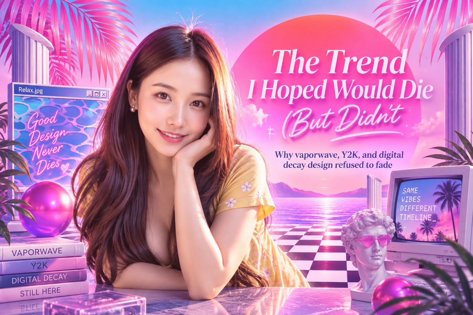
Some design trends arrive and immediately make sense. You see them, understand why they work, and perhaps even begin experimenting with them yourself. Others produce the opposite reaction. They look awkward, unnecessarily messy, or like someone deliberately ignored every rule you spent years learning.
For me, that reaction came from the resurgence of deliberately distorted digital design. Letters overlapped, typography became difficult to read, gradients looked like they had escaped from an old operating system, and interfaces began borrowing heavily from Y2K websites, vaporwave graphics, glitch art, and the rough aesthetics of the early internet. I assumed it was another short-lived visual fad.
I waited for it to disappear.
It never did.
The Trend That Refused to Go Away
At first, I saw the style only occasionally. A poster might deliberately break its typography. A logo would distort a letter until it was barely recognisable. A website might use strange gradients, oversized cursors, pixel graphics, clashing colours, or layouts that seemed almost intentionally unfinished.
Then it started appearing everywhere.
Fashion brands embraced it. Musicians adopted it for album artwork. Advertising campaigns began borrowing from early web graphics. Even established companies occasionally replaced polished corporate minimalism with designs that looked noisy, nostalgic, imperfect, and deliberately digital.
What originally appeared to be a fringe aesthetic was becoming a legitimate part of contemporary visual culture.
That was frustrating because I had spent years believing that good design should move in the opposite direction.
I Had Been Taught That Good Design Removes Friction
Most traditional design education places enormous value on clarity. Typography should be readable. Hierarchy should be obvious. Interfaces should reduce cognitive load. Layouts should guide the eye naturally rather than forcing the viewer to work out what is happening.
Those principles are still valuable.
The problem was that I had slowly transformed them from useful guidelines into something closer to universal rules. When I encountered a design that intentionally made the viewer hesitate, I automatically assumed the designer had failed.
But some of these designers knew exactly what they were doing.
The friction was intentional.
Digital Decay Became an Aesthetic
One of the most interesting elements of this movement is its willingness to celebrate imperfections associated with older digital technology.
Low-resolution graphics, pixelated images, compressed JPEG artefacts, distorted text, early-2000s gradients, badly rendered 3D objects, primitive icons, chrome effects, and interface elements reminiscent of Windows 98 or GeoCities began returning as deliberate stylistic choices.
Things that designers once tried desperately to avoid suddenly became desirable.
This was initially difficult to understand. Why would anyone intentionally recreate the visual limitations we spent decades trying to overcome?
The answer has a lot to do with nostalgia.
Y2K Design Is About More Than Looking Retro
For people who grew up during the early internet era, these visuals carry emotional associations. Old chat rooms, early social networks, desktop wallpapers, MP3 players, gaming websites, instant messengers, and primitive digital interfaces represent a particular moment when the internet still felt strange and experimental.
Modern digital design is incredibly polished by comparison.
Most websites now use predictable navigation structures, familiar interface components, carefully optimised typography, and professionally produced photography. That consistency improves usability, but it can also make different brands feel remarkably similar.
Y2K and digital-decay aesthetics offer something very different.
They feel unpredictable.
Imperfection Can Feel More Human
There is also something refreshing about design that refuses to look completely polished.
Modern creative tools make perfection relatively easy. Alignment can be exact. Images can be cleaned instantly. AI can generate beautifully balanced compositions. Templates ensure everything remains consistent.
Ironically, the easier perfect design becomes, the more valuable imperfection can start to feel.
A rough texture, strange crop, badly stretched photograph, handwritten annotation, or deliberately misaligned element can introduce personality that highly refined design sometimes lacks.
The mistake I made was assuming imperfection automatically meant poor craftsmanship.
Often, the opposite is true.
Creating something that looks intentionally messy while still communicating effectively can require considerable control.
Breaking Typography Rules Can Create Emotion
Typography was probably the part I resisted most.
I had always believed that text should be clear first and expressive second. Yet this new wave of design sometimes reversed those priorities.
Letters overlap. Words stretch beyond containers. Type bends, fragments, disappears behind images, or becomes part of the composition rather than simply sitting on top of it.
From a strict usability perspective, some of those decisions are questionable.
But not every piece of typography exists purely to communicate information efficiently.
Sometimes type is also atmosphere.
A distorted headline can create tension. Oversized text can feel aggressive. Tiny lettering can create intimacy. Uneven spacing can reinforce a feeling of chaos.
The typography is no longer simply carrying the message.
It becomes part of the message.
Good Design Does Not Always Need to Feel Comfortable
That realisation changed the way I thought about design more broadly.
I had unconsciously assumed that the designer's job was always to make experiences easier, cleaner, and more comfortable.
That is certainly true for many products. Nobody wants their banking interface deliberately confusing or their hospital website built around unreadable typography.
But design also exists in music, fashion, culture, art, entertainment, editorial work, and advertising.
In those environments, discomfort can sometimes be useful.
A poster may want to feel confrontational. A fashion campaign may deliberately look strange. An album cover may want to create uncertainty rather than clarity.
Design can communicate emotion just as effectively as information.
Context Changes Whether a Trend Works
This does not mean every website should suddenly become a chaotic Y2K collage.
Context still matters enormously.
A government portal probably benefits from clarity and conventional navigation. A cybersecurity dashboard needs information to remain understandable. An ecommerce checkout should not make customers decode distorted buttons before paying.
But a streetwear brand, music festival, creative portfolio, or youth-oriented campaign may benefit from breaking expectations.
The real skill is not deciding whether a particular style is good or bad.
It is understanding where it belongs.

The Trend Was Challenging My Definition of Taste
Eventually, I realised that my frustration had less to do with the trend itself and more to do with my own expectations.
I had built a definition of good design around clarity, restraint, alignment, and consistency.
Then a new generation of designers came along and said: what if we intentionally do the opposite?
My initial instinct was to assume that standards were declining.
But perhaps the standards were simply changing.
Design history is full of moments like this. Styles that once seemed inappropriate eventually became influential because they challenged what the previous generation considered correct.
What looks like bad taste today can become tomorrow's visual language.
Trends Are Cultural Signals
This is where trends become much more interesting.
They are not simply collections of colours, fonts, and effects. They often reveal something about the culture producing them.
The return of early-internet aesthetics suggests nostalgia for a digital era that felt less controlled. The popularity of intentionally imperfect graphics may reflect fatigue with extremely polished corporate branding. The rise of strange typography could be a reaction against years of minimalist websites using nearly identical sans-serif fonts.
Trends emerge because people are responding to something.
That does not mean designers need to adopt every trend they encounter.
But dismissing one without understanding why it exists means missing part of the cultural conversation.
You Can Learn From Design You Dislike
This may be one of the most useful lessons I took from the experience.
It is easy to study work you already admire because it reinforces your existing preferences. Looking carefully at design you dislike is much harder.
Instead of asking, "Why is this ugly?" try asking, "Why does somebody find this interesting?"
Who is the audience?
What emotion does it create?
What familiar rule is being broken?
Why might that rule no longer matter in this context?
Those questions are far more useful than simply labelling something as bad taste.
You may still dislike the design afterward.
That is completely fine.
But at least you understand what it is trying to accomplish.
Knowing the Rules Still Matters
There is an important distinction between intentionally breaking design rules and simply not knowing them.
Messy design does not mean careless design.
A designer who deliberately overlaps typography understands what readability they are sacrificing and what emotional effect they gain in return. Someone randomly overlapping text because they do not understand spacing is doing something very different.
The same applies to distortion, colour clashes, asymmetry, and unconventional layouts.
Strong experimental design usually comes from understanding conventional design principles well enough to manipulate them deliberately.
The rule is not "ignore the rules."
It is "know why you are breaking them."
Not Every Trend Deserves to Survive
Learning to understand trends does not mean pretending they are all equally valuable.
Some trends genuinely become overused. Others age badly because they depended too heavily on novelty. Certain styles work beautifully in one context and become exhausting when every brand copies them.
Designers should still be critical.
The difference is between criticism and dismissal.
Criticism asks whether the style communicates effectively, suits its audience, and contributes something meaningful.
Dismissal simply says, "I do not like this, therefore it should disappear."
Those are very different positions.
The Best Designers Stay Curious
Design changes because culture changes. Technology changes. Audiences change. What people consider beautiful, trustworthy, modern, rebellious, or nostalgic changes as well.
A designer who decides they already understand what good design should look like risks becoming disconnected from that evolution.
Curiosity protects against that.
You do not need to adopt every trend, but you should understand what younger designers, new audiences, and emerging communities are responding to.
Sometimes the design that irritates you most can teach you more than the design you immediately love.
Final Thoughts
The trend I once hoped would disappear never disappeared.
Instead, vaporwave, Y2K aesthetics, digital decay, distorted typography, and deliberately imperfect visual styles continued evolving until they became part of mainstream design vocabulary.
Eventually, I realised that the trend was not necessarily attacking good design.
It was challenging my definition of it.
That turned out to be much more valuable.
The experience taught me that design is not a fixed collection of rules. It is an ongoing conversation between technology, culture, designers, and audiences.
Some trends will disappear. Others will mature. A few will influence design for decades.
The important thing is to remain curious enough to understand why they appeared in the first place.
Because sometimes the design trend you desperately want to disappear is exactly the one that forces you to become a better designer.











Comments 0