

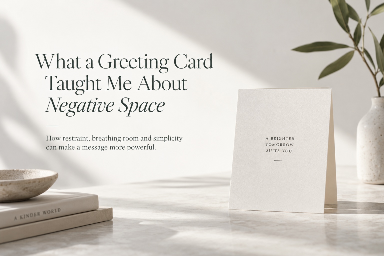
Sometimes the strongest design lessons come from the simplest objects. A greeting card with nothing more than a short line of text, generous margins and carefully chosen paper can communicate more effectively than something filled with illustrations, decorative borders and additional messages.
What makes that kind of card memorable is not necessarily what has been added to it. Very often, it is what has deliberately been left out. The empty area surrounding the message gives the words room to exist, allowing the reader to stop, notice and actually feel what is being said.
That is the real power of negative space. It is not unused territory waiting for another design element. It is an active part of the composition.
Why Designers Often Feel the Need to Fill Everything
Empty space can make designers uncomfortable. When a layout contains a large unused area, the instinct is often to assume that something is missing. Perhaps another image should go there, a decorative pattern could make it more interesting, or another line of copy might make the page feel more complete.
That instinct is understandable because designers are usually trained to solve problems by adding visual information. When the canvas feels unfinished, adding something seems like progress.
But there is an important difference between a design that feels unfinished and one that feels intentionally restrained. The greeting card works precisely because it does not apologise for being simple. The empty space communicates confidence.
It says that the message is strong enough to stand on its own.
Negative Space Is Not Really Empty
The term "negative space" can make it sound as though the area has no purpose, but that is misleading. Space performs several important jobs at once.
It separates elements that should not compete with each other. It establishes hierarchy. It creates rhythm and gives the eye somewhere to rest. Most importantly, it determines how much attention the remaining elements receive.
Put a short sentence inside a crowded composition and it becomes one object among many. Place the same sentence in the middle of a large empty field and suddenly it becomes the entire experience.
Nothing about the wording has changed. What changed is the amount of space supporting it.
Space Can Give Words More Emotional Weight
A greeting card is a particularly good example because the message is usually personal. A sentence such as "I'm proud of you," "Thank you," or "I miss you" does not necessarily need decoration to become meaningful.
In fact, too much decoration can weaken the emotional impact. When a message is surrounded by visual noise, the reader's attention gets divided between the words and everything else happening around them.
Large margins do the opposite. They isolate the message and create a moment of pause. The reader encounters the words without distraction.
The space almost becomes a kind of silence around the sentence, and that silence gives the message more weight.
Good Design Does Not Need to Prove How Hard You Worked
One reason designers sometimes overfill layouts is because simplicity can feel too easy. A composition with only one line of text may look like it took five minutes, even if achieving the right balance required hours of refinement.
That can create pressure to add more simply so the design appears more substantial.
But complexity is not proof of quality. A strong design is not successful because the viewer can see how much effort went into it. It is successful because the communication feels clear and deliberate.
Sometimes removing three elements requires better judgement than adding ten.
Negative Space Creates Hierarchy Without Needing More Decoration
Designers often create hierarchy using size, colour, weight and contrast, but spacing can accomplish just as much.
An element surrounded by generous space naturally attracts attention because nothing else is competing with it. It becomes important through isolation rather than exaggeration.
This is particularly useful when you want a design to feel calm or sophisticated. Instead of making the headline dramatically larger or adding a bright colour, simply giving it more room may create all the emphasis you need.
Luxury branding uses this principle frequently. Premium designs often feel expensive not because they contain more, but because they can afford to leave space unused.
The Eye Needs Somewhere to Rest
Dense layouts can become exhausting because the viewer is constantly processing information. Text, images, icons and colour all demand attention at the same time.
Negative space creates visual rest. It allows the eye to stop processing one thing before moving to another.
That breathing room improves readability and makes it easier to understand how different pieces of information relate to one another. Two paragraphs placed very close together may feel like one block, while sufficient spacing clearly separates them into distinct ideas.
This means white space is not simply aesthetic. It can improve comprehension.

The Same Lesson Applies to Web and Interface Design
The principle extends far beyond greeting cards and print design. Websites and application interfaces benefit from negative space in exactly the same way.
A landing page with too many buttons, messages and promotional elements makes it difficult for users to understand what matters most. A cleaner page with one obvious primary action usually feels easier to navigate.
The same applies to dashboards, mobile apps and forms. When every element is tightly packed together, everything begins to look equally important.
Spacing allows hierarchy to emerge naturally.
More Content Does Not Always Create More Value
There is a persistent assumption in design that empty space represents missed opportunity. If there is room for another testimonial, feature, banner or call-to-action, why not include it?
Because every additional element creates competition.
The question should not be whether another element fits. The question should be whether the design becomes better when that element is present.
If removing something makes the main message clearer, then the empty space created by its removal is already doing more useful work than the element itself.
Restraint Is a Form of Confidence
Minimal design works best when it feels intentional rather than incomplete. That requires confidence from the designer.
You need to trust that the typography is strong enough. Trust that the image does not need another supporting graphic. Trust that the message can hold attention without constant decoration.
That is difficult because leaving something out feels less measurable than adding something in. But restraint is often what separates a clean design from an overcrowded one.
The greeting card demonstrates this beautifully. Its simplicity works because the designer stopped before the composition became busy.
Space Also Influences Pace
One overlooked role of negative space is pacing. A dense composition encourages the viewer to process everything quickly because there is no natural pause between elements.
Generous spacing slows the experience down.
The reader moves from one element to another with more deliberate attention. In editorial design, that can make an article feel calmer. In branding, it can make the presentation feel more considered. On a greeting card, it encourages the recipient to spend a moment with the message rather than immediately moving past it.
Space controls not only what people see, but how quickly they experience it.
The Best Way to Improve a Design May Be to Remove Something
When a design feels weak, the instinct is often to add another visual treatment. Sometimes the better question is: What can disappear?
Remove an unnecessary subtitle. Reduce the number of colours. Eliminate a decorative border. Increase the margins. Give the headline more space.
Each removal forces the remaining elements to work harder, which quickly reveals whether they are strong enough.
If the design improves as elements disappear, the problem was probably never that it needed more.
Final Thoughts
A simple greeting card can teach a surprisingly important design lesson: empty space is not wasted space.
The area around the message is actively shaping how that message is perceived. It creates focus, gives the eye somewhere to rest and allows important elements to carry more emotional and visual weight.
Designers do not always need another colour, another illustration or another piece of copy. Sometimes the strongest decision is to stop adding and allow the composition to breathe.
The next time a layout feels unfinished because there is too much empty space, resist the urge to immediately fill it. Look at what the space is already doing.
It may be creating exactly the clarity, confidence and emphasis the design needs.
Fill less. Say more. Let the space do some of the work.











Comments 0