

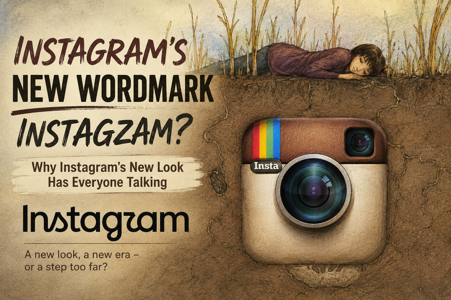
Instagram has officially introduced a new wordmark, replacing the familiar script-style branding that has represented the platform for more than a decade. On paper, the change is relatively small. The Instagram app icon remains the same, the platform itself has not been redesigned, and most users will probably continue using the service exactly as before. But branding changes tend to attract attention precisely because they alter something people have become used to seeing for years.
This time, Instagram's new wordmark has quickly become a talking point because of its unusual mix of handwritten and more conventional lettering. While the company describes the new design as cleaner and more modern, many users seem to be asking a simpler question:
Was there really anything wrong with the old one?
Instagram Moves Away From Its Familiar Script
Instagram head Adam Mosseri unveiled the new wordmark in a post on the platform, describing the refreshed design as a more modern interpretation of the brand while still retaining elements of its history.
The previous Instagram wordmark had a recognisable handwritten quality. Even when separated from the colourful camera icon, it was immediately associated with the platform.
The new version still attempts to preserve some of that personality, but it does so in a noticeably different way.
Rather than committing completely to either a clean printed font or a flowing handwritten script, the design appears to combine elements of both.
Certain letters, particularly the "s", "g" and "r", retain stronger cursive characteristics, while other parts of the word feel much more restrained.
Instagram's design philosophy appears to be about simplifying the overall look without completely abandoning its original identity.
Whether that combination actually works is proving much more subjective.
The New Wordmark Is Already Being Misread
One of the biggest criticisms surrounding the design is legibility.
The way some letters connect or curve has led users to jokingly suggest that the new wordmark resembles words such as "Instagzam" or even "Instagwam" rather than Instagram.
Once you notice it, it can be difficult to unsee.
That is obviously not ideal for a logo whose most basic job is to communicate the company's name clearly.
Typography is not only about creating something visually distinctive. A good wordmark needs to balance personality with readability, especially for a brand as globally recognisable as Instagram.
The old logo was highly stylised, but most people could still immediately read it.
The new design arguably requires a second glance in certain contexts.
That may not matter much for a platform with billions of recognisable visual cues surrounding it, but it does raise the question of whether Instagram traded some clarity for the sake of appearing newer.
Instagram Says the Design Is Cleaner and More Modern
Mosseri described the new text as "cleaner and more modern", while still referencing the craftsmanship and simplicity associated with earlier Instagram branding.
There is certainly some truth to that.
The new wordmark is thinner and less decorative than the previous design. It feels more restrained, and in some ways it aligns better with the minimalist branding language that dominates modern technology companies.
But that is also where some of the criticism comes from.
Modern corporate branding has increasingly moved toward simplified typography, flatter visual identities and neutral-looking designs that work consistently across mobile apps, websites, advertisements and digital interfaces.
That makes practical sense.
Unfortunately, it can also make brands begin to look increasingly similar.
Instagram's original wordmark had imperfections and personality.
The new one looks more polished, but arguably less distinctive.
Users Quickly Questioned Whether the Change Was Necessary
Unsurprisingly, the announcement attracted plenty of reactions.
Some users welcomed the refreshed appearance, but many others questioned why Instagram was spending time redesigning something that did not appear to be causing any real problems.
That reaction is fairly common whenever major platforms change familiar visual elements.
People become attached to branding through repetition. A logo that appears on someone's phone every day becomes part of their visual routine.
Changing it can therefore feel surprisingly significant even if nothing else about the service changes.
Mosseri later shared the redesign on Threads as well, inviting people to share their reactions.
And the responses there were reportedly even less forgiving.
A recurring theme across the comments was that users simply had not been asking for a new wordmark.
Instead, many would rather see Instagram dedicate attention toward platform features, moderation, recommendation algorithms or other parts of the experience they interact with every day.
Some Users Even Want the Older Instagram Identity Back
Whenever Instagram changes its visual identity, nostalgia inevitably enters the conversation.
Some users continue to associate Instagram with its much older branding, particularly the original camera-inspired icon and earlier script logo.
That reflects something larger about the platform itself.
Instagram has changed dramatically since its early years.
It began primarily as a photo-sharing application built around square images, filters and relatively simple social interaction.
Today, Instagram encompasses Reels, Stories, direct messaging, shopping, recommendation feeds, algorithmic discovery and creator-focused content.
Its branding has evolved alongside that transformation.
But some users still associate the older aesthetic with a time when Instagram felt simpler and more focused.
So when the company introduces an even cleaner and more corporate-looking identity, those nostalgic reactions become understandable.
The debate is not necessarily just about typography.
It is partially about what people feel Instagram has become.
Instagram Considered Several Other Designs
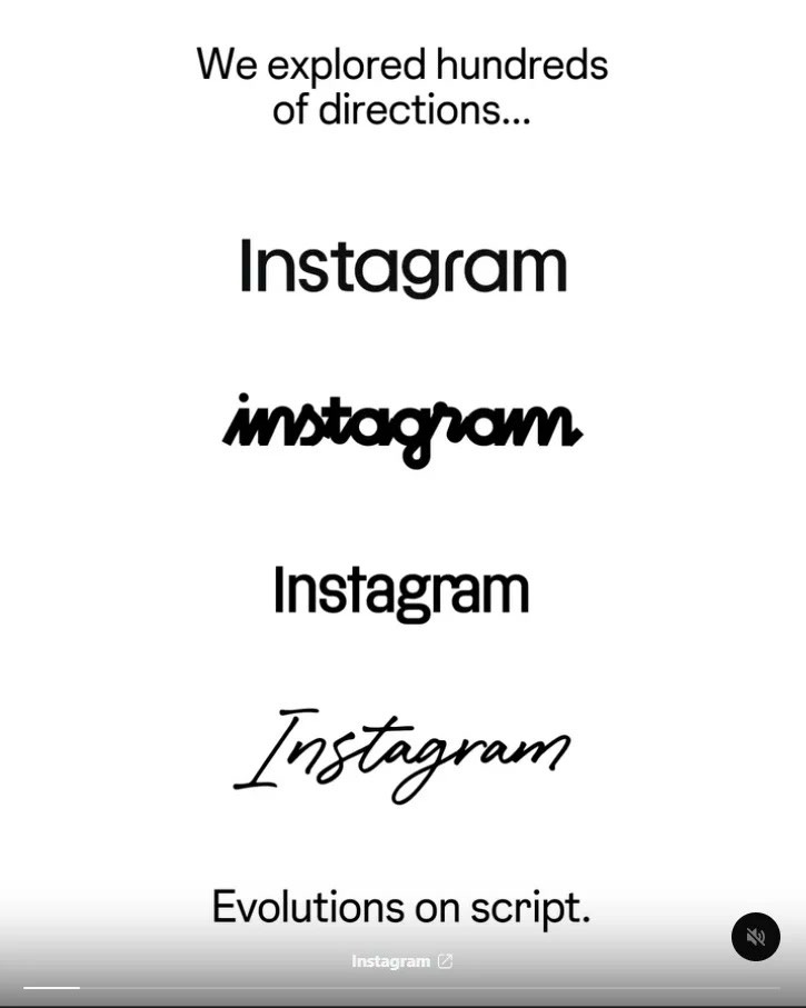
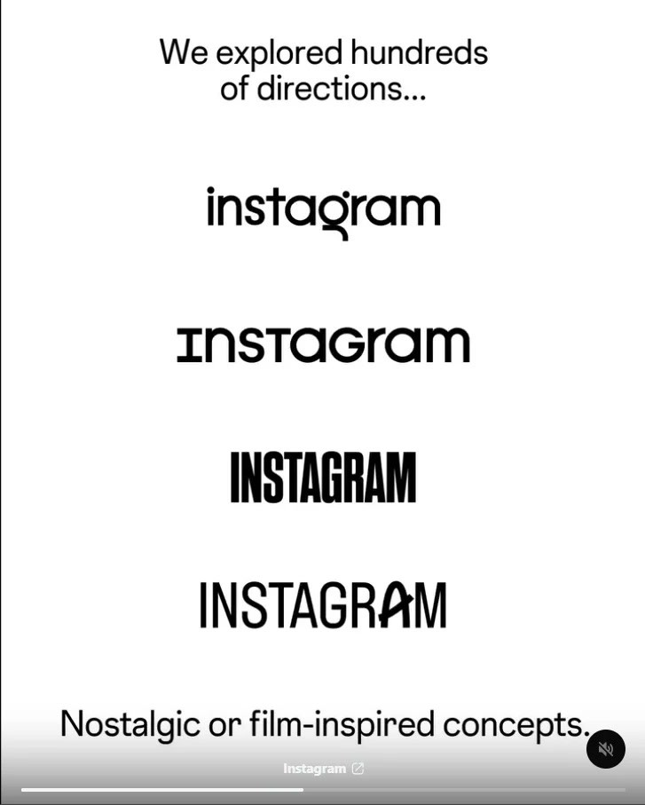
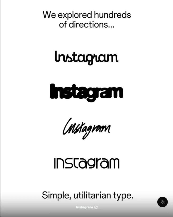
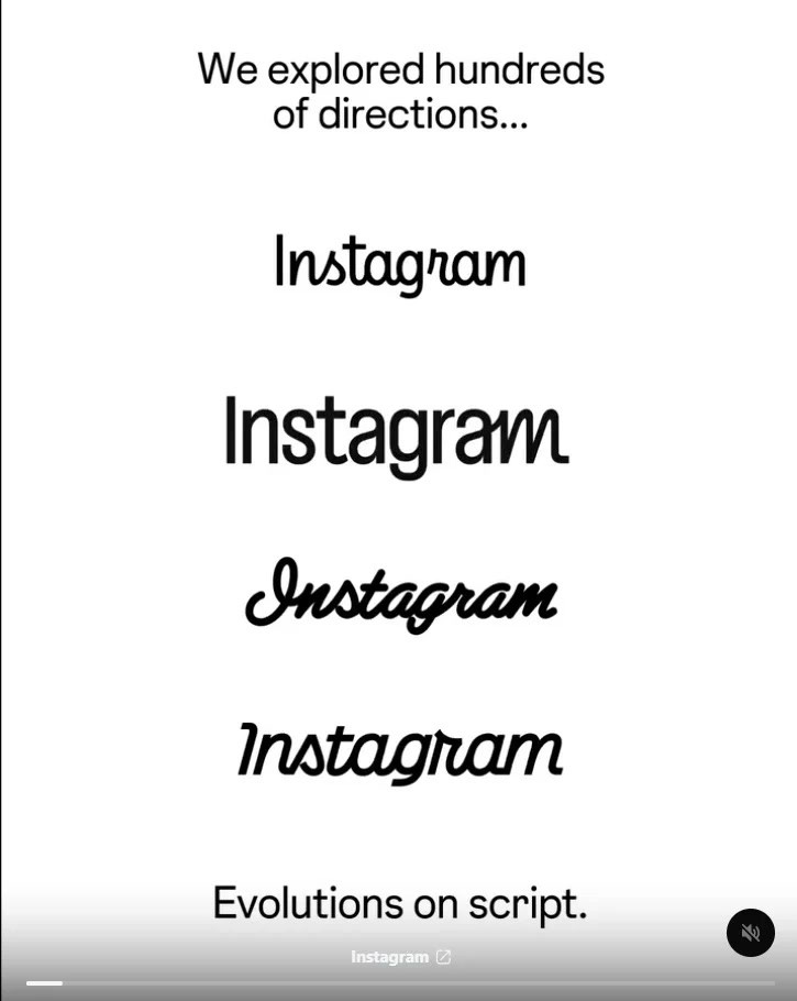
Perhaps the most interesting part of the redesign is that Instagram apparently explored a number of other possibilities before settling on the final version.
The Instagram Design account shared several experimental wordmarks, showing that the team tested different approaches and type styles during development.
Some were more heavily cursive.
Others appeared cleaner and more consistent.
Several of the alternatives arguably offered better readability than the final design.
That inevitably led to another round of discussion: if Instagram had several visually strong options available, why did it choose this one?
Design teams rarely select logos based purely on what looks nicest in isolation.
Branding has to work across countless environments, from tiny mobile screens to advertisements, promotional videos, merchandise and corporate presentations.
The final design may therefore have been selected because it performed better across a broad range of use cases.
Still, seeing the rejected designs makes the final choice feel less inevitable.
For some people, it may even make the new wordmark harder to defend.
The Mixed Typography Is the Most Divisive Element
The unusual combination of cursive and more conventional forms is probably what gives the new logo its most distinctive characteristic.
It is also what makes it controversial.
A fully handwritten logo can feel playful and expressive.
A clean sans-serif or modern typeface can feel contemporary and professional.
Instagram appears to be trying to occupy the space between those two ideas.
The problem is that compromises in visual design can sometimes produce something that feels less cohesive than either original direction.
Some viewers may interpret the varied lettering as handcrafted and expressive.
Others may simply see it as inconsistent.
And because Instagram is such a recognisable brand, even tiny irregularities become highly noticeable.
When a smaller company changes its typography, few people care.
When Instagram does it, every curve is inspected.
Could Instagram Have Chosen Something Simpler?
Looking through the alternative designs raises an interesting argument.
If Instagram's objective was primarily to modernise the logo while retaining its heritage, a slightly refined version of the existing cursive style may have been enough.
That approach could have preserved recognisability while reducing some of the heavier or more decorative elements.
Alternatively, Instagram could have gone in the opposite direction and adopted an entirely clean, minimal wordmark.
Either approach would have provided a clearer visual philosophy.
The chosen design attempts to preserve traces of the old Instagram while simultaneously moving away from it.
That may explain why it feels strange initially.
It is familiar enough to remind you of the old logo, yet different enough that your brain notices something is wrong.
Perhaps that reaction will disappear after people become accustomed to seeing it.
Most logo redesigns eventually become normal through repetition.
The Bigger Issue Is Corporate Design Becoming Increasingly Similar
Instagram's redesign also fits into a broader trend across the technology industry.
Many major companies have simplified their visual identities over the past decade.
Detailed logos have become flatter.
Distinctive fonts have become cleaner.
Bright or unusual branding elements are often reduced into designs that scale easily across smartphones, websites and digital products.
There are practical reasons for this.
Modern logos need to remain readable at extremely small sizes, work in dark and light themes, animate smoothly and fit within increasingly standardised user interfaces.
But the downside is a growing sense of sameness.
Brands that once had quirky or unusual identities increasingly adopt minimalist typography and simple geometric shapes.
That can make them technically cleaner while also making them less memorable.
Instagram's new wordmark arguably sits somewhere inside that tension.
It is designed to look modern.
But being modern does not automatically mean being interesting.
A Logo Doesn't Need to Be Perfect on Day One
It is worth remembering that public reactions to major redesigns are often harshest immediately after launch.
Users initially criticised many logos that later became completely normal.
Familiarity plays a significant role in how people judge visual branding.
The previous Instagram wordmark benefited from years of exposure.
People knew what it looked like without consciously thinking about it.
The replacement doesn't have that advantage yet.
After several months of seeing the new logo across Instagram, Threads, advertisements and marketing materials, the strange letter shapes may begin to feel completely ordinary.
The real test therefore won't necessarily be how people react during the first few days.
It will be whether the design still feels awkward once the novelty wears off.
Final Thoughts
Instagram's new wordmark is not disastrous, but it does feel like a surprisingly controversial solution to a problem most users probably didn't know existed.
It is undeniably cleaner and more contemporary than the previous script, and it still contains enough handwritten elements to reference Instagram's older identity.
At the same time, the mixed lettering creates readability issues that have already turned into jokes, while several of the alternative concepts shown by Instagram's own design team arguably look more cohesive.
That makes the redesign interesting less because of the logo itself and more because of what it represents.
Modern technology companies increasingly prioritise simplicity, consistency and scalability, even when doing so means removing some of the personality that made their branding distinctive in the first place.
Instagram's latest wordmark certainly looks more polished.
Whether it actually looks better is another question entirely.











Comments 0