

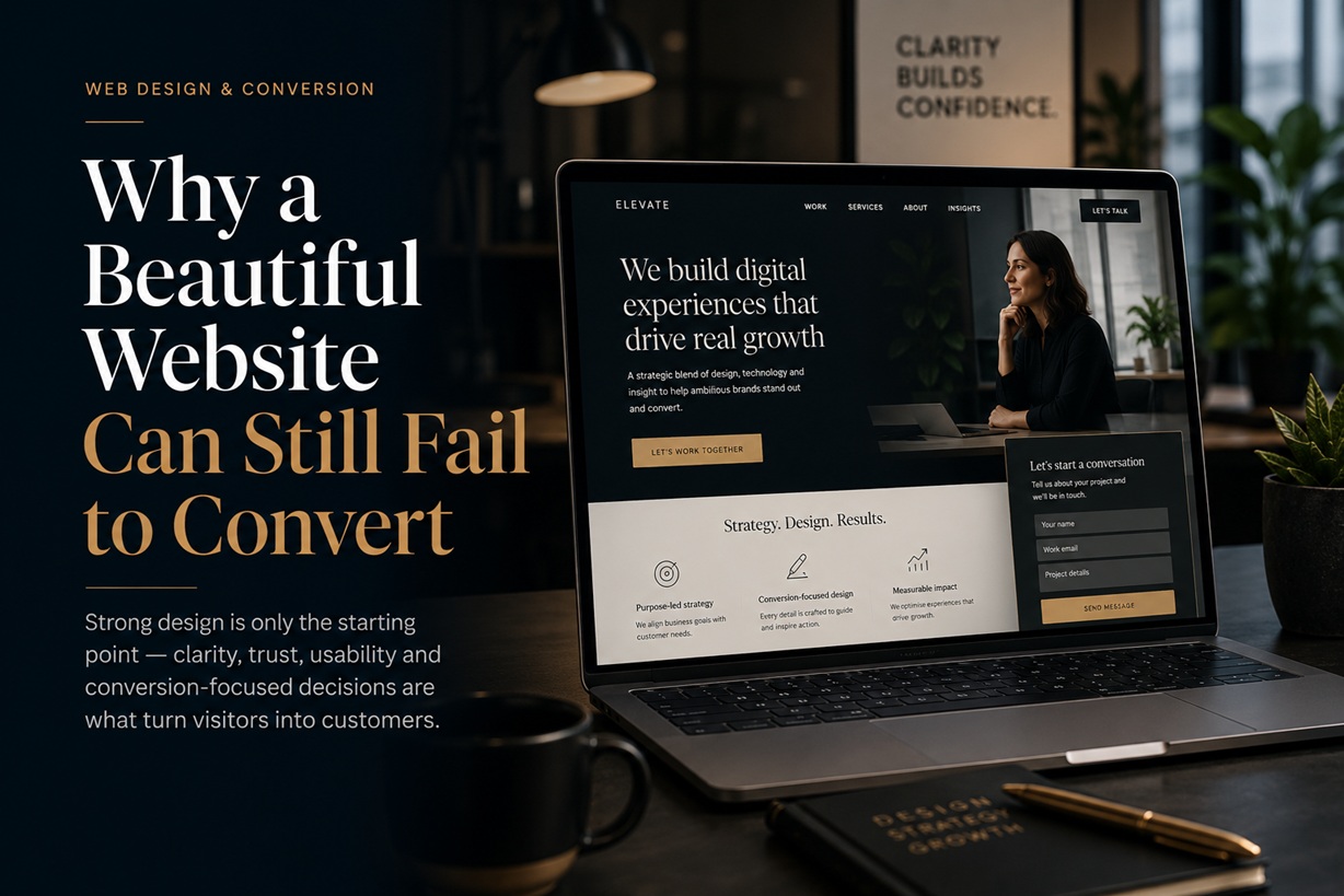
A polished website can make a strong first impression. The typography feels refined, the colour palette is consistent, the animations are smooth and every section sits neatly within the grid. From a visual perspective, everything appears complete. Then the site launches—and very little happens.
Visitors arrive, browse briefly and leave. Enquiries remain low. Product pages attract traffic but generate few purchases. The client begins asking why a website that looks so impressive is not producing better results.
This is where visual design and commercial performance begin to separate. A website can be beautifully executed and still fail at its most important task: helping the right visitor understand the offer, trust the business and take action.
Good Design Is Now the Minimum Expectation
There was a time when a responsive website with clean typography and a modern layout could distinguish a company from its competitors.
That is no longer enough.
Responsive design, mobile compatibility and consistent branding are now basic expectations. Clients assume their site will function across different screen sizes, load correctly and look professional before any discussion about conversion begins.
In other words, beauty has become the baseline rather than the finished product.
The more useful question for designers is no longer simply, "How can this site look better?" It is, "How can the design help the business achieve something measurable?"
That outcome may involve generating enquiries, increasing purchases, collecting registrations, encouraging downloads or guiding visitors toward a consultation.
A visually impressive website that does not support one of those goals may still succeed as a portfolio piece, but it is not yet functioning as a strong business tool.
Conversion Is Part of the Design Process
When a website underperforms, responsibility is often passed immediately to the marketing team.
Sometimes that criticism is justified. Weak targeting, poor-quality traffic or an unclear campaign can certainly limit results.
However, many so-called marketing problems are actually design problems.
A visitor may not convert because the primary button is difficult to notice. The form may ask for too much information. The service benefit may be hidden beneath vague wording. A decorative hero image may occupy so much space that the main call to action disappears below the fold.
These are not minor visual issues. They directly affect whether users understand what to do next.
The wording, position, size and contrast of a call-to-action button can influence behaviour. So can the amount of information placed around it.
A button labelled "Submit" tells the user almost nothing. A button labelled "Request a Free Consultation" explains both the action and the expected result.
That is not merely copywriting. It is a design decision because the wording must fit the layout, attract the correct level of attention and appear at the right point in the user journey.
Clarity Usually Converts Better Than Cleverness
Designers naturally want a website to feel original. Clients also want their brand to appear distinctive.
The problem begins when originality makes the experience harder to understand.
A clever headline may sound sophisticated but fail to explain what the company does. An experimental navigation system may look impressive but confuse visitors. A minimal homepage may be visually elegant while providing too little information to build trust.
Users rarely arrive on a website hoping to admire its creativity. They usually arrive with a question, a problem or a decision to make.
They want to know:
What does this company offer?
Is it suitable for me?
Why should I trust it?
What should I do next?
The faster a website answers those questions, the more useful it becomes.
Creativity still matters, but it should support understanding rather than compete with it.
The Hero Section Must Earn Its Space
The hero section is often treated as the centrepiece of the design.
Large photography, animated text and cinematic video can create an impressive opening. However, the hero must do more than set a mood.
Within a few seconds, visitors should be able to understand the business, the main value offered and the next available action.
A strong hero section usually combines a clear headline, a supporting explanation and one obvious call to action.
A weak hero may rely on generic phrases such as "Transforming Possibilities" or "Building a Better Tomorrow." These statements sound positive, but they force the visitor to keep searching for basic information.
The hero should reduce uncertainty, not create it.
The visual hierarchy must also be intentional. When the image, headline, background animation and multiple buttons all compete for attention, none of them performs effectively.
Mobile Design Requires Different Decisions
A mobile website is not simply the desktop version squeezed into a narrower screen.
The user behaves differently, the available space is smaller and the environment is often less controlled. Someone may be browsing while commuting, standing in a queue or using an older device on a slower connection.
Elements that appear manageable on desktop can become frustrating on mobile.
Long forms feel even longer. Small buttons become difficult to tap. Oversized images push important content further down the page. Pop-ups block the interface. Fixed elements consume valuable screen space.
Designing mobile-first means deciding what matters most when space is limited.
The main message should remain visible. Calls to action should be easy to reach. Forms should request only essential information. Navigation should feel obvious without requiring unnecessary gestures.
Mobile design is therefore less about shrinking and more about prioritising.
Speed Is a Design Feature
Performance is often treated as a development concern, but designers influence it heavily.
Large hero videos, uncompressed images, complex animations and multiple font files may all contribute to slower loading.
A visually impressive homepage becomes far less effective when visitors must wait several seconds before they can interact with it.
Every visual element should justify its cost.
Does the background video help explain the service, or is it merely decorative? Does the animation guide attention, or does it delay access to the content? Does the high-resolution image need to occupy the full screen?
Performance should be considered during design rather than left for developers to repair after approval.
A fast website feels more responsive, more trustworthy and easier to use. Those qualities directly affect conversion.
Forms Often Become Unnecessary Barriers
Forms are one of the most common points of failure.
Businesses frequently ask for as much information as possible because the data may be useful later. However, each additional field increases the effort required from the visitor.
A person making an initial enquiry may be willing to provide a name, email address and short message. They may not be ready to disclose their company size, budget, phone number, job title, industry and preferred appointment date.
The form should match the level of commitment being requested.
A simple newsletter registration should not resemble a customer onboarding process. A first-contact form should not feel like a legal application.
Designers should also consider the experience after submission.
Does the user receive confirmation? Is the next step explained? Will someone respond within a stated timeframe? Can the visitor continue exploring useful content?
Conversion does not end when the button is clicked. The confirmation experience is part of the journey.
Trust Must Be Designed Into the Page
Visitors are more likely to act when the site gives them reasons to feel confident.
Trust can be supported through customer testimonials, case studies, accreditations, transparent pricing, clear contact details and evidence of real experience.
However, these elements must appear where uncertainty is likely to occur.
A testimonial hidden near the bottom of an unrelated page may have little effect. A relevant case study placed beside a service description can help the visitor understand what the company has achieved for similar clients.
Trust also depends on smaller details.
Broken links, inconsistent typography, outdated copyright notices, poor grammar and low-quality images can make a business appear less reliable.
These issues may seem cosmetic, but users often judge credibility through the overall quality of the experience.
AI-Referred Visitors May Arrive With Stronger Intent
Traffic is also changing.
Some visitors now discover websites through AI assistants rather than traditional search engines. They ask a detailed question, receive a recommendation and follow the suggested source.
These visitors may arrive with clearer intent because they have already explained what they need before reaching the website.
That creates a valuable opportunity, but it also raises expectations.
The landing page must immediately confirm that the visitor has reached the right place. The content should answer the question that brought them there, provide useful context and make the next action obvious.
A vague landing page wastes a warm lead.
Designers should therefore think beyond traditional keyword-based search behaviour. Future visitors may arrive from conversational systems that have already positioned the website as a relevant answer.
The page must deliver on that recommendation quickly.
Content and Design Cannot Be Separated
A common project workflow involves designing pages first and inserting final content later.
This often produces layouts filled with placeholder text, followed by awkward revisions when the real content arrives.
Strong conversion design requires content and layout to develop together.
The length of the headline affects the composition. The complexity of the offer determines how much explanation is required. The call to action depends on the stage of the customer journey. Trust signals must be positioned near the claims they support.
Content is not material poured into a finished container. It is part of the structure.
Designers do not need to become full-time copywriters, but they should understand the role each message plays and challenge wording that creates confusion.
The Designer, Developer and Marketer Need One Goal
Many weak websites are not caused by a lack of talent. They are caused by disconnected teams.
The designer focuses on appearance. The developer focuses on functionality. The marketer focuses on traffic and leads.
When each discipline works from a separate brief, the finished product may technically succeed while commercially underperforming.
The designer may create an interaction that is difficult to track. The developer may build a feature that slows the page. The marketer may send visitors to a landing page that was never designed for a specific campaign.
The strongest projects treat the website as one system.
The designer owns the experience. The developer ensures that experience performs reliably. The marketer connects it to the audience and business objective.
Those conversations should happen before the first visual concept is approved, not after the site begins underperforming.
Design Decisions Should Be Tested, Not Defended
Designers often become attached to particular solutions because they spent time refining them.
However, conversion performance should not depend entirely on personal preference.
Testing can reveal whether users understand the headline, notice the call to action, complete the form or abandon the page.
This does not mean every creative decision should be reduced to numbers. Brand perception, emotional response and long-term credibility are not always immediately measurable.
But when a page has a clear commercial purpose, designers should be willing to examine whether the chosen design supports that purpose.
Changing a button label, simplifying a form or moving an important message higher on the page is not a rejection of the original design. It is part of improving it.
A High-Converting Site Does Not Need to Look Aggressive
Conversion-focused design is sometimes associated with flashing buttons, countdown timers and constant prompts.
That approach may generate short-term clicks, but it can also damage trust.
A well-designed conversion journey can remain calm, elegant and respectful.
The objective is not to pressure visitors. It is to remove uncertainty and unnecessary effort.
The page should clearly present the value, answer reasonable questions and make the next step easy.
When the experience feels natural, conversion becomes the result of good communication rather than manipulation.
Final Thoughts
A beautiful website is valuable, but beauty alone does not guarantee business performance.
The strongest websites combine visual quality with clarity, speed, trust and a carefully designed path toward action.
For designers, this does not require abandoning creativity or becoming performance marketers. It requires thinking beyond the reveal presentation and considering what happens when real visitors begin using the site.
Ask what the business considers a successful conversion. Identify which pages contribute most directly to that outcome. Test the experience on mobile devices, slower connections and smaller screens. Examine whether the content answers the visitor's questions quickly.
A website that impresses other designers may earn recognition. A website that helps customers understand, trust and act can produce lasting value for the client.
The best work manages to do both.











Comments 0