

Building a startup brand is tricky because startups are usually caught between two realities. On one side, they need to look professional enough to attract customers, investors, partners and future employees. On the other side, they usually do not have the budget, time or team size to build a complete brand identity the way a large company would.
That is where many founders get stuck. They either spend too much money too early on branding, or they ignore branding completely until the business starts to look inconsistent and unpolished. Neither approach is ideal.
A startup does not need a perfect brand from day one. What it needs is a practical brand that works. It needs enough visual identity to look credible, enough consistency to be recognisable and enough flexibility to grow without needing to redesign everything every few months.
In other words, startup branding is not about doing everything. It is about doing the right things first.
Start With A Minimum Viable Brand
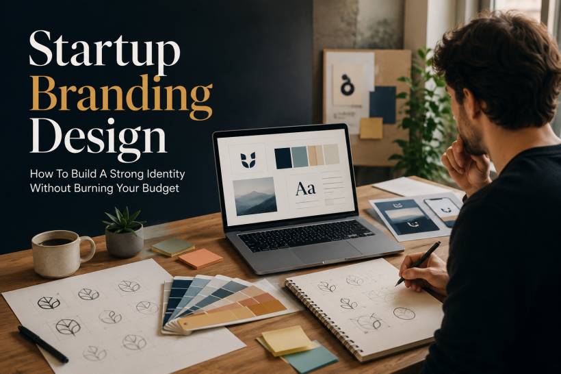
Just as startups often begin with a minimum viable product, they can also begin with a minimum viable brand. This is the simplest version of a brand identity that allows the company to appear consistent across basic materials such as a website, pitch deck, social media profile, email signature and product screen.
At the early stage, a brand does not need a huge guideline document. It does not need a complicated visual language, custom icon system or expensive photography direction. Those things can come later when the business has a stronger reason and the budget to support them.
The basic foundation should be simple. A startup needs a logo that works at small sizes, a colour palette that gives the brand personality and contrast, and a typography system that makes the company's communication readable and professional.
That is enough to get moving. The goal is not to impress a design award jury. The goal is to avoid looking random, unfinished or forgettable.
Create A One-Page Brand Cheat Sheet
Instead of starting with a long brand guideline document, a startup should begin with a one-page brand cheat sheet. This should be simple enough that everyone in the company can actually use it.
The cheat sheet should answer the most important questions. What does the logo look like? How should it be used? What are the main brand colours and their hex codes? Which fonts should be used for headlines and body text? What should the brand sound like when it communicates?
This one-page document becomes the practical brand reference for the team. It helps a founder prepare a deck, a marketer create a social graphic, a developer style a landing page and a salesperson update a proposal without guessing.
The biggest advantage of a brand cheat sheet is that it reduces decision fatigue. Instead of choosing new fonts, colours and layouts every time something is created, the team has a small set of rules to follow. That consistency is what makes even a young company feel more mature.
Keep The Logo Simple And Scalable
Many startups assume the logo has to be clever, complex or heavily customised to be good. In reality, the most useful startup logos are often the simplest ones.
A logo needs to work in real-world situations. It should look clear as a website favicon, social media avatar, app icon, invoice header, presentation cover and mobile screen element. If it only looks impressive when displayed large on a designer's portfolio, it may not be practical enough for everyday business use.
For many startups, a clean wordmark or lettermark is a smart starting point. A well-spaced name set in a strong typeface can look professional without being overdesigned. It also scales well, works in black and white, and is easier to apply across different platforms.
If the budget is tight, founders can begin with a carefully chosen free font and a clean layout. Later, when the business has more resources, a designer can refine the wordmark, adjust spacing, improve proportions and create a more polished version. This is often better than spending too much too early on a logo before the startup even fully understands its market.
Choose Colours With Purpose, Not Random Taste
Colour plays a big role in how people feel about a brand. A deep navy palette can feel trustworthy and corporate. A bright coral accent can feel energetic and modern. Forest green and cream may feel calm, organic or premium. These signals matter because people form impressions quickly.
Startups do not need to invent a completely original colour palette. What matters more is choosing colours strategically. The palette should match the emotional space the company wants to occupy and the expectations of its audience.
A good early-stage palette can be as simple as three colours: one primary brand colour, one secondary accent colour and one neutral colour such as white, off-white, dark grey or black. This keeps the brand manageable and prevents every design from becoming a colour experiment.
Accessibility should also be considered from the beginning. A colour may look beautiful in a logo but fail badly when used for buttons, links or text on a website. If users cannot read the content clearly, the colour choice becomes a problem rather than a brand asset.
Use Typography To Make The Brand Feel Professional
Typography is one of the easiest ways to make a startup look more polished. The good news is that startups no longer need expensive font licences to achieve a professional look. Free libraries such as Google Fonts offer many strong, web-friendly typefaces that work well for modern brands.
The simplest approach is to choose two typefaces. One can be more expressive for headlines, while the other should be highly readable for body text. This gives the brand enough personality without making the system complicated.
The key is restraint. Using too many fonts makes a startup look messy. It also creates unnecessary implementation issues across websites, decks, documents and social templates. In the first stage of branding, two fonts are usually enough.
Typography should not be treated as decoration only. It affects readability, tone and trust. A brand that uses type consistently will feel more organised, even if the rest of the visual identity is still simple.
Templates Are More Valuable Than One-Off Designs
For startups, templates are often more useful than custom designs created from scratch every time. A good template saves time, protects consistency and allows a small team to move quickly.
The most useful templates include a pitch deck, social media graphic, one-page company overview, email signature and basic proposal or document layout. These assets cover the situations where startups most often need to present themselves professionally.
Templates also reduce dependency on designers for every small task. Once the core structure is in place, team members can update text, images and data without breaking the overall look. This is especially useful for founders and early employees who need to create materials quickly.
The aim is not to remove design expertise. The aim is to use design expertise wisely. A designer can create the system, and the team can use that system repeatedly.
Know What To Outsource And What To Keep In-House
A startup with limited resources should not outsource everything. At the same time, it should not try to handle every important brand decision internally if nobody on the team has design experience.
The best approach is to outsource the strategic parts and keep the daily execution in-house. Strategic work includes the logo, colour palette, typography system and core templates. These decisions shape how the brand appears for months or even years, so they are worth getting right.
Once those foundations are ready, the team can handle routine tasks internally. Social posts, sales deck updates, email headers and minor template adjustments can be done using tools such as Canva, Figma or PowerPoint, as long as the brand cheat sheet is followed.
This keeps costs under control while still giving the startup a professional visual foundation. It also prevents the common problem of every employee creating materials in a different style.
Do Not Overbuild The Brand Too Early
One of the biggest mistakes a startup can make is building a brand system that is too heavy for the business to maintain. A detailed identity system may look impressive, but if the team is too small to use it properly, it becomes wasted effort.
A startup should only invest more when the business actually needs more. For example, expanded brand guidelines may become useful when the company hires its first marketing person or starts producing content at a larger scale.
Custom illustration or photography may become worth it when the product looks similar to every competitor and needs more personality. A full design system becomes more important when the company has multiple product surfaces, such as a website, mobile app, admin panel, customer emails and internal tools.
Until those moments arrive, simplicity is usually the smarter choice. The brand should support the business, not slow it down.

Consistency Matters More Than Perfection
A startup brand does not need to be perfect to be effective. It needs to be consistent enough that people recognise it and trust it.
A simple logo used consistently is better than an amazing logo surrounded by random colours and mismatched fonts. A one-page brand cheat sheet that everyone follows is better than a 100-page guideline that nobody opens. A basic template library that supports daily work is better than a beautiful design concept that cannot be applied easily.
This is the practical side of branding that founders sometimes overlook. Branding is not only what the company looks like on launch day. It is what the company looks like every time someone sees a proposal, visits a landing page, opens an email or checks a social post.
Consistency builds familiarity. Familiarity builds trust. For a startup, that trust can make a real difference.
Final Thoughts
Startup branding is not about pretending to be a large company. It is about presenting the business clearly, confidently and consistently with the resources available.
The smartest approach is to start small but intentional. Build a simple logo, choose a focused colour palette, select reliable typography and create templates that the team can actually use. Put everything into a one-page brand cheat sheet and treat that as the foundation until the company grows enough to justify more.
A brand can always become more sophisticated later. What matters in the beginning is that it works. It should help the startup look credible, communicate clearly and move faster without wasting time on unnecessary design decisions.
Do the essentials well first. Add complexity only when the business is ready for it. A practical brand that launches and supports real growth is far more valuable than a perfect brand that never leaves the planning stage.


Comments