

An album cover has one of the hardest jobs in visual design. It has to represent an entire body of music through a single image, often before the listener has heard a single note. At its best, an album cover does much more than make the packaging attractive. It establishes mood, creates curiosity, gives the music a visual identity and becomes something listeners associate with the songs for years afterward.
That is why album artwork remains such a useful reference for designers. Whether you are creating a poster, website, campaign, logo or social media artwork, many of the same principles apply: communicate one strong idea, create an immediate emotional response and make the visual memorable enough to survive outside its original context.
A Great Cover Starts With One Clear Idea
One of the biggest mistakes in visual communication is trying to explain everything at once.
Strong album artwork rarely attempts to illustrate every song, lyric or concept contained within the record. Instead, it identifies one central emotional or conceptual idea and builds the entire visual around it.
Pink Floyd's The Dark Side of the Moon is an obvious example. Its prism and spectrum do not literally describe the songs. Instead, the image works as a metaphor for transformation, division and different dimensions of human experience.
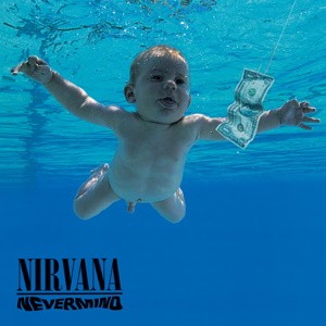
Nirvana's Nevermind takes a completely different approach, but the principle is similar. The image of a baby reaching toward money communicates innocence colliding with commercial desire without needing a paragraph of explanation.
That is the lesson designers should remember: a visual does not need to explain everything to communicate something meaningful.
In fact, the more ideas competing for attention, the weaker the message often becomes.
Before beginning a design, it can therefore help to ask one simple question:
What is the single idea this visual needs people to remember?
Everything else should support that answer.
Emotion Comes Before Explanation
Album covers are also extremely good at creating a feeling before the viewer fully understands what they are looking at.
That emotional reaction matters because people usually respond to visual work before they analyse it.
Joy Division's Unknown Pleasures, for example, creates an immediate sense of isolation and unease through nothing more than stark white lines against black.
The image is minimal, but emotionally specific.
The Beatles' Abbey Road creates something entirely different. Four people walking across an ordinary street feels casual, familiar and strangely timeless.
Neither cover requires an explanation before it works.
That principle translates directly into other forms of design.
If you are designing for a luxury brand, the first emotional impression might need to be sophistication.
A cybersecurity campaign may need to communicate urgency or uncertainty.
A healthcare website may need to feel reassuring and trustworthy.
The important thing is that the visual tone should match the experience or message behind it.
When the visual promises one emotion but the content delivers another, people notice the disconnect.
Strong Visual Storytelling Works Without Too Much Detail
Album covers have always had to work at different viewing distances, but streaming has made this requirement even more important.
A vinyl sleeve once gave designers a relatively large canvas. Today, many people first encounter an album as a tiny square on a phone screen.
That means intricate details alone are rarely enough.
The strongest designs generally rely on recognisable shapes, clear contrast and a dominant visual element.
The Velvet Underground & Nico's banana artwork is a perfect example. You do not need to inspect it closely to recognise it.
The Clash's London Calling works similarly. The photograph of a musician smashing a guitar is visually explosive even when viewed quickly.
This is a lesson that applies far beyond music.
A website hero image, advertisement or social-media thumbnail may only receive a fraction of a second of attention.
If the design depends on someone carefully studying ten separate elements, it has already created a problem.
Good visual storytelling often depends on economy.
Remove what does not strengthen the idea.
Make the most important element impossible to miss.
Symbolism Can Say More Than Literal Illustration
Album covers also demonstrate how powerful symbolism can be.
A literal image tells people exactly what something is.
A symbolic image gives them something to interpret.
That small amount of interpretation can make the viewer more involved with the design.
The Dark Side of the Moon prism is memorable partly because it does not dictate a single meaning. Different viewers can connect the image with ideas of science, light, division, transformation or perception.
That ambiguity gives the artwork longevity.
Designers sometimes become too focused on making everything immediately obvious.
But clarity does not always require literalism.
Sometimes a carefully chosen object, colour, gesture or composition can communicate an idea more effectively than showing the subject directly.
A cracked object can suggest fragility.
An empty chair can suggest absence.
A distant figure can suggest loneliness.
A doorway can represent transition.
The strongest symbolism feels natural rather than artificially clever.
Cultural References Give Visuals More Layers
Album artwork has also frequently borrowed from existing culture.
Photography, fine art, cinema, fashion, typography, political imagery and historical design movements have all found their way onto album covers.
The Beatles' Sgt. Pepper's Lonely Hearts Club Band brought together an entire collection of cultural personalities within a highly staged composition.
Coldplay's Viva la Vida or Death and All His Friends borrowed directly from Eugène Delacroix's historic painting Liberty Leading the People.
The artwork immediately brings associations of revolution, conflict and history before the listener even engages with the music.
This does not mean designers should simply copy existing visual styles.
The lesson is that design does not exist in isolation.
People bring their own memories and cultural references when they look at an image.
Using those references intelligently can give a design more meaning.
A visual inspired by 1980s technology carries different associations from one inspired by Victorian print design.
A typeface that resembles newspaper headlines creates a different feeling from one associated with luxury fashion.
Understanding those associations gives designers another storytelling tool.
The Medium Changes, So the Design Must Adapt
Album artwork has also changed because the way we consume music has changed.
Vinyl gave designers a large physical canvas.
There was room for gatefold artwork, elaborate typography, photography, lyric sheets and extensive liner notes.
Compact discs reduced that space considerably.
Streaming reduced it again.
Now, album artwork may spend most of its life as a small thumbnail inside Spotify, Apple Music or YouTube Music.
The artwork still needs personality, but the environment has changed.
That creates an important design lesson:
Do not design only for the ideal presentation. Design for where people will actually encounter the work.
The same principle applies to almost every modern visual project.
A beautiful desktop website that becomes unreadable on a phone has failed to adapt.
A poster that looks excellent at full size but becomes meaningless as a social-media thumbnail has the same problem.
Good design respects its medium instead of fighting against it.
Consistency Creates a Stronger Story
Another strength of memorable album artwork is the way it often becomes part of the artist's larger visual identity.
The colours, typography, photography and imagery surrounding an album frequently extend into music videos, concert stages, merchandise, promotional materials and even the way the artist dresses during that era.
The album cover becomes the starting point for an entire visual language.
That consistency strengthens recognition.
Designers working on brands can apply exactly the same principle.
A good visual system should not exist as one isolated piece of artwork.
Typography, colour, photography, iconography and composition should feel like parts of the same story.
This does not mean everything needs to look identical.
It means the pieces should feel related.
The Best Covers Become Part of the Music
Perhaps the greatest achievement of album artwork is when the image becomes impossible to separate from the music itself.
Think of Miles Davis' Kind of Blue, David Bowie's The Rise and Fall of Ziggy Stardust and the Spiders from Mars, Pink Floyd's The Dark Side of the Moon or countless other iconic releases.
Eventually, seeing the cover can almost make you hear the music.
That is powerful branding, but it is also something deeper.
The artwork has become part of the memory attached to the experience.
This is what strong visual storytelling ultimately tries to achieve.
The viewer should not simply remember what the design looked like.
They should remember how it made them feel.
What Designers Can Take From Album Covers
Album artwork teaches several principles that translate remarkably well into other creative work:
These principles apply equally well to a website landing page, advertisement, poster, application interface or brand identity.
Final Thoughts
Album covers are miniature lessons in visual storytelling because they are forced to communicate under extreme constraints.
One image has to represent something much larger than itself.
It needs to attract attention, establish emotion, remain recognisable and somehow feel connected to music that may last for decades.
That is precisely what makes the format so valuable for designers.
The next time you begin a visual project, try approaching it like an album cover.
Ask yourself:
What is the central idea?
What should someone feel immediately?
What is the one image or visual gesture that can carry the story?
If those answers are strong, the design usually becomes much easier to build.
Because effective visual storytelling is rarely about adding more.
Quite often, it is about finding the one image powerful enough to make everything else unnecessary.











Comments 0