

A form error is a small moment with a surprisingly large impact. Someone may be signing up for an account, booking an appointment, submitting an enquiry, or paying for an order. They fill in several fields, click submit, and suddenly something stops them. Maybe their email address is incomplete. Maybe they missed a required field. Maybe the date format does not match what the system expects.
At that point, the form has a choice. It can make the user feel like they have failed, or it can quietly guide them towards the next step.
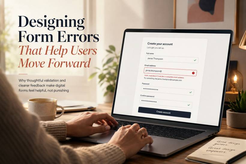
Too many digital forms still treat mistakes like offences. They show a vague red warning at the top of the page, provide little indication of where the issue is, and sometimes even remove information the user has already entered. That does not help anyone complete a task. It simply creates frustration.
Good form design recognises that errors are normal. People type quickly, work on small screens, get distracted, misunderstand wording, and use different formats from the ones a system expects. A well-designed error state should feel less like a reprimand and more like a helpful colleague pointing out what needs attention.
A Mistake Should Not Feel Like a Failure
Most users do not need to be told that something is wrong. They already know the form did not go through. What they need is a clear explanation of what happened and what to do next.
Compare these two messages:
The first message gives the user a problem but no path forward. The second message explains the issue in a way that is specific, calm, and easy to act on.
Tone matters because forms are often used during important or stressful moments. A patient may be registering for a healthcare service. A customer may be entering payment details. A job applicant may be uploading a resume. Even a small error message can add unnecessary tension when it sounds cold, technical, or judgmental.
The best error messages make the user feel supported. They acknowledge the situation without blaming the person filling in the form.
Show Errors at the Right Moment
Timing can make the difference between a smooth correction and a frustrating interruption.
Some checks work best while the user is completing the form. For example, an email address can be checked after the user leaves the field. A phone number can be checked once enough digits have been entered. A password strength indicator can update as the user types.
This type of feedback is useful because the user still remembers what they entered. They can correct the issue immediately instead of submitting an entire form and hunting for the problem afterwards.
However, not every error should appear instantly.
Showing an error the moment someone clicks into an empty required field can feel aggressive. The user has not made a mistake yet; they simply have not completed that part of the form. It is usually better to validate after they move away from the field, or after they attempt to submit the form.
Some errors also depend on information elsewhere in the form. A confirmation password cannot be validated properly until both password fields are filled in. A booking end date cannot be checked until a start date exists. In these situations, submit-time validation still plays an important role.
The goal is not to validate everything as early as possible. The goal is to provide feedback at the point when it is useful.
Keep the User's Work Safe
One of the most frustrating things a form can do is erase information after an error.
A user may have spent several minutes writing a message, entering an address, or completing a detailed registration form. If the form fails and clears everything, the system has turned a small mistake into a major inconvenience.
Preserve whatever can safely be preserved.
Highlight the incorrect field, keep the valid fields intact, and let the user make only the necessary correction. This is especially important for long forms, mobile users, and forms that include written responses.
There are some exceptions, particularly for sensitive fields such as passwords or payment information, where retaining data may not be appropriate. Even then, the form should clearly explain what needs to be entered again and why.
Respecting a user's effort is one of the simplest ways to build trust.
Every Error Message Needs Three Things
Useful error messages are usually simple, but they should answer three important questions.
First, what is wrong?
Second, how can it be fixed?
Third, where should the user make the correction?
For example:
This message identifies the issue, tells the user what a valid value looks like, and should appear directly beside or below the relevant date field.
A message such as "Invalid date format" does not go far enough. It may be technically accurate, but it assumes the user already understands what format is expected.
A more helpful version would be:
The difference is small in wording but significant in usability. The user does not need to guess, search for help, or try multiple formats until something works.
Put the Message Where the Problem Is
Error placement should remove effort, not create it.
A general error summary at the top of a form can be useful, particularly for long forms or accessibility purposes. It gives users a quick overview of what needs attention. But it should not be the only place errors appear.
Each individual error should also sit close to the field that caused it.
When the user sees a highlighted field, a clear border, and a short explanation directly underneath, the path to recovery becomes obvious. They do not need to scan up and down the page trying to match a message with an input box.
For larger forms, a good approach is to combine both methods:
Each affected field can then show its own specific explanation.
This supports people who want an overview while still helping those who are correcting issues one by one.
Use Clear Language, Not System Language
People filling in a form should never need to understand developer terminology.
Words such as "validation failed," "PAN," "input mismatch," or "null value" may make sense in a technical environment, but they do not belong in a customer-facing form.
Use language that matches what the user sees on screen.
Say "Card number" instead of "PAN."
Say "Expiry date" instead of "MM/YY field."
Say "Your passwords do not match" instead of "Password confirmation mismatch."
Clear wording is not about making a form sound overly casual. It is about making sure the user can understand and fix the issue without needing extra explanation.
It also helps to avoid vague phrases such as "Please enter a valid value." Valid according to what? The user should not have to guess.
Specific instructions work far better:
"Use at least eight characters."
"Enter a Malaysian mobile number starting with 01."
"Choose a username using letters, numbers, or underscores only."
Use Visual Cues Carefully
Red is widely associated with errors, so it remains useful in form design. A red border, message, or icon can quickly draw attention to the affected field.
But colour should never be the only signal.
Some users may have difficulty distinguishing colours, while others may be viewing the form on a low-quality display or in bright sunlight. Error states should also include text, icons, spacing, and clear labels.
For example, an invalid field can include:
• A visible border around the field
• A small alert icon
• A written explanation directly underneath
• An updated label that clearly states the issue
At the same time, not every form element needs to look urgent. Avoid turning all required labels red before the user has even started. Save strong error styling for actual errors. Otherwise, the form can feel intimidating before someone has entered a single word.
Positive Feedback Matters Too
Forms should not only speak when something goes wrong.
A user benefits from knowing when they are on the right track. A subtle confirmation that an email address is accepted, a password strength indicator, or a note that a username is available can make a form feel more responsive and reassuring.
Positive feedback is especially useful in multi-step forms, registration pages, and checkout experiences. It reduces uncertainty and helps users continue with confidence.
For example, a password field could quietly indicate:
"Strong password."
A username field could show:
"This username is available."
A file upload field could confirm:
"Resume.pdf uploaded successfully."
These small signals reduce the number of errors that happen later because users receive guidance before they reach the submit button.
Treat System Problems Differently From User Mistakes
Not every form error is caused by the person using it.
Sometimes the server is unavailable. Sometimes a payment provider fails to respond. Sometimes a session expires after the user has spent too long on a form. These situations should never be presented as though the user did something wrong.
Instead of saying:
"An error occurred."
Use something more useful:
"We could not save your changes right now. Your information is still here. Please try again in a few minutes."
For rate limits, explain the situation and provide a clear timeframe:
"You have made several attempts in a short time. Please wait 60 seconds before trying again."
For expired sessions, protect the user's work as much as possible:
"Your session has expired for security reasons. Please sign in again to continue. Your form details have been saved."
These messages are honest, practical, and respectful. They explain what happened without hiding behind technical language.
Accessibility Should Be Part of the Design
Form errors must work for everyone, including people using screen readers, keyboards, magnification tools, or other assistive technology.
A visually clear red border is helpful, but a screen reader user also needs to be told that the field has an error. Error messages should be linked programmatically to their fields, and focus should move logically when a form is submitted with invalid information.
For longer forms, an accessible error summary at the top can help users quickly understand what needs attention. Links within that summary can take them directly to the affected fields.
The best accessible forms do not treat accessibility as an additional feature. They build it into the experience from the beginning. Clear labels, plain language, visible focus states, and meaningful error messages benefit every user, not only those using assistive technology.
Test the Form When Things Go Wrong
A form may look perfect when every field is completed correctly. The real test is what happens when someone makes a mistake.
Try completing the form with an invalid email address. Leave required fields empty. Enter a date in an unexpected format. Use a weak password. Submit the form on a mobile phone with a slow connection.
Then ask a simple question: does the form help you recover quickly?
It is also worth watching someone unfamiliar with the website use the form. If they hesitate, repeatedly try different answers, or ask what an error means, the message needs improvement.
Reading messages aloud can also reveal problems. A good error message should sound like something a helpful person would say. It should be direct, respectful, and easy to understand.
Final Thoughts
Errors are unavoidable. People will mistype information, skip fields, use unexpected formats, lose their connection, or encounter a temporary technical issue.
The quality of a form is not measured only by how smoothly it works when everything goes right. It is also measured by how well it supports users when something goes wrong.
A thoughtful error message does not make the user feel corrected. It makes them feel guided.
When forms explain the issue clearly, preserve the user's work, show the exact place to fix, and use language that feels human, people are far more likely to complete the task instead of leaving halfway through.
That is the real purpose of good error design: not to point out failure, but to help someone continue.


Comments