

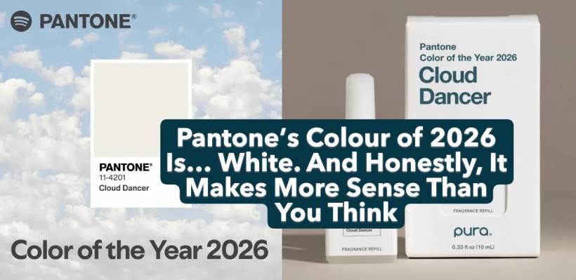
Pantone has finally done what many joked they'd do one day: they picked white as the Colour of the Year. Not off-white. Not cream. Not a subtle "warm neutral." Actual white — dressed up with the poetic name Cloud Dancer, but unmistakably still… white.
It's a bold move, partly because white is the colour designers use before they choose a colour. It's the background. The blank canvas. The space where things start, not the star of the show. And yet, here it is, headlining 2026.
So is this a stroke of philosophical brilliance, or simply a marketing trick guaranteed to stir debate? Surprisingly, it's a bit of both.
Why Pantone Chose White This Time Around
Each year since 1999, Pantone's colour experts study global psychology, design trends, cultural moods, technology shifts and artistic movements to pick a single colour that captures the moment. Previous choices have been expressive and emotional — Peach Fuzz in 2024 (soft and nurturing), Mocha Mousse in 2025 (warm and grounded).
But 2026 is different. According to Pantone's official description, Cloud Dancer is "a billowy, balanced white" symbolising serenity and "calm in a noisy world." In simpler terms: life feels overwhelming, and white feels like pressing the reset button.
It's hard to argue with that.
The World Is Exhausted — And White Is the Perfect Metaphor
Think about the past few years: economic strain, social tension, political drama, AI uncertainty, nonstop notifications, and a global creative industry constantly battling burnout. We're drowning in loud visuals, overstimulation, and digital clutter.
In that context, white isn't a lack of imagination — it's a rebellion.
Where every brand is shouting, white whispers.
Where everything feels chaotic, white offers a pause.
Where the world is visually overwhelming, white begs us to breathe.
Creative professionals may roll their eyes at another "philosophical" colour announcement, but Cloud Dancer does hit a cultural nerve. Many people are seeking simplicity, clarity, and a fresh mental slate. White embodies all of that without having to try.
The Power of Pantone's Influence
Pantone isn't just announcing a colour — they're issuing a signal. The fashion world, interior designers, branding agencies, product teams, and paint manufacturers take these predictions seriously. Expect to see Cloud Dancer everywhere from packaging to furniture to runway shows.
Whether you love the choice or think Pantone raided the "default settings" drawer, it will shape real-world aesthetics. Pantone's Colour of the Year has always been a mix of cultural reading and self-fulfilling prophecy.
And this year's choice lands during a true transition period. AI is reshaping creative work faster than many can adapt. Economic pressures continue to shift how agencies operate. Clients want more for less. In moments like these, a "blank page" colour feels symbolic — maybe even refreshing.
A Year of White: Cleansing or Just Convenient?
Is Pantone giving voice to a universal craving for mental clarity?
Or did the team simply realise that choosing white would generate headlines everywhere?
Probably both.
But unlike some past years where the narrative felt stretched, Cloud Dancer fits surprisingly well with where society is today. A neutral that represents quiet, stillness and renewal feels like the right tone for a world trying to regain perspective.
Even if it is, at the end of the day, just… white.
So brace yourself: 2026 might look cleaner, quieter, and more minimalist. Not beige. Not greige. Not even ivory.
Just white — or as Pantone insists, Cloud Dancer.


Comments