

A dish can be beautifully cooked, carefully plated, and full of flavour, but still look ordinary in a photo. That is one of the biggest surprises in food photography. The food itself matters, of course, but the way it is framed, arranged, lit, and presented can completely change how people respond to it.
Good composition is what turns a simple food photo into something that makes people pause, look closer, and feel hungry. It helps guide the viewer's eye, gives the dish a sense of mood, and makes the image feel intentional instead of accidental. Whether the photo is for a restaurant menu, food blog, social media post, delivery platform, or personal portfolio, composition plays a major role in making food look irresistible.
Start With The Right Camera Angle
The angle you choose sets the mood of the entire image. There is no single perfect angle for every dish, because different foods have different strengths. Some dishes are all about height, some are about colour, some are about texture, and some are about the overall table arrangement.
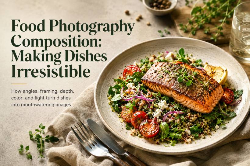
A 45-degree angle is often the safest and most flexible choice. It feels natural because it is close to how we usually see food when sitting at a table. This angle works well for plated meals, bowls, pasta, rice dishes, desserts, and anything that has both surface detail and a bit of height. It gives enough depth without making the image feel too dramatic.
An overhead flat lay works best when the shape and arrangement of the food matter most. Pizza, salad, tacos, pastry spreads, breakfast sets, charcuterie boards, and multi-dish table settings often look great from above. This angle is especially useful when you want to show variety or create a complete meal story in one image.
Eye-level shots are ideal for foods with strong height and structure. Burgers, cakes, stacked pancakes, milkshakes, sandwiches, and layered desserts usually benefit from this angle because it shows their height properly. It also creates a more dramatic and immersive feeling, almost as if the viewer is sitting right in front of the dish.
Macro close-ups are useful when you want to highlight texture and detail. This could be the crisp crust of fried chicken, melted cheese stretching from a slice of pizza, bubbles in a cold drink, or a glossy sauce on dessert. These shots work best when used selectively, because too many close-ups can make a photo set feel narrow. Used well, they add sensory impact.
Use The Rule Of Thirds Without Becoming Trapped By It
The rule of thirds is one of the simplest composition tools, but it remains useful because it helps create balance. Imagine the frame divided into nine equal sections using two horizontal and two vertical lines. Placing the main dish or important elements along those lines, or near their intersections, can make the photo feel more natural and visually interesting.
A plate placed exactly in the middle can sometimes feel too static. Moving it slightly to one side and balancing it with a fork, napkin, drink, or ingredient on the opposite side can make the image feel more alive. The viewer's eye has somewhere to travel instead of stopping immediately in the centre.
For overhead shots, placing the main dish near one of the lower intersections can create a pleasing layout, especially when there is enough empty space above it. This technique gives the photo room to breathe and can also make the image more suitable for text overlays if it is being used for a blog banner, poster, or social media graphic.
The rule of thirds should be treated as a guide, not a strict law. Sometimes a centred composition works beautifully, especially for symmetrical dishes or premium product-style shots. The key is to make the placement feel deliberate.
Create Depth Through Layering
One common reason food photos look flat is that everything sits on the same visual plane. When there is no depth, the image can feel lifeless, even if the food itself looks good. Layering helps solve this by giving the viewer a sense of space.
A strong food scene usually has a foreground, middle ground, and background. The main dish should normally sit in the middle ground, while small supporting elements can appear in front or behind it. A blurred glass rim, a folded napkin, a fork handle, or the edge of another plate in the foreground can make the image feel more immersive.
The background should add context without becoming distracting. A bread basket, salt cellar, wine glass, condiment jar, or small bowl of ingredients can help tell the story of the meal. However, these items should support the dish, not compete with it.
Texture also adds depth. A wooden table, linen cloth, ceramic plate, crumpled napkin, scattered herbs, or rough chopping board can make the photo feel more tactile. These details help the viewer imagine the feel and flavour of the food, which is exactly what good food photography should do.
Give The Image Room With Negative Space
Negative space is the empty area around the subject. It may look simple, but it is one of the most powerful ways to make food photography feel clean, premium, and intentional.
When a frame is packed with too many objects, the viewer may not know where to look. The image becomes busy and tiring. By leaving space around the dish, you allow the food to stand out more clearly. This is why many high-end restaurant photos often show a single plate on a large table surface. The emptiness creates confidence and elegance.
Negative space is also practical. For blog articles, menus, posters, or social media graphics, empty space gives you room to add titles, captions, or promotional text without covering the food. This is especially useful when creating article artwork or banner images.
The trick is to make negative space feel intentional. Empty space should support the composition, not make the image look unfinished.
Guide The Viewer's Eye With Lines And Curves
Strong food photos often have a visual path. The viewer's eye moves through the image naturally, from one element to another, until it lands on the main dish. This can be done using leading lines, curves, and repeated shapes.
An S-curve is especially effective for food scenes. A loosely folded napkin, a curved spoon handle, a trail of sauce, a line of breadsticks, or the arrangement of small plates can create a soft path through the frame. This makes the image feel more graceful and less rigid.
Plated dishes also have their own natural geometry. A swirl of sauce, a line of herbs, a crescent of garnish, or a diagonal arrangement of ingredients can all guide attention. These details are not just decoration. They help control how the viewer experiences the photo.
Good composition is not only about where the main dish is placed. It is also about how every supporting element helps lead the eye back to that dish.
A Little Imperfection Can Make Food Feel Real
Perfectly clean food photos can sometimes feel too sterile. Real food has crumbs, sauce, steam, texture, and small signs of life. A little controlled imperfection can make a photo feel more appetising.
A few crumbs beside a slice of cake, a small drip of sauce near a pasta plate, a spoon resting in a bowl, or a half-cut fruit can make the scene feel more natural. These details suggest that the food is ready to be eaten, not just displayed.
The important word here is controlled. A careless mess looks unprofessional, but a carefully placed crumb or sauce mark can feel authentic. Clean the scene first, remove anything distracting, and then add back small details that make the food feel alive.
This is especially useful for comfort food, desserts, baked goods, and casual dining photography, where warmth and realism often matter more than perfection.
Let The Food Decide The Colour Palette
Colour can make or break a food photo. The best approach is to let the food lead the palette. Look at the main colours already present in the dish, then choose plates, backgrounds, napkins, and props that support those colours.
Complementary colours can create strong contrast. Green herbs against red tomato sauce, orange citrus on a blue plate, or golden pastries on a cool-toned background can make the food pop. These combinations feel energetic and eye-catching.
Analogous colours create a softer and more harmonious feel. Beige pasta on a cream plate, brown bread on a wooden board, or warm soup with earthy-toned props can create a calm and cosy look.
The main thing to avoid is allowing the food to disappear into the background. White rice on a white plate, dark meat on a dark table, or pale desserts on pale props can make the subject look flat. Contrast helps the food remain the hero of the image.
Use Light As Part Of The Composition
Lighting is not separate from composition. It shapes the food, creates mood, and decides how much texture is visible.
Side lighting is excellent for showing texture. It can bring out the surface of grilled meat, the layers of pastry, the crust of bread, or the folds in pasta. Backlighting works beautifully for drinks, soups, steam, and glossy surfaces because it adds glow and depth.
Soft window light is one of the most reliable options for food photography. It creates gentle shadows, natural colours, and a flattering look for most dishes. Diffused light is usually better than harsh direct light because it avoids strong shadows and blown-out highlights.
Harsh overhead light can make food look flat or unflattering. Ring lights can also remove too much depth if used carelessly, making the dish look overly even and artificial. The goal is to use light with direction and purpose, so the food has shape and dimension.
Think Of The Dish As The Story
Every dish has something it wants to communicate. A burger may be about height and indulgence. A salad may be about freshness and colour. A bowl of noodles may be about warmth and texture. A dessert may be about softness, richness, or elegance.
Before arranging the shot, ask what the photo should make the viewer feel. Should it feel cosy, premium, rustic, fresh, dramatic, homemade, luxurious, or playful? Once that direction is clear, every composition choice becomes easier.
The angle, props, lighting, background, and colour palette should all support the story of the food. When these elements work together, the image feels natural and convincing.
Final Thoughts
Great food photography composition is not about blindly following rules. It is about making thoughtful choices that help the dish look its best. The right angle shows the food's strongest feature. Good placement keeps the frame balanced. Layering adds depth. Negative space gives the image room to breathe. Colour creates mood. Light brings texture and shape. Small imperfections make the food feel real.
At the end of the day, the purpose of food photography is simple. It should make people want to eat. The techniques are only there to support that goal. When composition is handled well, even a simple dish can look inviting, memorable, and genuinely delicious.


Comments