

When you build websites (or even just browse them), "screen size" sounds like a simple concept. But the moment you start testing responsive layouts, things get messy fast. A page looks perfect on your desktop, then feels cramped on mobile. A button suddenly wraps into two lines. A canvas appears smaller than expected. And you're left guessing whether the problem is your CSS, the browser UI, the device pixel ratio, or something else entirely.
That is exactly why this ViewPort Detector web application exists. It gives you a clear, real-time answer to a question every web developer and designer eventually asks: what is my current browser viewport right now, really?
Why ViewPort Size Is More Confusing Than It Should Be
Most people assume their "resolution" is the only number that matters. In reality, different measurements tell different stories, and each one can affect how your layout behaves.
• Viewport size is the space your webpage can actually use inside the browser window.
• Visual viewport can change depending on zoom level, mobile address bar behavior, and browser UI overlays.
• Device pixel ratio (DPR) can make a 400px-wide viewport represent far more physical pixels than you would expect.
So when a layout behaves strangely, it is often not because your design is wrong, but because you are looking at the wrong measurement. This app puts all the key values in front of you, so you can stop guessing and start fixing.
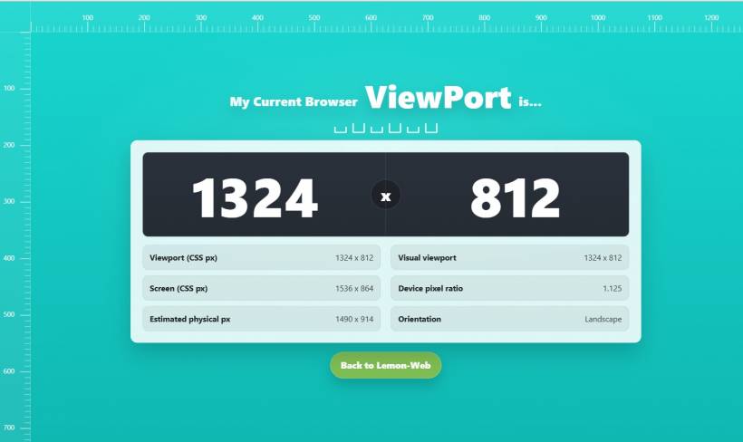
What the App Shows You at a Glance
The main display focuses on the most important number: your current browser viewport width and height. It updates instantly as you resize the browser, switch devices, or rotate your screen. Below that, the app breaks down extra details that are incredibly useful when you are troubleshooting responsive issues:
• Visual viewport: especially useful on mobile, where the browser UI and zoom can change the real usable area
• Screen (CSS px): the device's reported screen size in CSS pixels
• Device pixel ratio: the key number that explains why some things look sharper, larger, or unexpectedly scaled
• Estimated physical pixels: helps you understand what the viewport size translates to in device pixels
• Orientation: a quick confirmation of portrait vs landscape mode
The Built-In Rulers (Small Feature, Big Impact)
One of the most practical parts of this tool is the ruler system along the top and left edges. It turns your browser into a quick measuring workspace. Instead of eyeballing spacing, you can estimate margins, verify widths, and align elements with more confidence. It is not meant to replace professional design tools, but for quick checks, it feels surprisingly helpful.
Who This Is For
This app is useful even if you are not a developer, but it really shines for people who build and test websites.
• UI designers validating spacing and alignment
• QA testers confirming device behavior during responsive checks
• Content creators and site owners who want to see what users might experience on smaller screens
If you have ever asked "why does this look different on my phone?" this tool is basically your instant reality check.
Real-World Examples Where It Helps
Sometimes the fastest way to explain this app is to describe what it solves.
• If a canvas game feels tiny, you can compare viewport vs estimated physical pixels and see if DPR scaling is the culprit
• If your layout looks fine at 768px but breaks at 760px, you can verify the exact viewport width while resizing and catch the breakpoint in action
These are the annoying, time-wasting problems that usually lead to trial-and-error. With this detector, you get clarity first, then you change the code with confidence.
A Small Tool That Makes Development Less Painful
The best utilities are the ones that remove friction from your workflow. This ViewPort Detector is not trying to be complicated. It is designed to be quick, visual, and practical. You open it, you instantly see what matters, and you move on with your day. That is the whole point.
Try It and Use It as Your Quick Debug Buddy
If you are building responsive pages, testing mobile layouts, or just want a simple way to confirm your current browser view, this tool is a solid addition to your toolkit. The moment you start using it during layout troubleshooting, it becomes one of those "why didn't I have this earlier?" utilities.


Comments