

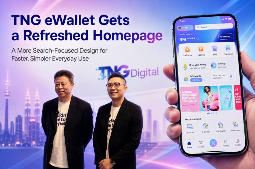
TNG Digital is giving the TNG eWallet app a refreshed look, with a redesigned homepage aimed at making the app easier to use and faster to navigate. For many Malaysians, TNG eWallet has grown from being just a simple payment app into something used for daily transactions, bills, transport, food deals, financial services, and more. Because of that, the app's homepage has become increasingly important.
The new redesign appears to focus on one main idea: helping users get to what they need with fewer taps. Instead of forcing users to dig through different menus, the refreshed homepage places search and quick access features more prominently, making the app feel more direct and practical for everyday use.
A Homepage Built Around Search
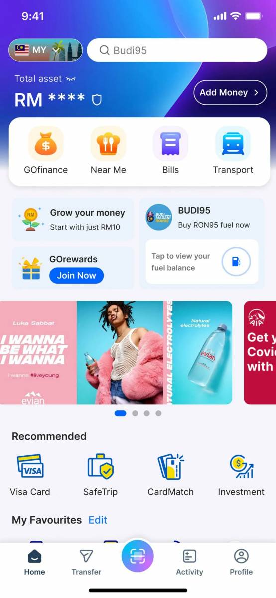
One of the biggest changes is the stronger focus on search. The updated homepage now places a larger search bar at the top, making it easier for users to look for services, features, merchants, or functions without manually browsing through multiple sections.
This makes sense because TNG eWallet is no longer just about scanning a QR code or checking your wallet balance. The app now includes a wide range of services, from payments and transfers to transport functions, bill payments, insurance, investments, and promotions. As an app grows, finding things quickly becomes just as important as adding new features.
A search-first design helps reduce that feeling of clutter. Instead of asking users to remember where a function is located, the app encourages them to simply search for it.
Quick Access Hubs for Commonly Used Features
Another noticeable change is the redesigned quick access area. TNG Digital has placed four main hubs on the homepage to highlight some of the platform's most frequently used services.
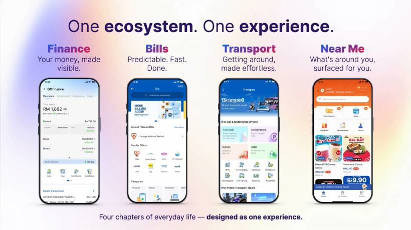
The first is GOfinance, which brings together the app's financial services. This section is likely to be useful for users who already use TNG eWallet beyond basic payments, especially for services related to savings, insurance, investment, or other financial products available through the platform.
The second hub is Near Me, which focuses on nearby food and beverage deals. This reflects how eWallet apps are increasingly being used not only for payments, but also for discovery. Users are not just paying at restaurants or cafes; they are also looking for promotions and rewards around them.
The third hub is Bills, which provides easier access to utility payments and recurring payments. For users who regularly pay electricity, water, telco, or other bills through the app, this makes the process more convenient.
The fourth hub is Transport, which brings together Touch 'n Go Card features and other commuting-related functions. This is an important section because transport remains one of the core reasons many Malaysians use the TNG ecosystem in the first place, whether for tolls, parking, public transport, or card-related services.
A Cleaner Bottom Navigation Bar
TNG Digital has also reorganised the bottom access bar. This is a small design change on the surface, but it can make a big difference in daily usage.
Modern mobile apps are often used with one hand, especially when users are commuting, queueing, walking, or multitasking. Because of that, important buttons need to be placed where the thumb can reach them comfortably. The updated bottom bar appears to follow this idea by making commonly used actions easier to access.
One of the key changes is the relocation of the Transfer button to the bottom navigation area. This makes sense because transfers are one of the most common actions in any eWallet app. Whether users are sending money to friends, family members, or other accounts, having Transfer within easy thumb reach should make the app feel more natural to use.
Activity Now Holds Transaction History
Another practical change is the placement of transaction history under the Activity section. This is where users can view recent payments, transfers, reloads, and related records.
For many users, transaction history is something they check often. It may be used to confirm whether a payment went through, track reloads, review monthly spending, or verify transfers. Moving this into a dedicated Activity area gives the app a clearer structure, especially as more services are added over time.
This also helps separate actions from records. The homepage can focus on helping users do things quickly, while the Activity section becomes the place to review what has already happened.
Why the Redesign Matters
The update reflects how eWallet apps have changed in Malaysia. In the early days, the main purpose was simple: reload money, scan, and pay. Today, apps like TNG eWallet have become broader digital platforms.
Users now expect more than just payments. They want bill payments, loyalty rewards, financial services, transport tools, merchant deals, reload functions, transfers, and transaction tracking in one place. The challenge is that when too many features are added, the app can start to feel crowded.
That is why user interface design matters. A cleaner homepage, better search, smarter grouping, and easier thumb access can make the difference between an app that feels convenient and one that feels overwhelming.
A Move Toward an Everyday Digital Companion
TNG Digital describes the refreshed experience as part of the app's evolution into a broader everyday digital companion. That description fits the direction the app has been moving in for some time.
For many Malaysians, TNG eWallet is already tied to daily routines. It is used for toll-related services, retail payments, food purchases, online transactions, bill payments, parking, reloads, and peer-to-peer transfers. With the refreshed homepage, the app seems to be organising itself around those daily habits instead of simply listing features.
This is a sensible direction. The more services an app offers, the more it needs to understand how people actually use it during normal daily life.
Rollout May Take Some Time
The refreshed TNG eWallet homepage is rolling out to users starting today, but not everyone will necessarily receive it at the same time. As with many app updates, the rollout may happen in stages.
Users who do not see the new homepage immediately may need to wait until the update reaches their account or device. It is also a good idea to make sure the app is updated to the latest version through the official app store.
Final Thoughts
The refreshed TNG eWallet homepage is not just a cosmetic update. It is a sign that the app is trying to become easier to use as its feature list continues to grow. The stronger search focus, reorganised quick access hubs, improved bottom navigation, and dedicated Activity section all point toward a more practical everyday experience.
For regular users, the update should make common actions easier to reach and reduce the need to search through multiple menus. For TNG Digital, it is also a reminder that as eWallet apps become more powerful, simplicity becomes even more important.
A payment app can keep adding features, but the real test is whether users can still find what they need quickly. This redesign seems aimed directly at solving that problem.


Comments