

Blog images matter more than many writers realise. They help articles stand out on social media, improve engagement, and gradually build a recognisable visual identity around a website. The problem is that creating a polished featured image can sometimes take almost as long as writing the article itself, which quickly becomes exhausting when publishing regularly.
The good news is that attractive blog graphics do not need to be reinvented from scratch every time. A consistent visual system, reusable templates, a personal photo library, and a workflow built around your existing creative strengths can make the process much faster without making every image look identical.
Start With a Clear Visual Identity
The subjects in your images may change from one article to another, but they should still feel as though they belong to the same publication. Consistency in colour, typography, composition, and overall visual tone helps readers recognise your work even before they notice the website name or logo. Pasted text
That does not mean your style has to remain frozen forever. Most brands naturally evolve, and older images will eventually look different from newer ones. What matters is creating enough structure that new artwork feels connected, rather than looking like every post came from a completely different website.
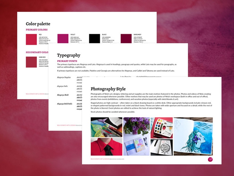
A simple brand guide can be enough. Decide on a core colour palette, one or two headline fonts, preferred image treatments, and a general mood. These small rules make future design decisions much easier.
Templates Save More Time Than You Think
One of the fastest ways to maintain consistency is to create reusable templates. Instead of opening a blank document for every new article, keep the layered file from a previous design and use it as the starting point for the next one. Replace the main photo, update the headline, make a few composition adjustments, and much of the design work is already finished. Pasted text
Templates do not have to make every article look identical. The background, colours, imagery, and even layout can change while maintaining a familiar underlying structure.
This approach is particularly useful when producing content frequently. You spend more time refining the idea and less time rebuilding basic design elements that already worked perfectly well on the previous post.
Never Sacrifice Readability for Style
Featured images are often displayed as very small thumbnails, especially on social networks. A headline that looks beautiful at full resolution may become completely unreadable once the image is reduced to a fraction of its original size. Pasted text
Typography therefore needs to remain simple enough to survive scaling. Highly decorative fonts may look interesting in the design file but can turn into an indistinct blur on a phone screen. Contrast matters just as much; dark lettering over a dark photograph forces people to work far harder than they should.
If the background is visually busy, introduce a subtle overlay, solid-colour area, gradient, or semi-transparent panel behind the text. The design may become slightly less decorative, but considerably more useful.
A blog image has failed if the headline cannot be read.
You Do Not Need a Completely Original Idea Every Time
One of the easiest creative traps is assuming every article requires an entirely new illustration concept. That standard quickly becomes unrealistic, especially when some topics are naturally difficult to represent visually.
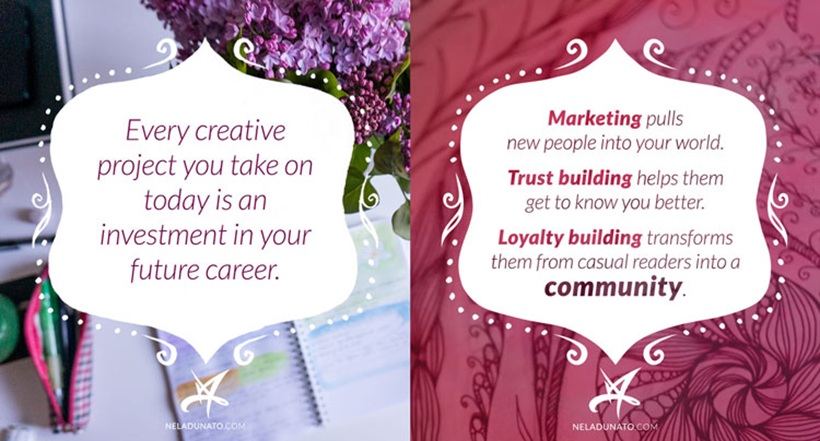
Reusing visual ideas is perfectly acceptable. A strong photograph, texture, sketchbook image, or background may work across several unrelated posts as long as it is not repeated so frequently that the site begins feeling repetitive. When creating a series of related articles, deliberately using the same visual treatment can actually strengthen the connection between them. Pasted text
Consistency is not laziness. Used properly, repetition becomes branding.
Build Your Own Photo Library
Stock photography is convenient, but the best-looking stock images often appear everywhere. When the same photograph is being used by dozens of websites, it becomes difficult for your brand to feel distinctive.
Creating your own photo library solves much of that problem. Photograph your workspace, tools, notebooks, plants, studio details, books, finished projects, outdoor locations, and anything else that reflects your creative environment. Even ordinary objects can become useful backgrounds once photographed carefully. Pasted text
When taking photographs specifically for blog graphics, remember to leave usable negative space. If the entire frame is filled with important objects, adding a headline later becomes difficult without covering something.
Compose some photographs with one side intentionally quieter. That empty area becomes valuable space for typography.
Batch Your Image Creation
Creating blog graphics one at a time means repeatedly switching between writing, design, photography, and publishing. That context switching can make even simple artwork feel slow.
A better approach is to batch several images together. Set aside a dedicated session and create artwork for multiple upcoming posts while you are already focused on visual work. The source notes that batching can improve speed, create greater consistency between images, and help your technique evolve more quickly because you remain in the same creative mindset. Pasted text
This works particularly well when paired with an editorial calendar. If you already know what the next five or ten articles will be about, you can prepare their artwork in advance rather than scrambling for an image moments before publishing.
Use the Creative Skills You Already Enjoy
It is easy to look at other blogs and assume you should imitate their illustration style. But producing artwork in a technique you do not actually enjoy can turn featured images into one of the most frustrating parts of publishing.
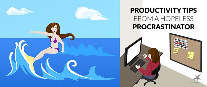
The source gives a useful example: trying to create vector cartoons simply because they seemed appropriate for blog images, only to discover that the process took too long and did not feel personally satisfying. Returning to familiar techniques such as ink, watercolour, lettering, or photography produced stronger results because those methods already matched the creator's natural style. Pasted text
Your strongest creative skill is often your biggest advantage.
If you photograph well, build your image system around photography. If you enjoy lettering, use custom lettering. If you create patterns or illustrations, incorporate those into the visual identity.
Blog graphics may be the first creative work a new visitor sees. They should feel like your work rather than an obligation copied from somebody else's style.
Do Not Obsess Over Every Social Media Dimension
Social platforms regularly change recommended image sizes, making it almost impossible to optimise one graphic perfectly for every service forever. Trying to chase every new specification can consume more time than the benefits justify. Pasted text
A more practical approach is to identify which platforms actually bring meaningful traffic and design around those first. If most visitors arrive from a platform that favours horizontal images, prioritise a strong landscape format. If another network is particularly important and prefers vertical artwork, create a second version when the additional effort is worthwhile.
The quality of the underlying article still matters more than perfect social-media dimensions. A strong image can help people discover the content, but it cannot compensate for weak content once they arrive.
Treat Featured Images as Part of the Creative Work
The biggest improvement often comes from changing how you think about blog artwork. If every image is treated as another publishing chore, the process quickly becomes repetitive. Instead, treat it as a small creative project with its own constraints.
Those constraints can actually be useful. A fixed aspect ratio, limited colour palette, familiar typography, and specific article topic give you enough boundaries to experiment without starting completely from zero.
Over time, those repeated creative decisions form a visual language around the blog.
Final Thoughts
Creating attractive blog images does not require producing a completely original illustration for every article. What matters more is developing a system that makes good design repeatable.
Build a consistent visual identity, create reusable templates, prioritise readable typography, photograph your own material, organise a useful image library, and batch artwork whenever possible. Most importantly, lean into the creative techniques you already enjoy rather than forcing yourself into a style simply because it seems appropriate for blogging.
The goal is not to make every featured image a masterpiece.
It is to create artwork that is recognisable, readable, attractive, and efficient enough that you can keep producing it consistently.











Comments 0