

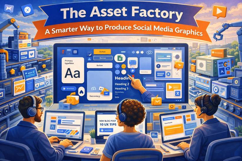
There's a familiar kind of panic that hits social media teams in the morning. You open the content calendar, see five posts due before lunch, and suddenly you're staring at a blank canvas like it personally insulted you. If you build every graphic from scratch, you're not just losing time, you're burning focus on the same decisions over and over again: fonts, spacing, colors, button styles, photo treatment.
The fix isn't "design faster." The fix is to stop designing individual posts and start building an asset factory, a reusable system where approved parts snap together, so new graphics take minutes instead of hours.
The Big Idea: Design Once, Reuse Forever
The mindset shift is simple: your brand look should be a system, not a one-off creation each time you post.
Your visual identity (colors, typography, textures, layouts) becomes a permanent library. Each new post becomes content that drops into that library. You're separating the "engine" from the "fuel." The engine stays the same. The fuel changes daily.
Step 1: Build the Foundation With Brand Libraries
Before templates, you need raw materials that are consistent and easy to apply.
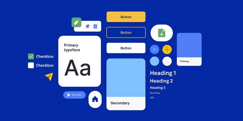
Colors That Are Named by Purpose, Not Shade
In tools like Figma or Canva, set up color styles and name them by function.
Instead of "Light Blue," think:
• Accent Highlight
• Call-to-Action
• Link Text
This does two things. First, it forces clarity about how colors should be used. Second, it makes updates painless. Change a style once, and every asset using it updates automatically.
Typography That Behaves Like a System
Create text styles for common needs so nobody is "eyeballing" font sizes ever again.
Examples:
• Subhead
• Body Copy
• Pull Quote
• Stats Number
Lock in size, weight, line spacing, and letter spacing. In Canva, this lives inside your brand kit. In Figma, it's part of your design system. The goal is simple: your team should never have to manually tweak font settings just to make a post look "right."
Textures and Overlays That Can Drop Into Anything
A lot of what makes posts feel polished is the subtle stuff: noise textures, gradients, overlays, patterns, photo treatments.
Build a small library of these elements, ready to drag-and-drop behind content. Keep them semi-transparent and layered so they work across multiple post types without overpowering the message.
Step 2: Create a Component Library of Building Blocks
Now you turn your brand basics into reusable parts. Think of these like Lego pieces: simple on their own, powerful when combined.
Core Components Worth Standardizing
• Button and CTA modules with your fonts and colors already applied
• Icons in one consistent style (line or filled, not a random mix)
• Dividers and decorative separators (dots, lines, shapes)
• Quote blocks for testimonials and highlighted statements
And don't ignore naming. Clear names make a system usable.
A good naming approach looks like:
• Image Frame / Portrait / Rounded
• Quote Block / Standard / Dark
If you can't find a component quickly, your system won't get used.
Step 3: Build a Template Library That Covers 90% of Your Posts
This is where the factory becomes real. The goal isn't a hundred templates. It's a small set of layouts that handle most of what you post.
A practical set usually includes:
• Announcement post
• Split screen (image + text)
• Stats/data post
• Event/webinar promo
• Carousel cover slide
• Behind-the-scenes photo layout
The key detail: every element inside a template should be a component instance, not a one-off shape someone drew once. Your headline uses the H1 style. Your CTA is the approved button component. Your image sits inside a standardized frame.
That's what makes it scalable.
Step 4: Use a Workflow That Prioritizes Speed
Once your system is in place, daily production becomes "swap and export" instead of "design and panic."
A typical flow looks like this:
• Social manager chooses the right template
• Swap placeholders with real content (headline, image, CTA)
• Adjust theme variant if needed (light vs dark)
• Export and schedule
If the system is clean, this can genuinely take one or two minutes per post, without sacrificing quality.
If You're Using Canva
• Save templates in a shared team folder
• Use resizing tools to adapt one design across formats (post, story, banner)
If You're Using Figma
• Use instance swapping to change layouts quickly
• Use batch updates when you need to refresh colors or styles at scale
Different tools, same principle: the system does the heavy lifting.
Step 5: Add Governance So the System Doesn't Rot
Every design system eventually gets messy if nobody maintains it. A "factory" can turn into a junk drawer fast.
A simple maintenance rhythm helps:
• Quarterly refresh: add seasonal variants without breaking the core system
• Version control: keep one master library file and push updates outward
This keeps your system clean, predictable, and trusted by the team.
The Payoff: Consistency Becomes Automatic
The best part of an asset factory is that brand consistency stops being something you constantly enforce. The system enforces it for you.
Approved colors are built in. Typography is locked. Spacing feels consistent. The team isn't wasting brainpower on repetitive layout decisions, so they can spend that energy on what actually moves the needle: better messaging, smarter content strategy, and the occasional creative campaign that isn't rushed.
Stop redesigning the same post every day. Build the system that makes posts effortlessly. Your future self, staring at that content calendar at 8 AM, will be very grateful.


Comments