

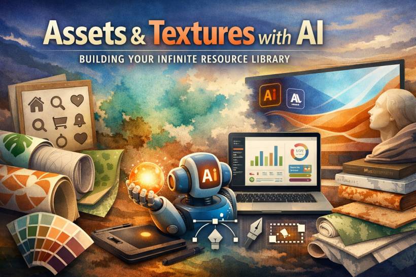
If you've ever spent half an hour hunting for "the perfect" marble texture, you already know the problem isn't lack of options. It's that none of them are exactly what you need. The color is slightly off your brand palette, the vibe feels too generic, or the pattern looks like something you've seen on ten other sites. AI flips that workflow: instead of searching and settling, you describe what you want and generate it, then keep the best results to grow your own reusable library.
The mindset shift: stop finding, start producing
This isn't just about speed (though yes, it saves time). It's about control. You can generate assets that match a brand system, follow a specific look, and stay consistent across projects. When you store the good outputs properly, you're not creating "one asset." You're building a personal resource vault you can reuse and remix later.
Your asset generation toolkit (and what each tool is best at)
Different tools are good at different things, so it helps to choose based on the asset type instead of forcing one tool to do everything.
The seamless texture workflow (a real example)
Let's say you need a watercolor texture in your brand colors for packaging. The old way is stock sites, compromises, and spending money on something you still have to tweak. The AI way is quicker and more direct:
If you want the texture to look less "perfect," you can prompt for more natural imperfections: uneven pigment pooling, softer transitions, and realistic paper texture.
Icons and UI assets that don't look like a template pack
Icons are where generic design shows up fast. The trick is to lock style consistency before you generate a full set. Start with one "test icon" to define the rules (line vs filled, rounded corners, stroke thickness, minimal detail). Once you like it, expand into a full set using the exact same constraints.
A practical workflow looks like this:
You can do the same thing for mock app screens too. Even if you don't ship those screens directly, they're useful for presentations, pitches, and early "direction setting" before you write a single line of code.
Backgrounds for websites, social, and print
Backgrounds are time traps because they need to support content without competing with it. AI makes background exploration fast, especially when you're aiming for "on-brand but not distracting."
Building your personal asset library (the part that makes this powerful)
The real win is what happens after you generate something good. Don't leave it in a downloads folder chaos pile. Store it like a resource you'll reuse:
That's how you go from "AI helps sometimes" to "I always have assets ready."
Remix your own work to evolve your style
A smart way to stay original is to start from your own portfolio. If you have a texture or pattern you created manually, use it as a base reference and generate variations that push your style forward: grungier, cleaner, softer, more contrast, different palettes. This feels more like "evolving a signature" than borrowing someone else's look.
Commercial use: keep it safe and professional
AI assets can be used in client work, but it pays to be sensible.
Quality control (so your assets don't betray you later)
Before using any AI-generated asset, do quick checks:
The takeaway
Once you treat AI like a resource engine and not a one-off trick, you stop being limited by what exists online. You can generate exactly what your project needs, keep the best results, and build a library that makes your work faster and more unique over time.


Comments