

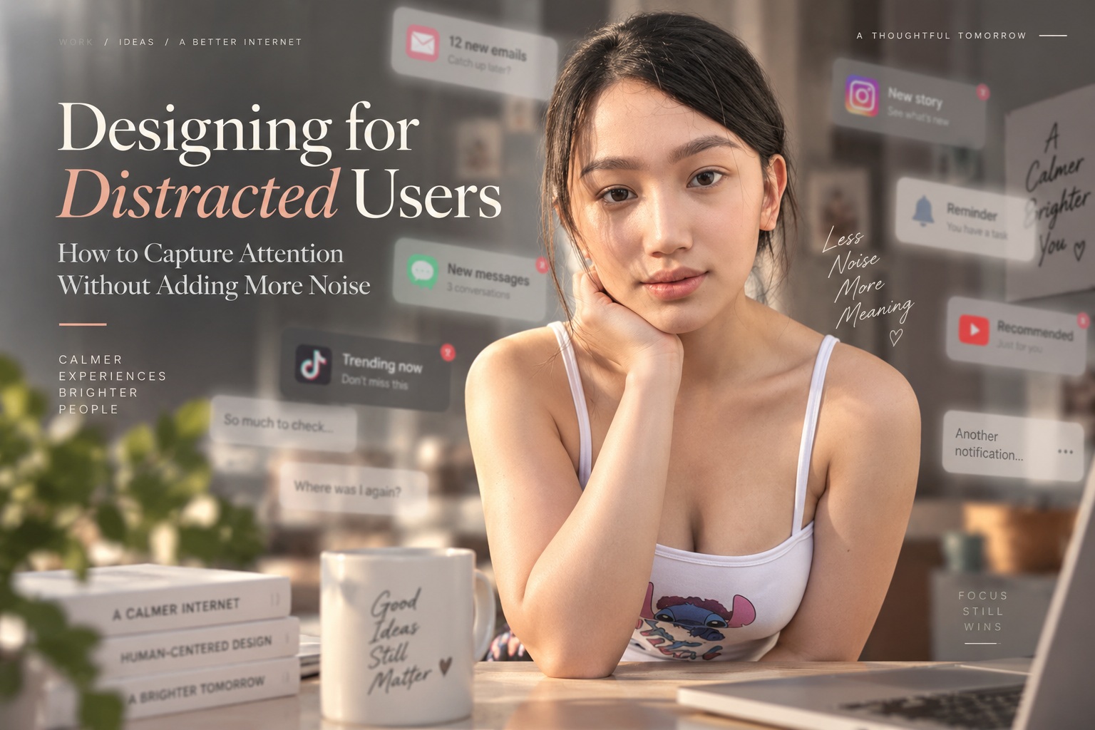
People rarely use websites, apps, and digital products under perfect conditions. They may be commuting, watching television, switching between meetings, or responding to notifications while trying to complete a task. That means designers are not simply competing for attention against other products; they are competing with everything happening around the user at the same time. Pasted markdown
The solution is not to make every button larger, every headline brighter, or every interaction more animated. Effective attention design is usually much quieter. It helps users recognise what matters, understand what to do next, and complete their goal with as little unnecessary mental effort as possible. Pasted markdown
Distracted Does Not Mean Uninterested
A user with divided attention may still genuinely want to finish the task in front of them. Someone might want to buy a product, read an article, complete a form, or understand a feature, but their focus is being shared with something else. Treating that person as uninterested can lead designers in the wrong direction. Pasted markdown
The common response is to add more stimulation: pop-ups, flashing banners, badges, notifications, animations, and aggressive calls to action. The problem is that when every element tries to become the most important thing on the screen, nothing feels important anymore. Good design reduces competition rather than adding to it. Pasted markdown
Visual Hierarchy Should Do the Thinking for the User
When people only have a few seconds to understand a screen, visual hierarchy becomes essential. The page should make it immediately obvious what deserves attention first, what follows next, and which action matters most. Pasted markdown
Designers can establish hierarchy through typography, size, contrast, spacing, position, colour, grouping, and visual weight. But these tools only work when they reflect genuine importance. Five equally prominent buttons do not create five equally good opportunities; they create uncertainty about where the user should begin. Pasted markdown
A strong interface identifies the primary task and lets supporting information remain available without competing with it.
Make Recognition Easier Than Recall
Distracted users benefit from interfaces they can understand immediately. Recognition is easier than remembering instructions, terminology, or previous steps, so important information should appear when and where it is needed. Pasted markdown
A checkout form, for example, should label fields clearly, preserve information that has already been entered, and explain errors next to the relevant field. Navigation should use familiar patterns and meaningful labels rather than clever wording that forces users to interpret what each option might mean.
Every piece of information the user does not need to remember frees up attention for the task itself.
Use Contrast Like a Spotlight
Contrast is one of the strongest ways to direct attention, but it becomes ineffective when everything is high contrast. If every heading is bold, every button is bright, and every message is highlighted, the interface loses its visual priorities. Pasted markdown
The better approach is to reserve strong contrast for elements that genuinely need it. A primary action may receive the most distinctive colour, while secondary actions remain quieter. A critical warning can stand out because ordinary information is visually restrained.
Think of contrast as a spotlight. It only works when the entire stage is not equally illuminated. Pasted markdown
The First Few Seconds Matter
Users often decide very quickly whether a page is relevant. The beginning of the experience should therefore answer three basic questions: what is this, why does it matter to me, and what can I do next? Pasted markdown
That does not necessarily require a huge headline or oversized button. It simply means the page's purpose should be easy to understand. Product pages should surface pricing, benefits, and next steps clearly. Content-heavy pages should use descriptive headings and short introductory sections. Applications should make the user's immediate task obvious. Pasted markdown
When attention is fragmented, clarity becomes one of the most valuable features a design can offer.
Reduce the Number of Things Competing at Once
A promotional banner, newsletter pop-up, cookie notice, chat widget, rotating carousel, animated buttons, notification badges, and autoplay video may all have legitimate purposes individually. Put them together, however, and the result can become visually exhausting. Pasted markdown
The solution is not necessarily to remove every interactive element. Timing matters just as much as quantity. A newsletter invitation may make sense after someone has read an article, but it can feel intrusive when it appears before they have consumed a single paragraph. A help prompt is useful when someone encounters difficulty, but unnecessary while a simple task is progressing smoothly. Pasted markdown
Good attention design asks not only what should appear, but also when it should appear.
Motion Should Explain Something
Animation naturally attracts the eye, which is exactly why designers need to use it carefully. Useful motion can confirm that an action has succeeded, explain the relationship between interface states, highlight newly available functionality, or provide feedback while something is processing. Pasted markdown
Motion that serves no communicative purpose quickly becomes noise. Continuously moving banners or decorative animation may initially grab attention but can become distracting when users are trying to read or complete another task.
A simple test is useful: if removing the animation does not make the experience harder to understand, the motion may not be necessary. Pasted markdown
Calls to Action Should Say Exactly What Happens
Generic labels such as "Click Here" or "Learn More" make users spend additional effort interpreting what will happen next. Specific actions like View Pricing Plans or Create Account communicate intent much faster. Pasted markdown
Clear wording is particularly helpful when attention is divided because users can recognise the next step without stopping to decode the interface. This also improves accessibility and reduces hesitation around important actions.
Good microcopy is not about sounding clever. It is about removing uncertainty.
Design for Scanning, Not Perfect Reading
Most people do not read digital interfaces word by word. They scan for useful landmarks, so the design should support that behaviour rather than expecting complete attention. Pasted markdown
Descriptive headings, shorter paragraphs, bullet points, meaningful labels, and clear visual grouping give users places to pause and quickly identify what matters. This becomes even more important on mobile devices, where limited screen space makes clutter more noticeable.
A scannable page serves both kinds of users: those looking for one specific answer and those willing to read more deeply once they find something relevant.
Remove Friction at the Moments That Matter
Attention becomes particularly fragile when users encounter unnecessary obstacles. Long registration processes, vague error messages, confusing navigation, and unexpected interruptions can cause someone to abandon a task they genuinely wanted to complete. Pasted markdown
Designers should identify where users are most likely to hesitate. Which fields are genuinely necessary? Which steps could be removed? What information is needed before a decision? What happens if the person becomes distracted halfway through and returns later?
Strong interfaces do not assume uninterrupted concentration. They make it easy to pause, recover, and continue. Pasted markdown
Give Users Control Over Their Attention
Attention-friendly design also respects user agency. People should be able to close overlays, dismiss interruptions, pause animation, control media, and understand why an interface is suddenly demanding attention. Pasted markdown
This is especially important for accessibility because motion, flashing content, dense layouts, and unexpected changes can affect some users more strongly than others.
Giving users control does not weaken engagement. It often builds trust because the interface feels as though it is helping rather than constantly fighting for attention.
Do Not Confuse Clicks With Good Attention
Clicks, time on page, conversion rates, and interaction counts can all be useful measurements, but they do not automatically prove that the design is handling attention well. A disruptive pop-up may generate clicks while frustrating users, while an autoplaying video may artificially increase time on page because visitors cannot immediately find what they wanted. Pasted markdown
The better question is whether attention helped the user make meaningful progress. Did the customer complete the purchase? Did the learner understand the material? Did someone using a productivity tool actually accomplish the task?
Attention is only valuable when it helps people move forward. Pasted markdown
Final Thoughts
Designing for distracted users is not about making interfaces louder. It is about making them easier to understand.
The strongest attention strategies are often surprisingly simple: a clear headline, one obvious primary action, deliberate contrast, concise language, useful spacing, and interactions that appear at the right moment rather than all at once. Pasted markdown
When every element fights for attention, users experience noise. When a design establishes a clear order of importance, people can understand and navigate it even when their attention is divided.
The goal is not to capture every second of someone's focus.
It is to make the few seconds they give you count.











Comments 0