

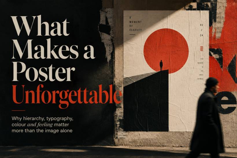
A poster only has a brief moment to make an impression. Someone may notice it while scrolling, walking through a mall, waiting at a train station or passing a noticeboard. In that short window, the design either creates enough interest to make them stop, or it disappears into the background.
That is why a memorable poster is never just about using a beautiful photograph or an impressive illustration.
A striking image can help, but it is not enough on its own. What people remember is the overall feeling of the poster: the tension, curiosity, mood, confidence or emotion it creates. The strongest poster designs make every part of the composition work together, from the headline and colour choices to the empty space around the content.
A Strong Poster Tells the Eye Where to Look First
The first job of a poster is to create a clear visual path.
A viewer should immediately understand what matters most without needing to study the design. There should be one dominant element that catches attention first. It could be a large headline, a dramatic image, a bold shape or even a single unexpected word.
After that, the eye should naturally move to the supporting information. This may include a short description, event details, a date, a call to action or a logo. Important details should be visible, but they should not fight with the main message.
Smaller items such as credits, sponsors, contact details and legal information should stay quiet in the background until someone actively looks for them.
When everything is given the same size, contrast and importance, the result becomes visually tiring. The viewer does not know where to begin, so they often move on.
A good poster is not simply arranged. It is directed.
Curiosity Gives People a Reason to Pause
The most effective posters often avoid explaining everything immediately.
Instead of giving viewers the entire story at once, they leave room for a question. This may come from an unusual headline, a cropped image, an unfamiliar setting or a detail that does not quite make sense at first glance.
For example, a poster may show only part of a face, place an everyday object in an unexpected environment or pair a serious subject with playful colours. That slight tension encourages the brain to look again and work out what is happening.
This does not mean making a poster confusing for the sake of being confusing. The goal is to create interest, not frustration.
A good curiosity gap works because it suggests that there is a meaningful answer waiting behind the design. It invites the viewer to engage rather than simply consume information.

Typography Is More Than Just Words
Typography carries personality before the viewer even reads the sentence.
A large, heavy headline can feel urgent, bold or energetic. A refined serif typeface may suggest tradition, luxury or authority. A clean sans-serif can feel modern, practical or digital. Handwritten lettering may feel personal, creative or informal.
The words matter, but the way those words appear matters just as much.
For posters, display text should be readable from a distance and confident enough to command attention. Supporting text should be comfortable to read without becoming visually louder than the main message.
The relationship between the two is important. Contrast in size, weight, spacing and placement helps create hierarchy. A viewer should be able to understand the importance of the information even before reading every word.
Typography should not be treated as something added at the end. In strong poster design, the type is part of the visual idea itself.
Colour Creates the Mood Before the Message Is Read
Colour is often the first emotional signal in a poster.
A dark background with bright text can feel dramatic, premium or urgent. Soft colours may feel calm, inviting or reflective. Bold contrast can create excitement, while limited colour palettes can make a poster feel more controlled and intentional.
The key is not simply choosing attractive colours. It is choosing colours that support the message.
A poster about a serious public issue may need strong contrast and a focused palette. A creative event may benefit from expressive colour combinations. A poster for a luxury brand may use restrained tones and space to create a sense of refinement.
Unexpected colour choices can also make a familiar subject feel fresh. A serious image paired with playful colours, or a cheerful subject presented in darker tones, can create the kind of visual friction that people remember.
Colour is not decoration. It shapes attention, emotion and meaning.
Negative Space Makes a Poster Feel More Confident
Many posters lose their impact because they try to fit too much into one page.
When every corner is filled with text, images, icons and logos, the viewer has no place to rest. The design becomes exhausting before the message has a chance to land.
Negative space gives a poster breathing room. It creates separation between ideas and makes important elements feel more deliberate. A headline surrounded by space often feels stronger than one squeezed tightly between several competing visuals.
This does not mean that every poster needs large empty areas. It means that every element should have enough room to be understood.
Good use of space makes a poster feel confident. It shows that the designer knows what to include and, just as importantly, what to leave out.
Small Details Can Turn Attention Into Memory
A poster can become more rewarding when it offers something extra for viewers who look closer.
This may be a hidden shape in the negative space, a subtle texture, a visual reference, a secondary message or a small detail that only becomes noticeable after a second look.
These details are not always necessary, but they can create a stronger relationship between the design and the viewer. Discovering something unexpected gives people a small sense of satisfaction, and that feeling can make the poster more memorable.
The most effective hidden details do not distract from the main message. They support it.
A poster should work from a distance first. The close-up details are the reward for people who choose to spend more time with it.
Consistency Makes the Message Feel Trustworthy
A memorable poster needs one clear visual voice.
The image style, typography, colours, tone and wording should all feel as though they belong to the same idea. When a poster combines too many unrelated styles, it can feel rushed or uncertain.
For example, a playful headline paired with overly formal typography may send mixed signals. A serious campaign with cartoon-like visuals may confuse the viewer unless the contrast is intentional and well handled.
Consistency does not mean a design has to be predictable or boring. It means the choices should feel connected.
The strongest posters usually make one central point clearly. They do not attempt to explain everything, appeal to every audience or include every possible message. They choose a direction and commit to it.
Final Thoughts
An unforgettable poster is not created by one impressive image alone.
It is created through clear hierarchy, intentional typography, emotional colour, thoughtful spacing, curiosity and consistency. Every element has a role, and the design works because those roles support one another.
The image may be the first thing someone notices, but the feeling is what stays with them.
A poster that makes people pause, wonder or feel something has already done more than decorate a wall. It has created a memory.


Comments