

Microsoft Edge has been improving a lot over the years. It is fast, clean enough, deeply integrated with Windows, and for many users, it has become a serious alternative to Google Chrome. But every now and then, Microsoft makes a design decision that reminds people why browser customisation still matters.
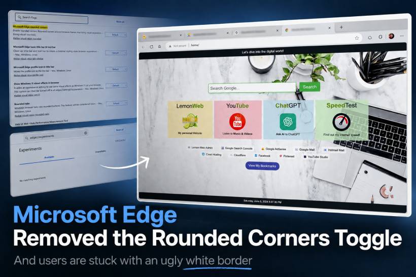
One of the latest frustrations comes from the removal of the Microsoft Edge rounded corners flag, previously available under Edge's experimental settings. This setting allowed users to disable the rounded browser frame and remove the visual border around webpages. For users who prefer a clean, edge-to-edge browsing experience, this was a useful option. Now, in newer versions of Edge, that setting appears to be gone.
And honestly, it is not a great move.
The Problem With The New Edge Border
The issue is not simply about rounded corners. Rounded corners can look nice when they are used properly. The real problem is the way Edge now places the webpage inside what feels like another frame, creating a visible border around the browsing area.
For some people, this may look modern. For others, it looks messy, distracting, and unnecessary. When you are used to a clean browser window where the webpage blends naturally with the browser frame, this new border makes the entire experience feel less polished.
It is especially noticeable when opening custom dashboards, homepage layouts, dark-themed pages, or full-screen style web apps. Instead of feeling like the webpage belongs inside the browser, it now looks like the browser is wrapping it inside a floating card.
That may sound minor, but visual consistency matters. A browser is something many of us stare at for hours every day. Small design annoyances become very noticeable when they are always sitting in front of you.
Why Remove The Option In The First Place?
This is the biggest question. Why remove the option?
Previously, users could go to Edge flags and search for:
#edge-rounded-containers
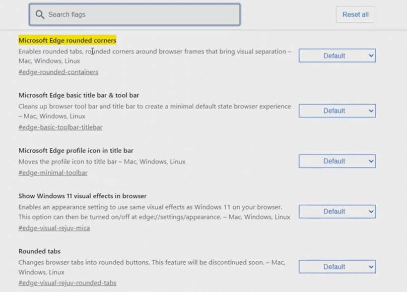
From there, they could disable the rounded container effect and return Edge to a cleaner look. It was simple, it worked, and it gave users control.
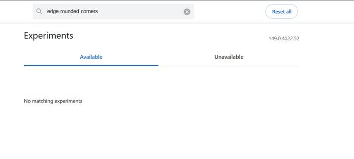
But in newer Edge builds, searching for that flag now returns nothing. The setting appears to have been removed, hidden, or made unavailable. The alternative visual effects setting also does not solve the problem, and the Appearance section no longer provides a proper toggle for this specific behaviour.
That is what makes this frustrating. Microsoft did not just change the design. It removed the practical way for users to undo the design.
A better approach would have been simple:
• Keep the new rounded design as the default
• Allow users to disable it if they prefer the older look
• Keep the setting under Appearance instead of hiding it inside flags
• Respect that different users prefer different browser layouts
That would have pleased both sides. Users who like the modern rounded look can keep it. Users who prefer a cleaner rectangular browsing area can turn it off. Everyone wins.
Instead, Microsoft seems to be pushing one visual style on everyone.
Users Should Be Allowed To Choose
This is where Microsoft sometimes gets things wrong. Not every design decision needs to be forced. A browser is a personal workspace. Some users like vertical tabs. Some prefer traditional tabs. Some like rounded corners. Some want sharp edges. Some want visual effects. Some want a simple, clean window without extra decoration.
The issue is not that Microsoft introduced rounded corners. The issue is that Microsoft removed the choice.
For users who are sensitive to visual clutter or who simply prefer neat, clean layouts, this kind of forced UI change can be genuinely irritating. It makes the browser feel less comfortable to use, even if the performance and features are still good.
And when many users are already complaining about the same thing, it becomes even harder to understand why Microsoft would remove the toggle instead of improving it.
The White Border Makes Edge Look Less Clean
The strange part is that Edge has actually become a very capable browser. It has good performance, strong compatibility, built-in productivity features, and solid Windows integration. But design choices like this make the experience feel unnecessarily annoying.
The white border around the page does not always blend well with websites. On certain pages, it stands out too much. On dashboards or custom homepages, it can make the design look like it is being displayed inside a container rather than using the full browser space.
For people who care about layout, alignment, and clean presentation, this is the kind of thing that is hard to ignore.
It may not break the browser, but it makes the browser feel uglier than before.
Rolling Back Is Not Really A Good Solution
Some users may think about rolling back to an older Edge version just to bring back the old setting. Technically, that may be possible in certain cases, especially using enterprise installers or downgrade commands. But for normal users, it is not a clean solution.
Edge will usually auto-update again. Blocking updates can create security concerns. Older browser versions may miss important patches. In short, rolling back just to fix a visual issue is possible, but it is not really practical.
That is why this should not require a workaround in the first place. Microsoft should simply bring back the option.
A small setting under Appearance would be enough:
That is all users need.
Time To Go Back To Google Chrome?
For users who are already frustrated, this may be the final push back to Google Chrome. Chrome may not be perfect either, but at least the browser window still feels visually cleaner in this area.
If a browser starts making your daily workflow visually uncomfortable, then switching becomes reasonable. It is not always about features. Sometimes it is about how the software feels when you use it every day.
Personally, this kind of forced border around the browser is annoying enough to make Edge feel less enjoyable. It may sound like a small issue, but for people who prefer clean layouts, it becomes a daily irritation.
And when there is no toggle to disable it, the frustration becomes worse.
Microsoft Should Bring Back The Toggle
Microsoft does not need to remove the rounded design completely. Some users may like it, and that is fine. But removing the ability to disable it is the real mistake.
A good browser should offer flexibility, especially for visual preferences. Not every user wants the same interface. Not every user wants the latest design trend forced into their daily workflow.
Microsoft should bring back the Microsoft Edge rounded corners setting, preferably under the normal Appearance settings instead of hiding it inside experimental flags. That would be the most user-friendly approach.
Final Thoughts
Microsoft Edge is still a good browser in many ways, but this kind of design decision is frustrating. The rounded border may look modern to Microsoft, but to many users, it looks unnecessary, distracting, and ugly. More importantly, the removal of the toggle takes control away from users who already had a working solution.
Design changes are fine. Forced design changes are not.
If Microsoft wants Edge to continue growing, it should listen to users who care about clean layouts and personal preference. Bring back the option, let people choose, and stop turning simple browser appearance settings into unnecessary battles.
Until then, for users who cannot stand the new border, moving back to Google Chrome may be the cleaner and more comfortable choice.


Comments 5
I'm done with this trash ugly browser. Gonna use Firefox instead
It is still possible to disable rounded corners (by adding that 'disabled features' option to your shortcut). But like others said, that solution may also be patched out soon.
You said it very well, that the problem is that it looks like the webpage is placed into another frame. I will probably never get used to that.
Usually Apple does this things forcing users. Now Microsoft?
FYI, the launch argument "--disable-features=msEdgeRoundedCorners,msVisualRejuv" or "--disable-features=msEdgeRoundedCorners,msVisualRejuv,msMica,msMicaTitlebar,msAcrylic" does not work in the latest version.
Microsoft really don't want users to forcibly enjoy their border
this argument works
--disable-features=msFeatureGroupNewLookAndFeelHoldout