

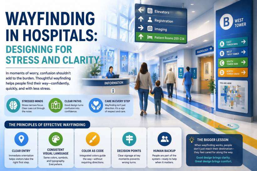
Walking into a hospital is rarely a calm experience. Most people are not there for routine sightseeing. They are there because they are worried, tired, overwhelmed, or trying to help someone they care about. In that kind of situation, even a simple task like finding the right department can suddenly feel much harder than it should. A missed turn, a confusing corridor, or a sign that does not make immediate sense can add another layer of stress to an already difficult moment.
That is why hospital wayfinding deserves more attention than it usually gets. It is not just about signs on walls or arrows pointing toward a lift. It is about helping people stay calm, move with confidence, and feel supported in an environment that can otherwise feel intimidating. In healthcare, navigation is not a minor design detail. It is part of the patient and visitor experience.
Hospitals Are Different From Other Public Spaces
It is easy to compare a hospital to places like airports, shopping malls, or office towers because they are all large buildings with many destinations. But hospitals are different in one very important way: the emotional state of the people inside them.
Someone navigating an airport might be rushed. Someone in a mall might be distracted. But someone in a hospital is often anxious, mentally exhausted, or dealing with urgent personal concerns. That changes everything. When stress is high, people do not absorb information the same way they normally would. They may overlook obvious signs, forget directions they were told just seconds earlier, or become uncertain even when they are technically on the right path.
In other words, hospital navigation must work for people at their least comfortable moments, not their best.
Stress Changes How People Find Their Way
One of the biggest challenges in healthcare wayfinding is psychology. Stress affects how the brain processes space, attention, and memory. When people are worried, their focus narrows. They pay more attention to what feels urgent and less attention to surrounding details. That makes it easier to miss directional cues, overlook landmarks, or become confused by instructions that seem straightforward on paper.
This is why hospital navigation cannot rely on subtle design choices alone. It needs to be direct, visible, and reassuring. If a visitor has to stop and interpret a symbol, compare multiple signs, or remember a sequence of directions, the system is already asking too much. In a hospital, clarity has to come quickly and almost instinctively.
Good wayfinding does not assume people are calm enough to study their environment. It assumes the opposite and designs accordingly.
Why So Many Hospitals Feel Hard to Navigate
Part of the problem comes from how hospitals are built over time. Many healthcare facilities did not begin as one perfectly planned structure. They expanded in stages, often across many years or even decades. A new wing gets added here, another specialist department moves there, an extra floor is built, an outpatient block is connected later, and suddenly the whole campus becomes a patchwork of different layouts stitched together.
This kind of growth makes sense from an operational and financial perspective, but it often creates a maze for visitors. Corridors may connect at awkward angles. Departments that sound like they should be close together may be separated by long, indirect routes. Lift lobbies may be hidden from obvious sightlines. Even staff who work in one area may not always know the easiest route to another.
So in many cases, confusing navigation is not the result of careless planning. It is the result of years of practical expansion. The job of wayfinding design is to bring order and confidence into spaces that were never originally built with perfect navigational logic.
First Impressions Matter at the Entrance
The moment someone enters a hospital is one of the most important parts of the entire journey. This is the point where uncertainty is often at its highest. Visitors are scanning their surroundings, trying to figure out where they are, where they need to go, and who can help them.
A well-designed entrance reduces that uncertainty immediately. It does not leave people standing in the middle of a lobby trying to decode the space. Instead, it gives them orientation right away. That might mean a clearly visible information counter, obvious sightlines to registration or main lifts, and signage that is readable at a glance rather than buried in the visual clutter.
The best entrances guide people naturally. They make the next step feel obvious instead of forcing visitors to pause and ask what to do next.
Consistency Makes Navigation Easier
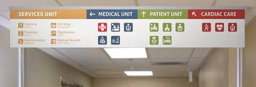
One of the fastest ways to create confusion in a hospital is inconsistency. If signs look different from one floor to another, if naming conventions change between departments, or if the icons and colours are used differently across the building, visitors have to keep relearning the system. That increases mental effort at a time when people already have too much on their minds.
A strong wayfinding system uses a consistent visual language throughout the facility. The typography stays familiar. The colours mean the same thing everywhere. The symbols are clear and repeated in a predictable way. Once visitors learn that visual language in one area, they can apply it with more confidence throughout the hospital.
That consistency quietly builds trust. It makes the environment feel more coherent and less overwhelming.
Colour Works Best When It Is Part of the Environment
Colour coding is one of the most useful tools in hospital navigation, but only when it is applied properly. Telling people to follow the green zone or blue corridor can be effective, but only if those colours are reinforced throughout the actual space. If the only appearance of that colour is on a small sign, it loses much of its power.
The most effective systems use colour as part of the overall environment. It appears not only on signs, but also in corridor accents, wall treatments, floor graphics, and nearby architectural details. This creates a visual thread that visitors can follow more naturally, even when they are not actively reading instructions.
That matters because people under stress do not always want to stop and process written information. Sometimes they simply want to move toward something that feels clearly marked and easy to follow.
Decision Points Are Where People Get Lost
Not every part of a hospital is equally confusing. There are certain places where people are far more likely to hesitate, second-guess themselves, or take a wrong turn. These are the decision points. Lift lobbies, major intersections, hallway splits, transitions between public and clinical areas, and entrances to large departments are some of the most common examples.
These are the moments where signage has to work the hardest. It is not enough to put one small directional sign somewhere nearby and hope people notice it. Decision points need layered information. Visitors need to know what direction to take, confirmation that they are still on the correct route, and reassurance between major turns that they have not gone off course.
A good wayfinding system does more than point once. It keeps supporting the user throughout the journey.
Human Help Still Matters
Even the best signage system cannot do everything on its own. Hospitals are emotional places, and many visitors will still seek help from a real person even when the route is clearly marked. That is not a failure of design. It is simply human behaviour.
This is why strong wayfinding includes people as part of the system. Information desks placed in the right locations, volunteers who guide rather than just point, and staff who understand that giving directions is part of care all make a real difference. Sometimes what a visitor needs most is not just the correct route, but the reassurance that they are heading the right way.
In a hospital, human support and physical design should work together, not separately.
Large Campuses Need More Than Signs
Navigation becomes even more challenging on large medical campuses with multiple buildings. In these environments, traditional signs alone are often not enough. People need memorable landmarks that help them create a mental map of the place. A distinctive tower, a bright atrium, a clearly recognisable façade, or even a strong landscaping feature can serve as an anchor that helps visitors understand where they are in relation to the rest of the campus.
Digital tools are also becoming more useful in this area. Interactive kiosks, QR codes, hospital apps, and indoor mapping can make navigation more convenient, especially for repeat visitors or people comfortable using their phones. But digital tools should support physical wayfinding, not replace it. Phones lose signal, batteries run low, and not everyone can comfortably use a screen while managing appointments, paperwork, children, or a loved one in a wheelchair.
Hospitals need systems that work for everyone, with or without technology.
What Other Industries Can Learn From Hospital Wayfinding
Hospital navigation offers lessons that go far beyond healthcare. Any environment where people may be stressed, hurried, distracted, or unfamiliar with the space can benefit from the same thinking. Airports, government offices, transport hubs, convention centres, and even large corporate buildings face similar challenges.
The deeper lesson is simple: do not assume users are calm, patient, and ready to study the environment. Design for the moments when they are overloaded. Make information obvious. Repeat important cues. Support people at critical decision points. Offer reassurance along the way. Test systems with real users, not just internal teams who already know the layout.
When designers do that well, navigation becomes less about signs and more about empathy.
Wayfinding Is Also a Form of Care
At its core, hospital wayfinding is about more than movement. It is about how a place makes people feel. A hospital that is difficult to navigate can increase frustration, anxiety, and helplessness. A hospital that is intuitive and easy to understand sends a very different message. It tells visitors that their experience matters, that their time is respected, and that someone has thought carefully about what they are going through.
That is why good wayfinding feels almost invisible when it works. People may not stop to admire the signage or think about the planning behind it. They simply feel less stressed. They move more confidently. They arrive where they need to be without that extra layer of uncertainty.
And in a healthcare setting, that quiet sense of reassurance can matter more than many people realise.
Final Thoughts
Wayfinding in hospitals is not just a practical issue. It is a human one. In places where people are often scared, exhausted, and emotionally stretched, clear navigation can ease part of the burden. It helps visitors move through unfamiliar environments with less confusion and more confidence.
The best hospital wayfinding systems do not just direct people from one point to another. They communicate calm, support, and care. That is what makes them so important. When navigation is done well, it becomes part of the healing environment itself, even for those who are only there to visit, ask questions, or wait anxiously for news.


Comments