


Money has always been personal, but digital banking makes that relationship even more sensitive. When someone pauses before tapping "Send" on a banking app, it's not just hesitation about the button or the screen. It's a moment of doubt about whether the system on the other side can be trusted with their finances.
For FinTech platforms, this changes everything. Trust isn't something you market after building the product. It is the product. And design plays a much bigger role in that than most people realise.
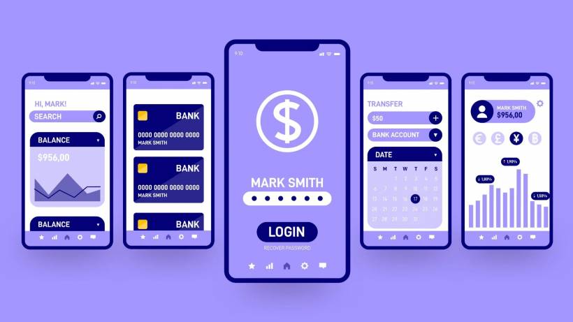
Why Trust Matters More in FinTech Than Anywhere Else
People tolerate small annoyances when shopping online. They expect glitches on social media. But when it comes to banking, patience disappears quickly.
Users want reassurance at every step. If something feels off, even slightly, they don't just abandon a transaction. They start questioning the entire platform. In many cases, they simply move their money somewhere else.
This is especially true for digital-first banks. Traditional banks still benefit from physical branches, signage, and decades of presence. Digital banks don't have that luxury. Every screen, every interaction, every micro-detail has to carry the weight of proving legitimacy.
That's why a clean interface isn't just about aesthetics. It's about credibility.
Making Security Feel Visible (Without Being Overwhelming)
Security is tricky. It needs to be obvious, but not scary.
If an app feels too "locked down" with aggressive warnings, users may get nervous. But if security is invisible, they might assume it's not there at all. The sweet spot is subtle reassurance.
Consistency plays a surprisingly big role here. When colours don't match, fonts look off, or layouts feel messy, users instinctively associate that with risk. It may not be logical, but perception matters more than technical reality in these moments.
Clear messaging helps as well. Small cues like "Your session is encrypted" or reminders that passwords are never requested via email quietly reinforce safety. The key is placement. Messages that appear naturally within the flow feel more trustworthy than badges or icons randomly placed at the bottom of a page.
Even something as simple as showing progress during a transaction makes a difference. A payment that instantly jumps from click to completion can feel suspicious. But when users see steps like "Verifying," "Processing," and "Completed," it gives the impression of a controlled, secure process rather than a black box.
Preventing Mistakes Before They Happen
Nothing destroys confidence faster than making a costly mistake, especially when money is involved.
That's why the best FinTech design doesn't just handle errors. It prevents them entirely.
Real-time validation is one of the simplest but most powerful tools. As users type in account numbers or payment details, the system can immediately flag issues or confirm accuracy. This reduces the risk of sending money to the wrong place and avoids that sinking feeling users get when they realise something went wrong.
Confirmation screens are equally important. Before finalising a transfer, users should see a clear summary of the amount, recipient, and any fees involved. Some apps even go a step further by requiring users to re-enter key details to confirm. It might seem like extra effort, but it dramatically reduces mistakes.
And when errors do happen, the response matters. A vague message like "Transaction failed" only adds frustration. A helpful explanation that tells users what went wrong and how to fix it turns a negative moment into a manageable one.
Designing for Different Generations on a Single Platform
One of the biggest challenges in digital banking is that the audience isn't uniform. You're designing for teenagers opening their first account and retirees managing lifelong savings on the same platform.
Each group approaches technology differently.
Younger users tend to expect speed, simplicity, and visual clarity. They want quick insights into their financial health without digging through menus. At the same time, many of them benefit from subtle guidance since they may have less real-world financial experience.
Working adults, especially millennials, often look for convenience and integration. They want everything in one place, payments, budgeting, investments. For them, even small design flaws can feel like a sign that something bigger might be wrong.
Older users usually prioritise clarity over speed. They value readable text, straightforward navigation, and visible support options. A confusing interface doesn't just frustrate them. It creates doubt.
The solution isn't to build separate experiences. It's to design layers. Keep the main interface simple and intuitive, while allowing deeper features to be accessed when needed. Over time, familiarity becomes the foundation of trust.
Common Mistakes That Instantly Break Trust
Some issues don't just annoy users. They actively push them away.
Hidden fees are one of the biggest offenders. When costs appear only after a transaction is completed, users feel misled. Transparency upfront is always the better approach.
System downtime is another critical moment. Outages happen, but silence makes things worse. When users don't know what's going on, they assume the worst. Clear communication, even a simple status update, can prevent panic and maintain confidence.
Inconsistent experiences across platforms also create problems. If the mobile app, website, and customer support all provide different information, users start questioning which one is correct. Consistency across every touchpoint isn't just good design practice. It's essential for maintaining trust.
Final Thoughts
People don't open a banking app because it looks nice. They open it because they need a safe place for their money.
That means every design decision carries weight. Clear navigation, transparent fees, helpful feedback, and a consistent experience all work together to create confidence. And confidence is what keeps users coming back.
In digital banking, switching providers is easier than ever. If trust breaks, users don't hesitate to leave. But when the experience feels reliable, predictable, and honest, they stay.
At the end of the day, that's what great FinTech design is really about. Not just functionality or aesthetics, but creating an environment where users feel comfortable enough to trust you with something that matters most to them.


Comments