

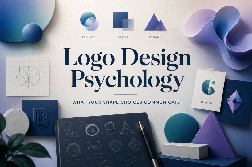
Logo design is never just about making something look nice. Every shape carries a message, even before anyone reads the brand name or understands what the business does. A circle feels different from a square. A triangle creates a different mood from a soft organic curve. These reactions happen almost instantly, often before the viewer has time to think about them rationally.
That is why shape choice matters so much in logo design. It quietly influences how people feel about a brand. A logo can appear friendly, stable, premium, energetic, creative, or trustworthy simply through the forms used in its design.
This does not mean shape psychology is magic. A circle alone will not make people trust a company, and a square will not automatically make a brand look professional. But shapes do create emotional signals. When combined with color, typography, spacing, industry context, and brand reputation, they help form the first impression.
For designers, the real value is not memorising shape meanings like a formula. It is understanding how visual choices affect perception, then using those choices with purpose.
Why Shape Psychology Matters in Logo Design
Before a viewer reads a tagline, studies the color palette, or understands the brand story, they first react to the overall form of the logo. Is it soft or sharp? Open or contained? Balanced or energetic? Calm or aggressive?
This immediate reaction matters because logos are often seen quickly. They appear on websites, product packaging, app icons, business cards, social media profiles, building signage, invoices, and advertisements. In many of these situations, the viewer does not spend much time analysing the design. They simply feel something.
That feeling may be subtle, but it can still shape perception.
A financial brand may want to feel stable and dependable. A children's brand may want to feel playful and approachable. A luxury brand may want to feel elegant and exclusive. A fitness brand may want to feel energetic and forward-moving. Shape choices help support those goals.
Good logo design is not just about whether the logo looks attractive. It is about whether the logo feels right for the brand.
Circles and Ovals: Friendly, Complete, and Connected
Circles are among the softest and most approachable shapes in logo design. Because they have no corners, they feel smooth, continuous, and non-threatening. They suggest wholeness, unity, protection, and connection.
This is why circles are often used by brands that want to communicate community, inclusiveness, or harmony. A circle can feel like a group, a cycle, a world, or a protective boundary. It has a natural sense of completeness.
The Olympic rings are a strong example of circular symbolism. The rings suggest unity, connection, and global participation. In a different context, circular forms are also common in wellness branding because they can represent balance, holistic care, and the idea of body and mind working together.
Circles can work especially well for brands that want to feel:
• Approachable
• Inclusive
• Connected
• Human
• Balanced
• Supportive
However, circles may not always suit brands that want to feel sharp, aggressive, rebellious, or highly exclusive. Their softness can be a strength, but in the wrong context, it may also feel too gentle or too safe.
Squares and Rectangles: Stable, Practical, and Trustworthy
Squares and rectangles communicate structure. They feel solid, grounded, organised, and reliable. Their straight edges and right angles suggest discipline, order, and professionalism.
This is why square and rectangular forms are often used in industries where trust is important. Banks, insurance companies, law firms, software companies, and corporate brands frequently use rectilinear shapes because they give a sense of stability.
A square feels like something that will not easily move. It looks balanced and dependable. For many brands, that is exactly the message they want to send.
Microsoft's four-pane window mark, for example, uses square geometry to suggest structure and clarity. Adobe's identity also uses strong geometric framing, giving the brand a sense of professional reliability while still operating in the creative space.
Squares and rectangles are useful when a brand wants to feel:
• Established
• Secure
• Professional
• Dependable
• Organised
• Practical
The downside is that squares can sometimes feel cold or predictable. They are strong at communicating trust, but they do not always communicate warmth, movement, or emotional energy. If a brand wants to feel playful, unconventional, or highly expressive, a square-heavy logo may need softer supporting elements to avoid feeling too rigid.
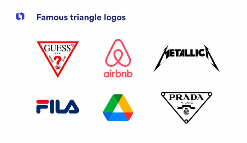
Triangles and Diamonds: Direction, Energy, and Ambition
Triangles are active shapes. Unlike circles and squares, they naturally point somewhere. That direction gives them a sense of movement, ambition, and purpose.
An upward-facing triangle can suggest growth, achievement, progress, and aspiration. It feels like something rising. A downward-facing triangle can feel more grounded, depending on the design, but it may also feel sharper or more intense. Diamonds, which are often built from triangular geometry, can suggest value, precision, and focus.
Triangles are useful for brands that want to look bold and forward-moving. They are often associated with innovation, competition, transformation, and progress.
A triangle-based mark can be a good fit for brands in areas such as technology, fitness, consulting, performance, architecture, or transformation-focused services. The shape feels less settled than a square and less soft than a circle, which gives it more visual tension.
Triangles work well when a brand wants to feel:
• Ambitious
• Energetic
• Competitive
• Directional
• Innovative
• Transformational
However, they should be used carefully for brands that need to feel calm, gentle, nurturing, or traditional. Sharp angles can create excitement, but they can also create tension.
Horizontal Lines: Calm, Reliable, and Steady
Horizontal shapes and lines usually feel calm because they echo the horizon. They suggest rest, balance, and stability. A wide horizontal logo can feel settled and dependable, as if the brand is firmly positioned and not easily shaken.
This is why horizontal forms often appear in brands that want to communicate reliability. The shape gives the impression of steadiness and long-term presence.
A horizontal layout can make a logo feel mature and composed. It is less dramatic than a vertical or diagonal composition, but that calmness can be useful. For a business that promises security, consistency, or professional support, horizontal design can help reinforce that message.
Horizontal forms are helpful when a brand wants to communicate:
• Stability
• Calmness
• Reliability
• Consistency
• Balance
• Confidence
The trade-off is that horizontal shapes may feel less dynamic. If a brand needs urgency, speed, or excitement, a heavily horizontal logo may feel too quiet unless combined with stronger color, typography, or motion-based elements.
Vertical Lines: Strength, Prestige, and Aspiration
Vertical shapes naturally draw the eye upward. They can suggest height, growth, authority, elegance, and aspiration. Tall forms often feel more formal and refined, especially when used with careful spacing and strong typography.
This is why verticality can work well for premium brands. Tall letterforms, narrow marks, architectural shapes, and skyscraper-like silhouettes can all create a sense of status and sophistication.
Vertical design can also communicate strength. It stands upright, almost like a pillar. That makes it suitable for brands that want to project confidence, leadership, or excellence.
Vertical forms are useful when a brand wants to feel:
• Strong
• Elegant
• Premium
• Aspirational
• Authoritative
• Refined
However, vertical shapes can sometimes feel less approachable. A very tall, narrow, or formal mark may create distance between the brand and the audience. For brands that need warmth and friendliness, verticality should be balanced with softer shapes, colors, or typography.
Spirals and Organic Forms: Creative, Natural, and Human
Not every logo needs to be built from strict geometry. Spirals, curves, waves, blobs, and irregular organic forms can make a brand feel more natural, creative, and human.
Spirals are especially interesting because they combine circular movement with a sense of evolution. They can suggest growth, creativity, transformation, and natural cycles. Organic shapes, meanwhile, feel less mechanical and more handmade. They can communicate flexibility, imagination, and emotional warmth.
These forms are common in creative agencies, wellness brands, environmental organisations, children's brands, and businesses that want to avoid feeling too corporate.
Organic shapes can make a logo feel:
• Creative
• Natural
• Friendly
• Playful
• Flexible
• Human-centred
The downside is that organic forms may not always communicate precision or authority. If a brand needs to look highly technical, serious, or institutionally reliable, too much irregularity can weaken that impression.
Combining Shapes Creates a More Nuanced Message
Most strong logos do not rely on one shape alone. They combine different visual elements to create a more layered message.
A circle inside a square can suggest community within structure. This might work well for a bank, healthcare provider, or technology company that wants to feel both secure and human. A triangle inside a circle can suggest ambition contained within balance. A square with rounded corners can soften a corporate identity while keeping its sense of reliability.
This is where logo design becomes more interesting. Shape psychology should not be treated as a simple checklist. The emotional message often comes from how shapes interact.
The main shape usually sets the dominant tone. Secondary shapes add personality, contrast, or complexity.
For example:
• A square foundation can make a brand feel stable, while rounded details add friendliness
• A circular frame can make a bold symbol feel more approachable
• A triangular element can add energy to an otherwise calm design
• Organic curves can soften a technical or corporate identity
• Horizontal structure can balance a logo that has sharp or dynamic elements
A good logo often works because it balances different emotional signals instead of leaning too heavily on one.
Shape Psychology Has Limits
While shape psychology is useful, it should not be treated as a guaranteed rule. A circle does not automatically make a brand feel friendly. A square does not automatically create trust. A triangle does not always mean ambition.
Context changes everything.
A square logo for an accounting firm may feel professional and reliable. The same square logo for a skateboard brand may feel boring or overly corporate. A triangle may feel innovative in a technology logo but harsh in a childcare brand. A spiral may feel creative in an art studio identity but too loose for a cybersecurity company.
Other design elements also influence how a shape is perceived. Color, typography, spacing, texture, composition, and cultural meaning can all change the emotional reading of a logo.
That is why designers should use shape psychology as a guide, not a shortcut. It helps with decision-making, but it does not replace research, testing, or understanding the client's audience.
Designing With Intention
The best logo designers do not choose shapes only because they look nice. They choose them because they support the brand's personality, positioning, and promise.
Before selecting a shape direction, it helps to ask a few practical questions:
• Should the brand feel friendly or authoritative?
• Should it look established or disruptive?
• Should it feel calm or energetic?
• Should it appear premium or accessible?
• Should the audience feel protected, inspired, excited, or reassured?
These questions turn design decisions into strategic decisions. Instead of saying, "I used a circle because it looks good," the designer can say, "I used a circular form because the brand needs to feel inclusive, connected, and supportive."
That is the difference between decoration and intentional design.
Final Thoughts
Shape choices are not neutral. They speak before the brand says a word. Circles invite. Squares reassure. Triangles energise. Horizontal lines calm. Vertical forms elevate. Organic shapes humanise.
The viewer will react to these forms whether the designer plans for it or not. The real question is whether that reaction supports the brand message.
Logo design psychology is not about following rigid rules. It is about understanding the emotional language of visual form. When designers understand that language, they can make better choices, build stronger identities, and create logos that do more than simply look good.
A successful logo does not just represent a brand visually. It helps people feel the brand before they fully understand it.


Comments