

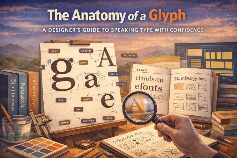
To most people, a letter is just a letter. A shape. Something you read and move on from. But designers don't get to "move on." Because once you've spent enough time choosing type for logos, websites, posters, or UI, you start seeing the tiny decisions hiding inside every letterform. That "simple" font choice suddenly becomes a whole personality system: sharp or soft, modern or classic, friendly or strict, airy or dense.
Here's the twist: you don't need to be a type designer to talk about type like a pro. You just need the vocabulary. Not to sound fancy, but to think clearly. Because the moment you can name parts of a letter, you can spot why something feels wrong, justify why something feels right, and explain your choices without resorting to "I don't know… it just looks better."
That's the difference between picking a font and using type intentionally.
Why letter anatomy matters more than you think
Typography feels "subjective" when you can't describe what you're seeing. But once you know what the parts are called, you start noticing patterns and cause-and-effect:
A headline feels stiff because the terminals are square and heavy.
A brand feels premium because the strokes have high contrast and elegant stress.
When you can point to the exact feature causing the vibe, you're no longer guessing. You're designing.
The core structures: strokes and spaces
Let's start with the big building blocks. These are the bones of most letterforms and the reason typefaces can feel stable, playful, dense, or spacious.
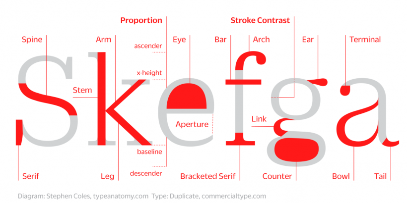
The stem is the main vertical stroke you'll spot in letters like l, h, b, and d. It's basically the backbone. Thick stems can feel bold and confident, while thinner stems can feel delicate or minimal depending on the overall design.
A bowl is the closed rounded shape that forms letters like o, b, d, and p. Bowls are where a lot of a typeface's "friendliness" or "formality" shows up, depending on how circular, narrow, or geometric they are.
Counters are the enclosed or partially enclosed spaces inside letters. An o has a closed counter. A c has a more open one. Bigger counters usually improve readability, especially on screens or at small sizes, because the letter doesn't turn into a blob.
Crossbars are horizontal strokes that connect or cut across a form, like in A, H, t, or f. Their thickness, position, and shape can dramatically change the personality of a typeface. A high crossbar can feel elegant. A low one can feel grounded.
Ascenders are the parts of lowercase letters that rise above the x-height, like in b, d, h, and k. Descenders drop below the baseline, like in g, j, p, and y. Long ascenders and descenders can feel graceful and traditional, but they can also create spacing challenges in tight layouts.
The personality details: the features you notice subconsciously
Once the structure is in place, the small finishing details are what make a typeface memorable. These are the pieces that help a font feel "classic," "modern," "quirky," or "premium."
Serifs (and why they matter)
Serifs are the small finishing strokes at the ends of main strokes. But not all serifs behave the same, and the style of serif can completely change the tone.
A bracketed serif connects to the stem with a smooth curve, often feeling warm, human, and traditional.
A slab serif is thick and blocky, usually bold and sturdy, sometimes with a strong editorial vibe.
A hairline serif is thin and crisp, often used when you want elegance, luxury, or high fashion energy.
Terminals
Not every stroke ends in a serif. The endpoint of a serif-less stroke is called a terminal, and terminals are a huge source of "voice."
A teardrop terminal can feel organic and calligraphic.
A sharp or flat terminal can feel modern, strict, or technical.
If a font feels too cold or too stiff, terminals are often part of the reason.
Spine
The spine is the main curved stroke in an s or S. It's one of those features people rarely name, but everyone reacts to. The tension in that curve can make a typeface look elegant, playful, rigid, or relaxed.
Ear, tail, and link (the fancy bits you'll start spotting everywhere)
Some typefaces have a distinctive "ear" on the lowercase g, usually projecting from the upper right. When it's unique, it becomes almost like a signature. A tail is a descending stroke you often see in letters like Q or y. Tails can be simple and functional or decorative and expressive. The link (sometimes called a neck) is the connector in a double-story g between the upper bowl and the lower loop. If that link gets too thin, it can become fragile at small sizes or low-resolution environments.
The invisible geometry: space that shapes the letter
Typography is not just the black strokes. It's the white space around and inside them. A typeface can feel open and friendly or tight and compressed based largely on how it treats space.
Aperture
An aperture is the opening in a partially enclosed shape, like in c, e, s, or a. Fonts with open apertures tend to be more legible and airy. Fonts with tight apertures can feel efficient, compact, or more formal, but they can also reduce readability at small sizes.
Shoulder
The shoulder is the curved stroke that comes off a stem, like in h, m, and n. Shoulders affect how "rounded" a typeface feels, and they contribute to rhythm in body text.
Spur
A spur is a small pointed projection you might notice on a G or at certain curve-to-stem junctions in sans-serif fonts. It's subtle, but it can add sharpness and structure, making a typeface feel more engineered.
How this vocabulary becomes your design superpower
Once you can name these parts, three big things change: pairing gets smarter, branding gets intentional, and client conversations get easier.
Smarter font pairing
Instead of pairing fonts because they "look okay together," you start matching specific traits.
If a slab serif has strong square terminals, it often pairs nicely with a geometric sans-serif that also has firm, crisp endings. If a humanist serif has soft bracketed serifs and friendly proportions, it usually harmonizes better with a humanist sans-serif that shares open apertures and a similar warmth.
And once you know the rules, you can also break them intentionally. Pairing opposites, like a rigid grotesque sans-serif with a dramatic high-contrast serif, can create purposeful editorial tension instead of accidental mismatch.
Better branding decisions
Type anatomy also helps you translate brand personality into visual form. A fintech brand might lean toward large counters, open apertures, strong x-height, and stable strokes because those features suggest clarity, trust, and reliability. A luxury perfume brand might prefer high-contrast strokes, refined terminals, and elegant proportions because those details signal exclusivity, craftsmanship, and sophistication.
This is where typography stops being decoration and starts becoming strategy.
Stronger client communication
This might be the biggest win. When a client says, "The headline font feels too stiff," you don't have to panic or randomly swap fonts until they stop complaining.
You can respond like a consultant:
Suddenly the conversation becomes objective. You're diagnosing, not guessing.
A practical exercise: become a type detective
If you want to train your eye quickly, use the classic word "Hamburgefonts" and set it in three different typefaces. Then look closely and identify a few things:
Do this a few times and you'll notice something funny: you'll start seeing type like a mechanic hears an engine. You'll spot "why" instantly.
The takeaway
Once you learn the anatomy of letterforms, fonts stop being mysterious. You stop choosing type based on vibes alone. You begin to orchestrate it.
You start noticing the ear on the g, the spine of the s, the aperture of the e, and how all those tiny choices add up to a voice. And when you can explain that voice clearly, you design with more precision, defend your decisions with confidence, and make typography feel like a tangible tool instead of an invisible art.


Comments