

We live in a world that's trained us to skim. Infinite scroll, endless tabs, headlines flying by faster than we can blink. That's why a well-designed magazine spread (or a digital long-form layout that borrows magazine logic) feels almost rebellious. It doesn't just present content. It creates a place to read.
And the best layouts do something even more interesting: they quietly control your tempo.
They tell you when to browse quickly, when to slow down, when to pause for a visual breath, and when to settle in for the long haul. The editor shapes the story with words, but the designer shapes the experience of time.
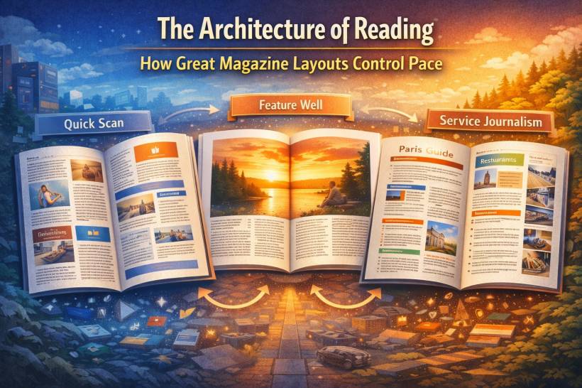
A useful way to think about it is this: readers shift between three reading modes as they move through an issue. Each mode needs a different layout strategy.
Reading Mode One: The Quick Scan Zone
The opening section of a magazine usually feels like stepping into a busy room. Letters, short news hits, quick cultural bits, small features that are designed to be sampled. The reader isn't committing yet. They're browsing and deciding what deserves attention.
So the layout has to support a restless eye.
Build a layout with multiple entry points
Instead of one linear block of text, the page works better as a set of modules. Give the reader several obvious "ways in":
• Strong images that act like visual stop signs
• Pull quotes and callouts that preview the tone
• Small chunks that feel finishable
The job here is not immersion. It's invitation.
Make typography do the heavy lifting
This is where hierarchy matters most. Headings should feel punchy and clear. Subheads, captions, and deck text aren't "extras" here. They're often what gets read first, and sometimes what gets read instead of the full piece.
Captions, especially, become mini-stories. In fast-scan sections, they can carry more meaning than people realize.
Use density carefully
Front sections can be information-rich, but they can't be messy. Whitespace is tighter, columns might be narrower, and content is compact, but everything still needs to be legible and organized. You're aiming for "packed but not stressful."
Reading Mode Two: The Feature Well, Where People Settle In
This is the deep-reading section. The reader has chosen a story and they're ready to spend time. That means the layout's job changes completely.
Now you're not trying to grab attention. You're trying to hold it.
Treat a feature like a narrative arc
A multi-page feature isn't a single page repeated ten times. It's a journey.
The opener should feel like a curtain-raiser: big image, bold typographic moment, a clear emotional tone. After that, the pacing should vary on purpose.
A good feature often alternates:
• Image-driven spreads for relief
• Shorter interludes like quotes, sidebars, or photo sequences to reset rhythm
The point is to keep the reader from feeling like they're trudging through a wall of words.
Make body text "disappear"
In long reads, typography should stop drawing attention to itself. Your body font needs to be extremely readable, with comfortable line length and spacing. If the lines are too long, the eye loses its place. Too short, and the reading feels choppy and tiring.
The reader shouldn't be thinking about the type. They should be thinking about the story.
Give the reader breathing room
Whitespace isn't wasted space in a feature. It's pacing.
Generous margins and comfortable line spacing create a feeling of calm. They also make complex ideas land better because the eye isn't fighting the page. In deep-reading layouts, the space around the words is part of the storytelling.
Reading Mode Three: Service Pieces, Built for Reference
Service journalism sits in an interesting middle ground. Think travel guides, recipes, how-to articles, buying guides, checklists, "best of" roundups.
People don't always read these straight through. They often scan first, then return later to extract something specific.
So the design has to do two jobs at once:
• Support retrieval (finding info fast later)
Prioritize wayfinding over decoration
This is where structure becomes a luxury. Clear grids. Strong labels. Consistent modules. Anything that helps readers locate what they need quickly.
Chunking is the secret weapon here. Break information into distinct blocks with obvious headings, so the reader can hop around without losing context.
Color can help too, if used consistently as navigation rather than flair. The goal is that readers instinctively know where "hotels" or "steps" or "pricing" lives.
Make images informative, not just beautiful
Photography in service pieces should clarify as much as it inspires. A dish photo should show the final result clearly. A style guide photo should demonstrate the look, not just mood.
When relevant, diagrams, annotations, and labeled visuals can outperform a paragraph of explanation.
Make key facts extractable
The most important information should be easy to pull out without rereading the entire article:
• Summary boxes and sidebars
• Lists that can be skimmed
• Distinct typographic styling for "reference" content
If someone needs one detail, they should find it in seconds.
The Secret Sauce: Rhythm Across the Whole Issue
The real magic happens when these sections work together.
The fast, energetic front section makes the feature well feel calmer by contrast. The immersive feature section makes the service section feel practical and action-oriented. Each part reinforces the mood of the next.
That's why the best magazines feel cohesive even when the content shifts wildly. Designers create consistency through repeating systems:
• A consistent grid logic
• Familiar navigation elements like running heads
• Recurring spacing patterns
Then they modulate that system to change pace: more density here, more air there, larger imagery in one section, tighter modular blocks in another.
Final Thoughts
When you design with reading pace in mind, you're not just arranging text and images. You're shaping how someone experiences time on the page. You're telling them, quietly, "skim this," "slow down here," "pause for a second," "this is worth your attention."
And in a distracted world, that ability to create a real space for reading, one that feels intentional and human, is more powerful than ever.


Comments